
CurvedScope
@LayoutScopeMarker
class CurvedScope
Layout scope used for curved containers. This is the base of a DSL that specifies what components can be added to a curved layout.
Summary
Extension functions |
|
|---|---|
Unit |
CurvedScope.basicCurvedText(
|
Unit |
CurvedScope.basicCurvedText(
|
Unit |
CurvedScope.confirmationDialogCurvedText(A customized variation of |
Unit |
CurvedScope.curvedBox(A layout composable that places its children on top of each other and on an arc. |
Unit |
CurvedScope.curvedColumn(A curved layout composable that places its children stacked as part of an arc (the first child will be the outermost). |
Unit |
CurvedScope.curvedComposable(Component that allows normal composables to be part of a |
Unit |
CurvedScope.curvedRow(A layout composable that places its children in an arc, rotating them as needed. |
Unit |
CurvedScope.curvedText(CurvedText is a component allowing developers to easily write curved text following the curvature a circle (usually at the edge of a circular screen). |
Unit |
CurvedScope.curvedText(CurvedText is a component allowing developers to easily write curved text following the curvature a circle (usually at the edge of a circular screen). |
Unit |
CurvedScope.openOnPhoneDialogCurvedText(A customized variation of |
Unit |
CurvedScope.timeTextCurvedText(time: String, style: CurvedTextStyle?)Default curved text to use in a |
Unit |
CurvedScope.timeTextSeparator(A default implementation of Separator, to be shown between any text/composable and the time. |
Extension functions
CurvedScope.basicCurvedText
fun CurvedScope.basicCurvedText(
    text: String,
    modifier: CurvedModifier = CurvedModifier,
    angularDirection: CurvedDirection.Angular? = null,
    overflow: TextOverflow = TextOverflow.Clip,
    style: @Composable () -> CurvedTextStyle = { CurvedTextStyle() }
): Unit
basicCurvedText is a component allowing developers to easily write curved text following the curvature a circle (usually at the edge of a circular screen). basicCurvedText can be only created within a CurvedLayout since it's not a composable.
import androidx.compose.foundation.background
import androidx.compose.foundation.layout.Box
import androidx.compose.foundation.layout.fillMaxSize
import androidx.compose.foundation.layout.padding
import androidx.compose.foundation.layout.size
import androidx.compose.foundation.text.BasicText
import androidx.compose.runtime.Composable
import androidx.compose.ui.Modifier
import androidx.compose.ui.graphics.Color
import androidx.compose.ui.text.TextStyle
import androidx.compose.ui.unit.dp
import androidx.compose.ui.unit.sp
import androidx.wear.compose.foundation.CurvedLayout
import androidx.wear.compose.foundation.CurvedModifier
import androidx.wear.compose.foundation.CurvedTextStyle
import androidx.wear.compose.foundation.background
import androidx.wear.compose.foundation.basicCurvedText
import androidx.wear.compose.foundation.curvedComposable
import androidx.wear.compose.foundation.padding
import androidx.wear.compose.foundation.size
import androidx.wear.compose.material.Text

CurvedLayout(modifier = Modifier.fillMaxSize()) {
    basicCurvedText(
        "Curved Text",
        CurvedModifier.padding(10.dp),
        style = {
            CurvedTextStyle(fontSize = 16.sp, color = Color.Black, background = Color.White)
        },
    )
    curvedComposable { Box(modifier = Modifier.size(20.dp).background(Color.Gray)) }
    curvedComposable {
        BasicText(
            "Normal Text",
            Modifier.padding(5.dp),
            TextStyle(fontSize = 16.sp, color = Color.Black, background = Color.White),
        )
    }
}
| Parameters | |
|---|---|
text: String |
The text to display |
modifier: CurvedModifier = CurvedModifier |
The |
angularDirection: CurvedDirection.Angular? = null |
Specify if the text is laid out clockwise or anti-clockwise, and if those needs to be reversed in a Rtl layout. If not specified, it will be inherited from the enclosing |
overflow: TextOverflow = TextOverflow.Clip |
How visual overflow should be handled. Note that this takes into account only explicit size curved modifiers in this element, to size this element matching the parent's, add a CurvedModifier.weight here. |
style: @Composable () -> CurvedTextStyle = { CurvedTextStyle() } |
A @Composable factory to provide the style to use. This composable SHOULDN'T generate any compose nodes. |
CurvedScope.basicCurvedText
fun CurvedScope.basicCurvedText(
    text: String,
    style: CurvedTextStyle,
    modifier: CurvedModifier = CurvedModifier,
    angularDirection: CurvedDirection.Angular? = null,
    overflow: TextOverflow = TextOverflow.Clip
): Unit
basicCurvedText is a component allowing developers to easily write curved text following the curvature a circle (usually at the edge of a circular screen). basicCurvedText can be only created within a CurvedLayout since it's not a composable.
import androidx.compose.foundation.background
import androidx.compose.foundation.layout.Box
import androidx.compose.foundation.layout.fillMaxSize
import androidx.compose.foundation.layout.padding
import androidx.compose.foundation.layout.size
import androidx.compose.foundation.text.BasicText
import androidx.compose.runtime.Composable
import androidx.compose.ui.Modifier
import androidx.compose.ui.graphics.Color
import androidx.compose.ui.text.TextStyle
import androidx.compose.ui.unit.dp
import androidx.compose.ui.unit.sp
import androidx.wear.compose.foundation.CurvedLayout
import androidx.wear.compose.foundation.CurvedModifier
import androidx.wear.compose.foundation.CurvedTextStyle
import androidx.wear.compose.foundation.background
import androidx.wear.compose.foundation.basicCurvedText
import androidx.wear.compose.foundation.curvedComposable
import androidx.wear.compose.foundation.padding
import androidx.wear.compose.foundation.size
import androidx.wear.compose.material.Text

CurvedLayout(modifier = Modifier.fillMaxSize()) {
    basicCurvedText(
        "Curved Text",
        CurvedModifier.padding(10.dp),
        style = {
            CurvedTextStyle(fontSize = 16.sp, color = Color.Black, background = Color.White)
        },
    )
    curvedComposable { Box(modifier = Modifier.size(20.dp).background(Color.Gray)) }
    curvedComposable {
        BasicText(
            "Normal Text",
            Modifier.padding(5.dp),
            TextStyle(fontSize = 16.sp, color = Color.Black, background = Color.White),
        )
    }
}
| Parameters | |
|---|---|
text: String |
The text to display |
style: CurvedTextStyle |
A style to use. |
modifier: CurvedModifier = CurvedModifier |
The |
angularDirection: CurvedDirection.Angular? = null |
Specify if the text is laid out clockwise or anti-clockwise, and if those needs to be reversed in a Rtl layout. If not specified, it will be inherited from the enclosing |
overflow: TextOverflow = TextOverflow.Clip |
How visual overflow should be handled. |
CurvedScope.confirmationDialogCurvedText
fun CurvedScope.confirmationDialogCurvedText(
    text: String,
    style: CurvedTextStyle
): Unit
A customized variation of androidx.wear.compose.material3.curvedText that displays text along a curved path. This variation adopts suitable sweep angle and padding for use in ConfirmationDialogs.
| Parameters | |
|---|---|
text: String |
The text to display. |
style: CurvedTextStyle |
It is recommended to use |
CurvedScope.curvedBox
fun CurvedScope.curvedBox(
    modifier: CurvedModifier = CurvedModifier,
    radialAlignment: CurvedAlignment.Radial? = null,
    angularAlignment: CurvedAlignment.Angular? = null,
    contentBuilder: CurvedScope.() -> Unit
): Unit
A layout composable that places its children on top of each other and on an arc. This is similar to a Box layout, but curved into a segment of an annulus.
The thickness of the layout (the difference between the outer and inner radius) will be the same as the thickest child, and the angle taken will be the biggest angle of the children.
Example usage:
import androidx.compose.foundation.background
import androidx.compose.foundation.layout.Box
import androidx.compose.foundation.layout.fillMaxSize
import androidx.compose.foundation.layout.height
import androidx.compose.foundation.layout.size
import androidx.compose.foundation.layout.width
import androidx.compose.foundation.shape.CircleShape
import androidx.compose.runtime.Composable
import androidx.compose.ui.Alignment
import androidx.compose.ui.Modifier
import androidx.compose.ui.draw.clip
import androidx.compose.ui.graphics.Color
import androidx.compose.ui.unit.dp
import androidx.wear.compose.foundation.CurvedAlignment
import androidx.wear.compose.foundation.CurvedLayout
import androidx.wear.compose.foundation.CurvedModifier
import androidx.wear.compose.foundation.background
import androidx.wear.compose.foundation.curvedBox
import androidx.wear.compose.foundation.curvedComposable
import androidx.wear.compose.foundation.size

CurvedLayout(modifier = Modifier.fillMaxSize()) {
    curvedBox(
        modifier = CurvedModifier.background(Color.Red),
        radialAlignment = CurvedAlignment.Radial.Inner,
        angularAlignment = CurvedAlignment.Angular.End,
    ) {
        curvedComposable {
            Box(modifier = Modifier.width(40.dp).height(80.dp).background(Color.Green))
        }
        curvedComposable {
            Box(modifier = Modifier.size(30.dp).clip(CircleShape).background(Color.White))
        }
    }
}
| Parameters | |
|---|---|
modifier: CurvedModifier = CurvedModifier |
The |
radialAlignment: CurvedAlignment.Radial? = null |
Radial alignment specifies where to lay down children that are thinner than the CurvedBox, either closer to the center |
angularAlignment: CurvedAlignment.Angular? = null |
Angular alignment specifies where to lay down children that are thinner than the CurvedBox, either at the |
contentBuilder: CurvedScope.() -> Unit |
Specifies the content of this layout, currently there are 5 available elements defined in foundation for this DSL: the sub-layouts |
CurvedScope.curvedColumn
fun CurvedScope.curvedColumn(
    modifier: CurvedModifier = CurvedModifier,
    radialDirection: CurvedDirection.Radial? = null,
    angularAlignment: CurvedAlignment.Angular? = null,
    contentBuilder: CurvedScope.() -> Unit
): Unit
A curved layout composable that places its children stacked as part of an arc (the first child will be the outermost). This is similar to a Column layout, but curved into a segment of an annulus.
The thickness of the layout (the difference between the outer and inner radius) will be the sum of the thickness of its children, and the angle taken will be the biggest angle of the children.
Example usage:
import androidx.compose.foundation.background
import androidx.compose.foundation.layout.Box
import androidx.compose.foundation.layout.Row
import androidx.compose.foundation.layout.fillMaxSize
import androidx.compose.foundation.layout.padding
import androidx.compose.foundation.layout.size
import androidx.compose.foundation.text.BasicText
import androidx.compose.runtime.Composable
import androidx.compose.ui.Alignment
import androidx.compose.ui.Modifier
import androidx.compose.ui.graphics.Color
import androidx.compose.ui.text.TextStyle
import androidx.compose.ui.unit.dp
import androidx.compose.ui.unit.sp
import androidx.wear.compose.foundation.CurvedAlignment
import androidx.wear.compose.foundation.CurvedLayout
import androidx.wear.compose.foundation.background
import androidx.wear.compose.foundation.curvedColumn
import androidx.wear.compose.foundation.curvedComposable
import androidx.wear.compose.foundation.curvedRow
import androidx.wear.compose.foundation.padding
import androidx.wear.compose.foundation.size
import androidx.wear.compose.material.Text

CurvedLayout(modifier = Modifier.fillMaxSize()) {
    curvedComposable { Box(modifier = Modifier.size(20.dp).background(Color.Red)) }
    curvedColumn(angularAlignment = CurvedAlignment.Angular.End) {
        repeat(3) {
            curvedRow {
                curvedComposable {
                    BasicText(
                        "Row #$it",
                        Modifier.background(Color.White).padding(2.dp),
                        TextStyle(color = Color.Black, fontSize = 14.sp),
                    )
                }
                curvedComposable {
                    Box(modifier = Modifier.size(10.dp).background(Color.Green))
                }
                curvedComposable {
                    BasicText(
                        "More",
                        Modifier.background(Color.Yellow).padding(2.dp),
                        TextStyle(color = Color.Black, fontSize = 14.sp),
                    )
                }
            }
        }
    }
    curvedComposable { Box(modifier = Modifier.size(20.dp).background(Color.Red)) }
}
| Parameters | |
|---|---|
modifier: CurvedModifier = CurvedModifier |
The |
radialDirection: CurvedDirection.Radial? = null |
Order to lay out components, outside in or inside out. The default is to inherit from the containing |
angularAlignment: CurvedAlignment.Angular? = null |
Angular alignment specifies where to lay down children that are thinner than the curved column, either at the |
contentBuilder: CurvedScope.() -> Unit |
Scope used to provide the content for this column. |
CurvedScope.curvedComposable
fun CurvedScope.curvedComposable(
    modifier: CurvedModifier = CurvedModifier,
    radialAlignment: CurvedAlignment.Radial = CurvedAlignment.Radial.Center,
    rotationLocked: Boolean = false,
    content: @Composable BoxScope.() -> Unit
): Unit
Component that allows normal composables to be part of a CurvedLayout.
| Parameters | |
|---|---|
modifier: CurvedModifier = CurvedModifier |
The |
radialAlignment: CurvedAlignment.Radial = CurvedAlignment.Radial.Center |
How to align this component if it's thinner than the container. |
rotationLocked: Boolean = false |
by default (when this is false), the component will be rotated as it moves around the circle, so its base always faces the center. If set to true, it won't be rotated and only moved into position, for example, an upwards pointing arrow will remain pointing upwards wherever it appears on the circle. Note that this is not taken into account when computing the size this will take in the layout, so it's best suited for square/circular things and may require manual sizing when used in other contexts. |
content: @Composable BoxScope.() -> Unit |
The composable(s) that will be wrapped and laid out as part of the parent container. This has a |
CurvedScope.curvedRow
fun CurvedScope.curvedRow(
    modifier: CurvedModifier = CurvedModifier,
    radialAlignment: CurvedAlignment.Radial? = null,
    angularDirection: CurvedDirection.Angular? = null,
    contentBuilder: CurvedScope.() -> Unit
): Unit
A layout composable that places its children in an arc, rotating them as needed. This is similar to a Row layout, but curved into a segment of an annulus.
The thickness of the layout (the difference between the outer and inner radius) will be the same as the thickest child, and the total angle taken is the sum of the children's angles.
Example usage:
import androidx.compose.foundation.background
import androidx.compose.foundation.layout.Box
import androidx.compose.foundation.layout.Row
import androidx.compose.foundation.layout.fillMaxSize
import androidx.compose.foundation.layout.padding
import androidx.compose.foundation.layout.size
import androidx.compose.foundation.text.BasicText
import androidx.compose.runtime.Composable
import androidx.compose.ui.Alignment
import androidx.compose.ui.Modifier
import androidx.compose.ui.graphics.Color
import androidx.compose.ui.text.TextStyle
import androidx.compose.ui.unit.dp
import androidx.compose.ui.unit.sp
import androidx.wear.compose.foundation.CurvedAlignment
import androidx.wear.compose.foundation.CurvedLayout
import androidx.wear.compose.foundation.background
import androidx.wear.compose.foundation.curvedColumn
import androidx.wear.compose.foundation.curvedComposable
import androidx.wear.compose.foundation.curvedRow
import androidx.wear.compose.foundation.padding
import androidx.wear.compose.foundation.size
import androidx.wear.compose.material.Text

CurvedLayout(modifier = Modifier.fillMaxSize()) {
    curvedComposable { Box(modifier = Modifier.size(20.dp).background(Color.Red)) }
    curvedColumn(angularAlignment = CurvedAlignment.Angular.End) {
        repeat(3) {
            curvedRow {
                curvedComposable {
                    BasicText(
                        "Row #$it",
                        Modifier.background(Color.White).padding(2.dp),
                        TextStyle(color = Color.Black, fontSize = 14.sp),
                    )
                }
                curvedComposable {
                    Box(modifier = Modifier.size(10.dp).background(Color.Green))
                }
                curvedComposable {
                    BasicText(
                        "More",
                        Modifier.background(Color.Yellow).padding(2.dp),
                        TextStyle(color = Color.Black, fontSize = 14.sp),
                    )
                }
            }
        }
    }
    curvedComposable { Box(modifier = Modifier.size(20.dp).background(Color.Red)) }
}
| Parameters | |
|---|---|
modifier: CurvedModifier = CurvedModifier |
The |
radialAlignment: CurvedAlignment.Radial? = null |
Radial alignment specifies where to lay down children that are thinner than the CurvedRow, either closer to the center |
angularDirection: CurvedDirection.Angular? = null |
Specify if the children are laid out clockwise or anti-clockwise, and if those needs to be reversed in a Rtl layout. If not specified, it will be inherited from the enclosing |
contentBuilder: CurvedScope.() -> Unit |
Scope used to provide the content for this row. |
CurvedScope.curvedText
fun CurvedScope.curvedText(
    text: String,
    modifier: CurvedModifier = CurvedModifier,
    background: Color = Color.Unspecified,
    color: Color = Color.Unspecified,
    fontSize: TextUnit = TextUnit.Unspecified,
    fontFamily: FontFamily? = null,
    fontWeight: FontWeight? = null,
    fontStyle: FontStyle? = null,
    fontSynthesis: FontSynthesis? = null,
    style: CurvedTextStyle? = null,
    angularDirection: CurvedDirection.Angular? = null,
    overflow: TextOverflow = TextOverflow.Clip
): Unit
CurvedText is a component allowing developers to easily write curved text following the curvature a circle (usually at the edge of a circular screen). CurvedText can be only created within the CurvedLayout to ensure the best experience, like being able to specify to positioning.
The default style uses the LocalTextStyle provided by the MaterialTheme / components, converting it to a CurvedTextStyle. Note that not all parameters are used by curvedText.
If you are setting your own style, you may want to consider first retrieving LocalTextStyle, and using TextStyle.copy to keep any theme defined attributes, only modifying the specific attributes you want to override, then convert to CurvedTextStyle
For ease of use, commonly used parameters from CurvedTextStyle are also present here. The order of precedence is as follows:
-
If a parameter is explicitly set here (i.e, it is not
nullorTextUnit.Unspecified), then this parameter will always be used. -
If a parameter is not set, (
nullorTextUnit.Unspecified), then the corresponding value fromstylewill be used instead.
Additionally, for color, if color is not set, and style does not have a color, then LocalContentColor will be used with an alpha of LocalContentAlpha- this allows this curvedText or element containing this curvedText to adapt to different background colors and still maintain contrast and accessibility.
For samples explicitly specifying style see:
import androidx.compose.ui.graphics.Color
import androidx.compose.ui.text.font.FontFamily
import androidx.compose.ui.text.font.FontStyle
import androidx.compose.ui.text.font.FontWeight
import androidx.compose.ui.unit.dp
import androidx.compose.ui.unit.sp
import androidx.wear.compose.foundation.CurvedAlignment
import androidx.wear.compose.foundation.CurvedLayout
import androidx.wear.compose.foundation.CurvedModifier
import androidx.wear.compose.foundation.curvedColumn
import androidx.wear.compose.foundation.curvedRow
import androidx.wear.compose.foundation.padding
import androidx.wear.compose.material.curvedText

CurvedLayout() {
    curvedColumn(angularAlignment = CurvedAlignment.Angular.Center) {
        curvedRow {
            curvedText("Red", color = Color.Red)
            curvedText(
                "White On Green",
                color = Color.White,
                background = Color.Green,
                modifier = CurvedModifier.padding(angular = 5.dp),
            )
            curvedText("Big", fontSize = 24.sp)
            curvedText(
                "Extra Bold",
                fontWeight = FontWeight.ExtraBold,
                modifier = CurvedModifier.padding(angular = 5.dp),
            )
        }
        curvedRow {
            curvedText("Default")
            curvedText(
                "Italic",
                fontStyle = FontStyle.Italic,
                modifier = CurvedModifier.padding(angular = 5.dp),
            )
            curvedText("Monospaced", fontFamily = FontFamily.Monospace)
        }
    }
}
For examples using CompositionLocal to specify the style, see:
import androidx.compose.runtime.CompositionLocalProvider
import androidx.compose.ui.graphics.Color
import androidx.compose.ui.text.TextStyle
import androidx.compose.ui.text.font.FontFamily
import androidx.compose.ui.text.font.FontWeight
import androidx.wear.compose.foundation.CurvedLayout
import androidx.wear.compose.foundation.CurvedTextStyle
import androidx.wear.compose.material.LocalContentAlpha
import androidx.wear.compose.material.LocalContentColor
import androidx.wear.compose.material.LocalTextStyle
import androidx.wear.compose.material.ProvideTextStyle
import androidx.wear.compose.material.curvedText

CompositionLocalProvider(
    LocalContentColor provides Color.Cyan,
    LocalContentAlpha provides 0.5f,
    LocalTextStyle provides TextStyle(fontFamily = FontFamily.Serif),
) {
    val greenStyle = LocalTextStyle.current.copy(color = Color.Green)
    CurvedLayout {
        curvedText("Serif Cyan 50%")
        curvedText("Green", style = CurvedTextStyle(greenStyle))
    }
}

ProvideTextStyle(
    value =
        TextStyle(color = Color.Green, background = Color.White, fontWeight = FontWeight.Bold)
) {
    CurvedLayout(anchor = 90f) { curvedText("Green On White") }
}
For more information, see the Curved Text guide.
| Parameters | |
|---|---|
text: String |
The text to display |
modifier: CurvedModifier = CurvedModifier |
The |
background: Color = Color.Unspecified |
The background color for the text. |
color: Color = Color.Unspecified |
|
fontSize: TextUnit = TextUnit.Unspecified |
The size of glyphs to use when painting the text. See |
fontFamily: FontFamily? = null |
The font family to be used when rendering the text. |
fontWeight: FontWeight? = null |
The thickness of the glyphs, in a range of 1, 1000. see |
fontStyle: FontStyle? = null |
The typeface variant to use when drawing the letters (e.g. italic). |
fontSynthesis: FontSynthesis? = null |
Whether to synthesize font weight and/or style when the requested weight or style cannot be found in the provided font family. |
style: CurvedTextStyle? = null |
Specifies the style to use. |
angularDirection: CurvedDirection.Angular? = null |
Specify if the text is laid out clockwise or anti-clockwise, and if those needs to be reversed in a Rtl layout. If not specified, it will be inherited from the enclosing |
overflow: TextOverflow = TextOverflow.Clip |
How visual overflow should be handled. Note that this takes into account only explicit size curved modifiers in this element, to size this element matching the parent's, add a CurvedModifier.weight here. |
CurvedScope.curvedText
fun CurvedScope.curvedText(
    text: String,
    modifier: CurvedModifier = CurvedModifier,
    maxSweepAngle: Float = CurvedTextDefaults.ScrollableContentMaxSweepAngle,
    background: Color = Color.Unspecified,
    color: Color = Color.Unspecified,
    fontSize: TextUnit = TextUnit.Unspecified,
    fontFamily: FontFamily? = null,
    fontWeight: FontWeight? = null,
    fontStyle: FontStyle? = null,
    fontSynthesis: FontSynthesis? = null,
    letterSpacing: TextUnit = TextUnit.Unspecified,
    letterSpacingCounterClockwise: TextUnit = TextUnit.Unspecified,
    style: CurvedTextStyle? = null,
    angularDirection: CurvedDirection.Angular? = null,
    overflow: TextOverflow = TextOverflow.Clip
): Unit
CurvedText is a component allowing developers to easily write curved text following the curvature a circle (usually at the edge of a circular screen). CurvedText can be only created within the CurvedLayout to ensure the best experience, like being able to specify to positioning.
Note that Wear Material UX guidance recommends that curvedText should not exceed the sweep angle CurvedTextDefaults.ScrollableContentMaxSweepAngle on screens with scrollable content such as lists. This limit is enforced by default. For screens without scrollable content, CurvedTextDefaults.StaticContentMaxSweepAngle may be used instead.
The default style uses the LocalTextStyle provided by the MaterialTheme / components, converting it to a CurvedTextStyle. Note that not all parameters are used by curvedText.
If you are setting your own style, you may want to consider first retrieving LocalTextStyle, and using TextStyle.copy to keep any theme defined attributes, only modifying the specific attributes you want to override, then convert to CurvedTextStyle
For ease of use, commonly used parameters from CurvedTextStyle are also present here. The order of precedence is as follows:
-
If a parameter is explicitly set here (i.e, it is not
nullorTextUnit.Unspecified), then this parameter will always be used. -
If a parameter is not set, (
nullorTextUnit.Unspecified), then the corresponding value fromstylewill be used instead.
Additionally, for color, if color is not set, and style does not have a color, then LocalContentColor will be used.
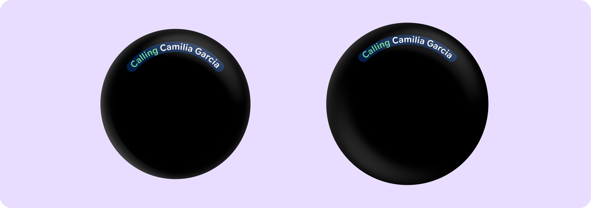
For samples using curved text in a CurvedLayout see:
import androidx.compose.ui.Modifier
import androidx.compose.ui.graphics.StrokeCap.Companion.Round
import androidx.compose.ui.unit.dp
import androidx.wear.compose.foundation.CurvedLayout
import androidx.wear.compose.foundation.CurvedModifier
import androidx.wear.compose.foundation.angularSizeDp
import androidx.wear.compose.foundation.background
import androidx.wear.compose.foundation.curvedBox
import androidx.wear.compose.foundation.curvedRow
import androidx.wear.compose.material3.MaterialTheme
import androidx.wear.compose.material3.curvedText

val backgroundColor = MaterialTheme.colorScheme.onPrimary
val customColor = MaterialTheme.colorScheme.tertiaryDim
CurvedLayout {
    curvedRow(CurvedModifier.background(backgroundColor, Round)) {
        curvedText("Calling", color = customColor)
        curvedBox(CurvedModifier.angularSizeDp(5.dp)) {}
        curvedText("Camilia Garcia")
    }
}
import androidx.compose.foundation.layout.size
import androidx.compose.material.icons.Icons
import androidx.compose.material.icons.filled.Warning
import androidx.compose.runtime.Composable
import androidx.compose.ui.Modifier
import androidx.compose.ui.graphics.StrokeCap.Companion.Round
import androidx.compose.ui.text.style.TextOverflow
import androidx.wear.compose.foundation.CurvedDirection
import androidx.wear.compose.foundation.CurvedLayout
import androidx.wear.compose.foundation.CurvedModifier
import androidx.wear.compose.foundation.background
import androidx.wear.compose.foundation.curvedComposable
import androidx.wear.compose.foundation.curvedRow
import androidx.wear.compose.material3.ButtonDefaults
import androidx.wear.compose.material3.CurvedTextDefaults
import androidx.wear.compose.material3.Icon
import androidx.wear.compose.material3.MaterialTheme
import androidx.wear.compose.material3.curvedText

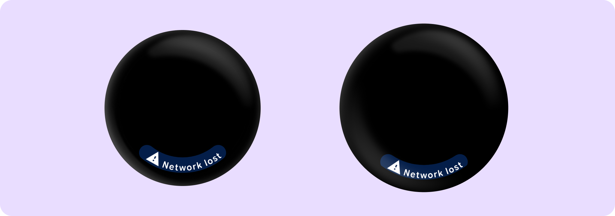
val backgroundColor = MaterialTheme.colorScheme.onPrimary
CurvedLayout(anchor = 90f, angularDirection = CurvedDirection.Angular.Reversed) {
    curvedRow(CurvedModifier.background(backgroundColor, Round)) {
        curvedComposable {
            Icon(
                Icons.Filled.Warning,
                contentDescription = "Warning",
                modifier = Modifier.size(ButtonDefaults.IconSize),
            )
        }
        curvedText(
            "Network lost",
            maxSweepAngle = CurvedTextDefaults.StaticContentMaxSweepAngle,
            overflow = TextOverflow.Ellipsis,
        )
    }
}
For more information, see the Curved Text guide.
| Parameters | |
|---|---|
text: String |
The text to display |
modifier: CurvedModifier = CurvedModifier |
The |
maxSweepAngle: Float = CurvedTextDefaults.ScrollableContentMaxSweepAngle |
The default maximum sweep angle in degrees. For screens without scrollable content, |
background: Color = Color.Unspecified |
The background color for the text. |
color: Color = Color.Unspecified |
|
fontSize: TextUnit = TextUnit.Unspecified |
The size of glyphs to use when painting the text. See |
fontFamily: FontFamily? = null |
The font family to be used when rendering the text. |
fontWeight: FontWeight? = null |
The thickness of the glyphs, in a range of 1, 1000. see |
fontStyle: FontStyle? = null |
The typeface variant to use when drawing the letters (e.g. italic). |
fontSynthesis: FontSynthesis? = null |
Whether to synthesize font weight and/or style when the requested weight or style cannot be found in the provided font family. |
letterSpacing: TextUnit = TextUnit.Unspecified |
The amount of space (in em or sp) to add between each letter, when text is going clockwise. |
letterSpacingCounterClockwise: TextUnit = TextUnit.Unspecified |
The amount of space (in em or sp) to add between each letter, when text is going counterClockwise. Note that this usually needs to be bigger than |
style: CurvedTextStyle? = null |
Specifies the style to use. |
angularDirection: CurvedDirection.Angular? = null |
Specify if the text is laid out clockwise or anti-clockwise, and if those needs to be reversed in a Rtl layout. If not specified, it will be inherited from the enclosing |
overflow: TextOverflow = TextOverflow.Clip |
How visual overflow should be handled. Note that this takes into account only explicit size curved modifiers in this element, to size this element matching the parent's, add a CurvedModifier.weight here. |
CurvedScope.openOnPhoneDialogCurvedText
fun CurvedScope.openOnPhoneDialogCurvedText(
    text: String,
    style: CurvedTextStyle
): Unit
A customized variation of androidx.wear.compose.material3.curvedText that displays text along a curved path. This variation adopts suitable sweep angle and padding for use in OpenOnPhoneDialog.
| Parameters | |
|---|---|
text: String |
The text to display. |
style: CurvedTextStyle |
The style to apply to the text. It is recommended to use |
CurvedScope.timeTextCurvedText
fun CurvedScope.timeTextCurvedText(time: String, style: CurvedTextStyle? = null): Unit
Default curved text to use in a TimeText, for displaying the time
| Parameters | |
|---|---|
time: String |
The time to display. |
style: CurvedTextStyle? = null |
A |
CurvedScope.timeTextSeparator
fun CurvedScope.timeTextSeparator(
    curvedTextStyle: CurvedTextStyle? = null,
    contentArcPadding: ArcPaddingValues = ArcPaddingValues(angular = 4.dp)
): Unit
A default implementation of Separator, to be shown between any text/composable and the time.
| Parameters | |
|---|---|
curvedTextStyle: CurvedTextStyle? = null |
A |
contentArcPadding: ArcPaddingValues = ArcPaddingValues(angular = 4.dp) |
|