
androidx.tv.material3
Interfaces
NavigationDrawerScope |
|
ScrollPauseHandle |
Handle returned by |
TabRowScope |
|
Classes
Border |
Defines the border for a TV component. |
ButtonBorder |
Defines |
ButtonColors |
Defines |
ButtonGlow |
Defines |
ButtonScale |
Defines the scale for all TV |
ButtonShape |
Defines |
CardBorder |
Represents the |
CardColors |
Represents the |
CardContainerColors |
Represents the |
CardGlow |
Represents the |
CardScale |
Represents the scaleFactor of Card in different interaction states. |
CardShape |
Represents the |
CarouselState |
State of the Carousel which allows the user to specify the first item that is shown when the Carousel is instantiated in the constructor. |
CheckboxColors |
Represents the colors used by the three different sections (checkmark, box, and border) of a |
ClickableChipBorder |
Defines |
ClickableChipColors |
Defines |
ClickableChipGlow |
Defines |
ClickableChipScale |
Defines the scale for all TV states of |
ClickableChipShape |
Defines |
ClickableSurfaceBorder |
|
ClickableSurfaceColors |
Defines |
ClickableSurfaceGlow |
Defines |
ClickableSurfaceScale |
Defines the scale for all TV indication states of Surface. |
ClickableSurfaceShape |
Defines |
ColorScheme |
A color scheme holds all the named color parameters for a |
DrawerState |
State of the |
Glow |
Defines the shadow for a TV component. |
ListItemBorder |
Represents the |
ListItemColors |
Represents the container & content color |
ListItemGlow |
Represents the |
ListItemScale |
Represents the scale |
ListItemShape |
Represents the |
NavigationDrawerItemBorder |
Defines |
NavigationDrawerItemColors |
Defines container & content color |
NavigationDrawerItemGlow |
Defines |
NavigationDrawerItemScale |
Defines the scale for all TV |
NavigationDrawerItemShape |
Defines |
RadioButtonColors |
Represents the color used by a |
SelectableChipBorder |
Defines |
SelectableChipColors |
Defines |
SelectableChipGlow |
Defines |
SelectableChipScale |
Defines the scale for all TV states of |
SelectableChipShape |
Defines |
SelectableSurfaceBorder |
Defines |
SelectableSurfaceColors |
Defines |
SelectableSurfaceGlow |
Defines |
SelectableSurfaceScale |
Defines the scale for all TV |
SelectableSurfaceShape |
Defines |
Shapes |
Material surfaces can be displayed in different shapes. |
SurfaceColors |
Defines the container & content color |
SwitchColors |
Represents the colors used by a |
TabColors |
Represents the colors used in a tab in different states. |
Typography |
The Material Design type scale includes a range of contrasting styles that support the needs of your product and its content. |
WideButtonContentColor |
Defines |
Objects
AssistChipDefaults |
Contains the default values used by |
ButtonDefaults |
|
CardContainerDefaults |
|
CardDefaults |
Contains the default values used by all card types. |
CarouselDefaults |
|
CheckboxDefaults |
Defaults used in |
ClickableSurfaceDefaults |
Contains the default values used by clickable Surface. |
FilterChipDefaults |
Contains the default values used by |
IconButtonDefaults |
|
InputChipDefaults |
Contains the default values used by |
ListItemDefaults |
Contains the default values used by list items. |
MaterialTheme |
Contains functions to access the current theme values provided at the call site's position in the hierarchy. |
NavigationDrawerItemDefaults |
Contains the default values used by selectable |
OutlinedButtonDefaults |
|
OutlinedIconButtonDefaults |
|
RadioButtonDefaults |
Defaults used in |
SelectableSurfaceDefaults |
Contains the default values used by Selectable Surface. |
ShapeDefaults |
Contains the default values used by |
SuggestionChipDefaults |
Contains the default values used by |
SurfaceDefaults |
Contains the default values used by a non-interactive |
SwitchDefaults |
Contains the default values used by |
TabDefaults |
|
TabRowDefaults |
|
WideButtonDefaults |
Annotations
Enums
DrawerValue |
States that the drawer can exist in. |
Top-level functions summary
Unit |
@ExperimentalTvMaterial3ApiMaterial Design assist chip |
Unit |
@NonRestartableComposableMaterial Design filled button for TV. |
Unit |
@ComposableCards contain content and actions that relate information about a subject. |
Unit |
@ExperimentalTvMaterial3ApiComposes a hero card rotator to highlight a piece of content. |
Unit |
@Composable |
Unit |
@Composable
|
Unit |
@Composable
|
Unit |
@ComposableLists are continuous, vertical indexes of text or images. |
Unit |
@ExperimentalTvMaterial3ApiMaterial Design filter chip |
Unit |
@ComposableA Material Design icon component that draws |
Unit |
@ComposableA Material Design icon component that draws |
Unit |
A Material Design icon component that draws |
Unit |
@NonRestartableComposableMaterial Design standard icon button for TV. |
Unit |
@ExperimentalTvMaterial3ApiChips help people enter information, make selections, filter content, or trigger actions. |
Unit |
@ComposableLists are continuous, vertical indexes of text or images. |
Unit |
@ComposableMaterial Theming refers to the customization of your Material Design app to better reflect your product’s brand. |
Unit |
@ComposableNavigation drawers provide ergonomic access to destinations in an app. |
Unit |
@ComposableNavigation drawers provide ergonomic access to destinations in an app. |
Unit |
@NonRestartableComposableMaterial Design outlined button for TV. |
Unit |
@NonRestartableComposableMaterial Design standard icon button for TV. |
Unit |
@ComposableThis function is used to set the current value of |
Unit |
@Composable |
Unit |
@Composable
|
Unit |
@ExperimentalTvMaterial3ApiMaterial Design suggestion chip |
Unit |
@NonRestartableComposableThe |
Unit |
@ComposableThe |
Unit |
@ComposableThe Surface is a building block component that will be used for any focusable element on TV such as buttons, cards, navigation, etc. |
Unit |
@Composable |
Unit |
@ComposableTV-Material Design Horizontal TabRow |
Unit |
@ComposableHigh level element that displays text and provides semantics / accessibility information. |
Unit |
@ComposableHigh level element that displays text and provides semantics / accessibility information. |
Unit |
@ComposableMaterial Design checkbox parent. |
Unit |
@NonRestartableComposableMaterial Design wide button for TV. |
Unit |
@NonRestartableComposableMaterial Design wide button for TV. |
Unit |
@Composable
|
Unit |
@Composable
|
Color |
@ComposableThe Material color system contains pairs of colors that are typically used for the background and content color inside a component. |
ColorScheme |
darkColorScheme(Returns a dark Material color scheme. |
ColorScheme |
lightColorScheme(Returns a light Material color scheme. |
CarouselState |
@ExperimentalTvMaterial3ApiCreates a |
DrawerState |
@ComposableCreate and remember a |
Extension functions summary
Unit |
@ComposableTV Material Design navigation drawer item. |
Unit |
@ComposableMaterial Design tab. |
Color |
ColorScheme.contentColorFor(backgroundColor: Color)The Material color system contains pairs of colors that are typically used for the background and content color inside a component. |
Color |
ColorScheme.surfaceColorAtElevation(elevation: Dp)Computes the surface tonal color at different elevation levels e.g. surface1 through surface5. |
Top-level properties summary
ProvidableCompositionLocal<Color> |
CompositionLocal containing the preferred content color for a given position in the hierarchy. |
ProvidableCompositionLocal<TextStyle> |
CompositionLocal containing the preferred |
Top-level functions
AssistChip
@ExperimentalTvMaterial3Api
@NonRestartableComposable
@Composable
fun AssistChip(
    onClick: () -> Unit,
    modifier: Modifier = Modifier,
    enabled: Boolean = true,
    onLongClick: (() -> Unit)? = null,
    leadingIcon: (@Composable () -> Unit)? = null,
    trailingIcon: (@Composable () -> Unit)? = null,
    shape: ClickableChipShape = AssistChipDefaults.shape(),
    colors: ClickableChipColors = AssistChipDefaults.colors(),
    scale: ClickableChipScale = AssistChipDefaults.scale(),
    border: ClickableChipBorder = AssistChipDefaults.border(),
    glow: ClickableChipGlow = AssistChipDefaults.glow(),
    interactionSource: MutableInteractionSource? = null,
    content: @Composable () -> Unit
): Unit
Material Design assist chip
Chips help people enter information, make selections, filter content, or trigger actions. Chips can show multiple interactive elements together in the same area, such as a list of selectable movie times, or a series of email contacts
Assist chips represent smart or automated actions that can span multiple apps, such as opening a calendar event from the home screen. Assist chips function as though the user asked an assistant to complete the action. They should appear dynamically and contextually in a UI
| Parameters | |
|---|---|
onClick: () -> Unit |
called when this chip is clicked |
modifier: Modifier = Modifier |
the |
enabled: Boolean = true |
controls the enabled state of this chip. When |
onLongClick: (() -> Unit)? = null |
callback to be called when the surface is long clicked (long-pressed) |
leadingIcon: (@Composable () -> Unit)? = null |
optional icon at the start of the chip, preceding the |
trailingIcon: (@Composable () -> Unit)? = null |
optional icon at the end of the chip |
shape: ClickableChipShape = AssistChipDefaults.shape() |
Defines the Chip's shape |
colors: ClickableChipColors = AssistChipDefaults.colors() |
Color to be used on background and content of the chip |
scale: ClickableChipScale = AssistChipDefaults.scale() |
Defines size of the chip relative to its original size |
border: ClickableChipBorder = AssistChipDefaults.border() |
Defines a border around the chip |
glow: ClickableChipGlow = AssistChipDefaults.glow() |
Shadow to be shown behind the chip |
interactionSource: MutableInteractionSource? = null |
an optional hoisted |
content: @Composable () -> Unit |
for this chip, ideally a Text composable |
Button
@NonRestartableComposable
@Composable
fun Button(
    onClick: () -> Unit,
    modifier: Modifier = Modifier,
    onLongClick: (() -> Unit)? = null,
    enabled: Boolean = true,
    scale: ButtonScale = ButtonDefaults.scale(),
    glow: ButtonGlow = ButtonDefaults.glow(),
    shape: ButtonShape = ButtonDefaults.shape(),
    colors: ButtonColors = ButtonDefaults.colors(),
    tonalElevation: Dp = Elevation.Level0,
    border: ButtonBorder = ButtonDefaults.border(),
    contentPadding: PaddingValues = ButtonDefaults.ContentPadding,
    interactionSource: MutableInteractionSource? = null,
    content: @Composable RowScope.() -> Unit
): Unit
Material Design filled button for TV.
Filled buttons are for high emphasis (important, final actions that complete a flow).
Choose the best button for an action based on the amount of emphasis it needs. The more important an action is, the higher emphasis its button should be.
-
See
Buttonfor high emphasis (important, final actions that complete a flow). -
See
OutlinedButtonfor a medium-emphasis button with a border.
The default text style for internal Text components will be set to Typography.labelLarge.
Samples:
import androidx.tv.material3.Button
import androidx.tv.material3.Text

Button(onClick = {}) { Text("Button") }
import androidx.compose.foundation.layout.Spacer
import androidx.compose.foundation.layout.size
import androidx.compose.material.icons.Icons
import androidx.compose.material.icons.filled.Favorite
import androidx.compose.ui.Modifier
import androidx.tv.material3.Button
import androidx.tv.material3.ButtonDefaults
import androidx.tv.material3.Icon
import androidx.tv.material3.Text

Button(
    onClick = { /* Do something! */ },
    contentPadding = ButtonDefaults.ButtonWithIconContentPadding
) {
    Icon(
        Icons.Filled.Favorite,
        contentDescription = "Localized description",
        modifier = Modifier.size(ButtonDefaults.IconSize)
    )
    Spacer(Modifier.size(ButtonDefaults.IconSpacing))
    Text("Like")
}
| Parameters | |
|---|---|
onClick: () -> Unit |
called when this button is clicked |
modifier: Modifier = Modifier |
the |
onLongClick: (() -> Unit)? = null |
called when this button is long clicked (long-pressed). |
enabled: Boolean = true |
controls the enabled state of this button. When |
scale: ButtonScale = ButtonDefaults.scale() |
Defines size of the Button relative to its original size. |
glow: ButtonGlow = ButtonDefaults.glow() |
Shadow to be shown behind the Button. |
shape: ButtonShape = ButtonDefaults.shape() |
Defines the Button's shape. |
colors: ButtonColors = ButtonDefaults.colors() |
Color to be used for background and content of the Button |
tonalElevation: Dp = Elevation.Level0 |
tonal elevation used to apply a color shift to the button to give the it higher emphasis |
border: ButtonBorder = ButtonDefaults.border() |
Defines a border around the Button. |
contentPadding: PaddingValues = ButtonDefaults.ContentPadding |
the spacing values to apply internally between the container and the content |
interactionSource: MutableInteractionSource? = null |
an optional hoisted |
content: @Composable RowScope.() -> Unit |
the content of the button |
Card
@Composable
fun Card(
    onClick: () -> Unit,
    modifier: Modifier = Modifier,
    onLongClick: (() -> Unit)? = null,
    shape: CardShape = CardDefaults.shape(),
    colors: CardColors = CardDefaults.colors(),
    scale: CardScale = CardDefaults.scale(),
    border: CardBorder = CardDefaults.border(),
    glow: CardGlow = CardDefaults.glow(),
    interactionSource: MutableInteractionSource? = null,
    content: @Composable ColumnScope.() -> Unit
): Unit
Cards contain content and actions that relate information about a subject.
This Card handles click events, calling its onClick lambda.
Checkout TV Guidelines for Aspect ratios for cards
import androidx.compose.foundation.BorderStroke
import androidx.compose.foundation.layout.aspectRatio
import androidx.compose.foundation.layout.width
import androidx.compose.foundation.shape.RoundedCornerShape
import androidx.compose.ui.Modifier
import androidx.compose.ui.graphics.Color
import androidx.compose.ui.unit.dp
import androidx.tv.material3.Border
import androidx.tv.material3.Card
import androidx.tv.material3.CardDefaults

Card(
    onClick = {},
    modifier = Modifier.width(200.dp).aspectRatio(CardDefaults.HorizontalImageAspectRatio),
    border =
        CardDefaults.border(
            focusedBorder =
                Border(
                    border = BorderStroke(width = 3.dp, color = Color.Green),
                    shape = RoundedCornerShape(5),
                ),
        ),
    colors =
        CardDefaults.colors(containerColor = Color.Red, focusedContainerColor = Color.Yellow),
    scale =
        CardDefaults.scale(
            focusedScale = 1.05f,
        )
) {}
import androidx.compose.foundation.BorderStroke
import androidx.compose.foundation.layout.aspectRatio
import androidx.compose.foundation.layout.width
import androidx.compose.foundation.shape.RoundedCornerShape
import androidx.compose.ui.Modifier
import androidx.compose.ui.graphics.Color
import androidx.compose.ui.unit.dp
import androidx.tv.material3.Border
import androidx.tv.material3.Card
import androidx.tv.material3.CardDefaults

Card(
    onClick = {},
    modifier = Modifier.width(200.dp).aspectRatio(CardDefaults.VerticalImageAspectRatio),
    border =
        CardDefaults.border(
            focusedBorder =
                Border(
                    border = BorderStroke(width = 3.dp, color = Color.Green),
                    shape = RoundedCornerShape(5),
                ),
        ),
    colors =
        CardDefaults.colors(containerColor = Color.Red, focusedContainerColor = Color.Yellow),
    scale =
        CardDefaults.scale(
            focusedScale = 1.05f,
        )
) {}
import androidx.compose.foundation.BorderStroke
import androidx.compose.foundation.layout.aspectRatio
import androidx.compose.foundation.layout.width
import androidx.compose.foundation.shape.CircleShape
import androidx.compose.ui.Modifier
import androidx.compose.ui.graphics.Color
import androidx.compose.ui.unit.dp
import androidx.tv.material3.Border
import androidx.tv.material3.Card
import androidx.tv.material3.CardDefaults

Card(
    onClick = {},
    modifier = Modifier.width(150.dp).aspectRatio(CardDefaults.SquareImageAspectRatio),
    border =
        CardDefaults.border(
            focusedBorder = Border(border = BorderStroke(width = 3.dp, color = Color.Green)),
        ),
    shape =
        CardDefaults.shape(
            shape = CircleShape,
        ),
    colors =
        CardDefaults.colors(containerColor = Color.Red, focusedContainerColor = Color.Yellow),
    scale =
        CardDefaults.scale(
            focusedScale = 1.05f,
        )
) {}
| Parameters | |
|---|---|
onClick: () -> Unit |
called when this card is clicked. |
modifier: Modifier = Modifier |
the |
onLongClick: (() -> Unit)? = null |
called when this card is long clicked (long-pressed). |
shape: CardShape = CardDefaults.shape() |
|
colors: CardColors = CardDefaults.colors() |
|
scale: CardScale = CardDefaults.scale() |
|
border: CardBorder = CardDefaults.border() |
|
glow: CardGlow = CardDefaults.glow() |
|
interactionSource: MutableInteractionSource? = null |
an optional hoisted |
content: @Composable ColumnScope.() -> Unit |
defines the |
Carousel
@ExperimentalTvMaterial3Api
@Composable
fun Carousel(
    itemCount: Int,
    modifier: Modifier = Modifier,
    carouselState: CarouselState = rememberCarouselState(),
    autoScrollDurationMillis: Long = CarouselDefaults.TimeToDisplayItemMillis,
    contentTransformStartToEnd: ContentTransform = CarouselDefaults.contentTransform,
    contentTransformEndToStart: ContentTransform = CarouselDefaults.contentTransform,
    carouselIndicator: @Composable BoxScope.() -> Unit = {
        CarouselDefaults.IndicatorRow(
            itemCount = itemCount,
            activeItemIndex = carouselState.activeItemIndex,
            modifier = Modifier.align(Alignment.BottomEnd).padding(16.dp),
        )
    },
    content: @Composable AnimatedContentScope.(index: Int) -> Unit
): Unit
Composes a hero card rotator to highlight a piece of content.
Examples:
import androidx.compose.animation.core.tween
import androidx.compose.animation.fadeIn
import androidx.compose.animation.fadeOut
import androidx.compose.animation.slideInHorizontally
import androidx.compose.animation.slideOutHorizontally
import androidx.compose.animation.togetherWith
import androidx.compose.foundation.background
import androidx.compose.foundation.border
import androidx.compose.foundation.layout.Box
import androidx.compose.foundation.layout.fillMaxSize
import androidx.compose.foundation.layout.fillMaxWidth
import androidx.compose.foundation.layout.height
import androidx.compose.foundation.layout.padding
import androidx.compose.foundation.layout.size
import androidx.compose.foundation.shape.RoundedCornerShape
import androidx.compose.material3.Button
import androidx.compose.material3.Text
import androidx.compose.runtime.Composable
import androidx.compose.runtime.LaunchedEffect
import androidx.compose.runtime.mutableStateOf
import androidx.compose.runtime.remember
import androidx.compose.ui.Modifier
import androidx.compose.ui.focus.FocusRequester
import androidx.compose.ui.focus.focusRequester
import androidx.compose.ui.focus.onFocusChanged
import androidx.compose.ui.graphics.Color
import androidx.compose.ui.layout.onPlaced
import androidx.compose.ui.unit.dp
import androidx.tv.material3.Carousel

@Composable
fun Modifier.onFirstGainingVisibility(onGainingVisibility: () -> Unit): Modifier {
    var isVisible by remember { mutableStateOf(false) }
    LaunchedEffect(isVisible) { if (isVisible) onGainingVisibility() }

    return onPlaced { isVisible = true }
}

@Composable
fun Modifier.requestFocusOnFirstGainingVisibility(): Modifier {
    val focusRequester = remember { FocusRequester() }
    return focusRequester(focusRequester).onFirstGainingVisibility {
        focusRequester.requestFocus()
    }
}

val backgrounds =
    listOf(
        Color.Red.copy(alpha = 0.3f),
        Color.Yellow.copy(alpha = 0.3f),
        Color.Green.copy(alpha = 0.3f)
    )

var carouselFocused by remember { mutableStateOf(false) }
Carousel(
    itemCount = backgrounds.size,
    modifier =
        Modifier.height(300.dp).fillMaxWidth().onFocusChanged {
            carouselFocused = it.isFocused
        },
    contentTransformEndToStart = fadeIn(tween(1000)).togetherWith(fadeOut(tween(1000))),
    contentTransformStartToEnd = fadeIn(tween(1000)).togetherWith(fadeOut(tween(1000)))
) { itemIndex ->
    Box(
        modifier =
            Modifier.background(backgrounds[itemIndex])
                .border(2.dp, Color.White.copy(alpha = 0.5f))
                .fillMaxSize()
    ) {
        var buttonFocused by remember { mutableStateOf(false) }
        val buttonModifier =
            if (carouselFocused) {
                Modifier.requestFocusOnFirstGainingVisibility()
            } else {
                Modifier
            }

        Button(
            onClick = {},
            modifier =
                buttonModifier
                    .onFocusChanged { buttonFocused = it.isFocused }
                    .padding(40.dp)
                    .border(
                        width = 2.dp,
                        color = if (buttonFocused) Color.Red else Color.Transparent,
                        shape = RoundedCornerShape(50)
                    )
                    // Duration of animation here should be less than or equal to carousel's
                    // contentTransform duration to ensure the item below does not disappear
                    // abruptly.
                    .animateEnterExit(
                        enter = slideInHorizontally(animationSpec = tween(1000)) { it / 2 },
                        exit = slideOutHorizontally(animationSpec = tween(1000))
                    )
                    .padding(vertical = 2.dp, horizontal = 5.dp)
        ) {
            Text(text = "Play")
        }
    }
}
import androidx.compose.animation.core.tween
import androidx.compose.animation.fadeIn
import androidx.compose.animation.fadeOut
import androidx.compose.animation.slideInHorizontally
import androidx.compose.animation.slideOutHorizontally
import androidx.compose.animation.togetherWith
import androidx.compose.foundation.background
import androidx.compose.foundation.border
import androidx.compose.foundation.layout.Box
import androidx.compose.foundation.layout.fillMaxSize
import androidx.compose.foundation.layout.fillMaxWidth
import androidx.compose.foundation.layout.height
import androidx.compose.foundation.layout.padding
import androidx.compose.foundation.layout.size
import androidx.compose.foundation.shape.RoundedCornerShape
import androidx.compose.material3.Button
import androidx.compose.material3.Text
import androidx.compose.runtime.mutableStateOf
import androidx.compose.runtime.remember
import androidx.compose.ui.Alignment
import androidx.compose.ui.Modifier
import androidx.compose.ui.focus.onFocusChanged
import androidx.compose.ui.graphics.Color
import androidx.compose.ui.graphics.RectangleShape
import androidx.compose.ui.unit.dp
import androidx.tv.material3.Carousel
import androidx.tv.material3.CarouselDefaults
import androidx.tv.material3.rememberCarouselState

val backgrounds =
    listOf(
        Color.Red.copy(alpha = 0.3f),
        Color.Yellow.copy(alpha = 0.3f),
        Color.Green.copy(alpha = 0.3f)
    )
val carouselState = rememberCarouselState()

Carousel(
    itemCount = backgrounds.size,
    modifier = Modifier.height(300.dp).fillMaxWidth(),
    carouselState = carouselState,
    carouselIndicator = {
        CarouselDefaults.IndicatorRow(
            itemCount = backgrounds.size,
            activeItemIndex = carouselState.activeItemIndex,
            modifier = Modifier.align(Alignment.BottomEnd).padding(16.dp),
            indicator = { isActive ->
                val activeColor = Color.Red
                val inactiveColor = activeColor.copy(alpha = 0.5f)
                Box(
                    modifier =
                        Modifier.size(8.dp)
                            .background(
                                color = if (isActive) activeColor else inactiveColor,
                                shape = RectangleShape,
                            ),
                )
            }
        )
    },
    contentTransformEndToStart = fadeIn(tween(1000)).togetherWith(fadeOut(tween(1000))),
    contentTransformStartToEnd = fadeIn(tween(1000)).togetherWith(fadeOut(tween(1000)))
) { itemIndex ->
    Box(
        modifier =
            Modifier.background(backgrounds[itemIndex])
                .border(2.dp, Color.White.copy(alpha = 0.5f))
                .fillMaxSize()
    ) {
        var isFocused by remember { mutableStateOf(false) }
        Button(
            onClick = {},
            modifier =
                Modifier.onFocusChanged { isFocused = it.isFocused }
                    // Duration of animation here should be less than or equal to carousel's
                    // contentTransform duration to ensure the item below does not disappear
                    // abruptly.
                    .animateEnterExit(
                        enter = slideInHorizontally(animationSpec = tween(1000)) { it / 2 },
                        exit = slideOutHorizontally(animationSpec = tween(1000))
                    )
                    .padding(40.dp)
                    .border(
                        width = 2.dp,
                        color = if (isFocused) Color.Red else Color.Transparent,
                        shape = RoundedCornerShape(50)
                    )
                    .padding(vertical = 2.dp, horizontal = 5.dp)
        ) {
            Text(text = "Play")
        }
    }
}
| Parameters | |
|---|---|
itemCount: Int |
total number of items present in the carousel. |
modifier: Modifier = Modifier |
Modifier applied to the Carousel. |
carouselState: CarouselState = rememberCarouselState() |
state associated with this carousel. |
autoScrollDurationMillis: Long = CarouselDefaults.TimeToDisplayItemMillis |
duration for which item should be visible before moving to the next item. |
contentTransformStartToEnd: ContentTransform = CarouselDefaults.contentTransform |
animation transform applied when we are moving from start to end in the carousel while scrolling to the next item |
contentTransformEndToStart: ContentTransform = CarouselDefaults.contentTransform |
animation transform applied when we are moving from end to start in the carousel while scrolling to the next item |
carouselIndicator: @Composable BoxScope.() -> Unit = {
        CarouselDefaults.IndicatorRow(
            itemCount = itemCount,
            activeItemIndex = carouselState.activeItemIndex,
            modifier = Modifier.align(Alignment.BottomEnd).padding(16.dp),
        )
} |
indicator showing the position of the current item among all items. |
content: @Composable AnimatedContentScope.(index: Int) -> Unit |
defines the items for a given index. |
Checkbox
@Composable
fun Checkbox(
    checked: Boolean,
    onCheckedChange: ((Boolean) -> Unit)?,
    modifier: Modifier = Modifier,
    enabled: Boolean = true,
    colors: CheckboxColors = CheckboxDefaults.colors(),
    interactionSource: MutableInteractionSource? = null
): Unit
Checkboxes allow users to select one or more items from a set. Checkboxes can turn an option on or off.
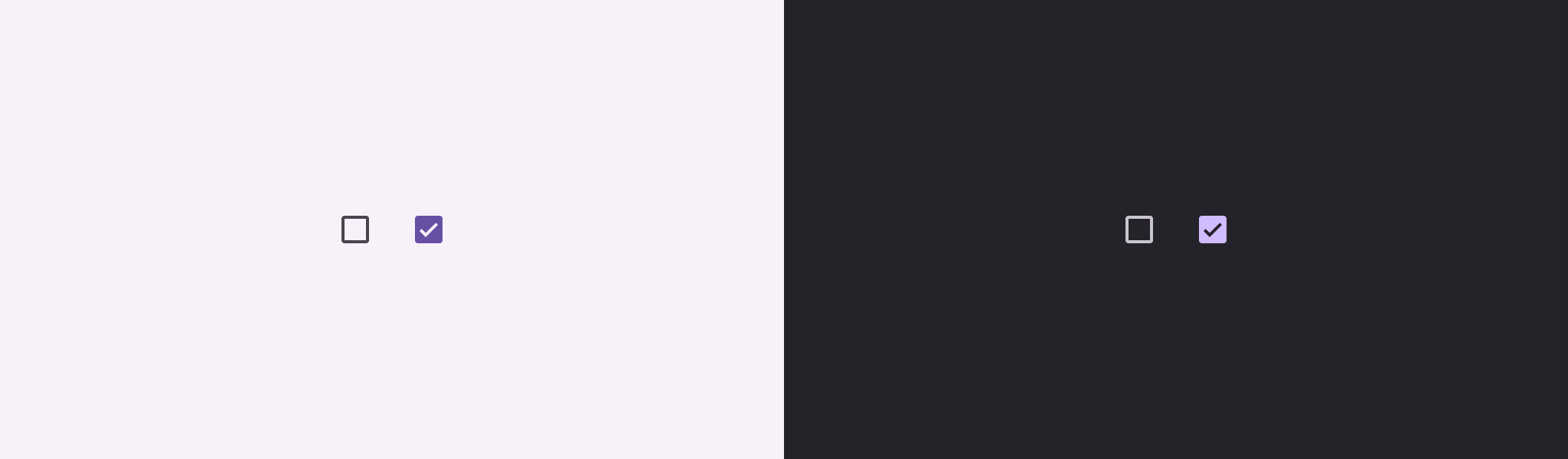
import androidx.tv.material3.Checkbox

Checkbox(checked = true, onCheckedChange = {})
| Parameters | |
|---|---|
checked: Boolean |
whether this checkbox is checked or unchecked |
onCheckedChange: ((Boolean) -> Unit)? |
called when this checkbox is clicked. If |
modifier: Modifier = Modifier |
the |
enabled: Boolean = true |
controls the enabled state of this checkbox. When |
colors: CheckboxColors = CheckboxDefaults.colors() |
|
interactionSource: MutableInteractionSource? = null |
an optional hoisted |
| See also | |
|---|---|
TriStateCheckbox |
if you require support for an indeterminate state. |
ClassicCard
@Composable
fun ClassicCard(
    onClick: () -> Unit,
    image: @Composable BoxScope.() -> Unit,
    title: @Composable () -> Unit,
    modifier: Modifier = Modifier,
    onLongClick: (() -> Unit)? = null,
    subtitle: @Composable () -> Unit = {},
    description: @Composable () -> Unit = {},
    shape: CardShape = CardDefaults.shape(),
    colors: CardColors = CardDefaults.colors(),
    scale: CardScale = CardDefaults.scale(),
    border: CardBorder = CardDefaults.border(),
    glow: CardGlow = CardDefaults.glow(),
    contentPadding: PaddingValues = PaddingValues(),
    interactionSource: MutableInteractionSource? = null
): Unit
ClassicCard is an opinionated TV Material card that offers a 4 slot layout to show information about a subject.
This card has a vertical layout with the interactive surface Surface, which provides the image slot at the top, followed by the title, subtitle, and description slots.

Checkout TV design guidelines to learn more about Material Classic Card.
This Card handles click events, calling its onClick lambda.
import androidx.compose.foundation.background
import androidx.compose.foundation.layout.Box
import androidx.compose.foundation.layout.PaddingValues
import androidx.compose.foundation.layout.fillMaxWidth
import androidx.compose.foundation.layout.height
import androidx.compose.foundation.layout.size
import androidx.compose.ui.Modifier
import androidx.compose.ui.graphics.Color
import androidx.compose.ui.unit.dp
import androidx.tv.material3.Card
import androidx.tv.material3.ClassicCard
import androidx.tv.material3.Text

ClassicCard(
    modifier = Modifier.size(150.dp, 120.dp),
    image = { Box(modifier = Modifier.fillMaxWidth().height(80.dp).background(Color.Blue)) },
    title = { Text("Classic Card") },
    contentPadding = PaddingValues(8.dp),
    onClick = {}
)
| Parameters | |
|---|---|
onClick: () -> Unit |
called when this card is clicked. |
image: @Composable BoxScope.() -> Unit |
defines the |
title: @Composable () -> Unit |
defines the |
modifier: Modifier = Modifier |
the |
onLongClick: (() -> Unit)? = null |
called when this card is long clicked (long-pressed). |
subtitle: @Composable () -> Unit = {} |
defines the |
description: @Composable () -> Unit = {} |
defines the |
shape: CardShape = CardDefaults.shape() |
|
colors: CardColors = CardDefaults.colors() |
|
scale: CardScale = CardDefaults.scale() |
|
border: CardBorder = CardDefaults.border() |
|
glow: CardGlow = CardDefaults.glow() |
|
contentPadding: PaddingValues = PaddingValues() |
|
interactionSource: MutableInteractionSource? = null |
an optional hoisted |
CompactCard
@Composable
fun CompactCard(
    onClick: () -> Unit,
    image: @Composable BoxScope.() -> Unit,
    title: @Composable () -> Unit,
    modifier: Modifier = Modifier,
    onLongClick: (() -> Unit)? = null,
    subtitle: @Composable () -> Unit = {},
    description: @Composable () -> Unit = {},
    shape: CardShape = CardDefaults.shape(),
    colors: CardColors = CardDefaults.compactCardColors(),
    scale: CardScale = CardDefaults.scale(),
    border: CardBorder = CardDefaults.border(),
    glow: CardGlow = CardDefaults.glow(),
    scrimBrush: Brush = CardDefaults.ScrimBrush,
    interactionSource: MutableInteractionSource? = null
): Unit
CompactCard is an opinionated TV Material card that offers a 4 slot layout to show information about a subject.
This card provides the interactive surface Surface with the image slot as the background (with an overlay scrim gradient). Other slots for the title, subtitle, and description are placed over it.

Checkout TV design guidelines to learn more about Material Compact Card.
This Card handles click events, calling its onClick lambda.
import androidx.compose.foundation.background
import androidx.compose.foundation.layout.Box
import androidx.compose.foundation.layout.fillMaxWidth
import androidx.compose.foundation.layout.height
import androidx.compose.foundation.layout.padding
import androidx.compose.foundation.layout.size
import androidx.compose.ui.Modifier
import androidx.compose.ui.graphics.Color
import androidx.compose.ui.unit.dp
import androidx.tv.material3.Card
import androidx.tv.material3.CompactCard
import androidx.tv.material3.Text

CompactCard(
    modifier = Modifier.size(150.dp, 120.dp),
    image = { Box(modifier = Modifier.fillMaxWidth().height(80.dp).background(Color.Blue)) },
    title = { Text(text = "Compact Card", modifier = Modifier.padding(8.dp)) },
    onClick = {}
)
| Parameters | |
|---|---|
onClick: () -> Unit |
called when this card is clicked. |
image: @Composable BoxScope.() -> Unit |
defines the |
title: @Composable () -> Unit |
defines the |
modifier: Modifier = Modifier |
the |
onLongClick: (() -> Unit)? = null |
called when this card is long clicked (long-pressed). |
subtitle: @Composable () -> Unit = {} |
defines the |
description: @Composable () -> Unit = {} |
defines the |
shape: CardShape = CardDefaults.shape() |
|
colors: CardColors = CardDefaults.compactCardColors() |
|
scale: CardScale = CardDefaults.scale() |
|
border: CardBorder = CardDefaults.border() |
|
glow: CardGlow = CardDefaults.glow() |
|
scrimBrush: Brush = CardDefaults.ScrimBrush |
|
interactionSource: MutableInteractionSource? = null |
an optional hoisted |
DenseListItem
@Composable
fun DenseListItem(
    selected: Boolean,
    onClick: () -> Unit,
    headlineContent: @Composable () -> Unit,
    modifier: Modifier = Modifier,
    enabled: Boolean = true,
    onLongClick: (() -> Unit)? = null,
    overlineContent: (@Composable () -> Unit)? = null,
    supportingContent: (@Composable () -> Unit)? = null,
    leadingContent: (@Composable BoxScope.() -> Unit)? = null,
    trailingContent: (@Composable () -> Unit)? = null,
    tonalElevation: Dp = ListItemDefaults.TonalElevation,
    shape: ListItemShape = ListItemDefaults.shape(),
    colors: ListItemColors = ListItemDefaults.colors(),
    scale: ListItemScale = ListItemDefaults.scale(),
    border: ListItemBorder = ListItemDefaults.border(),
    glow: ListItemGlow = ListItemDefaults.glow(),
    interactionSource: MutableInteractionSource? = null
): Unit
Lists are continuous, vertical indexes of text or images.
DenseListItem is a smaller/denser version of the Material ListItem.
This component can be used to achieve the list item templates existing in the spec. One-line list items have a singular line of headline content. Two-line list items additionally have either supporting or overline content. Three-line list items have either both supporting and overline content, or extended (two-line) supporting text.
This ListItem handles click events, calling its onClick lambda. It also support selected state which can be toggled using the selected param.
| Parameters | |
|---|---|
selected: Boolean |
defines whether this ListItem is selected or not |
onClick: () -> Unit |
called when this ListItem is clicked |
headlineContent: @Composable () -> Unit |
the |
modifier: Modifier = Modifier |
|
enabled: Boolean = true |
controls the enabled state of this list item. When |
onLongClick: (() -> Unit)? = null |
called when this ListItem is long clicked (long-pressed). |
overlineContent: (@Composable () -> Unit)? = null |
the |
supportingContent: (@Composable () -> Unit)? = null |
the |
leadingContent: (@Composable BoxScope.() -> Unit)? = null |
the |
trailingContent: (@Composable () -> Unit)? = null |
the |
tonalElevation: Dp = ListItemDefaults.TonalElevation |
the tonal elevation of this list item |
shape: ListItemShape = ListItemDefaults.shape() |
|
colors: ListItemColors = ListItemDefaults.colors() |
|
scale: ListItemScale = ListItemDefaults.scale() |
|
border: ListItemBorder = ListItemDefaults.border() |
|
glow: ListItemGlow = ListItemDefaults.glow() |
|
interactionSource: MutableInteractionSource? = null |
an optional hoisted |
FilterChip
@ExperimentalTvMaterial3Api
@NonRestartableComposable
@Composable
fun FilterChip(
    selected: Boolean,
    onClick: () -> Unit,
    modifier: Modifier = Modifier,
    enabled: Boolean = true,
    onLongClick: (() -> Unit)? = null,
    leadingIcon: (@Composable () -> Unit)? = null,
    trailingIcon: (@Composable () -> Unit)? = null,
    shape: SelectableChipShape = FilterChipDefaults.shape(),
    colors: SelectableChipColors = FilterChipDefaults.colors(),
    scale: SelectableChipScale = FilterChipDefaults.scale(),
    border: SelectableChipBorder = FilterChipDefaults.border(),
    glow: SelectableChipGlow = FilterChipDefaults.glow(),
    interactionSource: MutableInteractionSource? = null,
    content: @Composable () -> Unit
): Unit
Material Design filter chip
Chips help people enter information, make selections, filter content, or trigger actions. Chips can show multiple interactive elements together in the same area, such as a list of selectable movie times, or a series of email contacts
Filter chips use tags or descriptive words to filter content. They can be a good alternative to toggle buttons or checkboxes
Tapping on a filter chip toggles its selection state. A selection state leadingIcon can be provided (e.g. a checkmark) to be appended at the starting edge of the chip's label
| Parameters | |
|---|---|
selected: Boolean |
whether this chip is selected or not |
onClick: () -> Unit |
called when this chip is clicked |
modifier: Modifier = Modifier |
the |
enabled: Boolean = true |
controls the enabled state of this chip. When |
onLongClick: (() -> Unit)? = null |
callback to be called when the surface is long clicked (long-pressed) |
leadingIcon: (@Composable () -> Unit)? = null |
optional icon at the start of the chip, preceding the |
trailingIcon: (@Composable () -> Unit)? = null |
optional icon at the end of the chip |
shape: SelectableChipShape = FilterChipDefaults.shape() |
Defines the Chip's shape |
colors: SelectableChipColors = FilterChipDefaults.colors() |
Color to be used on background and content of the chip |
scale: SelectableChipScale = FilterChipDefaults.scale() |
Defines size of the chip relative to its original size |
border: SelectableChipBorder = FilterChipDefaults.border() |
Defines a border around the chip |
glow: SelectableChipGlow = FilterChipDefaults.glow() |
Shadow to be shown behind the chip |
interactionSource: MutableInteractionSource? = null |
an optional hoisted |
content: @Composable () -> Unit |
for this chip, ideally a Text composable |
Icon
@Composable
fun Icon(
    bitmap: ImageBitmap,
    contentDescription: String?,
    modifier: Modifier = Modifier,
    tint: Color = LocalContentColor.current
): Unit
A Material Design icon component that draws bitmap using tint, with a default value of LocalContentColor. If bitmap has no intrinsic size, this component will use the recommended default size. Icon is an opinionated component designed to be used with single-color icons so that they can be tinted correctly for the component they are placed in. For multicolored icons and icons that should not be tinted, use Color.Unspecified for tint. For generic images that should not be tinted, and do not follow the recommended icon size, use the generic androidx.compose.foundation.Image instead.
To learn more about icons, see Material Design icons
| Parameters | |
|---|---|
bitmap: ImageBitmap |
|
contentDescription: String? |
text used by accessibility services to describe what this icon represents. This should always be provided unless this icon is used for decorative purposes, and does not represent a meaningful action that a user can take. This text should be localized, such as by using androidx.compose.ui.res.stringResource or similar |
modifier: Modifier = Modifier |
the |
tint: Color = LocalContentColor.current |
tint to be applied to |
Icon
@Composable
fun Icon(
    imageVector: ImageVector,
    contentDescription: String?,
    modifier: Modifier = Modifier,
    tint: Color = LocalContentColor.current
): Unit
A Material Design icon component that draws imageVector using tint, with a default value of LocalContentColor. If imageVector has no intrinsic size, this component will use the recommended default size. Icon is an opinionated component designed to be used with single-color icons so that they can be tinted correctly for the component they are placed in. For multicolored icons and icons that should not be tinted, use Color.Unspecified for tint. For generic images that should not be tinted, and do not follow the recommended icon size, use the generic androidx.compose.foundation.Image instead.
To learn more about icons, see Material Design icons
| Parameters | |
|---|---|
imageVector: ImageVector |
|
contentDescription: String? |
text used by accessibility services to describe what this icon represents. This should always be gprovided unless this icon is used for decorative purposes, and does not represent a meaningful action that a user can take. This text should be localized, such as by using androidx.compose.ui.res.stringResource or similar |
modifier: Modifier = Modifier |
the |
tint: Color = LocalContentColor.current |
tint to be applied to |
Icon
@Composable
fun Icon(
    painter: Painter,
    contentDescription: String?,
    modifier: Modifier = Modifier,
    tint: Color = LocalContentColor.current
): Unit
A Material Design icon component that draws painter using tint, with a default value of LocalContentColor. If painter has no intrinsic size, this component will use the recommended default size. Icon is an opinionated component designed to be used with single-color icons so that they can be tinted correctly for the component they are placed in. For multicolored icons and icons that should not be tinted, use Color.Unspecified for tint. For generic images that should not be tinted, and do not follow the recommended icon size, use the generic androidx.compose.foundation.Image instead.
To learn more about icons, see Material Design icons
| Parameters | |
|---|---|
painter: Painter |
|
contentDescription: String? |
text used by accessibility services to describe what this icon represents. This should always be provided unless this icon is used for decorative purposes, and does not represent a meaningful action that a user can take. This text should be localized, such as by using androidx.compose.ui.res.stringResource or similar |
modifier: Modifier = Modifier |
the |
tint: Color = LocalContentColor.current |
tint to be applied to |
IconButton
@NonRestartableComposable
@Composable
fun IconButton(
    onClick: () -> Unit,
    modifier: Modifier = Modifier,
    onLongClick: (() -> Unit)? = null,
    enabled: Boolean = true,
    scale: ButtonScale = IconButtonDefaults.scale(),
    glow: ButtonGlow = IconButtonDefaults.glow(),
    shape: ButtonShape = IconButtonDefaults.shape(),
    colors: ButtonColors = IconButtonDefaults.colors(),
    border: ButtonBorder = IconButtonDefaults.border(),
    interactionSource: MutableInteractionSource? = null,
    content: @Composable BoxScope.() -> Unit
): Unit
Material Design standard icon button for TV.
Icon buttons help people take supplementary actions with a single tap. They’re used when a compact button is required, such as in a toolbar or image list.
content should typically be an Icon. If using a custom icon, note that the typical size for the internal icon is 24 x 24 dp.
The default text style for internal Text components will be set to Typography.labelLarge.
import androidx.compose.material.icons.Icons
import androidx.compose.material.icons.filled.Favorite
import androidx.tv.material3.Icon
import androidx.tv.material3.IconButton

IconButton(onClick = { /* doSomething() */ }) {
    Icon(Icons.Filled.Favorite, contentDescription = "Localized description")
}
| Parameters | |
|---|---|
onClick: () -> Unit |
called when this button is clicked. |
modifier: Modifier = Modifier |
the |
onLongClick: (() -> Unit)? = null |
called when this button is long clicked (long-pressed). |
enabled: Boolean = true |
controls the enabled state of this button. When |
scale: ButtonScale = IconButtonDefaults.scale() |
Defines size of the Button relative to its original size. |
glow: ButtonGlow = IconButtonDefaults.glow() |
Shadow to be shown behind the Button. |
shape: ButtonShape = IconButtonDefaults.shape() |
Defines the Button's shape. |
colors: ButtonColors = IconButtonDefaults.colors() |
Color to be used for background and content of the Button |
border: ButtonBorder = IconButtonDefaults.border() |
Defines a border around the Button. |
interactionSource: MutableInteractionSource? = null |
an optional hoisted |
content: @Composable BoxScope.() -> Unit |
the content of the button, typically an |
InputChip
@ExperimentalTvMaterial3Api
@NonRestartableComposable
@Composable
fun InputChip(
    selected: Boolean,
    onClick: () -> Unit,
    modifier: Modifier = Modifier,
    enabled: Boolean = true,
    onLongClick: (() -> Unit)? = null,
    leadingIcon: (@Composable () -> Unit)? = null,
    avatar: (@Composable () -> Unit)? = null,
    trailingIcon: (@Composable () -> Unit)? = null,
    shape: SelectableChipShape = InputChipDefaults.shape(hasAvatar = avatar != null),
    colors: SelectableChipColors = InputChipDefaults.colors(),
    scale: SelectableChipScale = InputChipDefaults.scale(),
    border: SelectableChipBorder = InputChipDefaults.border(hasAvatar = avatar != null),
    glow: SelectableChipGlow = InputChipDefaults.glow(),
    interactionSource: MutableInteractionSource? = null,
    content: @Composable () -> Unit
): Unit
Chips help people enter information, make selections, filter content, or trigger actions. Chips can show multiple interactive elements together in the same area, such as a list of selectable movie times, or a series of email contacts
Input chips represent discrete pieces of information entered by a user
An Input Chip can have a leading icon or an avatar at its start. In case both are provided, the avatar will take precedence and will be displayed
| Parameters | |
|---|---|
selected: Boolean |
whether this chip is selected or not |
onClick: () -> Unit |
called when this chip is clicked |
modifier: Modifier = Modifier |
the |
enabled: Boolean = true |
controls the enabled state of this chip. When |
onLongClick: (() -> Unit)? = null |
callback to be called when the surface is long clicked (long-pressed) |
leadingIcon: (@Composable () -> Unit)? = null |
optional icon at the start of the chip, preceding the |
avatar: (@Composable () -> Unit)? = null |
optional avatar at the start of the chip, preceding the |
trailingIcon: (@Composable () -> Unit)? = null |
optional icon at the end of the chip |
shape: SelectableChipShape = InputChipDefaults.shape(hasAvatar = avatar != null) |
Defines the Chip's shape |
colors: SelectableChipColors = InputChipDefaults.colors() |
Color to be used on background and content of the chip |
scale: SelectableChipScale = InputChipDefaults.scale() |
Defines size of the chip relative to its original size |
border: SelectableChipBorder = InputChipDefaults.border(hasAvatar = avatar != null) |
Defines a border around the chip |
glow: SelectableChipGlow = InputChipDefaults.glow() |
Shadow to be shown behind the chip |
interactionSource: MutableInteractionSource? = null |
an optional hoisted |
content: @Composable () -> Unit |
for this chip, ideally a Text composable |
ListItem
@Composable
fun ListItem(
    selected: Boolean,
    onClick: () -> Unit,
    headlineContent: @Composable () -> Unit,
    modifier: Modifier = Modifier,
    enabled: Boolean = true,
    onLongClick: (() -> Unit)? = null,
    overlineContent: (@Composable () -> Unit)? = null,
    supportingContent: (@Composable () -> Unit)? = null,
    leadingContent: (@Composable BoxScope.() -> Unit)? = null,
    trailingContent: (@Composable () -> Unit)? = null,
    tonalElevation: Dp = ListItemDefaults.TonalElevation,
    shape: ListItemShape = ListItemDefaults.shape(),
    colors: ListItemColors = ListItemDefaults.colors(),
    scale: ListItemScale = ListItemDefaults.scale(),
    border: ListItemBorder = ListItemDefaults.border(),
    glow: ListItemGlow = ListItemDefaults.glow(),
    interactionSource: MutableInteractionSource? = null
): Unit
Lists are continuous, vertical indexes of text or images.
This component can be used to achieve the list item templates existing in the spec. One-line list items have a singular line of headline content. Two-line list items additionally have either supporting or overline content. Three-line list items have either both supporting and overline content, or extended (two-line) supporting text.
This ListItem handles click events, calling its onClick lambda. It also support selected state which can be toggled using the selected param.
| Parameters | |
|---|---|
selected: Boolean |
defines whether this ListItem is selected or not |
onClick: () -> Unit |
called when this ListItem is clicked |
headlineContent: @Composable () -> Unit |
the |
modifier: Modifier = Modifier |
|
enabled: Boolean = true |
controls the enabled state of this list item. When |
onLongClick: (() -> Unit)? = null |
called when this ListItem is long clicked (long-pressed). |
overlineContent: (@Composable () -> Unit)? = null |
the |
supportingContent: (@Composable () -> Unit)? = null |
the |
leadingContent: (@Composable BoxScope.() -> Unit)? = null |
the |
trailingContent: (@Composable () -> Unit)? = null |
the |
tonalElevation: Dp = ListItemDefaults.TonalElevation |
the tonal elevation of this list item |
shape: ListItemShape = ListItemDefaults.shape() |
|
colors: ListItemColors = ListItemDefaults.colors() |
|
scale: ListItemScale = ListItemDefaults.scale() |
|
border: ListItemBorder = ListItemDefaults.border() |
|
glow: ListItemGlow = ListItemDefaults.glow() |
|
interactionSource: MutableInteractionSource? = null |
an optional hoisted |
MaterialTheme
@Composable
fun MaterialTheme(
    colorScheme: ColorScheme = MaterialTheme.colorScheme,
    shapes: Shapes = MaterialTheme.shapes,
    typography: Typography = MaterialTheme.typography,
    content: @Composable () -> Unit
): Unit
Material Theming refers to the customization of your Material Design app to better reflect your product’s brand.
Material components such as Button and Checkbox use values provided here when retrieving default values.
All values may be set by providing this component with the colorScheme, typography attributes. Use this to configure the overall theme of elements within this MaterialTheme.
Any values that are not set will inherit the current value from the theme, falling back to the defaults if there is no parent MaterialTheme. This allows using a MaterialTheme at the top of your application, and then separate MaterialTheme(s) for different screens / parts of your UI, overriding only the parts of the theme definition that need to change.
| Parameters | |
|---|---|
colorScheme: ColorScheme = MaterialTheme.colorScheme |
A complete definition of the Material Color theme for this hierarchy |
shapes: Shapes = MaterialTheme.shapes |
A set of corner shapes to be used as this hierarchy's shape system |
typography: Typography = MaterialTheme.typography |
A set of text styles to be used as this hierarchy's typography system |
content: @Composable () -> Unit |
The composable content that will be displayed with this theme |
ModalNavigationDrawer
@Composable
fun ModalNavigationDrawer(
    drawerContent: @Composable NavigationDrawerScope.(DrawerValue) -> Unit,
    modifier: Modifier = Modifier,
    drawerState: DrawerState = rememberDrawerState(DrawerValue.Closed),
    scrimBrush: Brush = SolidColor(LocalColorScheme.current.scrim.copy(alpha = 0.5f)),
    content: @Composable () -> Unit
): Unit
Navigation drawers provide ergonomic access to destinations in an app. Modal navigation drawers are good for infrequent, but more focused, switching to different destinations.
It displays content associated with the closed state when the drawer is not in focus and displays content associated with the open state when the drawer or its contents are focused on. Modal navigation drawers are elevated above most of the app’s UI and don’t affect the screen’s layout grid.
Example:
import androidx.compose.foundation.background
import androidx.compose.foundation.layout.Arrangement
import androidx.compose.foundation.layout.Column
import androidx.compose.foundation.layout.fillMaxHeight
import androidx.compose.foundation.layout.fillMaxWidth
import androidx.compose.foundation.layout.height
import androidx.compose.foundation.layout.padding
import androidx.compose.foundation.selection.selectableGroup
import androidx.compose.material.icons.Icons
import androidx.compose.material.icons.filled.Favorite
import androidx.compose.material.icons.filled.Home
import androidx.compose.material.icons.filled.Settings
import androidx.compose.material3.Button
import androidx.compose.runtime.mutableIntStateOf
import androidx.compose.runtime.remember
import androidx.compose.ui.Alignment
import androidx.compose.ui.Modifier
import androidx.compose.ui.graphics.Color
import androidx.compose.ui.unit.dp
import androidx.tv.material3.Icon
import androidx.tv.material3.ModalNavigationDrawer
import androidx.tv.material3.NavigationDrawer
import androidx.tv.material3.NavigationDrawerItem
import androidx.tv.material3.Text

var selectedIndex by remember { mutableIntStateOf(0) }

val items =
    listOf(
        "Home" to Icons.Default.Home,
        "Settings" to Icons.Default.Settings,
        "Favourites" to Icons.Default.Favorite,
    )

val closeDrawerWidth = 80.dp
val backgroundContentPadding = 10.dp
ModalNavigationDrawer(
    drawerContent = {
        Column(
            Modifier.background(Color.Gray).fillMaxHeight().padding(12.dp).selectableGroup(),
            horizontalAlignment = Alignment.Start,
            verticalArrangement = Arrangement.spacedBy(10.dp)
        ) {
            items.forEachIndexed { index, item ->
                val (text, icon) = item

                NavigationDrawerItem(
                    selected = selectedIndex == index,
                    onClick = { selectedIndex = index },
                    leadingContent = {
                        Icon(
                            imageVector = icon,
                            contentDescription = null,
                        )
                    }
                ) {
                    Text(text)
                }
            }
        }
    }
) {
    Button(
        modifier =
            Modifier.padding(closeDrawerWidth + backgroundContentPadding)
                .height(100.dp)
                .fillMaxWidth(),
        onClick = {}
    ) {
        Text("BUTTON")
    }
}
import androidx.compose.foundation.background
import androidx.compose.foundation.layout.Arrangement
import androidx.compose.foundation.layout.Column
import androidx.compose.foundation.layout.fillMaxHeight
import androidx.compose.foundation.layout.fillMaxWidth
import androidx.compose.foundation.layout.height
import androidx.compose.foundation.layout.padding
import androidx.compose.foundation.selection.selectableGroup
import androidx.compose.material.icons.Icons
import androidx.compose.material.icons.filled.Favorite
import androidx.compose.material.icons.filled.Home
import androidx.compose.material.icons.filled.Settings
import androidx.compose.material3.Button
import androidx.compose.runtime.mutableIntStateOf
import androidx.compose.runtime.remember
import androidx.compose.ui.Alignment
import androidx.compose.ui.Modifier
import androidx.compose.ui.graphics.Brush
import androidx.compose.ui.graphics.Color
import androidx.compose.ui.unit.dp
import androidx.tv.material3.Icon
import androidx.tv.material3.ModalNavigationDrawer
import androidx.tv.material3.NavigationDrawer
import androidx.tv.material3.NavigationDrawerItem
import androidx.tv.material3.Text

var selectedIndex by remember { mutableIntStateOf(0) }

val items =
    listOf(
        "Home" to Icons.Default.Home,
        "Settings" to Icons.Default.Settings,
        "Favourites" to Icons.Default.Favorite,
    )

val closeDrawerWidth = 80.dp
val backgroundContentPadding = 10.dp

ModalNavigationDrawer(
    drawerContent = {
        Column(
            Modifier.background(Color.Gray).fillMaxHeight().padding(12.dp).selectableGroup(),
            horizontalAlignment = Alignment.Start,
            verticalArrangement = Arrangement.spacedBy(10.dp)
        ) {
            items.forEachIndexed { index, item ->
                val (text, icon) = item

                NavigationDrawerItem(
                    selected = selectedIndex == index,
                    onClick = { selectedIndex = index },
                    leadingContent = {
                        Icon(
                            imageVector = icon,
                            contentDescription = null,
                        )
                    }
                ) {
                    Text(text)
                }
            }
        }
    },
    scrimBrush = Brush.horizontalGradient(listOf(Color.DarkGray, Color.Transparent))
) {
    Button(
        modifier =
            Modifier.padding(closeDrawerWidth + backgroundContentPadding)
                .height(100.dp)
                .fillMaxWidth(),
        onClick = {}
    ) {
        Text("BUTTON")
    }
}
| Parameters | |
|---|---|
drawerContent: @Composable NavigationDrawerScope.(DrawerValue) -> Unit |
Content that needs to be displayed on the drawer based on whether the drawer is To limit the width of the drawer in the open or closed state, wrap the content in a box with the required width. |
modifier: Modifier = Modifier |
the |
drawerState: DrawerState = rememberDrawerState(DrawerValue.Closed) |
state of the drawer |
scrimBrush: Brush = SolidColor(LocalColorScheme.current.scrim.copy(alpha = 0.5f)) |
brush to paint the scrim that obscures content when the drawer is open |
content: @Composable () -> Unit |
content of the rest of the UI. The content extends to the edge of the container under the modal navigation drawer. Focusable content that is not part of the background must have start-padding sufficient to prevent it from being drawn under the drawer in the Closed state. |
NavigationDrawer
@Composable
fun NavigationDrawer(
    drawerContent: @Composable NavigationDrawerScope.(DrawerValue) -> Unit,
    modifier: Modifier = Modifier,
    drawerState: DrawerState = rememberDrawerState(DrawerValue.Closed),
    content: @Composable () -> Unit
): Unit
Navigation drawers provide ergonomic access to destinations in an app. They’re often next to app content and affect the screen’s layout grid. Standard navigation drawers are good for frequent switching to different destinations.
It displays content associated with the closed state when the drawer is not in focus and displays content associated with the open state when the drawer or its contents are focused on. The drawer is at the same level as the app's UI an reduces the screen size available to the remaining content.
Example:
import androidx.compose.foundation.background
import androidx.compose.foundation.layout.Arrangement
import androidx.compose.foundation.layout.Column
import androidx.compose.foundation.layout.fillMaxHeight
import androidx.compose.foundation.layout.fillMaxWidth
import androidx.compose.foundation.layout.height
import androidx.compose.foundation.layout.padding
import androidx.compose.foundation.selection.selectableGroup
import androidx.compose.material.icons.Icons
import androidx.compose.material.icons.filled.Favorite
import androidx.compose.material.icons.filled.Home
import androidx.compose.material.icons.filled.Settings
import androidx.compose.material3.Button
import androidx.compose.runtime.mutableIntStateOf
import androidx.compose.runtime.remember
import androidx.compose.ui.Alignment
import androidx.compose.ui.Modifier
import androidx.compose.ui.graphics.Color
import androidx.compose.ui.unit.dp
import androidx.tv.material3.Icon
import androidx.tv.material3.NavigationDrawer
import androidx.tv.material3.NavigationDrawerItem
import androidx.tv.material3.Text

var selectedIndex by remember { mutableIntStateOf(0) }

val items =
    listOf(
        "Home" to Icons.Default.Home,
        "Settings" to Icons.Default.Settings,
        "Favourites" to Icons.Default.Favorite,
    )

NavigationDrawer(
    drawerContent = {
        Column(
            Modifier.background(Color.Gray).fillMaxHeight().padding(12.dp).selectableGroup(),
            horizontalAlignment = Alignment.Start,
            verticalArrangement = Arrangement.spacedBy(10.dp)
        ) {
            items.forEachIndexed { index, item ->
                val (text, icon) = item

                NavigationDrawerItem(
                    selected = selectedIndex == index,
                    onClick = { selectedIndex = index },
                    leadingContent = {
                        Icon(
                            imageVector = icon,
                            contentDescription = null,
                        )
                    }
                ) {
                    Text(text)
                }
            }
        }
    }
) {
    Button(modifier = Modifier.height(100.dp).fillMaxWidth(), onClick = {}) { Text("BUTTON") }
}
| Parameters | |
|---|---|
drawerContent: @Composable NavigationDrawerScope.(DrawerValue) -> Unit |
Content that needs to be displayed on the drawer based on whether the drawer is To limit the width of the drawer in the open or closed state, wrap the content in a box with the required width. |
modifier: Modifier = Modifier |
the |
drawerState: DrawerState = rememberDrawerState(DrawerValue.Closed) |
state of the drawer |
content: @Composable () -> Unit |
content of the rest of the UI |
OutlinedButton
@NonRestartableComposable
@Composable
fun OutlinedButton(
    onClick: () -> Unit,
    modifier: Modifier = Modifier,
    onLongClick: (() -> Unit)? = null,
    enabled: Boolean = true,
    scale: ButtonScale = OutlinedButtonDefaults.scale(),
    glow: ButtonGlow = OutlinedButtonDefaults.glow(),
    shape: ButtonShape = OutlinedButtonDefaults.shape(),
    colors: ButtonColors = OutlinedButtonDefaults.colors(),
    tonalElevation: Dp = Elevation.Level0,
    border: ButtonBorder = OutlinedButtonDefaults.border(),
    contentPadding: PaddingValues = OutlinedButtonDefaults.ContentPadding,
    interactionSource: MutableInteractionSource? = null,
    content: @Composable RowScope.() -> Unit
): Unit
Material Design outlined button for TV.
Outlined buttons are medium-emphasis buttons. They contain actions that are important, but are not the primary action in an app. Outlined buttons pair well with Buttons to indicate an alternative, secondary action.
Choose the best button for an action based on the amount of emphasis it needs. The more important an action is, the higher emphasis its button should be.
-
See
Buttonfor high emphasis (important, final actions that complete a flow). -
See
OutlinedButtonfor a medium-emphasis button with a border.
The default text style for internal Text components will be set to Typography.labelLarge.
Samples:
import androidx.tv.material3.Button
import androidx.tv.material3.OutlinedButton
import androidx.tv.material3.Text

OutlinedButton(onClick = {}) { Text("Outlined Button") }
| Parameters | |
|---|---|
onClick: () -> Unit |
called when this button is clicked |
modifier: Modifier = Modifier |
the |
onLongClick: (() -> Unit)? = null |
called when this button is long clicked (long-pressed). |
enabled: Boolean = true |
controls the enabled state of this button. When |
scale: ButtonScale = OutlinedButtonDefaults.scale() |
Defines size of the Button relative to its original size. |
glow: ButtonGlow = OutlinedButtonDefaults.glow() |
Shadow to be shown behind the Button. |
shape: ButtonShape = OutlinedButtonDefaults.shape() |
Defines the Button's shape. |
colors: ButtonColors = OutlinedButtonDefaults.colors() |
Color to be used for background and content of the Button |
tonalElevation: Dp = Elevation.Level0 |
tonal elevation used to apply a color shift to the button to give the it higher emphasis |
border: ButtonBorder = OutlinedButtonDefaults.border() |
Defines a border around the Button. |
contentPadding: PaddingValues = OutlinedButtonDefaults.ContentPadding |
the spacing values to apply internally between the container and the content |
interactionSource: MutableInteractionSource? = null |
an optional hoisted |
content: @Composable RowScope.() -> Unit |
the content of the button |
OutlinedIconButton
@NonRestartableComposable
@Composable
fun OutlinedIconButton(
    onClick: () -> Unit,
    modifier: Modifier = Modifier,
    onLongClick: (() -> Unit)? = null,
    enabled: Boolean = true,
    scale: ButtonScale = OutlinedIconButtonDefaults.scale(),
    glow: ButtonGlow = OutlinedIconButtonDefaults.glow(),
    shape: ButtonShape = OutlinedIconButtonDefaults.shape(),
    colors: ButtonColors = OutlinedIconButtonDefaults.colors(),
    border: ButtonBorder = OutlinedIconButtonDefaults.border(),
    interactionSource: MutableInteractionSource? = null,
    content: @Composable BoxScope.() -> Unit
): Unit
Material Design standard icon button for TV.
Icon buttons help people take supplementary actions with a single tap. They’re used when a compact button is required, such as in a toolbar or image list.
content should typically be an Icon. If using a custom icon, note that the typical size for the internal icon is 24 x 24 dp. This icon button has an overall minimum touch target size of 48 x 48dp, to meet accessibility guidelines.
The default text style for internal Text components will be set to Typography.labelLarge.
import androidx.compose.material.icons.Icons
import androidx.compose.material.icons.filled.Favorite
import androidx.compose.material.icons.outlined.FavoriteBorder
import androidx.tv.material3.Icon
import androidx.tv.material3.IconButton
import androidx.tv.material3.OutlinedIconButton

OutlinedIconButton(onClick = { /* doSomething() */ }) {
    Icon(Icons.Outlined.FavoriteBorder, contentDescription = "Localized description")
}
| Parameters | |
|---|---|
onClick: () -> Unit |
called when this button is clicked. |
modifier: Modifier = Modifier |
the |
onLongClick: (() -> Unit)? = null |
called when this card is long clicked (long-pressed). |
enabled: Boolean = true |
controls the enabled state of this button. When |
scale: ButtonScale = OutlinedIconButtonDefaults.scale() |
Defines size of the Button relative to its original size |
glow: ButtonGlow = OutlinedIconButtonDefaults.glow() |
Shadow to be shown behind the Button. |
shape: ButtonShape = OutlinedIconButtonDefaults.shape() |
Defines the Button's shape. |
colors: ButtonColors = OutlinedIconButtonDefaults.colors() |
Color to be used for background and content of the Button |
border: ButtonBorder = OutlinedIconButtonDefaults.border() |
Defines a border around the Button. |
interactionSource: MutableInteractionSource? = null |
an optional hoisted |
content: @Composable BoxScope.() -> Unit |
the content of the button, typically an |
ProvideTextStyle
@Composable
fun ProvideTextStyle(value: TextStyle, content: @Composable () -> Unit): Unit
This function is used to set the current value of LocalTextStyle, merging the given style with the current style values for any missing attributes. Any Text components included in this component's content will be styled with this style unless styled explicitly.
| See also | |
|---|---|
LocalTextStyle |
RadioButton
@Composable
fun RadioButton(
    selected: Boolean,
    onClick: (() -> Unit)?,
    modifier: Modifier = Modifier,
    enabled: Boolean = true,
    colors: RadioButtonColors = RadioButtonDefaults.colors(),
    interactionSource: MutableInteractionSource? = null
): Unit
Radio buttons allow users to select one option from a set.

import androidx.tv.material3.RadioButton

RadioButton(selected = true, onClick = {})
| Parameters | |
|---|---|
selected: Boolean |
whether this radio button is selected or not |
onClick: (() -> Unit)? |
called when this radio button is clicked. If |
modifier: Modifier = Modifier |
the |
enabled: Boolean = true |
controls the enabled state of this radio button. When |
colors: RadioButtonColors = RadioButtonDefaults.colors() |
|
interactionSource: MutableInteractionSource? = null |
an optional hoisted |
StandardCardContainer
@Composable
fun StandardCardContainer(
    imageCard: @Composable (interactionSource: MutableInteractionSource) -> Unit,
    title: @Composable () -> Unit,
    modifier: Modifier = Modifier,
    subtitle: @Composable () -> Unit = {},
    description: @Composable () -> Unit = {},
    contentColor: CardContainerColors = CardContainerDefaults.contentColor(),
    interactionSource: MutableInteractionSource = remember { MutableInteractionSource() }
): Unit
StandardCardContainer is an opinionated TV Material Card layout with an image and text content to show information about a subject.
It provides a vertical layout with an image card slot at the top. And below that, there are slots for the title, subtitle and description.

Checkout TV design guidelines to learn more about Material Standard Card.
import androidx.compose.foundation.background
import androidx.compose.foundation.layout.Box
import androidx.compose.foundation.layout.fillMaxWidth
import androidx.compose.foundation.layout.height
import androidx.compose.foundation.layout.size
import androidx.compose.ui.Modifier
import androidx.compose.ui.graphics.Color
import androidx.compose.ui.unit.dp
import androidx.tv.material3.Card
import androidx.tv.material3.StandardCardContainer
import androidx.tv.material3.Text

StandardCardContainer(
    modifier = Modifier.size(150.dp, 120.dp),
    imageCard = { interactionSource ->
        Card(onClick = {}, interactionSource = interactionSource) {
            Box(modifier = Modifier.fillMaxWidth().height(80.dp).background(Color.Blue))
        }
    },
    title = { Text("Standard Card") }
)
| Parameters | |
|---|---|
imageCard: @Composable (interactionSource: MutableInteractionSource) -> Unit |
defines the |
title: @Composable () -> Unit |
defines the |
modifier: Modifier = Modifier |
the |
subtitle: @Composable () -> Unit = {} |
defines the |
description: @Composable () -> Unit = {} |
defines the |
contentColor: CardContainerColors = CardContainerDefaults.contentColor() |
|
interactionSource: MutableInteractionSource |
a hoisted |
SuggestionChip
@ExperimentalTvMaterial3Api
@NonRestartableComposable
@Composable
fun SuggestionChip(
    onClick: () -> Unit,
    modifier: Modifier = Modifier,
    enabled: Boolean = true,
    onLongClick: (() -> Unit)? = null,
    shape: ClickableChipShape = SuggestionChipDefaults.shape(),
    colors: ClickableChipColors = SuggestionChipDefaults.colors(),
    scale: ClickableChipScale = SuggestionChipDefaults.scale(),
    border: ClickableChipBorder = SuggestionChipDefaults.border(),
    glow: ClickableChipGlow = SuggestionChipDefaults.glow(),
    interactionSource: MutableInteractionSource? = null,
    content: @Composable () -> Unit
): Unit
Material Design suggestion chip
Chips help people enter information, make selections, filter content, or trigger actions. Chips can show multiple interactive elements together in the same area, such as a list of selectable movie times, or a series of email contacts
Suggestion chips help narrow a user's intent by presenting dynamically generated suggestions, such as possible responses or search filters
| Parameters | |
|---|---|
onClick: () -> Unit |
called when this chip is clicked |
modifier: Modifier = Modifier |
the |
enabled: Boolean = true |
controls the enabled state of this chip. When |
onLongClick: (() -> Unit)? = null |
callback to be called when the surface is long clicked (long-pressed) |
shape: ClickableChipShape = SuggestionChipDefaults.shape() |
Defines the Chip's shape |
colors: ClickableChipColors = SuggestionChipDefaults.colors() |
Color to be used on background and content of the chip |
scale: ClickableChipScale = SuggestionChipDefaults.scale() |
Defines size of the chip relative to its original size |
border: ClickableChipBorder = SuggestionChipDefaults.border() |
Defines a border around the chip |
glow: ClickableChipGlow = SuggestionChipDefaults.glow() |
Shadow to be shown behind the chip |
interactionSource: MutableInteractionSource? = null |
an optional hoisted |
content: @Composable () -> Unit |
content for this chip, ideally a Text composable |
Surface
@NonRestartableComposable
@Composable
fun Surface(
    modifier: Modifier = Modifier,
    tonalElevation: Dp = 0.dp,
    shape: Shape = SurfaceDefaults.shape,
    colors: SurfaceColors = SurfaceDefaults.colors(),
    border: Border = SurfaceDefaults.border,
    glow: Glow = SurfaceDefaults.glow,
    content: @Composable BoxScope.() -> Unit
): Unit
The Surface is a building block component that will be used for any element on TV such as buttons, cards, navigation, or a simple background etc. This non-interactive Surface is similar to Compose Material's Surface composable
| Parameters | |
|---|---|
modifier: Modifier = Modifier |
Modifier to be applied to the layout corresponding to the surface |
tonalElevation: Dp = 0.dp |
When color is |
shape: Shape = SurfaceDefaults.shape |
Defines the surface's shape. |
colors: SurfaceColors = SurfaceDefaults.colors() |
Defines the background & content color to be used in this Surface. See |
border: Border = SurfaceDefaults.border |
Defines a border around the Surface. |
glow: Glow = SurfaceDefaults.glow |
Diffused shadow to be shown behind the Surface. Note that glow is disabled for API levels below 28 as it is not supported by the underlying OS |
content: @Composable BoxScope.() -> Unit |
defines the |
Surface
@Composable
fun Surface(
    onClick: () -> Unit,
    modifier: Modifier = Modifier,
    onLongClick: (() -> Unit)? = null,
    enabled: Boolean = true,
    tonalElevation: Dp = 0.dp,
    shape: ClickableSurfaceShape = ClickableSurfaceDefaults.shape(),
    colors: ClickableSurfaceColors = ClickableSurfaceDefaults.colors(),
    scale: ClickableSurfaceScale = ClickableSurfaceDefaults.scale(),
    border: ClickableSurfaceBorder = ClickableSurfaceDefaults.border(),
    glow: ClickableSurfaceGlow = ClickableSurfaceDefaults.glow(),
    interactionSource: MutableInteractionSource? = null,
    content: @Composable BoxScope.() -> Unit
): Unit
The Surface is a building block component that will be used for any focusable element on TV such as buttons, cards, navigation, etc. This clickable Surface is similar to Compose Material's Surface composable but will have more functionality that will make focus management easier. Surface will automatically apply the relevant modifier(s) based on the current interaction state.
| Parameters | |
|---|---|
onClick: () -> Unit |
callback to be called when the surface is clicked. Note: DPad Enter button won't work if this value is null |
modifier: Modifier = Modifier |
Modifier to be applied to the layout corresponding to the surface |
onLongClick: (() -> Unit)? = null |
callback to be called when the surface is long clicked (long-pressed). |
enabled: Boolean = true |
Controls the enabled state of the surface. When |
tonalElevation: Dp = 0.dp |
When color is |
shape: ClickableSurfaceShape = ClickableSurfaceDefaults.shape() |
Defines the surface's shape. |
colors: ClickableSurfaceColors = ClickableSurfaceDefaults.colors() |
Defines the background & content colors to be used in this surface for different interaction states. See |
scale: ClickableSurfaceScale = ClickableSurfaceDefaults.scale() |
Defines size of the Surface relative to its original size. |
border: ClickableSurfaceBorder = ClickableSurfaceDefaults.border() |
Defines a border around the Surface. |
glow: ClickableSurfaceGlow = ClickableSurfaceDefaults.glow() |
Diffused shadow to be shown behind the Surface. Note that glow is disabled for API levels below 28 as it is not supported by the underlying OS |
interactionSource: MutableInteractionSource? = null |
an optional hoisted |
content: @Composable BoxScope.() -> Unit |
defines the |
Surface
@Composable
fun Surface(
    selected: Boolean,
    onClick: () -> Unit,
    modifier: Modifier = Modifier,
    enabled: Boolean = true,
    onLongClick: (() -> Unit)? = null,
    tonalElevation: Dp = Elevation.Level0,
    shape: SelectableSurfaceShape = SelectableSurfaceDefaults.shape(),
    colors: SelectableSurfaceColors = SelectableSurfaceDefaults.colors(),
    scale: SelectableSurfaceScale = SelectableSurfaceDefaults.scale(),
    border: SelectableSurfaceBorder = SelectableSurfaceDefaults.border(),
    glow: SelectableSurfaceGlow = SelectableSurfaceDefaults.glow(),
    interactionSource: MutableInteractionSource? = null,
    content: @Composable BoxScope.() -> Unit
): Unit
The Surface is a building block component that will be used for any focusable element on TV such as buttons, cards, navigation, etc.
This version of Surface is responsible for a toggling its selected state as well as everything else that a regular Surface does:
This version of surface will react to the select toggles, calling onClick lambda, updating the interactionSource when PressInteraction occurs.
To manually retrieve the content color inside a surface, use LocalContentColor.
| Parameters | |
|---|---|
selected: Boolean |
whether or not this Surface is selected |
onClick: () -> Unit |
callback to be invoked when the selectable Surface is clicked. |
modifier: Modifier = Modifier |
|
enabled: Boolean = true |
Controls the enabled state of the surface. When |
onLongClick: (() -> Unit)? = null |
callback to be called when the selectable surface is long clicked (long-pressed). |
tonalElevation: Dp = Elevation.Level0 |
When color is |
shape: SelectableSurfaceShape = SelectableSurfaceDefaults.shape() |
Defines the surface's shape. |
colors: SelectableSurfaceColors = SelectableSurfaceDefaults.colors() |
Defines the background & content colors to be used in this surface for different interaction states. See |
scale: SelectableSurfaceScale = SelectableSurfaceDefaults.scale() |
Defines size of the Surface relative to its original size. |
border: SelectableSurfaceBorder = SelectableSurfaceDefaults.border() |
Defines a border around the Surface. |
glow: SelectableSurfaceGlow = SelectableSurfaceDefaults.glow() |
Diffused shadow to be shown behind the Surface. Note that glow is disabled for API levels below 28 as it is not supported by the underlying OS |
interactionSource: MutableInteractionSource? = null |
an optional hoisted |
content: @Composable BoxScope.() -> Unit |
defines the |
Switch
@Composable
fun Switch(
    checked: Boolean,
    onCheckedChange: ((Boolean) -> Unit)?,
    modifier: Modifier = Modifier,
    thumbContent: (@Composable () -> Unit)? = null,
    enabled: Boolean = true,
    colors: SwitchColors = SwitchDefaults.colors(),
    interactionSource: MutableInteractionSource? = null
): Unit
Switches toggle the state of a single item on or off.

Switch can be used with a custom icon via thumbContent parameter
import androidx.tv.material3.Switch

Switch(checked = true, onCheckedChange = {})
| Parameters | |
|---|---|
checked: Boolean |
whether or not this switch is checked |
onCheckedChange: ((Boolean) -> Unit)? |
called when this switch is clicked. If |
modifier: Modifier = Modifier |
the |
thumbContent: (@Composable () -> Unit)? = null |
content that will be drawn inside the thumb, expected to measure |
enabled: Boolean = true |
controls the enabled state of this switch. When |
colors: SwitchColors = SwitchDefaults.colors() |
|
interactionSource: MutableInteractionSource? = null |
an optional hoisted |
TabRow
@Composable
fun TabRow(
    selectedTabIndex: Int,
    modifier: Modifier = Modifier,
    containerColor: Color = TabRowDefaults.ContainerColor,
    contentColor: Color = TabRowDefaults.contentColor(),
    separator: @Composable () -> Unit = { TabRowDefaults.TabSeparator() },
    indicator: @Composable (tabPositions: List<DpRect>, doesTabRowHaveFocus: Boolean) -> Unit = @Composable { tabPositions, doesTabRowHaveFocus ->
            tabPositions.getOrNull(selectedTabIndex)?.let { currentTabPosition ->
                TabRowDefaults.PillIndicator(
                    currentTabPosition = currentTabPosition,
                    doesTabRowHaveFocus = doesTabRowHaveFocus
                )
            }
        },
    tabs: @Composable TabRowScope.() -> Unit
): Unit
TV-Material Design Horizontal TabRow
Display all tabs in a set simultaneously and if the tabs exceed the container size, it has scrolling to navigate to next tab. They are best for switching between related content quickly, such as between transportation methods in a map. To navigate between tabs, use d-pad left or d-pad right when focused.
A TvTabRow contains a row of []s, and displays an indicator underneath the currently selected tab. A TvTabRow places its tabs offset from the starting edge, and allows scrolling to tabs that are placed off screen.
Examples:
import androidx.compose.foundation.layout.padding
import androidx.compose.runtime.key
import androidx.compose.runtime.mutableStateOf
import androidx.compose.runtime.remember
import androidx.compose.ui.Modifier
import androidx.compose.ui.focus.focusRestorer
import androidx.compose.ui.unit.dp
import androidx.compose.ui.unit.sp
import androidx.tv.material3.Tab
import androidx.tv.material3.TabRow
import androidx.tv.material3.Text

val tabs = listOf("Tab 1", "Tab 2", "Tab 3")
var selectedTabIndex by remember { mutableStateOf(0) }

TabRow(selectedTabIndex = selectedTabIndex, modifier = Modifier.focusRestorer()) {
    tabs.forEachIndexed { index, tab ->
        key(index) {
            Tab(
                selected = index == selectedTabIndex,
                onFocus = { selectedTabIndex = index },
            ) {
                Text(
                    text = tab,
                    fontSize = 12.sp,
                    modifier = Modifier.padding(horizontal = 16.dp, vertical = 6.dp)
                )
            }
        }
    }
}
import androidx.compose.foundation.layout.padding
import androidx.compose.runtime.key
import androidx.compose.runtime.mutableStateOf
import androidx.compose.runtime.remember
import androidx.compose.ui.Modifier
import androidx.compose.ui.focus.focusRestorer
import androidx.compose.ui.graphics.Color
import androidx.compose.ui.unit.dp
import androidx.compose.ui.unit.sp
import androidx.tv.material3.Tab
import androidx.tv.material3.TabDefaults
import androidx.tv.material3.TabRow
import androidx.tv.material3.TabRowDefaults
import androidx.tv.material3.Text

val tabs = listOf("Tab 1", "Tab 2", "Tab 3")
var selectedTabIndex by remember { mutableStateOf(0) }

TabRow(
    selectedTabIndex = selectedTabIndex,
    indicator = { tabPositions, doesTabRowHaveFocus ->
        TabRowDefaults.UnderlinedIndicator(
            currentTabPosition = tabPositions[selectedTabIndex],
            doesTabRowHaveFocus = doesTabRowHaveFocus,
        )
    },
    modifier = Modifier.focusRestorer()
) {
    tabs.forEachIndexed { index, tab ->
        key(index) {
            Tab(
                selected = index == selectedTabIndex,
                onFocus = { selectedTabIndex = index },
                colors = TabDefaults.underlinedIndicatorTabColors(),
            ) {
                Text(
                    text = tab,
                    fontSize = 12.sp,
                    modifier = Modifier.padding(horizontal = 16.dp, vertical = 6.dp)
                )
            }
        }
    }
}
import androidx.compose.foundation.layout.padding
import androidx.compose.runtime.LaunchedEffect
import androidx.compose.runtime.key
import androidx.compose.runtime.mutableStateOf
import androidx.compose.runtime.remember
import androidx.compose.ui.Modifier
import androidx.compose.ui.focus.focusRestorer
import androidx.compose.ui.unit.dp
import androidx.compose.ui.unit.sp
import androidx.tv.material3.Tab
import androidx.tv.material3.TabRow
import androidx.tv.material3.Text

val tabs = listOf("Tab 1", "Tab 2", "Tab 3")
var selectedTabIndex by remember { mutableStateOf(0) }

// This index will be used to show a panel
var tabPanelIndex by remember { mutableStateOf(selectedTabIndex) }

// Change the tab-panel only after some delay
LaunchedEffect(selectedTabIndex) {
    delay(250.microseconds)
    tabPanelIndex = selectedTabIndex
}

TabRow(selectedTabIndex = selectedTabIndex, modifier = Modifier.focusRestorer()) {
    tabs.forEachIndexed { index, tab ->
        key(index) {
            Tab(
                selected = index == selectedTabIndex,
                onFocus = { selectedTabIndex = index },
            ) {
                Text(
                    text = tab,
                    fontSize = 12.sp,
                    modifier = Modifier.padding(horizontal = 16.dp, vertical = 6.dp)
                )
            }
        }
    }
}
import androidx.compose.foundation.background
import androidx.compose.foundation.layout.Box
import androidx.compose.foundation.layout.fillMaxSize
import androidx.compose.foundation.layout.padding
import androidx.compose.runtime.key
import androidx.compose.runtime.mutableStateOf
import androidx.compose.runtime.remember
import androidx.compose.ui.Modifier
import androidx.compose.ui.focus.focusRestorer
import androidx.compose.ui.graphics.Color
import androidx.compose.ui.unit.dp
import androidx.compose.ui.unit.sp
import androidx.tv.material3.Tab
import androidx.tv.material3.TabRow
import androidx.tv.material3.TabRowDefaults
import androidx.tv.material3.Text

val bgColors =
    listOf(
        Color(0x6a, 0x16, 0x16),
        Color(0x6a, 0x40, 0x16),
        Color(0x6a, 0x6a, 0x16),
        Color(0x40, 0x6a, 0x16),
    )

var focusedTabIndex by remember { mutableStateOf(0) }
var activeTabIndex by remember { mutableStateOf(focusedTabIndex) }

Box(modifier = Modifier.fillMaxSize().background(bgColors[activeTabIndex])) {
    TabRow(
        selectedTabIndex = focusedTabIndex,
        indicator = { tabPositions, doesTabRowHaveFocus ->
            // FocusedTab's indicator
            TabRowDefaults.PillIndicator(
                currentTabPosition = tabPositions[focusedTabIndex],
                activeColor = Color.Blue.copy(alpha = 0.4f),
                inactiveColor = Color.Transparent,
                doesTabRowHaveFocus = doesTabRowHaveFocus,
            )

            // SelectedTab's indicator
            TabRowDefaults.PillIndicator(
                currentTabPosition = tabPositions[activeTabIndex],
                doesTabRowHaveFocus = doesTabRowHaveFocus,
            )
        },
        modifier = Modifier.focusRestorer()
    ) {
        repeat(bgColors.size) {
            key(it) {
                Tab(
                    selected = activeTabIndex == it,
                    onFocus = { focusedTabIndex = it },
                    onClick = {
                        focusedTabIndex = it
                        activeTabIndex = it
                    }
                ) {
                    Text(
                        text = "Tab ${it + 1}",
                        fontSize = 12.sp,
                        modifier = Modifier.padding(horizontal = 16.dp, vertical = 6.dp)
                    )
                }
            }
        }
    }
}
| Parameters | |
|---|---|
selectedTabIndex: Int |
the index of the currently selected tab |
modifier: Modifier = Modifier |
the |
containerColor: Color = TabRowDefaults.ContainerColor |
the color used for the background of this tab row |
contentColor: Color = TabRowDefaults.contentColor() |
the primary color used in the tabs |
separator: @Composable () -> Unit = { TabRowDefaults.TabSeparator() } |
use this composable to add a separator between the tabs |
indicator: @Composable (tabPositions: List<DpRect>, doesTabRowHaveFocus: Boolean) -> Unit = @Composable { tabPositions, doesTabRowHaveFocus ->
            tabPositions.getOrNull(selectedTabIndex)?.let { currentTabPosition ->
                TabRowDefaults.PillIndicator(
                    currentTabPosition = currentTabPosition,
                    doesTabRowHaveFocus = doesTabRowHaveFocus
                )
            }
} |
used to indicate which tab is currently selected and/or focused. This lambda provides 2 values: |
tabs: @Composable TabRowScope.() -> Unit |
a composable which will render all the tabs |
Text
@Composable
fun Text(
    text: String,
    modifier: Modifier = Modifier,
    color: Color = Color.Unspecified,
    fontSize: TextUnit = TextUnit.Unspecified,
    fontStyle: FontStyle? = null,
    fontWeight: FontWeight? = null,
    fontFamily: FontFamily? = null,
    letterSpacing: TextUnit = TextUnit.Unspecified,
    textDecoration: TextDecoration? = null,
    textAlign: TextAlign? = null,
    lineHeight: TextUnit = TextUnit.Unspecified,
    overflow: TextOverflow = TextOverflow.Clip,
    softWrap: Boolean = true,
    maxLines: Int = Int.MAX_VALUE,
    minLines: Int = 1,
    onTextLayout: (TextLayoutResult) -> Unit = {},
    style: TextStyle = LocalTextStyle.current
): Unit
High level element that displays text and provides semantics / accessibility information.
The default style uses the LocalTextStyle provided by the MaterialTheme / components. If you are setting your own style, you may want to consider first retrieving LocalTextStyle, and using TextStyle.copy to keep any theme defined attributes, only modifying the specific attributes you want to override.
For ease of use, commonly used parameters from TextStyle are also present here. The order of precedence is as follows:
-
If a parameter is explicitly set here (i.e, it is not
nullorTextUnit.Unspecified), then this parameter will always be used. -
If a parameter is not set, (
nullorTextUnit.Unspecified), then the corresponding value fromstylewill be used instead.
Additionally, for color, if color is not set, and style does not have a color, then LocalContentColor will be used.
| Parameters | |
|---|---|
text: String |
the text to be displayed |
modifier: Modifier = Modifier |
the |
color: Color = Color.Unspecified |
|
fontSize: TextUnit = TextUnit.Unspecified |
the size of glyphs to use when painting the text. See |
fontStyle: FontStyle? = null |
the typeface variant to use when drawing the letters (e.g., italic). See |
fontWeight: FontWeight? = null |
the typeface thickness to use when painting the text (e.g., |
fontFamily: FontFamily? = null |
the font family to be used when rendering the text. See |
letterSpacing: TextUnit = TextUnit.Unspecified |
the amount of space to add between each letter. See |
textDecoration: TextDecoration? = null |
the decorations to paint on the text (e.g., an underline). See |
textAlign: TextAlign? = null |
the alignment of the text within the lines of the paragraph. See |
lineHeight: TextUnit = TextUnit.Unspecified |
line height for the |
overflow: TextOverflow = TextOverflow.Clip |
how visual overflow should be handled. |
softWrap: Boolean = true |
whether the text should break at soft line breaks. If false, the glyphs in the text will be positioned as if there was unlimited horizontal space. If |
maxLines: Int = Int.MAX_VALUE |
an optional maximum number of lines for the text to span, wrapping if necessary. If the text exceeds the given number of lines, it will be truncated according to |
minLines: Int = 1 |
The minimum height in terms of minimum number of visible lines. It is required that 1 <= |
onTextLayout: (TextLayoutResult) -> Unit = {} |
callback that is executed when a new text layout is calculated. A |
style: TextStyle = LocalTextStyle.current |
style configuration for the text such as color, font, line height etc. |
Text
@Composable
fun Text(
    text: AnnotatedString,
    modifier: Modifier = Modifier,
    color: Color = Color.Unspecified,
    fontSize: TextUnit = TextUnit.Unspecified,
    fontStyle: FontStyle? = null,
    fontWeight: FontWeight? = null,
    fontFamily: FontFamily? = null,
    letterSpacing: TextUnit = TextUnit.Unspecified,
    textDecoration: TextDecoration? = null,
    textAlign: TextAlign? = null,
    lineHeight: TextUnit = TextUnit.Unspecified,
    overflow: TextOverflow = TextOverflow.Clip,
    softWrap: Boolean = true,
    maxLines: Int = Int.MAX_VALUE,
    minLines: Int = 1,
    inlineContent: Map<String, InlineTextContent> = mapOf(),
    onTextLayout: (TextLayoutResult) -> Unit = {},
    style: TextStyle = LocalTextStyle.current
): Unit
High level element that displays text and provides semantics / accessibility information.
The default style uses the LocalTextStyle provided by the MaterialTheme / components. If you are setting your own style, you may want to consider first retrieving LocalTextStyle, and using TextStyle.copy to keep any theme defined attributes, only modifying the specific attributes you want to override.
For ease of use, commonly used parameters from TextStyle are also present here. The order of precedence is as follows:
-
If a parameter is explicitly set here (i.e, it is not
nullorTextUnit.Unspecified), then this parameter will always be used. -
If a parameter is not set, (
nullorTextUnit.Unspecified), then the corresponding value fromstylewill be used instead.
Additionally, for color, if color is not set, and style does not have a color, then LocalContentColor will be used.
| Parameters | |
|---|---|
text: AnnotatedString |
the text to be displayed |
modifier: Modifier = Modifier |
the |
color: Color = Color.Unspecified |
|
fontSize: TextUnit = TextUnit.Unspecified |
the size of glyphs to use when painting the text. See |
fontStyle: FontStyle? = null |
the typeface variant to use when drawing the letters (e.g., italic). See |
fontWeight: FontWeight? = null |
the typeface thickness to use when painting the text (e.g., |
fontFamily: FontFamily? = null |
the font family to be used when rendering the text. See |
letterSpacing: TextUnit = TextUnit.Unspecified |
the amount of space to add between each letter. See |
textDecoration: TextDecoration? = null |
the decorations to paint on the text (e.g., an underline). See |
textAlign: TextAlign? = null |
the alignment of the text within the lines of the paragraph. See |
lineHeight: TextUnit = TextUnit.Unspecified |
line height for the |
overflow: TextOverflow = TextOverflow.Clip |
how visual overflow should be handled. |
softWrap: Boolean = true |
whether the text should break at soft line breaks. If false, the glyphs in the text will be positioned as if there was unlimited horizontal space. If |
maxLines: Int = Int.MAX_VALUE |
an optional maximum number of lines for the text to span, wrapping if necessary. If the text exceeds the given number of lines, it will be truncated according to |
minLines: Int = 1 |
The minimum height in terms of minimum number of visible lines. It is required that 1 <= |
inlineContent: Map<String, InlineTextContent> = mapOf() |
a map storing composables that replaces certain ranges of the text, used to insert composables into text layout. See |
onTextLayout: (TextLayoutResult) -> Unit = {} |
callback that is executed when a new text layout is calculated. A |
style: TextStyle = LocalTextStyle.current |
style configuration for the text such as color, font, line height etc. |
TriStateCheckbox
@Composable
fun TriStateCheckbox(
    state: ToggleableState,
    onClick: (() -> Unit)?,
    modifier: Modifier = Modifier,
    enabled: Boolean = true,
    colors: CheckboxColors = CheckboxDefaults.colors(),
    interactionSource: MutableInteractionSource? = null
): Unit
Material Design checkbox parent.
Checkboxes can have a parent-child relationship with other checkboxes. When the parent checkbox is checked, all child checkboxes are checked. If a parent checkbox is unchecked, all child checkboxes are unchecked. If some, but not all, child checkboxes are checked, the parent checkbox becomes an indeterminate checkbox.

| Parameters | |
|---|---|
state: ToggleableState |
whether this checkbox is checked, unchecked, or in an indeterminate state |
onClick: (() -> Unit)? |
called when this checkbox is clicked. If |
modifier: Modifier = Modifier |
the |
enabled: Boolean = true |
controls the enabled state of this checkbox. When |
colors: CheckboxColors = CheckboxDefaults.colors() |
|
interactionSource: MutableInteractionSource? = null |
an optional hoisted |
| See also | |
|---|---|
Checkbox |
if you want a simple component that represents Boolean state |
WideButton
@NonRestartableComposable
@Composable
fun WideButton(
    onClick: () -> Unit,
    modifier: Modifier = Modifier,
    onLongClick: (() -> Unit)? = null,
    enabled: Boolean = true,
    interactionSource: MutableInteractionSource = remember { MutableInteractionSource() },
    background: @Composable () -> Unit = {
        WideButtonDefaults.Background(
            enabled = enabled,
            interactionSource = interactionSource,
        )
    },
    scale: ButtonScale = WideButtonDefaults.scale(),
    glow: ButtonGlow = WideButtonDefaults.glow(),
    shape: ButtonShape = WideButtonDefaults.shape(),
    contentColor: WideButtonContentColor = WideButtonDefaults.contentColor(),
    tonalElevation: Dp = Elevation.Level0,
    border: ButtonBorder = WideButtonDefaults.border(),
    contentPadding: PaddingValues = WideButtonDefaults.ContentPadding,
    content: @Composable RowScope.() -> Unit
): Unit
Material Design wide button for TV.
Samples:
import androidx.compose.material.icons.filled.Settings
import androidx.tv.material3.Text
import androidx.tv.material3.WideButton

WideButton(onClick = {}) { Text("Settings") }
| Parameters | |
|---|---|
onClick: () -> Unit |
called when this button is clicked |
modifier: Modifier = Modifier |
the |
onLongClick: (() -> Unit)? = null |
called when this button is long clicked (long-pressed). |
enabled: Boolean = true |
controls the enabled state of this button. When |
interactionSource: MutableInteractionSource = remember { MutableInteractionSource() } |
a hoisted |
background: @Composable () -> Unit = {
        WideButtonDefaults.Background(
            enabled = enabled,
            interactionSource = interactionSource,
        )
} |
the background to be applied to the |
scale: ButtonScale = WideButtonDefaults.scale() |
Defines size of the Button relative to its original size. |
glow: ButtonGlow = WideButtonDefaults.glow() |
Shadow to be shown behind the Button. |
shape: ButtonShape = WideButtonDefaults.shape() |
Defines the Button's shape. |
contentColor: WideButtonContentColor = WideButtonDefaults.contentColor() |
Color to be used for the text content of the Button |
tonalElevation: Dp = Elevation.Level0 |
tonal elevation used to apply a color shift to the button to give the it higher emphasis |
border: ButtonBorder = WideButtonDefaults.border() |
Defines a border around the Button. |
contentPadding: PaddingValues = WideButtonDefaults.ContentPadding |
the spacing values to apply internally between the container and the content |
content: @Composable RowScope.() -> Unit |
the content of the button |
WideButton
@NonRestartableComposable
@Composable
fun WideButton(
    onClick: () -> Unit,
    title: @Composable () -> Unit,
    modifier: Modifier = Modifier,
    onLongClick: (() -> Unit)? = null,
    enabled: Boolean = true,
    icon: (@Composable () -> Unit)? = null,
    subtitle: (@Composable () -> Unit)? = null,
    interactionSource: MutableInteractionSource = remember { MutableInteractionSource() },
    background: @Composable () -> Unit = {
        WideButtonDefaults.Background(enabled = enabled, interactionSource = interactionSource)
    },
    scale: ButtonScale = WideButtonDefaults.scale(),
    glow: ButtonGlow = WideButtonDefaults.glow(),
    shape: ButtonShape = WideButtonDefaults.shape(),
    contentColor: WideButtonContentColor = WideButtonDefaults.contentColor(),
    tonalElevation: Dp = Elevation.Level0,
    border: ButtonBorder = WideButtonDefaults.border(),
    contentPadding: PaddingValues = WideButtonDefaults.ContentPadding
): Unit
Material Design wide button for TV.
Samples:
import androidx.compose.material.icons.Icons
import androidx.compose.material.icons.filled.Settings
import androidx.tv.material3.Icon
import androidx.tv.material3.Text
import androidx.tv.material3.WideButton

WideButton(
    onClick = {},
    title = { Text("Settings") },
    icon = { Icon(imageVector = Icons.Default.Settings, contentDescription = "Settings") }
)
import androidx.compose.material.icons.filled.Settings
import androidx.tv.material3.Text
import androidx.tv.material3.WideButton

WideButton(
    onClick = {},
    title = { Text("Settings") },
    subtitle = { Text(text = "Update device preferences") },
)
import androidx.compose.material.icons.Icons
import androidx.compose.material.icons.filled.Settings
import androidx.tv.material3.Icon
import androidx.tv.material3.Text
import androidx.tv.material3.WideButton

WideButton(
    onClick = {},
    title = { Text("Settings") },
    subtitle = { Text(text = "Update device preferences") },
    icon = { Icon(imageVector = Icons.Default.Settings, contentDescription = "Settings") }
)
| Parameters | |
|---|---|
onClick: () -> Unit |
called when this button is clicked |
title: @Composable () -> Unit |
the title content of the button, typically a |
modifier: Modifier = Modifier |
the |
onLongClick: (() -> Unit)? = null |
called when this button is long clicked (long-pressed). |
enabled: Boolean = true |
controls the enabled state of this button. When |
icon: (@Composable () -> Unit)? = null |
the leading icon content of the button, typically an |
subtitle: (@Composable () -> Unit)? = null |
the subtitle content of the button, typically a |
interactionSource: MutableInteractionSource = remember { MutableInteractionSource() } |
a hoisted |
background: @Composable () -> Unit = {
        WideButtonDefaults.Background(enabled = enabled, interactionSource = interactionSource)
} |
the background to be applied to the |
scale: ButtonScale = WideButtonDefaults.scale() |
Defines size of the Button relative to its original size. |
glow: ButtonGlow = WideButtonDefaults.glow() |
Shadow to be shown behind the Button. |
shape: ButtonShape = WideButtonDefaults.shape() |
Defines the Button's shape. |
contentColor: WideButtonContentColor = WideButtonDefaults.contentColor() |
Color to be used for the text content of the Button |
tonalElevation: Dp = Elevation.Level0 |
tonal elevation used to apply a color shift to the button to give the it higher emphasis |
border: ButtonBorder = WideButtonDefaults.border() |
Defines a border around the Button. |
contentPadding: PaddingValues = WideButtonDefaults.ContentPadding |
the spacing values to apply internally between the container and the content |
WideCardContainer
@Composable
fun WideCardContainer(
    imageCard: @Composable (interactionSource: MutableInteractionSource) -> Unit,
    title: @Composable () -> Unit,
    modifier: Modifier = Modifier,
    subtitle: @Composable () -> Unit = {},
    description: @Composable () -> Unit = {},
    contentColor: CardContainerColors = CardContainerDefaults.contentColor(),
    interactionSource: MutableInteractionSource = remember { MutableInteractionSource() }
): Unit
WideCardContainer is an opinionated TV Material Card layout with an image and text content to show information about a subject.
It provides a horizontal layout with an image card slot at the start, followed by the title, subtitle and description at the end.

Checkout TV design guidelines to learn more about Material Wide Standard Card.
import androidx.compose.foundation.background
import androidx.compose.foundation.layout.Box
import androidx.compose.foundation.layout.fillMaxWidth
import androidx.compose.foundation.layout.height
import androidx.compose.foundation.layout.padding
import androidx.compose.foundation.layout.size
import androidx.compose.ui.Modifier
import androidx.compose.ui.graphics.Color
import androidx.compose.ui.unit.dp
import androidx.tv.material3.Card
import androidx.tv.material3.Text
import androidx.tv.material3.WideCardContainer

WideCardContainer(
    modifier = Modifier.size(180.dp, 100.dp),
    imageCard = { interactionSource ->
        Card(onClick = {}, interactionSource = interactionSource) {
            Box(modifier = Modifier.fillMaxWidth().height(90.dp).background(Color.Blue))
        }
    },
    title = { Text("Wide Card", Modifier.padding(start = 8.dp)) },
)
| Parameters | |
|---|---|
imageCard: @Composable (interactionSource: MutableInteractionSource) -> Unit |
defines the |
title: @Composable () -> Unit |
defines the |
modifier: Modifier = Modifier |
the |
subtitle: @Composable () -> Unit = {} |
defines the |
description: @Composable () -> Unit = {} |
defines the |
contentColor: CardContainerColors = CardContainerDefaults.contentColor() |
|
interactionSource: MutableInteractionSource |
a hoisted |
WideClassicCard
@Composable
fun WideClassicCard(
    onClick: () -> Unit,
    image: @Composable BoxScope.() -> Unit,
    title: @Composable () -> Unit,
    modifier: Modifier = Modifier,
    onLongClick: (() -> Unit)? = null,
    subtitle: @Composable () -> Unit = {},
    description: @Composable () -> Unit = {},
    shape: CardShape = CardDefaults.shape(),
    colors: CardColors = CardDefaults.colors(),
    scale: CardScale = CardDefaults.scale(),
    border: CardBorder = CardDefaults.border(),
    glow: CardGlow = CardDefaults.glow(),
    contentPadding: PaddingValues = PaddingValues(),
    interactionSource: MutableInteractionSource? = null
): Unit
WideClassicCard is an opinionated TV Material card that offers a 4 slot layout to show information about a subject.
This card has a horizontal layout with the interactive surface Surface, which provides the image slot at the start, followed by the title, subtitle, and description slots at the end.
This Card handles click events, calling its onClick lambda.

Checkout TV design guidelines to learn more about Material Wide Classic Card.
import androidx.compose.foundation.background
import androidx.compose.foundation.layout.Box
import androidx.compose.foundation.layout.PaddingValues
import androidx.compose.foundation.layout.fillMaxWidth
import androidx.compose.foundation.layout.height
import androidx.compose.foundation.layout.padding
import androidx.compose.foundation.layout.size
import androidx.compose.ui.Modifier
import androidx.compose.ui.graphics.Color
import androidx.compose.ui.unit.dp
import androidx.tv.material3.Card
import androidx.tv.material3.ClassicCard
import androidx.tv.material3.Text
import androidx.tv.material3.WideClassicCard

WideClassicCard(
    modifier = Modifier.size(180.dp, 100.dp),
    image = { Box(modifier = Modifier.fillMaxWidth().height(80.dp).background(Color.Blue)) },
    title = { Text(text = "Wide Classic Card", modifier = Modifier.padding(start = 8.dp)) },
    contentPadding = PaddingValues(8.dp),
    onClick = {}
)
| Parameters | |
|---|---|
onClick: () -> Unit |
called when this card is clicked. |
image: @Composable BoxScope.() -> Unit |
defines the |
title: @Composable () -> Unit |
defines the |
modifier: Modifier = Modifier |
the |
onLongClick: (() -> Unit)? = null |
called when this card is long clicked (long-pressed). |
subtitle: @Composable () -> Unit = {} |
defines the |
description: @Composable () -> Unit = {} |
defines the |
shape: CardShape = CardDefaults.shape() |
|
colors: CardColors = CardDefaults.colors() |
|
scale: CardScale = CardDefaults.scale() |
|
border: CardBorder = CardDefaults.border() |
|
glow: CardGlow = CardDefaults.glow() |
|
contentPadding: PaddingValues = PaddingValues() |
|
interactionSource: MutableInteractionSource? = null |
an optional hoisted |
contentColorFor
@Composable
fun contentColorFor(backgroundColor: Color): Color
The Material color system contains pairs of colors that are typically used for the background and content color inside a component. For example, a Button typically uses primary for its background, and onPrimary for the color of its content (usually text or iconography).
This function tries to match the provided backgroundColor to a 'background' color in this ColorScheme, and then will return the corresponding color used for content. For example, when backgroundColor is ColorScheme.primary, this will return ColorScheme.onPrimary.
If backgroundColor does not match a background color in the theme, this will return the current value of LocalContentColor as a best-effort color.
| Returns | |
|---|---|
Color |
the matching content color for |
| See also | |
|---|---|
contentColorFor |
darkColorScheme
fun darkColorScheme(
    primary: Color = ColorDarkTokens.Primary,
    onPrimary: Color = ColorDarkTokens.OnPrimary,
    primaryContainer: Color = ColorDarkTokens.PrimaryContainer,
    onPrimaryContainer: Color = ColorDarkTokens.OnPrimaryContainer,
    inversePrimary: Color = ColorDarkTokens.InversePrimary,
    secondary: Color = ColorDarkTokens.Secondary,
    onSecondary: Color = ColorDarkTokens.OnSecondary,
    secondaryContainer: Color = ColorDarkTokens.SecondaryContainer,
    onSecondaryContainer: Color = ColorDarkTokens.OnSecondaryContainer,
    tertiary: Color = ColorDarkTokens.Tertiary,
    onTertiary: Color = ColorDarkTokens.OnTertiary,
    tertiaryContainer: Color = ColorDarkTokens.TertiaryContainer,
    onTertiaryContainer: Color = ColorDarkTokens.OnTertiaryContainer,
    background: Color = ColorDarkTokens.Background,
    onBackground: Color = ColorDarkTokens.OnBackground,
    surface: Color = ColorDarkTokens.Surface,
    onSurface: Color = ColorDarkTokens.OnSurface,
    surfaceVariant: Color = ColorDarkTokens.SurfaceVariant,
    onSurfaceVariant: Color = ColorDarkTokens.OnSurfaceVariant,
    surfaceTint: Color = primary,
    inverseSurface: Color = ColorDarkTokens.InverseSurface,
    inverseOnSurface: Color = ColorDarkTokens.InverseOnSurface,
    error: Color = ColorDarkTokens.Error,
    onError: Color = ColorDarkTokens.OnError,
    errorContainer: Color = ColorDarkTokens.ErrorContainer,
    onErrorContainer: Color = ColorDarkTokens.OnErrorContainer,
    border: Color = ColorDarkTokens.Border,
    borderVariant: Color = ColorDarkTokens.BorderVariant,
    scrim: Color = ColorDarkTokens.Scrim
): ColorScheme
Returns a dark Material color scheme.
lightColorScheme
fun lightColorScheme(
    primary: Color = ColorLightTokens.Primary,
    onPrimary: Color = ColorLightTokens.OnPrimary,
    primaryContainer: Color = ColorLightTokens.PrimaryContainer,
    onPrimaryContainer: Color = ColorLightTokens.OnPrimaryContainer,
    inversePrimary: Color = ColorLightTokens.InversePrimary,
    secondary: Color = ColorLightTokens.Secondary,
    onSecondary: Color = ColorLightTokens.OnSecondary,
    secondaryContainer: Color = ColorLightTokens.SecondaryContainer,
    onSecondaryContainer: Color = ColorLightTokens.OnSecondaryContainer,
    tertiary: Color = ColorLightTokens.Tertiary,
    onTertiary: Color = ColorLightTokens.OnTertiary,
    tertiaryContainer: Color = ColorLightTokens.TertiaryContainer,
    onTertiaryContainer: Color = ColorLightTokens.OnTertiaryContainer,
    background: Color = ColorLightTokens.Background,
    onBackground: Color = ColorLightTokens.OnBackground,
    surface: Color = ColorLightTokens.Surface,
    onSurface: Color = ColorLightTokens.OnSurface,
    surfaceVariant: Color = ColorLightTokens.SurfaceVariant,
    onSurfaceVariant: Color = ColorLightTokens.OnSurfaceVariant,
    surfaceTint: Color = primary,
    inverseSurface: Color = ColorLightTokens.InverseSurface,
    inverseOnSurface: Color = ColorLightTokens.InverseOnSurface,
    error: Color = ColorLightTokens.Error,
    onError: Color = ColorLightTokens.OnError,
    errorContainer: Color = ColorLightTokens.ErrorContainer,
    onErrorContainer: Color = ColorLightTokens.OnErrorContainer,
    border: Color = ColorLightTokens.Border,
    borderVariant: Color = ColorLightTokens.BorderVariant,
    scrim: Color = ColorLightTokens.Scrim
): ColorScheme
Returns a light Material color scheme.
rememberCarouselState
@ExperimentalTvMaterial3Api
@Composable
fun rememberCarouselState(initialActiveItemIndex: Int = 0): CarouselState
Creates a CarouselState that is remembered across compositions.
Changes to the provided initial values will not result in the state being recreated or changed in any way if it has already been created.
| Parameters | |
|---|---|
initialActiveItemIndex: Int = 0 |
the index of the first active item |
rememberDrawerState
@Composable
fun rememberDrawerState(initialValue: DrawerValue): DrawerState
Create and remember a DrawerState.
| Parameters | |
|---|---|
initialValue: DrawerValue |
The initial value of the state. |
Extension functions
NavigationDrawerItem
@Composable
fun NavigationDrawerScope.NavigationDrawerItem(
    selected: Boolean,
    onClick: () -> Unit,
    leadingContent: @Composable () -> Unit,
    modifier: Modifier = Modifier,
    enabled: Boolean = true,
    onLongClick: (() -> Unit)? = null,
    supportingContent: (@Composable () -> Unit)? = null,
    trailingContent: (@Composable () -> Unit)? = null,
    tonalElevation: Dp = NavigationDrawerItemDefaults.NavigationDrawerItemElevation,
    shape: NavigationDrawerItemShape = NavigationDrawerItemDefaults.shape(),
    colors: NavigationDrawerItemColors = NavigationDrawerItemDefaults.colors(),
    scale: NavigationDrawerItemScale = NavigationDrawerItemScale.None,
    border: NavigationDrawerItemBorder = NavigationDrawerItemDefaults.border(),
    glow: NavigationDrawerItemGlow = NavigationDrawerItemDefaults.glow(),
    interactionSource: MutableInteractionSource? = null,
    content: @Composable () -> Unit
): Unit
TV Material Design navigation drawer item.
A NavigationDrawerItem represents a destination within drawers, either NavigationDrawer or ModalNavigationDrawer
import androidx.compose.foundation.background
import androidx.compose.foundation.layout.Arrangement
import androidx.compose.foundation.layout.Column
import androidx.compose.foundation.layout.fillMaxHeight
import androidx.compose.foundation.layout.fillMaxWidth
import androidx.compose.foundation.layout.height
import androidx.compose.foundation.layout.padding
import androidx.compose.foundation.selection.selectableGroup
import androidx.compose.material.icons.Icons
import androidx.compose.material.icons.filled.Favorite
import androidx.compose.material.icons.filled.Home
import androidx.compose.material.icons.filled.Settings
import androidx.compose.material3.Button
import androidx.compose.runtime.mutableIntStateOf
import androidx.compose.runtime.remember
import androidx.compose.ui.Alignment
import androidx.compose.ui.Modifier
import androidx.compose.ui.graphics.Color
import androidx.compose.ui.unit.dp
import androidx.tv.material3.Icon
import androidx.tv.material3.NavigationDrawer
import androidx.tv.material3.NavigationDrawerItem
import androidx.tv.material3.Text

var selectedIndex by remember { mutableIntStateOf(0) }

val items =
    listOf(
        "Home" to Icons.Default.Home,
        "Settings" to Icons.Default.Settings,
        "Favourites" to Icons.Default.Favorite,
    )

NavigationDrawer(
    drawerContent = {
        Column(
            Modifier.background(Color.Gray).fillMaxHeight().padding(12.dp).selectableGroup(),
            horizontalAlignment = Alignment.Start,
            verticalArrangement = Arrangement.spacedBy(10.dp)
        ) {
            items.forEachIndexed { index, item ->
                val (text, icon) = item

                NavigationDrawerItem(
                    selected = selectedIndex == index,
                    onClick = { selectedIndex = index },
                    leadingContent = {
                        Icon(
                            imageVector = icon,
                            contentDescription = null,
                        )
                    }
                ) {
                    Text(text)
                }
            }
        }
    }
) {
    Button(modifier = Modifier.height(100.dp).fillMaxWidth(), onClick = {}) { Text("BUTTON") }
}
import androidx.compose.foundation.background
import androidx.compose.foundation.layout.Arrangement
import androidx.compose.foundation.layout.Column
import androidx.compose.foundation.layout.fillMaxHeight
import androidx.compose.foundation.layout.fillMaxWidth
import androidx.compose.foundation.layout.height
import androidx.compose.foundation.layout.padding
import androidx.compose.foundation.selection.selectableGroup
import androidx.compose.material.icons.Icons
import androidx.compose.material.icons.filled.Favorite
import androidx.compose.material.icons.filled.Home
import androidx.compose.material.icons.filled.Settings
import androidx.compose.material3.Button
import androidx.compose.runtime.mutableIntStateOf
import androidx.compose.runtime.remember
import androidx.compose.ui.Alignment
import androidx.compose.ui.Modifier
import androidx.compose.ui.graphics.Color
import androidx.compose.ui.unit.dp
import androidx.tv.material3.Icon
import androidx.tv.material3.ModalNavigationDrawer
import androidx.tv.material3.NavigationDrawer
import androidx.tv.material3.NavigationDrawerItem
import androidx.tv.material3.Text

var selectedIndex by remember { mutableIntStateOf(0) }

val items =
    listOf(
        "Home" to Icons.Default.Home,
        "Settings" to Icons.Default.Settings,
        "Favourites" to Icons.Default.Favorite,
    )

val closeDrawerWidth = 80.dp
val backgroundContentPadding = 10.dp
ModalNavigationDrawer(
    drawerContent = {
        Column(
            Modifier.background(Color.Gray).fillMaxHeight().padding(12.dp).selectableGroup(),
            horizontalAlignment = Alignment.Start,
            verticalArrangement = Arrangement.spacedBy(10.dp)
        ) {
            items.forEachIndexed { index, item ->
                val (text, icon) = item

                NavigationDrawerItem(
                    selected = selectedIndex == index,
                    onClick = { selectedIndex = index },
                    leadingContent = {
                        Icon(
                            imageVector = icon,
                            contentDescription = null,
                        )
                    }
                ) {
                    Text(text)
                }
            }
        }
    }
) {
    Button(
        modifier =
            Modifier.padding(closeDrawerWidth + backgroundContentPadding)
                .height(100.dp)
                .fillMaxWidth(),
        onClick = {}
    ) {
        Text("BUTTON")
    }
}
import androidx.compose.foundation.background
import androidx.compose.foundation.layout.Arrangement
import androidx.compose.foundation.layout.Column
import androidx.compose.foundation.layout.fillMaxHeight
import androidx.compose.foundation.layout.fillMaxWidth
import androidx.compose.foundation.layout.height
import androidx.compose.foundation.layout.padding
import androidx.compose.foundation.selection.selectableGroup
import androidx.compose.material.icons.Icons
import androidx.compose.material.icons.filled.Favorite
import androidx.compose.material.icons.filled.Home
import androidx.compose.material.icons.filled.Settings
import androidx.compose.material3.Button
import androidx.compose.runtime.mutableIntStateOf
import androidx.compose.runtime.remember
import androidx.compose.ui.Alignment
import androidx.compose.ui.Modifier
import androidx.compose.ui.graphics.Brush
import androidx.compose.ui.graphics.Color
import androidx.compose.ui.unit.dp
import androidx.tv.material3.Icon
import androidx.tv.material3.ModalNavigationDrawer
import androidx.tv.material3.NavigationDrawer
import androidx.tv.material3.NavigationDrawerItem
import androidx.tv.material3.Text

var selectedIndex by remember { mutableIntStateOf(0) }

val items =
    listOf(
        "Home" to Icons.Default.Home,
        "Settings" to Icons.Default.Settings,
        "Favourites" to Icons.Default.Favorite,
    )

val closeDrawerWidth = 80.dp
val backgroundContentPadding = 10.dp

ModalNavigationDrawer(
    drawerContent = {
        Column(
            Modifier.background(Color.Gray).fillMaxHeight().padding(12.dp).selectableGroup(),
            horizontalAlignment = Alignment.Start,
            verticalArrangement = Arrangement.spacedBy(10.dp)
        ) {
            items.forEachIndexed { index, item ->
                val (text, icon) = item

                NavigationDrawerItem(
                    selected = selectedIndex == index,
                    onClick = { selectedIndex = index },
                    leadingContent = {
                        Icon(
                            imageVector = icon,
                            contentDescription = null,
                        )
                    }
                ) {
                    Text(text)
                }
            }
        }
    },
    scrimBrush = Brush.horizontalGradient(listOf(Color.DarkGray, Color.Transparent))
) {
    Button(
        modifier =
            Modifier.padding(closeDrawerWidth + backgroundContentPadding)
                .height(100.dp)
                .fillMaxWidth(),
        onClick = {}
    ) {
        Text("BUTTON")
    }
}
| Parameters | |
|---|---|
selected: Boolean |
defines whether this composable is selected or not |
onClick: () -> Unit |
called when this composable is clicked |
leadingContent: @Composable () -> Unit |
the leading content of the list item |
modifier: Modifier = Modifier |
to be applied to the list item |
enabled: Boolean = true |
controls the enabled state of this composable. When |
onLongClick: (() -> Unit)? = null |
called when this composable is long clicked (long-pressed) |
supportingContent: (@Composable () -> Unit)? = null |
the content displayed below the headline content |
trailingContent: (@Composable () -> Unit)? = null |
the trailing meta badge or icon |
tonalElevation: Dp = NavigationDrawerItemDefaults.NavigationDrawerItemElevation |
the tonal elevation of this composable |
shape: NavigationDrawerItemShape = NavigationDrawerItemDefaults.shape() |
defines the shape of Composable's container in different interaction states |
colors: NavigationDrawerItemColors = NavigationDrawerItemDefaults.colors() |
defines the background and content colors used in the composable for different interaction states |
scale: NavigationDrawerItemScale = NavigationDrawerItemScale.None |
defines the size of the composable relative to its original size in different interaction states |
border: NavigationDrawerItemBorder = NavigationDrawerItemDefaults.border() |
defines a border around the composable in different interaction states |
glow: NavigationDrawerItemGlow = NavigationDrawerItemDefaults.glow() |
defines a shadow to be shown behind the composable for different interaction states |
interactionSource: MutableInteractionSource? = null |
an optional hoisted |
content: @Composable () -> Unit |
main content of this composable |
Tab
@Composable
fun TabRowScope.Tab(
    selected: Boolean,
    onFocus: () -> Unit,
    modifier: Modifier = Modifier,
    onClick: () -> Unit = {},
    enabled: Boolean = true,
    colors: TabColors = TabDefaults.pillIndicatorTabColors(),
    interactionSource: MutableInteractionSource? = null,
    content: @Composable RowScope.() -> Unit
): Unit
Material Design tab.
A default Tab, also known as a Primary Navigation Tab. Tabs organize content across different screens, data sets, and other interactions.
This should typically be used inside of a TabRow, see the corresponding documentation for example usage.
| Parameters | |
|---|---|
selected: Boolean |
whether this tab is selected or not |
onFocus: () -> Unit |
called when this tab is focused |
modifier: Modifier = Modifier |
the |
onClick: () -> Unit = {} |
called when this tab is clicked (with D-Pad Center) |
enabled: Boolean = true |
controls the enabled state of this tab. When |
colors: TabColors = TabDefaults.pillIndicatorTabColors() |
these will be used by the tab when in different states (focused, selected, etc.) |
interactionSource: MutableInteractionSource? = null |
an optional hoisted |
content: @Composable RowScope.() -> Unit |
content of the |
contentColorFor
fun ColorScheme.contentColorFor(backgroundColor: Color): Color
The Material color system contains pairs of colors that are typically used for the background and content color inside a component. For example, a Button typically uses primary for its background, and onPrimary for the color of its content (usually text or iconography).
This function tries to match the provided backgroundColor to a 'background' color in this ColorScheme, and then will return the corresponding color used for content. For example, when backgroundColor is ColorScheme.primary, this will return ColorScheme.onPrimary.
If backgroundColor does not match a background color in the theme, this will return Color.Unspecified.
| Returns | |
|---|---|
Color |
the matching content color for |
| See also | |
|---|---|
contentColorFor |
surfaceColorAtElevation
fun ColorScheme.surfaceColorAtElevation(elevation: Dp): Color
Computes the surface tonal color at different elevation levels e.g. surface1 through surface5.
| Parameters | |
|---|---|
elevation: Dp |
Elevation value used to compute alpha of the color overlay layer. |
| Returns | |
|---|---|
Color |
the |
Top-level properties
LocalContentColor
val LocalContentColor: ProvidableCompositionLocal<Color>
CompositionLocal containing the preferred content color for a given position in the hierarchy. This typically represents the on color for a color in ColorScheme. For example, if the background color is surface, this color is typically set to onSurface.
This color should be used for any typography / iconography, to ensure that the color of these adjusts when the background color changes. For example, on a dark background, text should be light, and on a light background, text should be dark.
Defaults to Color.Black if no color has been explicitly set.
LocalTextStyle
val LocalTextStyle: ProvidableCompositionLocal<TextStyle>
CompositionLocal containing the preferred TextStyle that will be used by Text components by default. To set the value for this CompositionLocal, see ProvideTextStyle which will merge any missing TextStyle properties with the existing TextStyle set in this CompositionLocal.
| See also | |
|---|---|
ProvideTextStyle |