
androidx.compose.material
Build Jetpack Compose UIs with ready to use Material Design Components. This is the higher level entry point of Compose, designed to provide components that match those described at material.io.

In this page, you'll find documentation for types, properties, and functions available in the androidx.compose.material package.
For more information, check out the Material Theming in Compose guide.
Overview
Theming
Material Theming refers to the customization of your Material Design app to better reflect your product’s brand.
| APIs | Description | |
| Material Theming | MaterialTheme |
Material Theme |
| Color | Colors |
Material Design color system |
| Typography | Typography |
Material Design type scale |
| Shape | Shapes |
Material Design shape |
Components
Material Components are interactive building blocks for creating a user interface.
| APIs | Description | |
| App bars: bottom | BottomAppBar |
Bottom app bar |
| App bars: top | TopAppBar |
Top app bar |
| Backdrop | BackdropScaffold |
Backdrop |
| Bottom navigation | BottomNavigation |
Bottom navigation |
| Buttons | Button |
Contained button |
OutlinedButton |
Outlined button | |
TextButton |
Text button | |
| Buttons: floating action button | FloatingActionButton |
Floating action button |
ExtendedFloatingActionButton |
Extended floating action button | |
| Cards | Card |
Card |
| Checkboxes | Checkbox |
Checkbox |
TriStateCheckbox |
Parent checkbox | |
| Dialogs | AlertDialog |
Alert dialog |
| Dividers | Divider |
Divider |
| Lists | ListItem |
List item |
| Menus | DropdownMenu |
Dropdown menu |
DropdownMenuItem |
Dropdown menu item | |
| Navigation drawer | ModalDrawer |
Modal navigation drawer |
BottomDrawer |
Bottom navigation drawer | |
| Progress indicators | LinearProgressIndicator |
Linear progress indicator |
CircularProgressIndicator |
Circular progress indicator | |
| Radio buttons | RadioButton |
Radio button |
| Sheets: bottom | BottomSheetScaffold |
Standard bottom sheet |
ModalBottomSheetLayout |
Modal bottom sheet | |
| Sliders | Slider |
Slider |
| Snackbars | Snackbar |
Snackbar |
| Switches | Switch |
Switch |
| Tabs | Tab |
Tab |
LeadingIconTab |
Icon tab | |
TabRow |
Fixed tabs | |
ScrollableTabRow |
Scrollable tabs | |
| Text fields | TextField |
Filled text field |
OutlinedTextField |
Outlined text field |
Dark theme
A dark theme is a low-light UI that displays mostly dark surfaces.
| APIs | Description | |
| System | androidx.compose.foundation.isSystemInDarkTheme |
System dark theme |
| Elevation | ElevationOverlay |
Elevation overlay |
| Color | primarySurface |
Primary surface color |
Surfaces and layout
Material Design defines the qualities that can be expressed by UI regions, surfaces, and components.
| APIs | Description | |
| Surfaces | Surface |
Material surface |
| Layout | Scaffold |
Basic Material Design visual layout structure |
Icons
| APIs | Description | |
| Icon | Icon |
Icon |
| Icon button | IconButton |
Icon button |
| Icon toggle button | IconToggleButton |
Icon toggle button |
Also check out the androidx.compose.material.icons package.
Interfaces
ButtonColors |
Represents the background and content colors used in a button in different states. |
Cmn
|
ButtonElevation |
Represents the elevation for a button in different states. |
Cmn
|
CheckboxColors |
Represents the colors used by the three different sections (checkmark, box, and border) of a |
Cmn
|
ChipColors |
Represents the background and content colors used in a clickable chip in different states. |
Cmn
|
ElevationOverlay |
An ElevationOverlay is an overlay applied to the background color of |
Cmn
|
FloatingActionButtonElevation |
Represents the elevation for a floating action button in different states. |
Cmn
|
RadioButtonColors |
Represents the color used by a |
Cmn
|
SelectableChipColors |
Represents the background and content colors used in a selectable chip in different states. |
Cmn
|
SliderColors |
Represents the colors used by a |
Cmn
|
SnackbarData |
Interface to represent one particular |
Cmn
|
SwitchColors |
Represents the colors used by a |
Cmn
|
TextFieldColors |
Represents the colors of the input text, background and content (including label, placeholder, leading and trailing icons) used in a text field in different states. |
Cmn
|
TextFieldColorsWithIcons |
This interface is deprecated. Empty interface; use parent TextFieldColors instead |
Cmn
|
ThresholdConfig |
This interface is deprecated. Material's Swipeable has been replaced by Foundation's AnchoredDraggable APIs. |
Cmn
|
Classes
BackdropScaffoldState |
State of the |
Cmn
|
BottomDrawerState |
State of the |
Cmn
|
BottomSheetScaffoldState |
State of the |
Cmn
|
BottomSheetState |
State of the persistent bottom sheet in |
Cmn
|
Colors |
Cmn
|
|
DismissState |
State of the |
Cmn
|
DrawerState |
State of the |
Cmn
|
ExposedDropdownMenuBoxScope |
Scope for |
Cmn
|
FabPosition |
The possible positions for a |
Cmn
|
FixedThreshold |
This class is deprecated. Material's Swipeable has been replaced by Foundation's AnchoredDraggable APIs. |
Cmn
|
FractionalThreshold |
This class is deprecated. Material's Swipeable has been replaced by Foundation's AnchoredDraggable APIs. |
Cmn
|
ModalBottomSheetState |
State of the |
Cmn
|
ResistanceConfig |
This class is deprecated. Material's Swipeable has been replaced by Foundation's AnchoredDraggable APIs. |
Cmn
|
RippleConfiguration |
Configuration for |
Cmn
|
ScaffoldState |
State for |
Cmn
|
Shapes |
Cmn
|
|
SnackbarHostState |
State of the |
Cmn
|
SwipeProgress |
This class is deprecated. Material's Swipeable has been replaced by Foundation's AnchoredDraggable APIs. |
Cmn
|
SwipeableState |
This class is deprecated. Material's Swipeable has been replaced by Foundation's AnchoredDraggable APIs. |
Cmn
|
TabPosition |
Data class that contains information about a tab's position on screen, used for calculating where to place the indicator that shows which tab is selected. |
Cmn
|
Typography |
Cmn
|
Objects
AppBarDefaults |
Contains default values used for |
Cmn
|
BackdropScaffoldDefaults |
Contains useful defaults for |
Cmn
|
BottomNavigationDefaults |
Contains default values used for |
Cmn
|
BottomSheetScaffoldDefaults |
Contains useful defaults for |
Cmn
|
ButtonDefaults |
Contains the default values used by |
Cmn
|
CheckboxDefaults |
Defaults used in |
Cmn
|
ChipDefaults |
Contains the baseline values used by chips. |
Cmn
|
ContentAlpha |
Default alpha levels used by Material components. |
Cmn
|
DrawerDefaults |
Object to hold default values for |
Cmn
|
ExposedDropdownMenuDefaults |
Contains default values used by Exposed Dropdown Menu. |
Cmn
|
FloatingActionButtonDefaults |
Contains the default values used by |
Cmn
|
MaterialTheme |
Contains functions to access the current theme values provided at the call site's position in the hierarchy. |
Cmn
|
MenuDefaults |
Contains default values used for |
Cmn
|
ModalBottomSheetDefaults |
Contains useful Defaults for |
Cmn
|
NavigationRailDefaults |
Contains default values used for |
Cmn
|
ProgressIndicatorDefaults |
Contains the default values used for |
Cmn
|
RadioButtonDefaults |
Defaults used in |
Cmn
|
RippleDefaults |
Default values used by |
Cmn
|
ScaffoldDefaults |
Object containing various default values for |
Cmn
|
SliderDefaults |
Object to hold defaults used by |
Cmn
|
SnackbarDefaults |
Object to hold defaults used by |
Cmn
|
SwipeableDefaults |
This object is deprecated. Material's Swipeable has been replaced by Foundation's AnchoredDraggable APIs. |
Cmn
|
SwitchDefaults |
Contains the default values used by |
Cmn
|
TabRowDefaults |
Contains default implementations and values used for TabRow. |
Cmn
|
TextFieldDefaults |
Contains the default values used by |
Cmn
|
Annotations
Enums
BackdropValue |
Possible values of |
Cmn
|
BottomDrawerValue |
Possible values of |
Cmn
|
BottomSheetValue |
Possible values of |
Cmn
|
DismissDirection |
The directions in which a |
Cmn
|
DismissValue |
Possible values of |
Cmn
|
DrawerValue |
Possible values of |
Cmn
|
ModalBottomSheetValue |
Possible values of |
Cmn
|
SnackbarDuration |
Possible durations of the |
Cmn
|
SnackbarResult |
Possible results of the |
Cmn
|
Top-level functions summary
Unit |
@Composable |
Cmn
android
|
Unit |
@Composable |
Cmn
android
|
Unit |
@Composable |
Cmn
|
BackdropScaffoldState |
BackdropScaffoldState(State of the persistent bottom sheet in |
Cmn
|
Unit |
@ComposableBadge is a component that can contain dynamic information, such as the presence of a new notification or a number of pending requests. |
Cmn
|
Unit |
@ComposableA BadgeBox is used to decorate |
Cmn
|
Unit |
@Composable |
Cmn
|
Unit |
@Composable |
Cmn
|
Unit |
@Composable |
Cmn
|
Unit |
@Composable |
Cmn
|
Unit |
@Composable |
Cmn
|
Unit |
@Composable |
Cmn
|
Unit |
@Composable |
Cmn
|
Unit |
@Composable |
Cmn
|
Unit |
@ExperimentalMaterialApiCards are |
Cmn
|
Unit |
@Composable |
Cmn
|
Unit |
@ExperimentalMaterialApi |
Cmn
|
Unit |
@ComposableIndeterminate Material Design circular progress indicator. |
Cmn
|
Unit |
@ComposableDeterminate Material Design circular progress indicator. |
Cmn
|
Unit |
Cmn
|
|
Unit |
@Composable |
Cmn
android
|
Unit |
@Composable |
Cmn
android
|
Unit |
@ExperimentalMaterialApi |
Cmn
|
Unit |
@Composable |
Cmn
|
Unit |
@ExperimentalMaterialApi |
Cmn
|
Unit |
@Composable |
Cmn
|
Unit |
@ComposableA Material Design icon component that draws |
Cmn
|
Unit |
@ComposableA Material Design icon component that draws |
Cmn
|
Unit |
A Material Design icon component that draws |
Cmn
|
Unit |
@ComposableIconButton is a clickable icon, used to represent actions. |
Cmn
|
Unit |
@ComposableAn |
Cmn
|
Unit |
@Composable |
Cmn
|
Unit |
@ComposableIndeterminate Material Design linear progress indicator. |
Cmn
|
Unit |
@ComposableDeterminate Material Design linear progress indicator. |
Cmn
|
Unit |
@Composable |
Cmn
|
Unit |
@Composable |
Cmn
|
Unit |
@Composable |
Cmn
|
Unit |
@Composable |
Cmn
|
Unit |
@Composable |
Cmn
|
Unit |
@Composable |
Cmn
|
Unit |
@Composable |
Cmn
|
Unit |
@Composable |
Cmn
|
Unit |
@Composable |
Cmn
|
Unit |
@Composable |
Cmn
|
Unit |
@Composable |
Cmn
|
Unit |
@Composable |
Cmn
|
Unit |
@ComposableThis function is used to set the current value of |
Cmn
|
Unit |
@Composable |
Cmn
|
Unit |
@Composable |
Cmn
|
Unit |
@Composable |
Cmn
|
Unit |
@Composable |
Cmn
|
Unit |
@Composable |
Cmn
|
Unit |
@Composable |
Cmn
|
Unit |
@Composable |
Cmn
|
Unit |
@Composable |
Cmn
|
Unit |
@Composable |
Cmn
|
Unit |
@ComposableHost for |
Cmn
|
Unit |
@Composable |
Cmn
|
Unit |
@ExperimentalMaterialApiMaterial surface is the central metaphor in material design. |
Cmn
|
Unit |
@ExperimentalMaterialApiMaterial surface is the central metaphor in material design. |
Cmn
|
Unit |
@ExperimentalMaterialApiMaterial surface is the central metaphor in material design. |
Cmn
|
Unit |
@ComposableA composable that can be dismissed by swiping left or right. |
Cmn
|
Unit |
@Composable |
Cmn
|
Unit |
@Composable |
Cmn
|
Unit |
@Composable |
Cmn
|
Unit |
@Composable |
Cmn
|
Unit |
@ComposableHigh level element that displays text and provides semantics / accessibility information. |
Cmn
|
Unit |
@ComposableHigh level element that displays text and provides semantics / accessibility information. |
Cmn
|
Unit |
@Composable |
Cmn
|
Unit |
@Composable |
Cmn
|
Unit |
@Composable |
Cmn
|
Unit |
@Composable |
Cmn
|
Unit |
@Composable |
Cmn
|
Unit |
@Composable |
Cmn
|
Unit |
@Composable |
Cmn
|
Unit |
@Composable |
Cmn
|
Unit |
@Composable |
Cmn
|
Color |
@ComposableThe Material color system contains pairs of colors that are typically used for the background and content color inside a component. |
Cmn
|
Colors |
darkColors(Creates a complete color definition for the Material color specification using the default dark theme values. |
Cmn
|
Colors |
lightColors(Creates a complete color definition for the Material color specification using the default light theme values. |
Cmn
|
BackdropScaffoldState |
@ComposableCreate and |
Cmn
|
BottomDrawerState |
@ComposableCreate and |
Cmn
|
BottomSheetScaffoldState |
@ComposableCreate and |
Cmn
|
BottomSheetState |
@ComposableCreate a |
Cmn
|
DismissState |
@ComposableCreate and |
Cmn
|
DrawerState |
@ComposableCreate and |
Cmn
|
ModalBottomSheetState |
@ComposableCreate a |
Cmn
|
ScaffoldState |
@ComposableCreates a |
Cmn
|
SwipeableState<T> |
@ComposableThis function is deprecated. Material's Swipeable has been replaced by Foundation's AnchoredDraggable APIs. |
Cmn
|
IndicationNodeFactory |
Creates a Ripple using the provided values and values inferred from the theme. |
Cmn
|
IndicationNodeFactory |
ripple(color: ColorProducer, bounded: Boolean, radius: Dp)Creates a Ripple using the provided values and values inferred from the theme. |
Cmn
|
Extension functions summary
Unit |
@Composable |
Cmn
|
Color |
Colors.contentColorFor(backgroundColor: Color)The Material color system contains pairs of colors that are typically used for the background and content color inside a component. |
Cmn
|
Modifier |
Reserves at least 48.dp in size to disambiguate touch interactions if the element would measure smaller. |
Cmn
|
Modifier |
@ExperimentalMaterialApiThis function is deprecated. Material's Swipeable has been replaced by Foundation's AnchoredDraggable APIs. |
Cmn
|
Top-level properties summary
ProvidableCompositionLocal<Dp> |
CompositionLocal containing the current absolute elevation provided by |
Cmn
|
ProvidableCompositionLocal<Float> |
CompositionLocal containing the preferred content alpha for a given position in the hierarchy. |
Cmn
|
ProvidableCompositionLocal<Color> |
CompositionLocal containing the preferred content color for a given position in the hierarchy. |
Cmn
|
ProvidableCompositionLocal<ElevationOverlay?> |
CompositionLocal containing the |
Cmn
|
ProvidableCompositionLocal<Boolean> |
CompositionLocal that configures whether Material components that have a visual size that is lower than the minimum touch target size for accessibility (such as |
Cmn
|
ProvidableCompositionLocal<Boolean> |
This property is deprecated. Use LocalMinimumInteractiveComponentEnforcement instead. |
Cmn
|
ProvidableCompositionLocal<RippleConfiguration?> |
CompositionLocal used for providing |
Cmn
|
ProvidableCompositionLocal<TextStyle> |
CompositionLocal containing the preferred |
Cmn
|
Extension properties summary
Color |
primarySurface represents the background color of components that are |
Cmn
|
Top-level functions
AlertDialog
@Composable
fun AlertDialog(
onDismissRequest: () -> Unit,
buttons: @Composable () -> Unit,
modifier: Modifier = Modifier,
title: (@Composable () -> Unit)? = null,
text: (@Composable () -> Unit)? = null,
shape: Shape = MaterialTheme.shapes.medium,
backgroundColor: Color = MaterialTheme.colors.surface,
contentColor: Color = contentColorFor(backgroundColor),
properties: DialogProperties = DialogProperties()
): Unit
Alert dialogs interrupt users with urgent information, details, or actions.
This function can be used to fully customize the button area, e.g. with:
import androidx.compose.foundation.layout.Arrangement import androidx.compose.foundation.layout.Row import androidx.compose.foundation.layout.fillMaxWidth import androidx.compose.foundation.layout.padding import androidx.compose.material.AlertDialog import androidx.compose.material.Button import androidx.compose.material.Text import androidx.compose.runtime.mutableStateOf import androidx.compose.runtime.remember import androidx.compose.ui.Modifier import androidx.compose.ui.unit.dp val openDialog = remember { mutableStateOf(true) } if (openDialog.value) { AlertDialog( onDismissRequest = { openDialog.value = false }, title = { Text(text = "Title") }, text = { Text( "This area typically contains the supportive text " + "which presents the details regarding the Dialog's purpose." ) }, buttons = { Row( modifier = Modifier.padding(all = 8.dp), horizontalArrangement = Arrangement.Center, ) { Button( modifier = Modifier.fillMaxWidth(), onClick = { openDialog.value = false }, ) { Text("Dismiss") } } }, ) }
| Parameters | |
|---|---|
onDismissRequest: () -> Unit |
Executes when the user tries to dismiss the Dialog by clicking outside or pressing the back button. This is not called when the dismiss button is clicked. |
buttons: @Composable () -> Unit |
Function that emits the layout with the buttons. |
modifier: Modifier = Modifier |
Modifier to be applied to the layout of the dialog. |
title: (@Composable () -> Unit)? = null |
The title of the Dialog which should specify the purpose of the Dialog. The title is not mandatory, because there may be sufficient information inside the |
text: (@Composable () -> Unit)? = null |
The text which presents the details regarding the Dialog's purpose. Provided text style will be |
shape: Shape = MaterialTheme.shapes.medium |
Defines the Dialog's shape. |
backgroundColor: Color = MaterialTheme.colors.surface |
The background color of the dialog. |
contentColor: Color = contentColorFor(backgroundColor) |
The preferred content color provided by this dialog to its children. |
properties: DialogProperties = DialogProperties() |
Typically platform specific properties to further configure the dialog. |
AlertDialog
@Composable
fun AlertDialog(
onDismissRequest: () -> Unit,
confirmButton: @Composable () -> Unit,
modifier: Modifier = Modifier,
dismissButton: (@Composable () -> Unit)? = null,
title: (@Composable () -> Unit)? = null,
text: (@Composable () -> Unit)? = null,
shape: Shape = MaterialTheme.shapes.medium,
backgroundColor: Color = MaterialTheme.colors.surface,
contentColor: Color = contentColorFor(backgroundColor),
properties: DialogProperties = DialogProperties()
): Unit
Alert dialogs interrupt users with urgent information, details, or actions.
The dialog will position its buttons based on the available space. By default it will try to place them horizontally next to each other and fallback to horizontal placement if not enough space is available. There is also another version of this composable that has a slot for buttons to provide custom buttons layout.
Sample of dialog:
import androidx.compose.material.AlertDialog import androidx.compose.material.Button import androidx.compose.material.Text import androidx.compose.material.TextButton import androidx.compose.runtime.mutableStateOf import androidx.compose.runtime.remember val openDialog = remember { mutableStateOf(true) } if (openDialog.value) { AlertDialog( onDismissRequest = { // Dismiss the dialog when the user clicks outside the dialog or on the back // button. If you want to disable that functionality, simply use an empty // onCloseRequest. openDialog.value = false }, title = { Text(text = "Title") }, text = { Text( "This area typically contains the supportive text " + "which presents the details regarding the Dialog's purpose." ) }, confirmButton = { TextButton(onClick = { openDialog.value = false }) { Text("Confirm") } }, dismissButton = { TextButton(onClick = { openDialog.value = false }) { Text("Dismiss") } }, ) }
| Parameters | |
|---|---|
onDismissRequest: () -> Unit |
Executes when the user tries to dismiss the Dialog by clicking outside or pressing the back button. This is not called when the dismiss button is clicked. |
confirmButton: @Composable () -> Unit |
A button which is meant to confirm a proposed action, thus resolving what triggered the dialog. The dialog does not set up any events for this button so they need to be set up by the caller. |
modifier: Modifier = Modifier |
Modifier to be applied to the layout of the dialog. |
dismissButton: (@Composable () -> Unit)? = null |
A button which is meant to dismiss the dialog. The dialog does not set up any events for this button so they need to be set up by the caller. |
title: (@Composable () -> Unit)? = null |
The title of the Dialog which should specify the purpose of the Dialog. The title is not mandatory, because there may be sufficient information inside the |
text: (@Composable () -> Unit)? = null |
The text which presents the details regarding the Dialog's purpose. Provided text style will be |
shape: Shape = MaterialTheme.shapes.medium |
Defines the Dialog's shape |
backgroundColor: Color = MaterialTheme.colors.surface |
The background color of the dialog. |
contentColor: Color = contentColorFor(backgroundColor) |
The preferred content color provided by this dialog to its children. |
properties: DialogProperties = DialogProperties() |
Typically platform specific properties to further configure the dialog. |
BackdropScaffold
@Composable
fun BackdropScaffold(
appBar: @Composable () -> Unit,
backLayerContent: @Composable () -> Unit,
frontLayerContent: @Composable () -> Unit,
modifier: Modifier = Modifier,
scaffoldState: BackdropScaffoldState = rememberBackdropScaffoldState(Concealed),
snackbarHost: @Composable (SnackbarHostState) -> Unit = { SnackbarHost(it) },
gesturesEnabled: Boolean = true,
peekHeight: Dp = BackdropScaffoldDefaults.PeekHeight,
headerHeight: Dp = BackdropScaffoldDefaults.HeaderHeight,
persistentAppBar: Boolean = true,
stickyFrontLayer: Boolean = true,
backLayerBackgroundColor: Color = MaterialTheme.colors.primary,
backLayerContentColor: Color = contentColorFor(backLayerBackgroundColor),
frontLayerShape: Shape = BackdropScaffoldDefaults.frontLayerShape,
frontLayerElevation: Dp = BackdropScaffoldDefaults.FrontLayerElevation,
frontLayerBackgroundColor: Color = MaterialTheme.colors.surface,
frontLayerContentColor: Color = contentColorFor(frontLayerBackgroundColor),
frontLayerScrimColor: Color = BackdropScaffoldDefaults.frontLayerScrimColor
): Unit
A backdrop appears behind all other surfaces in an app, displaying contextual and actionable content.
This component provides an API to put together several material components to construct your screen. For a similar component which implements the basic material design layout strategy with app bars, floating action buttons and navigation drawers, use the standard Scaffold. For similar component that uses a bottom sheet as the centerpiece of the screen, use BottomSheetScaffold.
Either the back layer or front layer can be active at a time. When the front layer is active, it sits at an offset below the top of the screen. This is the peekHeight and defaults to 56dp which is the default app bar height. When the front layer is inactive, it sticks to the height of the back layer's content if stickyFrontLayer is set to true and the height of the front layer exceeds the headerHeight, and otherwise it minimizes to the headerHeight. To switch between the back layer and front layer, you can either swipe on the front layer if gesturesEnabled is set to true or use any of the methods in BackdropScaffoldState.
The scaffold also contains an app bar, which by default is placed above the back layer's content. If persistentAppBar is set to false, then the backdrop will not show the app bar when the back layer is revealed; instead it will switch between the app bar and the provided content with an animation. For best results, the peekHeight should match the app bar height. To show a snackbar, use the method showSnackbar of BackdropScaffoldState.snackbarHostState.
A simple example of a backdrop scaffold looks like this:
import androidx.compose.foundation.clickable import androidx.compose.foundation.lazy.LazyColumn import androidx.compose.material.BackdropScaffold import androidx.compose.material.BackdropValue import androidx.compose.material.Icon import androidx.compose.material.IconButton import androidx.compose.material.ListItem import androidx.compose.material.Text import androidx.compose.material.TopAppBar import androidx.compose.material.icons.Icons import androidx.compose.material.icons.filled.Close import androidx.compose.material.icons.filled.Favorite import androidx.compose.material.icons.filled.Menu import androidx.compose.material.rememberBackdropScaffoldState import androidx.compose.runtime.LaunchedEffect import androidx.compose.runtime.mutableStateOf import androidx.compose.runtime.remember import androidx.compose.runtime.rememberCoroutineScope import androidx.compose.ui.Modifier import androidx.compose.ui.graphics.Color import androidx.compose.ui.unit.dp val scope = rememberCoroutineScope() val selection = remember { mutableStateOf(1) } val scaffoldState = rememberBackdropScaffoldState(BackdropValue.Concealed) LaunchedEffect(scaffoldState) { scaffoldState.reveal() } BackdropScaffold( scaffoldState = scaffoldState, appBar = { TopAppBar( title = { Text("Backdrop scaffold") }, navigationIcon = { if (scaffoldState.isConcealed) { IconButton(onClick = { scope.launch { scaffoldState.reveal() } }) { Icon(Icons.Default.Menu, contentDescription = "Localized description") } } else { IconButton(onClick = { scope.launch { scaffoldState.conceal() } }) { Icon(Icons.Default.Close, contentDescription = "Localized description") } } }, actions = { var clickCount by remember { mutableStateOf(0) } IconButton( onClick = { // show snackbar as a suspend function scope.launch { scaffoldState.snackbarHostState.showSnackbar( "Snackbar #${++clickCount}" ) } } ) { Icon(Icons.Default.Favorite, contentDescription = "Localized description") } }, elevation = 0.dp, backgroundColor = Color.Transparent, ) }, backLayerContent = { LazyColumn { items(if (selection.value >= 3) 3 else 5) { ListItem( Modifier.clickable { selection.value = it scope.launch { scaffoldState.conceal() } }, text = { Text("Select $it") }, ) } } }, frontLayerContent = { Text("Selection: ${selection.value}") LazyColumn { items(50) { ListItem( text = { Text("Item $it") }, icon = { Icon( Icons.Default.Favorite, contentDescription = "Localized description", ) }, ) } } }, )
| Parameters | |
|---|---|
appBar: @Composable () -> Unit |
App bar for the back layer. Make sure that the |
backLayerContent: @Composable () -> Unit |
The content of the back layer. |
frontLayerContent: @Composable () -> Unit |
The content of the front layer. |
modifier: Modifier = Modifier |
Optional |
scaffoldState: BackdropScaffoldState = rememberBackdropScaffoldState(Concealed) |
The state of the scaffold. |
snackbarHost: @Composable (SnackbarHostState) -> Unit = { SnackbarHost(it) } |
The component hosting the snackbars shown inside the scaffold. |
gesturesEnabled: Boolean = true |
Whether or not the backdrop can be interacted with by gestures. |
peekHeight: Dp = BackdropScaffoldDefaults.PeekHeight |
The height of the visible part of the back layer when it is concealed. |
headerHeight: Dp = BackdropScaffoldDefaults.HeaderHeight |
The minimum height of the front layer when it is inactive. |
persistentAppBar: Boolean = true |
Whether the app bar should be shown when the back layer is revealed. By default, it will always be shown above the back layer's content. If this is set to |
stickyFrontLayer: Boolean = true |
Whether the front layer should stick to the height of the back layer. |
backLayerBackgroundColor: Color = MaterialTheme.colors.primary |
The background color of the back layer. |
backLayerContentColor: Color = contentColorFor(backLayerBackgroundColor) |
The preferred content color provided by the back layer to its children. Defaults to the matching content color for |
frontLayerShape: Shape = BackdropScaffoldDefaults.frontLayerShape |
The shape of the front layer. |
frontLayerElevation: Dp = BackdropScaffoldDefaults.FrontLayerElevation |
The elevation of the front layer. |
frontLayerBackgroundColor: Color = MaterialTheme.colors.surface |
The background color of the front layer. |
frontLayerContentColor: Color = contentColorFor(frontLayerBackgroundColor) |
The preferred content color provided by the back front to its children. Defaults to the matching content color for |
frontLayerScrimColor: Color = BackdropScaffoldDefaults.frontLayerScrimColor |
The color of the scrim applied to the front layer when the back layer is revealed. If the color passed is |
BackdropScaffoldState
fun BackdropScaffoldState(
initialValue: BackdropValue,
density: Density,
animationSpec: AnimationSpec<Float> = BackdropScaffoldDefaults.AnimationSpec,
confirmValueChange: (BackdropValue) -> Boolean = { true },
snackbarHostState: SnackbarHostState = SnackbarHostState()
): BackdropScaffoldState
State of the persistent bottom sheet in BackdropScaffold.
| Parameters | |
|---|---|
initialValue: BackdropValue |
The initial value of the state. |
density: Density |
The density that this state can use to convert values to and from dp. |
animationSpec: AnimationSpec<Float> = BackdropScaffoldDefaults.AnimationSpec |
The default animation that will be used to animate to a new state. |
confirmValueChange: (BackdropValue) -> Boolean = { true } |
Optional callback invoked to confirm or veto a pending state change. |
snackbarHostState: SnackbarHostState = SnackbarHostState() |
The |
Badge
@Composable
fun Badge(
modifier: Modifier = Modifier,
backgroundColor: Color = MaterialTheme.colors.error,
contentColor: Color = contentColorFor(backgroundColor),
content: (@Composable RowScope.() -> Unit)? = null
): Unit
Badge is a component that can contain dynamic information, such as the presence of a new notification or a number of pending requests. Badges can be icon only or contain short text.
See BadgedBox for a top level layout that will properly place the badge relative to content such as text or an icon.
| Parameters | |
|---|---|
modifier: Modifier = Modifier |
optional |
backgroundColor: Color = MaterialTheme.colors.error |
the background color for the badge |
contentColor: Color = contentColorFor(backgroundColor) |
the color of label text rendered in the badge |
content: (@Composable RowScope.() -> Unit)? = null |
optional content to be rendered inside the badge |
BadgedBox
@Composable
fun BadgedBox(
badge: @Composable BoxScope.() -> Unit,
modifier: Modifier = Modifier,
content: @Composable BoxScope.() -> Unit
): Unit
A BadgeBox is used to decorate content with a badge that can contain dynamic information, such as the presence of a new notification or a number of pending requests. Badges can be icon only or contain short text.
A common use case is to display a badge with bottom navigation items. For more information, see Bottom Navigation
A simple icon with badge example looks like:
import androidx.compose.material.Badge import androidx.compose.material.BadgedBox import androidx.compose.material.BottomNavigation import androidx.compose.material.BottomNavigationItem import androidx.compose.material.Icon import androidx.compose.material.Text import androidx.compose.material.icons.Icons import androidx.compose.material.icons.filled.Favorite import androidx.compose.ui.Modifier import androidx.compose.ui.semantics.contentDescription import androidx.compose.ui.semantics.semantics BottomNavigation { BottomNavigationItem( icon = { BadgedBox( badge = { Badge { val badgeNumber = "8" Text( badgeNumber, modifier = Modifier.semantics { contentDescription = "$badgeNumber new notifications" }, ) } } ) { Icon(Icons.Filled.Favorite, contentDescription = "Favorite") } }, selected = false, onClick = {}, ) }
| Parameters | |
|---|---|
badge: @Composable BoxScope.() -> Unit |
the badge to be displayed - typically a |
modifier: Modifier = Modifier |
optional |
content: @Composable BoxScope.() -> Unit |
the anchor to which this badge will be positioned |
BottomAppBar
@Composable
fun BottomAppBar(
modifier: Modifier = Modifier,
backgroundColor: Color = MaterialTheme.colors.primarySurface,
contentColor: Color = contentColorFor(backgroundColor),
cutoutShape: Shape? = null,
elevation: Dp = AppBarDefaults.BottomAppBarElevation,
contentPadding: PaddingValues = AppBarDefaults.ContentPadding,
content: @Composable RowScope.() -> Unit
): Unit
Material Design bottom app bar
A bottom app bar displays navigation and key actions at the bottom of screens.
It can also optionally display a FloatingActionButton, which is either overlaid on top of the BottomAppBar, or inset, carving a cutout in the BottomAppBar.
See BottomAppBar anatomy for the recommended content depending on the FloatingActionButton position.
Note that when you pass a non-null cutoutShape this makes the AppBar shape concave. The shadows for such shapes will not be drawn on Android versions less than 10.
The LocalContentAlpha inside a BottomAppBar is ContentAlpha.medium - this is the default for trailing and overflow icons. It is recommended that any leading icons at the start of the BottomAppBar, such as a menu icon, use ContentAlpha.high instead. This is demonstrated in the sample below.
Also see BottomNavigation.
import androidx.compose.foundation.layout.Spacer import androidx.compose.material.AppBarDefaults import androidx.compose.material.BottomAppBar import androidx.compose.material.ContentAlpha import androidx.compose.material.Icon import androidx.compose.material.IconButton import androidx.compose.material.LocalContentAlpha import androidx.compose.material.icons.Icons import androidx.compose.material.icons.filled.Favorite import androidx.compose.material.icons.filled.Menu import androidx.compose.runtime.CompositionLocalProvider import androidx.compose.ui.Modifier BottomAppBar(windowInsets = AppBarDefaults.bottomAppBarWindowInsets) { // Leading icons should typically have a high content alpha CompositionLocalProvider(LocalContentAlpha provides ContentAlpha.high) { IconButton(onClick = { /* doSomething() */ }) { Icon(Icons.Filled.Menu, contentDescription = "Localized description") } } // The actions should be at the end of the BottomAppBar. They use the default medium // content alpha provided by BottomAppBar Spacer(Modifier.weight(1f, true)) IconButton(onClick = { /* doSomething() */ }) { Icon(Icons.Filled.Favorite, contentDescription = "Localized description") } IconButton(onClick = { /* doSomething() */ }) { Icon(Icons.Filled.Favorite, contentDescription = "Localized description") } }
| Parameters | |
|---|---|
modifier: Modifier = Modifier |
The |
backgroundColor: Color = MaterialTheme.colors.primarySurface |
The background color for the BottomAppBar. Use |
contentColor: Color = contentColorFor(backgroundColor) |
The preferred content color provided by this BottomAppBar to its children. Defaults to either the matching content color for |
cutoutShape: Shape? = null |
the shape of the cutout that will be added to the BottomAppBar - this should typically be the same shape used inside the |
elevation: Dp = AppBarDefaults.BottomAppBarElevation |
the elevation of this BottomAppBar. |
contentPadding: PaddingValues = AppBarDefaults.ContentPadding |
the padding applied to the content of this BottomAppBar |
content: @Composable RowScope.() -> Unit |
the content of this BottomAppBar. The default layout here is a |
BottomAppBar
@Composable
fun BottomAppBar(
windowInsets: WindowInsets,
modifier: Modifier = Modifier,
backgroundColor: Color = MaterialTheme.colors.primarySurface,
contentColor: Color = contentColorFor(backgroundColor),
cutoutShape: Shape? = null,
elevation: Dp = AppBarDefaults.BottomAppBarElevation,
contentPadding: PaddingValues = AppBarDefaults.ContentPadding,
content: @Composable RowScope.() -> Unit
): Unit
Material Design bottom app bar
A bottom app bar displays navigation and key actions at the bottom of screens.
This particular overload provides ability to specify WindowInsets. Recommended value can be found in AppBarDefaults.bottomAppBarWindowInsets.
It can also optionally display a FloatingActionButton, which is either overlaid on top of the BottomAppBar, or inset, carving a cutout in the BottomAppBar.
See BottomAppBar anatomy for the recommended content depending on the FloatingActionButton position.
Note that when you pass a non-null cutoutShape this makes the AppBar shape concave. The shadows for such shapes will not be drawn on Android versions less than 10.
The LocalContentAlpha inside a BottomAppBar is ContentAlpha.medium - this is the default for trailing and overflow icons. It is recommended that any leading icons at the start of the BottomAppBar, such as a menu icon, use ContentAlpha.high instead. This is demonstrated in the sample below.
Also see BottomNavigation.
import androidx.compose.foundation.layout.Spacer import androidx.compose.material.AppBarDefaults import androidx.compose.material.BottomAppBar import androidx.compose.material.ContentAlpha import androidx.compose.material.Icon import androidx.compose.material.IconButton import androidx.compose.material.LocalContentAlpha import androidx.compose.material.icons.Icons import androidx.compose.material.icons.filled.Favorite import androidx.compose.material.icons.filled.Menu import androidx.compose.runtime.CompositionLocalProvider import androidx.compose.ui.Modifier BottomAppBar(windowInsets = AppBarDefaults.bottomAppBarWindowInsets) { // Leading icons should typically have a high content alpha CompositionLocalProvider(LocalContentAlpha provides ContentAlpha.high) { IconButton(onClick = { /* doSomething() */ }) { Icon(Icons.Filled.Menu, contentDescription = "Localized description") } } // The actions should be at the end of the BottomAppBar. They use the default medium // content alpha provided by BottomAppBar Spacer(Modifier.weight(1f, true)) IconButton(onClick = { /* doSomething() */ }) { Icon(Icons.Filled.Favorite, contentDescription = "Localized description") } IconButton(onClick = { /* doSomething() */ }) { Icon(Icons.Filled.Favorite, contentDescription = "Localized description") } }
| Parameters | |
|---|---|
windowInsets: WindowInsets |
a window insets that app bar will respect. |
modifier: Modifier = Modifier |
The |
backgroundColor: Color = MaterialTheme.colors.primarySurface |
The background color for the BottomAppBar. Use |
contentColor: Color = contentColorFor(backgroundColor) |
The preferred content color provided by this BottomAppBar to its children. Defaults to either the matching content color for |
cutoutShape: Shape? = null |
the shape of the cutout that will be added to the BottomAppBar - this should typically be the same shape used inside the |
elevation: Dp = AppBarDefaults.BottomAppBarElevation |
the elevation of this BottomAppBar. |
contentPadding: PaddingValues = AppBarDefaults.ContentPadding |
the padding applied to the content of this BottomAppBar |
content: @Composable RowScope.() -> Unit |
the content of this BottomAppBar. The default layout here is a |
BottomDrawer
@Composable
fun BottomDrawer(
drawerContent: @Composable ColumnScope.() -> Unit,
modifier: Modifier = Modifier,
drawerState: BottomDrawerState = rememberBottomDrawerState(Closed),
gesturesEnabled: Boolean = true,
drawerShape: Shape = DrawerDefaults.shape,
drawerElevation: Dp = DrawerDefaults.Elevation,
drawerBackgroundColor: Color = DrawerDefaults.backgroundColor,
drawerContentColor: Color = contentColorFor(drawerBackgroundColor),
scrimColor: Color = DrawerDefaults.scrimColor,
content: @Composable () -> Unit
): Unit
Material Design bottom navigation drawer
Bottom navigation drawers are modal drawers that are anchored to the bottom of the screen instead of the left or right edge. They are only used with bottom app bars.
See ModalDrawer for a layout that introduces a classic from-the-side drawer.
import androidx.compose.foundation.layout.Column import androidx.compose.foundation.layout.Row import androidx.compose.foundation.layout.Spacer import androidx.compose.foundation.layout.fillMaxSize import androidx.compose.foundation.layout.fillMaxWidth import androidx.compose.foundation.layout.height import androidx.compose.foundation.layout.padding import androidx.compose.foundation.lazy.LazyColumn import androidx.compose.foundation.selection.toggleable import androidx.compose.material.BottomDrawer import androidx.compose.material.BottomDrawerValue import androidx.compose.material.Button import androidx.compose.material.Checkbox import androidx.compose.material.DrawerValue import androidx.compose.material.Icon import androidx.compose.material.ListItem import androidx.compose.material.Text import androidx.compose.material.icons.Icons import androidx.compose.material.icons.filled.Favorite import androidx.compose.material.rememberBottomDrawerState import androidx.compose.runtime.mutableStateOf import androidx.compose.runtime.remember import androidx.compose.runtime.rememberCoroutineScope import androidx.compose.ui.Alignment import androidx.compose.ui.Modifier import androidx.compose.ui.unit.dp val (gesturesEnabled, toggleGesturesEnabled) = remember { mutableStateOf(true) } val scope = rememberCoroutineScope() Column { Row( modifier = Modifier.fillMaxWidth() .toggleable(value = gesturesEnabled, onValueChange = toggleGesturesEnabled) ) { Checkbox(gesturesEnabled, null) Text(text = if (gesturesEnabled) "Gestures Enabled" else "Gestures Disabled") } val drawerState = rememberBottomDrawerState(BottomDrawerValue.Closed) BottomDrawer( gesturesEnabled = gesturesEnabled, drawerState = drawerState, drawerContent = { Button( modifier = Modifier.align(Alignment.CenterHorizontally).padding(top = 16.dp), onClick = { scope.launch { drawerState.close() } }, content = { Text("Close Drawer") }, ) LazyColumn { items(25) { ListItem( text = { Text("Item $it") }, icon = { Icon( Icons.Default.Favorite, contentDescription = "Localized description", ) }, ) } } }, content = { Column( modifier = Modifier.fillMaxSize().padding(16.dp), horizontalAlignment = Alignment.CenterHorizontally, ) { val openText = if (gesturesEnabled) "▲▲▲ Pull up ▲▲▲" else "Click the button!" Text(text = if (drawerState.isClosed) openText else "▼▼▼ Drag down ▼▼▼") Spacer(Modifier.height(20.dp)) Button(onClick = { scope.launch { drawerState.open() } }) { Text("Click to open") } } }, ) }
| Parameters | |
|---|---|
drawerContent: @Composable ColumnScope.() -> Unit |
composable that represents content inside the drawer |
modifier: Modifier = Modifier |
optional |
drawerState: BottomDrawerState = rememberBottomDrawerState(Closed) |
state of the drawer |
gesturesEnabled: Boolean = true |
whether or not drawer can be interacted by gestures |
drawerShape: Shape = DrawerDefaults.shape |
shape of the drawer sheet |
drawerElevation: Dp = DrawerDefaults.Elevation |
drawer sheet elevation. This controls the size of the shadow below the drawer sheet |
drawerBackgroundColor: Color = DrawerDefaults.backgroundColor |
background color to be used for the drawer sheet |
drawerContentColor: Color = contentColorFor(drawerBackgroundColor) |
color of the content to use inside the drawer sheet. Defaults to either the matching content color for |
scrimColor: Color = DrawerDefaults.scrimColor |
color of the scrim that obscures content when the drawer is open. If the color passed is |
content: @Composable () -> Unit |
content of the rest of the UI |
BottomNavigation
@Composable
fun BottomNavigation(
modifier: Modifier = Modifier,
backgroundColor: Color = MaterialTheme.colors.primarySurface,
contentColor: Color = contentColorFor(backgroundColor),
elevation: Dp = BottomNavigationDefaults.Elevation,
content: @Composable RowScope.() -> Unit
): Unit
Material Design bottom navigation
Bottom navigation bars allow movement between primary destinations in an app.

BottomNavigation should contain multiple BottomNavigationItems, each representing a singular destination.
A simple example looks like:
import androidx.compose.material.BottomNavigation import androidx.compose.material.BottomNavigationDefaults import androidx.compose.material.BottomNavigationItem import androidx.compose.material.Icon import androidx.compose.material.Text import androidx.compose.material.icons.Icons import androidx.compose.material.icons.filled.Favorite import androidx.compose.runtime.mutableStateOf import androidx.compose.runtime.remember var selectedItem by remember { mutableStateOf(0) } val items = listOf("Songs", "Artists", "Playlists") BottomNavigation(windowInsets = BottomNavigationDefaults.windowInsets) { items.forEachIndexed { index, item -> BottomNavigationItem( icon = { Icon(Icons.Filled.Favorite, contentDescription = null) }, label = { Text(item) }, selected = selectedItem == index, onClick = { selectedItem = index }, ) } }
See BottomNavigationItem for configuration specific to each item, and not the overall BottomNavigation component.
For more information, see Bottom Navigation
| Parameters | |
|---|---|
modifier: Modifier = Modifier |
optional |
backgroundColor: Color = MaterialTheme.colors.primarySurface |
The background color for this BottomNavigation |
contentColor: Color = contentColorFor(backgroundColor) |
The preferred content color provided by this BottomNavigation to its children. Defaults to either the matching content color for |
elevation: Dp = BottomNavigationDefaults.Elevation |
elevation for this BottomNavigation |
content: @Composable RowScope.() -> Unit |
destinations inside this BottomNavigation, this should contain multiple |
BottomNavigation
@Composable
fun BottomNavigation(
windowInsets: WindowInsets,
modifier: Modifier = Modifier,
backgroundColor: Color = MaterialTheme.colors.primarySurface,
contentColor: Color = contentColorFor(backgroundColor),
elevation: Dp = BottomNavigationDefaults.Elevation,
content: @Composable RowScope.() -> Unit
): Unit
Material Design bottom navigation
Bottom navigation bars allow movement between primary destinations in an app.
This particular overload provides ability to specify WindowInsets. Recommended value can be found in BottomNavigationDefaults.windowInsets.
BottomNavigation should contain multiple BottomNavigationItems, each representing a singular destination.
A simple example looks like:
import androidx.compose.material.BottomNavigation import androidx.compose.material.BottomNavigationDefaults import androidx.compose.material.BottomNavigationItem import androidx.compose.material.Icon import androidx.compose.material.Text import androidx.compose.material.icons.Icons import androidx.compose.material.icons.filled.Favorite import androidx.compose.runtime.mutableStateOf import androidx.compose.runtime.remember var selectedItem by remember { mutableStateOf(0) } val items = listOf("Songs", "Artists", "Playlists") BottomNavigation(windowInsets = BottomNavigationDefaults.windowInsets) { items.forEachIndexed { index, item -> BottomNavigationItem( icon = { Icon(Icons.Filled.Favorite, contentDescription = null) }, label = { Text(item) }, selected = selectedItem == index, onClick = { selectedItem = index }, ) } }
See BottomNavigationItem for configuration specific to each item, and not the overall BottomNavigation component.
For more information, see Bottom Navigation
| Parameters | |
|---|---|
windowInsets: WindowInsets |
a window insets that bottom navigation will respect. |
modifier: Modifier = Modifier |
optional |
backgroundColor: Color = MaterialTheme.colors.primarySurface |
The background color for this BottomNavigation |
contentColor: Color = contentColorFor(backgroundColor) |
The preferred content color provided by this BottomNavigation to its children. Defaults to either the matching content color for |
elevation: Dp = BottomNavigationDefaults.Elevation |
elevation for this BottomNavigation |
content: @Composable RowScope.() -> Unit |
destinations inside this BottomNavigation, this should contain multiple |
BottomSheetScaffold
@Composable
fun BottomSheetScaffold(
sheetContent: @Composable ColumnScope.() -> Unit,
modifier: Modifier = Modifier,
scaffoldState: BottomSheetScaffoldState = rememberBottomSheetScaffoldState(),
topBar: (@Composable () -> Unit)? = null,
snackbarHost: @Composable (SnackbarHostState) -> Unit = { SnackbarHost(it) },
floatingActionButton: (@Composable () -> Unit)? = null,
floatingActionButtonPosition: FabPosition = FabPosition.End,
sheetGesturesEnabled: Boolean = true,
sheetShape: Shape = MaterialTheme.shapes.large,
sheetElevation: Dp = BottomSheetScaffoldDefaults.SheetElevation,
sheetBackgroundColor: Color = MaterialTheme.colors.surface,
sheetContentColor: Color = contentColorFor(sheetBackgroundColor),
sheetPeekHeight: Dp = BottomSheetScaffoldDefaults.SheetPeekHeight,
backgroundColor: Color = MaterialTheme.colors.background,
contentColor: Color = contentColorFor(backgroundColor),
content: @Composable (PaddingValues) -> Unit
): Unit
Material Design standard bottom sheet
Standard bottom sheets co-exist with the screen’s main UI region and allow for simultaneously viewing and interacting with both regions. They are commonly used to keep a feature or secondary content visible on screen when content in main UI region is frequently scrolled or panned.

This component provides an API to put together several material components to construct your screen. For a similar component which implements the basic material design layout strategy with app bars, floating action buttons and navigation drawers, use the standard Scaffold. For similar component that uses a backdrop as the centerpiece of the screen, use BackdropScaffold.
A simple example of a bottom sheet scaffold looks like this:
import androidx.compose.foundation.background import androidx.compose.foundation.layout.Box import androidx.compose.foundation.layout.Column import androidx.compose.foundation.layout.Spacer import androidx.compose.foundation.layout.fillMaxWidth import androidx.compose.foundation.layout.height import androidx.compose.foundation.layout.padding import androidx.compose.foundation.lazy.LazyColumn import androidx.compose.material.BottomSheetScaffold import androidx.compose.material.Button import androidx.compose.material.FabPosition import androidx.compose.material.FloatingActionButton import androidx.compose.material.Icon import androidx.compose.material.Text import androidx.compose.material.TopAppBar import androidx.compose.material.icons.Icons import androidx.compose.material.icons.filled.Favorite import androidx.compose.material.rememberBottomSheetScaffoldState import androidx.compose.runtime.mutableStateOf import androidx.compose.runtime.remember import androidx.compose.runtime.rememberCoroutineScope import androidx.compose.ui.Alignment import androidx.compose.ui.Modifier import androidx.compose.ui.unit.dp val scope = rememberCoroutineScope() val scaffoldState = rememberBottomSheetScaffoldState() BottomSheetScaffold( sheetContent = { Box(Modifier.fillMaxWidth().height(128.dp), contentAlignment = Alignment.Center) { Text("Swipe up to expand sheet") } Column( Modifier.fillMaxWidth().padding(64.dp), horizontalAlignment = Alignment.CenterHorizontally, ) { Text("Sheet content") Spacer(Modifier.height(20.dp)) Button(onClick = { scope.launch { scaffoldState.bottomSheetState.collapse() } }) { Text("Click to collapse sheet") } } }, scaffoldState = scaffoldState, topBar = { TopAppBar { Text("Bottom sheet scaffold") } }, floatingActionButton = { var clickCount by remember { mutableStateOf(0) } FloatingActionButton( onClick = { // show snackbar as a suspend function scope.launch { scaffoldState.snackbarHostState.showSnackbar("Snackbar #${++clickCount}") } } ) { Icon(Icons.Default.Favorite, contentDescription = "Localized description") } }, floatingActionButtonPosition = FabPosition.End, sheetPeekHeight = 128.dp, ) { innerPadding -> LazyColumn(contentPadding = innerPadding) { items(100) { Box(Modifier.fillMaxWidth().height(50.dp).background(colors[it % colors.size])) } } }
| Parameters | |
|---|---|
sheetContent: @Composable ColumnScope.() -> Unit |
The content of the bottom sheet. |
modifier: Modifier = Modifier |
An optional |
scaffoldState: BottomSheetScaffoldState = rememberBottomSheetScaffoldState() |
The state of the scaffold. |
topBar: (@Composable () -> Unit)? = null |
An optional top app bar. |
snackbarHost: @Composable (SnackbarHostState) -> Unit = { SnackbarHost(it) } |
The composable hosting the snackbars shown inside the scaffold. |
floatingActionButton: (@Composable () -> Unit)? = null |
An optional floating action button. |
floatingActionButtonPosition: FabPosition = FabPosition.End |
The position of the floating action button. |
sheetGesturesEnabled: Boolean = true |
Whether the bottom sheet can be interacted with by gestures. |
sheetShape: Shape = MaterialTheme.shapes.large |
The shape of the bottom sheet. |
sheetElevation: Dp = BottomSheetScaffoldDefaults.SheetElevation |
The elevation of the bottom sheet. |
sheetBackgroundColor: Color = MaterialTheme.colors.surface |
The background color of the bottom sheet. |
sheetContentColor: Color = contentColorFor(sheetBackgroundColor) |
The preferred content color provided by the bottom sheet to its children. Defaults to the matching content color for |
sheetPeekHeight: Dp = BottomSheetScaffoldDefaults.SheetPeekHeight |
The height of the bottom sheet when it is collapsed. If the peek height equals the sheet's full height, the sheet will only have a collapsed state. |
backgroundColor: Color = MaterialTheme.colors.background |
The background color of the scaffold body. |
contentColor: Color = contentColorFor(backgroundColor) |
The color of the content in scaffold body. Defaults to either the matching content color for |
content: @Composable (PaddingValues) -> Unit |
The main content of the screen. You should use the provided |
Button
@Composable
fun Button(
onClick: () -> Unit,
modifier: Modifier = Modifier,
enabled: Boolean = true,
interactionSource: MutableInteractionSource? = null,
elevation: ButtonElevation? = ButtonDefaults.elevation(),
shape: Shape = MaterialTheme.shapes.small,
border: BorderStroke? = null,
colors: ButtonColors = ButtonDefaults.buttonColors(),
contentPadding: PaddingValues = ButtonDefaults.ContentPadding,
content: @Composable RowScope.() -> Unit
): Unit
Material Design contained button
Contained buttons are high-emphasis, distinguished by their use of elevation and fill. They contain actions that are primary to your app.
The default text style for internal Text components will be set to Typography.button.
import androidx.compose.material.Button import androidx.compose.material.Text Button(onClick = { /* Do something! */ }) { Text("Button") }
If you need to add an icon just put it inside the content slot together with a spacing and a text:
import androidx.compose.foundation.layout.Spacer import androidx.compose.foundation.layout.size import androidx.compose.material.Button import androidx.compose.material.ButtonDefaults import androidx.compose.material.Icon import androidx.compose.material.Text import androidx.compose.material.icons.Icons import androidx.compose.material.icons.filled.Favorite import androidx.compose.ui.Modifier Button(onClick = { /* Do something! */ }) { Icon( Icons.Filled.Favorite, contentDescription = null, modifier = Modifier.size(ButtonDefaults.IconSize), ) Spacer(Modifier.size(ButtonDefaults.IconSpacing)) Text("Like") }
| Parameters | |
|---|---|
onClick: () -> Unit |
Will be called when the user clicks the button |
modifier: Modifier = Modifier |
Modifier to be applied to the button |
enabled: Boolean = true |
Controls the enabled state of the button. When |
interactionSource: MutableInteractionSource? = null |
an optional hoisted |
elevation: ButtonElevation? = ButtonDefaults.elevation() |
|
shape: Shape = MaterialTheme.shapes.small |
Defines the button's shape as well as its shadow |
border: BorderStroke? = null |
Border to draw around the button |
colors: ButtonColors = ButtonDefaults.buttonColors() |
|
contentPadding: PaddingValues = ButtonDefaults.ContentPadding |
The spacing values to apply internally between the container and the content |
content: @Composable RowScope.() -> Unit |
The content displayed on the button, expected to be text, icon or image. |
Card
@Composable
@NonRestartableComposable
fun Card(
modifier: Modifier = Modifier,
shape: Shape = MaterialTheme.shapes.medium,
backgroundColor: Color = MaterialTheme.colors.surface,
contentColor: Color = contentColorFor(backgroundColor),
border: BorderStroke? = null,
elevation: Dp = 1.dp,
content: @Composable () -> Unit
): Unit
Cards contain content and actions about a single subject.
This version of Card will block clicks behind it. For clickable card, please use another overload that accepts onClick as a parameter.
import androidx.compose.material.Card import androidx.compose.material.Text Card { Text("Card Content") }
| Parameters | |
|---|---|
modifier: Modifier = Modifier |
Modifier to be applied to the layout of the card. |
shape: Shape = MaterialTheme.shapes.medium |
Defines the card's shape as well its shadow. A shadow is only displayed if the |
backgroundColor: Color = MaterialTheme.colors.surface |
The background color. |
contentColor: Color = contentColorFor(backgroundColor) |
The preferred content color provided by this card to its children. Defaults to either the matching content color for |
border: BorderStroke? = null |
Optional border to draw on top of the card |
elevation: Dp = 1.dp |
The z-coordinate at which to place this card. This controls the size of the shadow below the card. |
content: @Composable () -> Unit |
The content displayed on the card. |
Card
@ExperimentalMaterialApi
@Composable
@NonRestartableComposable
fun Card(
onClick: () -> Unit,
modifier: Modifier = Modifier,
enabled: Boolean = true,
shape: Shape = MaterialTheme.shapes.medium,
backgroundColor: Color = MaterialTheme.colors.surface,
contentColor: Color = contentColorFor(backgroundColor),
border: BorderStroke? = null,
elevation: Dp = 1.dp,
interactionSource: MutableInteractionSource? = null,
content: @Composable () -> Unit
): Unit
Cards are Surfaces that display content and actions on a single topic.
This version of Card provides click handling as well. If you do not want Card to handle clicks, consider using another overload.
import androidx.compose.material.Card import androidx.compose.material.Text import androidx.compose.runtime.mutableStateOf import androidx.compose.runtime.remember var count by remember { mutableStateOf(0) } Card(onClick = { count++ }) { Text("Clickable card content with count: $count") }
| Parameters | |
|---|---|
onClick: () -> Unit |
callback to be called when the card is clicked |
modifier: Modifier = Modifier |
Modifier to be applied to the layout of the card. |
enabled: Boolean = true |
Controls the enabled state of the card. When |
shape: Shape = MaterialTheme.shapes.medium |
Defines the card's shape as well its shadow. A shadow is only displayed if the |
backgroundColor: Color = MaterialTheme.colors.surface |
The background color. |
contentColor: Color = contentColorFor(backgroundColor) |
The preferred content color provided by this card to its children. Defaults to either the matching content color for |
border: BorderStroke? = null |
Optional border to draw on top of the card |
elevation: Dp = 1.dp |
The z-coordinate at which to place this card. This controls the size of the shadow below the card. |
interactionSource: MutableInteractionSource? = null |
an optional hoisted |
content: @Composable () -> Unit |
The content displayed on the card. |
Checkbox
@Composable
fun Checkbox(
checked: Boolean,
onCheckedChange: ((Boolean) -> Unit)?,
modifier: Modifier = Modifier,
enabled: Boolean = true,
interactionSource: MutableInteractionSource? = null,
colors: CheckboxColors = CheckboxDefaults.colors()
): Unit
Checkboxes allow users to select one or more items from a set. Checkboxes can turn an option on or off.
import androidx.compose.material.Checkbox import androidx.compose.runtime.mutableStateOf import androidx.compose.runtime.remember val checkedState = remember { mutableStateOf(true) } Checkbox(checked = checkedState.value, onCheckedChange = { checkedState.value = it })
| Parameters | |
|---|---|
checked: Boolean |
whether Checkbox is checked or unchecked |
onCheckedChange: ((Boolean) -> Unit)? |
callback to be invoked when checkbox is being clicked, therefore the change of checked state in requested. If null, then this is passive and relies entirely on a higher-level component to control the "checked" state. |
modifier: Modifier = Modifier |
Modifier to be applied to the layout of the checkbox |
enabled: Boolean = true |
whether the component is enabled or grayed out |
interactionSource: MutableInteractionSource? = null |
an optional hoisted |
colors: CheckboxColors = CheckboxDefaults.colors() |
|
| See also | |
|---|---|
TriStateCheckbox |
if you require support for an indeterminate state, or more advanced color customization between states. |
Chip
@ExperimentalMaterialApi
@Composable
fun Chip(
onClick: () -> Unit,
modifier: Modifier = Modifier,
enabled: Boolean = true,
interactionSource: MutableInteractionSource? = null,
shape: Shape = MaterialTheme.shapes.small.copy(CornerSize(percent = 50)),
border: BorderStroke? = null,
colors: ChipColors = ChipDefaults.chipColors(),
leadingIcon: (@Composable () -> Unit)? = null,
content: @Composable RowScope.() -> Unit
): Unit
Action chips offer actions related to primary content. They should appear dynamically and contextually in a UI.
import androidx.compose.material.Chip import androidx.compose.material.Text Chip(onClick = { /* Do something! */ }) { Text("Action Chip") }
You can create an outlined action chip using ChipDefaults.outlinedChipColors and ChipDefaults.outlinedBorder
import androidx.compose.material.Chip import androidx.compose.material.ChipDefaults import androidx.compose.material.Icon import androidx.compose.material.Text import androidx.compose.material.icons.Icons import androidx.compose.material.icons.filled.Settings Chip( onClick = { /* Do something! */ }, border = ChipDefaults.outlinedBorder, colors = ChipDefaults.outlinedChipColors(), leadingIcon = { Icon(Icons.Filled.Settings, contentDescription = "Localized description") }, ) { Text("Change settings") }
Action chips should appear in a set and can be horizontally scrollable
import androidx.compose.foundation.horizontalScroll import androidx.compose.foundation.layout.Column import androidx.compose.foundation.layout.Row import androidx.compose.foundation.layout.padding import androidx.compose.foundation.rememberScrollState import androidx.compose.material.Chip import androidx.compose.material.Text import androidx.compose.runtime.remember import androidx.compose.ui.Alignment import androidx.compose.ui.Modifier import androidx.compose.ui.unit.dp Column(horizontalAlignment = Alignment.CenterHorizontally) { Row(modifier = Modifier.horizontalScroll(rememberScrollState())) { repeat(9) { index -> Chip( modifier = Modifier.padding(horizontal = 4.dp), onClick = { /* do something*/ }, ) { Text("Chip $index") } } } }
Alternatively, use androidx.compose.foundation.layout.FlowRow to wrap chips to a new line.
import androidx.compose.foundation.layout.Arrangement import androidx.compose.foundation.layout.Column import androidx.compose.foundation.layout.FlowRow import androidx.compose.foundation.layout.Row import androidx.compose.foundation.layout.fillMaxWidth import androidx.compose.foundation.layout.padding import androidx.compose.foundation.layout.wrapContentHeight import androidx.compose.material.Chip import androidx.compose.material.Text import androidx.compose.ui.Alignment import androidx.compose.ui.Modifier import androidx.compose.ui.unit.dp Column { FlowRow( Modifier.fillMaxWidth(1f).wrapContentHeight(align = Alignment.Top), horizontalArrangement = Arrangement.Start, ) { repeat(10) { index -> Chip( modifier = Modifier.padding(horizontal = 4.dp) .align(alignment = Alignment.CenterVertically), onClick = { /* do something*/ }, ) { Text("Chip $index") } } } }
| Parameters | |
|---|---|
onClick: () -> Unit |
called when the chip is clicked. |
modifier: Modifier = Modifier |
Modifier to be applied to the chip |
enabled: Boolean = true |
When disabled, chip will not respond to user input. It will also appear visually disabled and disabled to accessibility services. |
interactionSource: MutableInteractionSource? = null |
an optional hoisted |
shape: Shape = MaterialTheme.shapes.small.copy(CornerSize(percent = 50)) |
defines the chip's shape as well as its shadow |
border: BorderStroke? = null |
Border to draw around the chip. Pass |
colors: ChipColors = ChipDefaults.chipColors() |
|
leadingIcon: (@Composable () -> Unit)? = null |
Optional icon at the start of the chip, preceding the content text. |
content: @Composable RowScope.() -> Unit |
the content of this chip |
CircularProgressIndicator
@Composable
fun CircularProgressIndicator(
modifier: Modifier = Modifier,
color: Color = MaterialTheme.colors.primary,
strokeWidth: Dp = ProgressIndicatorDefaults.StrokeWidth,
backgroundColor: Color = Color.Transparent,
strokeCap: StrokeCap = StrokeCap.Square
): Unit
Indeterminate Material Design circular progress indicator.
Progress indicators express an unspecified wait time or display the length of a process.
| Parameters | |
|---|---|
modifier: Modifier = Modifier |
the |
color: Color = MaterialTheme.colors.primary |
The color of the progress indicator. |
strokeWidth: Dp = ProgressIndicatorDefaults.StrokeWidth |
The stroke width for the progress indicator. |
backgroundColor: Color = Color.Transparent |
The color of the background behind the indicator, visible when the progress has not reached that area of the overall indicator yet. |
strokeCap: StrokeCap = StrokeCap.Square |
stroke cap to use for the ends of this progress indicator |
CircularProgressIndicator
@Composable
fun CircularProgressIndicator(
progress: @FloatRange(from = 0.0, to = 1.0) Float,
modifier: Modifier = Modifier,
color: Color = MaterialTheme.colors.primary,
strokeWidth: Dp = ProgressIndicatorDefaults.StrokeWidth,
backgroundColor: Color = Color.Transparent,
strokeCap: StrokeCap = StrokeCap.Butt
): Unit
Determinate Material Design circular progress indicator.
Progress indicators express an unspecified wait time or display the length of a process.
By default there is no animation between progress values. You can use ProgressIndicatorDefaults.ProgressAnimationSpec as the default recommended AnimationSpec when animating progress, such as in the following example:
import androidx.compose.animation.core.animateFloatAsState import androidx.compose.foundation.layout.Column import androidx.compose.foundation.layout.Spacer import androidx.compose.foundation.layout.requiredHeight import androidx.compose.material.CircularProgressIndicator import androidx.compose.material.OutlinedButton import androidx.compose.material.ProgressIndicatorDefaults import androidx.compose.material.Text import androidx.compose.runtime.getValue import androidx.compose.runtime.mutableStateOf import androidx.compose.runtime.remember import androidx.compose.ui.Alignment import androidx.compose.ui.Modifier import androidx.compose.ui.unit.dp var progress by remember { mutableStateOf(0.1f) } val animatedProgress by animateFloatAsState( targetValue = progress, animationSpec = ProgressIndicatorDefaults.ProgressAnimationSpec, ) Column(horizontalAlignment = Alignment.CenterHorizontally) { CircularProgressIndicator(progress = animatedProgress) Spacer(Modifier.requiredHeight(30.dp)) OutlinedButton(onClick = { if (progress < 1f) progress += 0.1f }) { Text("Increase") } }
| Parameters | |
|---|---|
progress: @FloatRange(from = 0.0, to = 1.0) Float |
The progress of this progress indicator, where 0.0 represents no progress and 1.0 represents full progress. Values outside of this range are coerced into the range. |
modifier: Modifier = Modifier |
the |
color: Color = MaterialTheme.colors.primary |
The color of the progress indicator. |
strokeWidth: Dp = ProgressIndicatorDefaults.StrokeWidth |
The stroke width for the progress indicator. |
backgroundColor: Color = Color.Transparent |
The color of the background behind the indicator, visible when the progress has not reached that area of the overall indicator yet. |
strokeCap: StrokeCap = StrokeCap.Butt |
stroke cap to use for the ends of this progress indicator |
Divider
@Composable
fun Divider(
modifier: Modifier = Modifier,
color: Color = MaterialTheme.colors.onSurface.copy(alpha = DividerAlpha),
thickness: Dp = 1.dp,
startIndent: Dp = 0.dp
): Unit
A divider is a thin line that groups content in lists and layouts.
| Parameters | |
|---|---|
modifier: Modifier = Modifier |
Modifier to be applied to the divider line |
color: Color = MaterialTheme.colors.onSurface.copy(alpha = DividerAlpha) |
color of the divider line |
thickness: Dp = 1.dp |
thickness of the divider line, 1 dp is used by default. Using |
startIndent: Dp = 0.dp |
start offset of this line, no offset by default |
DropdownMenu
@Composable
fun DropdownMenu(
expanded: Boolean,
onDismissRequest: () -> Unit,
modifier: Modifier = Modifier,
offset: DpOffset = DpOffset(0.dp, 0.dp),
scrollState: ScrollState = rememberScrollState(),
properties: PopupProperties = DefaultMenuProperties,
content: @Composable ColumnScope.() -> Unit
): Unit
A dropdown menu is a compact way of displaying multiple choices. It appears upon interaction with an element (such as an icon or button) or when users perform a specific action.
A DropdownMenu behaves similarly to a Popup, and will use the position of the parent layout to position itself on screen. Commonly a DropdownMenu will be placed in a Box with a sibling that will be used as the 'anchor'. Note that a DropdownMenu by itself will not take up any space in a layout, as the menu is displayed in a separate window, on top of other content.
The content of a DropdownMenu will typically be DropdownMenuItems, as well as custom content. Using DropdownMenuItems will result in a menu that matches the Material specification for menus. Also note that the content is placed inside a scrollable Column, so using a LazyColumn as the root layout inside content is unsupported.
onDismissRequest will be called when the menu should close - for example when there is a tap outside the menu, or when the back key is pressed.
DropdownMenu changes its positioning depending on the available space, always trying to be fully visible. Depending on layout direction, first it will try to align its start to the start of its parent, then its end to the end of its parent, and then to the edge of the window. Vertically, it will try to align its top to the bottom of its parent, then its bottom to top of its parent, and then to the edge of the window.
An offset can be provided to adjust the positioning of the menu for cases when the layout bounds of its parent do not coincide with its visual bounds.
Example usage:
import androidx.compose.foundation.layout.Box import androidx.compose.foundation.layout.fillMaxSize import androidx.compose.foundation.layout.wrapContentSize import androidx.compose.material.Divider import androidx.compose.material.DropdownMenu import androidx.compose.material.DropdownMenuItem import androidx.compose.material.Icon import androidx.compose.material.IconButton import androidx.compose.material.Text import androidx.compose.material.icons.Icons import androidx.compose.material.icons.filled.MoreVert import androidx.compose.runtime.mutableStateOf import androidx.compose.runtime.remember import androidx.compose.ui.Alignment import androidx.compose.ui.Modifier var expanded by remember { mutableStateOf(false) } Box(modifier = Modifier.fillMaxSize().wrapContentSize(Alignment.TopStart)) { IconButton(onClick = { expanded = true }) { Icon(Icons.Default.MoreVert, contentDescription = "Localized description") } DropdownMenu(expanded = expanded, onDismissRequest = { expanded = false }) { DropdownMenuItem(onClick = { /* Handle refresh! */ }) { Text("Refresh") } DropdownMenuItem(onClick = { /* Handle settings! */ }) { Text("Settings") } Divider() DropdownMenuItem(onClick = { /* Handle send feedback! */ }) { Text("Send Feedback") } } }
Example usage with a ScrollState to control the menu items scroll position:
import androidx.compose.foundation.layout.Box import androidx.compose.foundation.layout.fillMaxSize import androidx.compose.foundation.layout.wrapContentSize import androidx.compose.foundation.rememberScrollState import androidx.compose.material.DropdownMenu import androidx.compose.material.DropdownMenuItem import androidx.compose.material.Icon import androidx.compose.material.IconButton import androidx.compose.material.Text import androidx.compose.material.icons.Icons import androidx.compose.material.icons.filled.MoreVert import androidx.compose.runtime.LaunchedEffect import androidx.compose.runtime.mutableStateOf import androidx.compose.runtime.remember import androidx.compose.ui.Alignment import androidx.compose.ui.Modifier var expanded by remember { mutableStateOf(false) } val scrollState = rememberScrollState() Box(modifier = Modifier.fillMaxSize().wrapContentSize(Alignment.TopStart)) { IconButton(onClick = { expanded = true }) { Icon(Icons.Default.MoreVert, contentDescription = "Localized description") } DropdownMenu( expanded = expanded, onDismissRequest = { expanded = false }, scrollState = scrollState, ) { repeat(30) { DropdownMenuItem(onClick = { /* Handle item! */ }) { Text("Item ${it + 1}") } } } LaunchedEffect(expanded) { if (expanded) { // Scroll to show the bottom menu items. scrollState.scrollTo(scrollState.maxValue) } } }
| Parameters | |
|---|---|
expanded: Boolean |
whether the menu is expanded or not |
onDismissRequest: () -> Unit |
called when the user requests to dismiss the menu, such as by tapping outside the menu's bounds |
modifier: Modifier = Modifier |
|
offset: DpOffset = DpOffset(0.dp, 0.dp) |
|
scrollState: ScrollState = rememberScrollState() |
a |
properties: PopupProperties = DefaultMenuProperties |
|
content: @Composable ColumnScope.() -> Unit |
the content of this dropdown menu, typically a |
DropdownMenuItem
@Composable
fun DropdownMenuItem(
onClick: () -> Unit,
modifier: Modifier = Modifier,
enabled: Boolean = true,
contentPadding: PaddingValues = MenuDefaults.DropdownMenuItemContentPadding,
interactionSource: MutableInteractionSource? = null,
content: @Composable RowScope.() -> Unit
): Unit
Example usage:
import androidx.compose.foundation.layout.Box import androidx.compose.foundation.layout.fillMaxSize import androidx.compose.foundation.layout.wrapContentSize import androidx.compose.material.Divider import androidx.compose.material.DropdownMenu import androidx.compose.material.DropdownMenuItem import androidx.compose.material.Icon import androidx.compose.material.IconButton import androidx.compose.material.Text import androidx.compose.material.icons.Icons import androidx.compose.material.icons.filled.MoreVert import androidx.compose.runtime.mutableStateOf import androidx.compose.runtime.remember import androidx.compose.ui.Alignment import androidx.compose.ui.Modifier var expanded by remember { mutableStateOf(false) } Box(modifier = Modifier.fillMaxSize().wrapContentSize(Alignment.TopStart)) { IconButton(onClick = { expanded = true }) { Icon(Icons.Default.MoreVert, contentDescription = "Localized description") } DropdownMenu(expanded = expanded, onDismissRequest = { expanded = false }) { DropdownMenuItem(onClick = { /* Handle refresh! */ }) { Text("Refresh") } DropdownMenuItem(onClick = { /* Handle settings! */ }) { Text("Settings") } Divider() DropdownMenuItem(onClick = { /* Handle send feedback! */ }) { Text("Send Feedback") } } }
| Parameters | |
|---|---|
onClick: () -> Unit |
Called when the menu item was clicked |
modifier: Modifier = Modifier |
The modifier to be applied to the menu item |
enabled: Boolean = true |
Controls the enabled state of the menu item - when |
contentPadding: PaddingValues = MenuDefaults.DropdownMenuItemContentPadding |
the padding applied to the content of this menu item |
interactionSource: MutableInteractionSource? = null |
an optional hoisted |
content: @Composable RowScope.() -> Unit |
the content of this menu item |
ExposedDropdownMenuBox
@ExperimentalMaterialApi
@Composable
fun ExposedDropdownMenuBox(
expanded: Boolean,
onExpandedChange: (Boolean) -> Unit,
modifier: Modifier = Modifier,
content: @Composable ExposedDropdownMenuBoxScope.() -> Unit
): Unit
Material Design Exposed Dropdown Menu.
Box for Exposed Dropdown Menu. Expected to contain TextField and ExposedDropdownMenuBoxScope.ExposedDropdownMenu as a content.
An example of read-only Exposed Dropdown Menu:
import androidx.compose.foundation.text.input.rememberTextFieldState import androidx.compose.foundation.text.input.setTextAndPlaceCursorAtEnd import androidx.compose.material.DropdownMenuItem import androidx.compose.material.ExposedDropdownMenuBox import androidx.compose.material.ExposedDropdownMenuDefaults import androidx.compose.material.Text import androidx.compose.material.TextField import androidx.compose.runtime.mutableStateOf import androidx.compose.runtime.remember val options = listOf("Option 1", "Option 2", "Option 3", "Option 4", "Option 5") var expanded by remember { mutableStateOf(false) } val textFieldState = rememberTextFieldState(options[0]) // We want to react on tap/press on TextField to show menu ExposedDropdownMenuBox(expanded = expanded, onExpandedChange = { expanded = it }) { TextField( readOnly = true, state = textFieldState, label = { Text("Label") }, trailingIcon = { ExposedDropdownMenuDefaults.TrailingIcon(expanded = expanded) }, colors = ExposedDropdownMenuDefaults.textFieldColors(), ) ExposedDropdownMenu(expanded = expanded, onDismissRequest = { expanded = false }) { options.forEach { selectionOption -> DropdownMenuItem( onClick = { textFieldState.setTextAndPlaceCursorAtEnd(selectionOption) expanded = false } ) { Text(text = selectionOption) } } } }
An example of editable Exposed Dropdown Menu:
import androidx.compose.foundation.text.input.rememberTextFieldState import androidx.compose.foundation.text.input.setTextAndPlaceCursorAtEnd import androidx.compose.material.DropdownMenuItem import androidx.compose.material.ExposedDropdownMenuBox import androidx.compose.material.ExposedDropdownMenuDefaults import androidx.compose.material.Text import androidx.compose.material.TextField import androidx.compose.runtime.mutableStateOf import androidx.compose.runtime.remember val options = listOf("Option 1", "Option 2", "Option 3", "Option 4", "Option 5") var expanded by remember { mutableStateOf(false) } val textFieldState = rememberTextFieldState() ExposedDropdownMenuBox(expanded = expanded, onExpandedChange = { expanded = it }) { TextField( state = textFieldState, label = { Text("Label") }, trailingIcon = { ExposedDropdownMenuDefaults.TrailingIcon(expanded = expanded) }, colors = ExposedDropdownMenuDefaults.textFieldColors(), ) // filter options based on text field value val filteringOptions = options.filter { it.contains(textFieldState.text, ignoreCase = true) } if (filteringOptions.isNotEmpty()) { ExposedDropdownMenu(expanded = expanded, onDismissRequest = { expanded = false }) { filteringOptions.forEach { selectionOption -> DropdownMenuItem( onClick = { textFieldState.setTextAndPlaceCursorAtEnd(selectionOption) expanded = false } ) { Text(text = selectionOption) } } } } }
| Parameters | |
|---|---|
expanded: Boolean |
Whether Dropdown Menu should be expanded or not. |
onExpandedChange: (Boolean) -> Unit |
Executes when the user clicks on the ExposedDropdownMenuBox. |
modifier: Modifier = Modifier |
The modifier to apply to this layout |
content: @Composable ExposedDropdownMenuBoxScope.() -> Unit |
The content to be displayed inside ExposedDropdownMenuBox. |
ExtendedFloatingActionButton
@Composable
fun ExtendedFloatingActionButton(
text: @Composable () -> Unit,
onClick: () -> Unit,
modifier: Modifier = Modifier,
icon: (@Composable () -> Unit)? = null,
interactionSource: MutableInteractionSource? = null,
shape: Shape = MaterialTheme.shapes.small.copy(CornerSize(percent = 50)),
backgroundColor: Color = MaterialTheme.colors.secondary,
contentColor: Color = contentColorFor(backgroundColor),
elevation: FloatingActionButtonElevation = FloatingActionButtonDefaults.elevation()
): Unit
Material Design extended floating action button
The extended FAB is wider than a regular FAB, and it includes a text label.
This extended FAB contains text and an optional icon that will be placed at the start. See FloatingActionButton for a FAB that just contains some content, typically an icon.
import androidx.compose.material.ExtendedFloatingActionButton import androidx.compose.material.FloatingActionButton import androidx.compose.material.Icon import androidx.compose.material.Text import androidx.compose.material.icons.Icons import androidx.compose.material.icons.filled.Favorite ExtendedFloatingActionButton( icon = { Icon(Icons.Filled.Favorite, contentDescription = null) }, text = { Text("ADD TO BASKET") }, onClick = { /*do something*/ }, )
If you want FAB’s container to have a fluid width (to be defined by its relationship to something else on screen, such as screen width or the layout grid) just apply an appropriate modifier. For example to fill the whole available width you can do:
import androidx.compose.foundation.layout.fillMaxWidth import androidx.compose.material.ExtendedFloatingActionButton import androidx.compose.material.FloatingActionButton import androidx.compose.material.Icon import androidx.compose.material.Text import androidx.compose.material.icons.Icons import androidx.compose.material.icons.filled.Favorite import androidx.compose.ui.Modifier ExtendedFloatingActionButton( icon = { Icon(Icons.Filled.Favorite, contentDescription = null) }, text = { Text("FLUID FAB") }, onClick = { /*do something*/ }, modifier = Modifier.fillMaxWidth(), )
| Parameters | |
|---|---|
text: @Composable () -> Unit |
Text label displayed inside this FAB |
onClick: () -> Unit |
callback invoked when this FAB is clicked |
modifier: Modifier = Modifier |
|
icon: (@Composable () -> Unit)? = null |
Optional icon for this FAB, typically this will be a |
interactionSource: MutableInteractionSource? = null |
an optional hoisted |
shape: Shape = MaterialTheme.shapes.small.copy(CornerSize(percent = 50)) |
The |
backgroundColor: Color = MaterialTheme.colors.secondary |
The background color. Use |
contentColor: Color = contentColorFor(backgroundColor) |
The preferred content color. Will be used by text and iconography |
elevation: FloatingActionButtonElevation = FloatingActionButtonDefaults.elevation() |
|
FilterChip
@ExperimentalMaterialApi
@Composable
fun FilterChip(
selected: Boolean,
onClick: () -> Unit,
modifier: Modifier = Modifier,
enabled: Boolean = true,
interactionSource: MutableInteractionSource? = null,
shape: Shape = MaterialTheme.shapes.small.copy(CornerSize(percent = 50)),
border: BorderStroke? = null,
colors: SelectableChipColors = ChipDefaults.filterChipColors(),
leadingIcon: (@Composable () -> Unit)? = null,
selectedIcon: (@Composable () -> Unit)? = null,
trailingIcon: (@Composable () -> Unit)? = null,
content: @Composable RowScope.() -> Unit
): Unit
Filter chips use tags or descriptive words to filter a collection. They are a good alternative to toggle buttons or checkboxes.
import androidx.compose.foundation.layout.requiredSize import androidx.compose.material.Chip import androidx.compose.material.ChipDefaults import androidx.compose.material.FilterChip import androidx.compose.material.Icon import androidx.compose.material.Text import androidx.compose.material.icons.Icons import androidx.compose.material.icons.filled.Done import androidx.compose.runtime.mutableStateOf import androidx.compose.runtime.remember import androidx.compose.ui.Modifier val state = remember { mutableStateOf(false) } FilterChip( selected = state.value, onClick = { state.value = !state.value }, selectedIcon = { Icon( imageVector = Icons.Filled.Done, contentDescription = "Localized Description", modifier = Modifier.requiredSize(ChipDefaults.SelectedIconSize), ) }, ) { Text("Filter chip") }
A filter chip with leading icon and selected icon looks like:
import androidx.compose.foundation.layout.requiredSize import androidx.compose.material.Chip import androidx.compose.material.ChipDefaults import androidx.compose.material.FilterChip import androidx.compose.material.Icon import androidx.compose.material.Text import androidx.compose.material.icons.Icons import androidx.compose.material.icons.filled.Done import androidx.compose.material.icons.filled.Home import androidx.compose.runtime.mutableStateOf import androidx.compose.runtime.remember import androidx.compose.ui.Modifier val state = remember { mutableStateOf(false) } FilterChip( selected = state.value, onClick = { state.value = !state.value }, leadingIcon = { Icon( imageVector = Icons.Filled.Home, contentDescription = "Localized description", modifier = Modifier.requiredSize(ChipDefaults.LeadingIconSize), ) }, selectedIcon = { Icon( imageVector = Icons.Filled.Done, contentDescription = "Localized Description", modifier = Modifier.requiredSize(ChipDefaults.SelectedIconSize), ) }, ) { Text("Filter chip") }
You can create an outlined filter chip using ChipDefaults.outlinedFilterChipColors and ChipDefaults.outlinedBorder
import androidx.compose.foundation.layout.requiredSize import androidx.compose.material.Chip import androidx.compose.material.ChipDefaults import androidx.compose.material.FilterChip import androidx.compose.material.Icon import androidx.compose.material.Text import androidx.compose.material.icons.Icons import androidx.compose.material.icons.filled.Done import androidx.compose.runtime.mutableStateOf import androidx.compose.runtime.remember import androidx.compose.ui.Modifier val state = remember { mutableStateOf(false) } FilterChip( selected = state.value, onClick = { state.value = !state.value }, border = ChipDefaults.outlinedBorder, colors = ChipDefaults.outlinedFilterChipColors(), selectedIcon = { Icon( imageVector = Icons.Filled.Done, contentDescription = "Localized Description", modifier = Modifier.requiredSize(ChipDefaults.SelectedIconSize), ) }, ) { Text("Filter chip") }
| Parameters | |
|---|---|
selected: Boolean |
boolean state for this chip: either it is selected or not |
onClick: () -> Unit |
will be called when the user clicks the chip |
modifier: Modifier = Modifier |
Modifier to be applied to the chip |
enabled: Boolean = true |
controls the enabled state of the chip. When |
interactionSource: MutableInteractionSource? = null |
an optional hoisted |
shape: Shape = MaterialTheme.shapes.small.copy(CornerSize(percent = 50)) |
defines the chip's shape as well as its shadow |
border: BorderStroke? = null |
border to draw around the chip |
colors: SelectableChipColors = ChipDefaults.filterChipColors() |
|
leadingIcon: (@Composable () -> Unit)? = null |
Optional icon at the start of the chip, preceding the content text. |
selectedIcon: (@Composable () -> Unit)? = null |
Icon used to indicate a chip's selected state, it is commonly a androidx.compose.material.icons.Icons.Filled.Done. By default, if a leading icon is also provided, the leading icon will be obscured by a circle overlay and then the selected icon. |
trailingIcon: (@Composable () -> Unit)? = null |
Optional icon at the end of the chip, following the content text. Filter chips commonly do not display any trailing icon. |
content: @Composable RowScope.() -> Unit |
the content of this chip |
FloatingActionButton
@Composable
fun FloatingActionButton(
onClick: () -> Unit,
modifier: Modifier = Modifier,
interactionSource: MutableInteractionSource? = null,
shape: Shape = MaterialTheme.shapes.small.copy(CornerSize(percent = 50)),
backgroundColor: Color = MaterialTheme.colors.secondary,
contentColor: Color = contentColorFor(backgroundColor),
elevation: FloatingActionButtonElevation = FloatingActionButtonDefaults.elevation(),
content: @Composable () -> Unit
): Unit
Material Design floating action button
A floating action button (FAB) represents the primary action of a screen.

This FAB is typically used with an Icon:
import androidx.compose.material.FloatingActionButton import androidx.compose.material.Icon import androidx.compose.material.icons.Icons import androidx.compose.material.icons.filled.Favorite FloatingActionButton(onClick = { /*do something*/ }) { Icon(Icons.Filled.Favorite, contentDescription = "Localized description") }
See ExtendedFloatingActionButton for an extended FAB that contains text and an optional icon.
| Parameters | |
|---|---|
onClick: () -> Unit |
callback invoked when this FAB is clicked |
modifier: Modifier = Modifier |
|
interactionSource: MutableInteractionSource? = null |
an optional hoisted |
shape: Shape = MaterialTheme.shapes.small.copy(CornerSize(percent = 50)) |
The |
backgroundColor: Color = MaterialTheme.colors.secondary |
The background color. Use |
contentColor: Color = contentColorFor(backgroundColor) |
The preferred content color for content inside this FAB |
elevation: FloatingActionButtonElevation = FloatingActionButtonDefaults.elevation() |
|
content: @Composable () -> Unit |
the content of this FAB - this is typically an |
Icon
@Composable
@NonRestartableComposable
fun Icon(
bitmap: ImageBitmap,
contentDescription: String?,
modifier: Modifier = Modifier,
tint: Color = LocalContentColor.current.copy(alpha = LocalContentAlpha.current)
): Unit
A Material Design icon component that draws bitmap using tint, with a default value of LocalContentColor. If bitmap has no intrinsic size, this component will use the recommended default size. Icon is an opinionated component designed to be used with single-color icons so that they can be tinted correctly for the component they are placed in. For multicolored icons and icons that should not be tinted, use Color.Unspecified for tint. For generic images that should not be tinted, and do not follow the recommended icon size, use the generic androidx.compose.foundation.Image instead. For a clickable icon, see IconButton.
| Parameters | |
|---|---|
bitmap: ImageBitmap |
|
contentDescription: String? |
text used by accessibility services to describe what this icon represents. This should always be provided unless this icon is used for decorative purposes, and does not represent a meaningful action that a user can take. This text should be localized, such as by using androidx.compose.ui.res.stringResource or similar |
modifier: Modifier = Modifier |
optional |
tint: Color = LocalContentColor.current.copy(alpha = LocalContentAlpha.current) |
tint to be applied to |
Icon
@Composable
@NonRestartableComposable
fun Icon(
imageVector: ImageVector,
contentDescription: String?,
modifier: Modifier = Modifier,
tint: Color = LocalContentColor.current.copy(alpha = LocalContentAlpha.current)
): Unit
A Material Design icon component that draws imageVector using tint, with a default value of LocalContentColor. If imageVector has no intrinsic size, this component will use the recommended default size. Icon is an opinionated component designed to be used with single-color icons so that they can be tinted correctly for the component they are placed in. For multicolored icons and icons that should not be tinted, use Color.Unspecified for tint. For generic images that should not be tinted, and do not follow the recommended icon size, use the generic androidx.compose.foundation.Image instead. For a clickable icon, see IconButton.
| Parameters | |
|---|---|
imageVector: ImageVector |
|
contentDescription: String? |
text used by accessibility services to describe what this icon represents. This should always be provided unless this icon is used for decorative purposes, and does not represent a meaningful action that a user can take. This text should be localized, such as by using androidx.compose.ui.res.stringResource or similar |
modifier: Modifier = Modifier |
optional |
tint: Color = LocalContentColor.current.copy(alpha = LocalContentAlpha.current) |
tint to be applied to |
Icon
@Composable
fun Icon(
painter: Painter,
contentDescription: String?,
modifier: Modifier = Modifier,
tint: Color = LocalContentColor.current.copy(alpha = LocalContentAlpha.current)
): Unit
A Material Design icon component that draws painter using tint, with a default value of LocalContentColor. If painter has no intrinsic size, this component will use the recommended default size. Icon is an opinionated component designed to be used with single-color icons so that they can be tinted correctly for the component they are placed in. For multicolored icons and icons that should not be tinted, use Color.Unspecified for tint. For generic images that should not be tinted, and do not follow the recommended icon size, use the generic androidx.compose.foundation.Image instead. For a clickable icon, see IconButton.
| Parameters | |
|---|---|
painter: Painter |
|
contentDescription: String? |
text used by accessibility services to describe what this icon represents. This should always be provided unless this icon is used for decorative purposes, and does not represent a meaningful action that a user can take. This text should be localized, such as by using androidx.compose.ui.res.stringResource or similar |
modifier: Modifier = Modifier |
optional |
tint: Color = LocalContentColor.current.copy(alpha = LocalContentAlpha.current) |
tint to be applied to |
IconButton
@Composable
fun IconButton(
onClick: () -> Unit,
modifier: Modifier = Modifier,
enabled: Boolean = true,
interactionSource: MutableInteractionSource? = null,
content: @Composable () -> Unit
): Unit
IconButton is a clickable icon, used to represent actions. An IconButton has an overall minimum touch target size of 48 x 48dp, to meet accessibility guidelines. content is centered inside the IconButton.
This component is typically used inside an App Bar for the navigation icon / actions. See App Bar documentation for samples of this.
content should typically be an Icon, using an icon from androidx.compose.material.icons.Icons. If using a custom icon, note that the typical size for the internal icon is 24 x 24 dp.
import androidx.compose.material.Icon import androidx.compose.material.IconButton import androidx.compose.material.icons.Icons import androidx.compose.material.icons.filled.Favorite IconButton(onClick = { /* doSomething() */ }) { Icon(Icons.Filled.Favorite, contentDescription = "Localized description") }
| Parameters | |
|---|---|
onClick: () -> Unit |
the lambda to be invoked when this icon is pressed |
modifier: Modifier = Modifier |
optional |
enabled: Boolean = true |
whether or not this IconButton will handle input events and appear enabled for semantics purposes |
interactionSource: MutableInteractionSource? = null |
an optional hoisted |
content: @Composable () -> Unit |
the content (icon) to be drawn inside the IconButton. This is typically an |
IconToggleButton
@Composable
fun IconToggleButton(
checked: Boolean,
onCheckedChange: (Boolean) -> Unit,
modifier: Modifier = Modifier,
enabled: Boolean = true,
interactionSource: MutableInteractionSource? = null,
content: @Composable () -> Unit
): Unit
An IconButton with two states, for icons that can be toggled 'on' and 'off', such as a bookmark icon, or a navigation icon that opens a drawer.
import androidx.compose.animation.animateColorAsState import androidx.compose.material.Icon import androidx.compose.material.IconToggleButton import androidx.compose.material.icons.Icons import androidx.compose.material.icons.filled.Favorite import androidx.compose.runtime.mutableStateOf import androidx.compose.runtime.remember import androidx.compose.ui.graphics.Color var checked by remember { mutableStateOf(false) } IconToggleButton(checked = checked, onCheckedChange = { checked = it }) { val tint by animateColorAsState(if (checked) Color(0xFFEC407A) else Color(0xFFB0BEC5)) Icon(Icons.Filled.Favorite, contentDescription = "Localized description", tint = tint) }
| Parameters | |
|---|---|
checked: Boolean |
whether this IconToggleButton is currently checked |
onCheckedChange: (Boolean) -> Unit |
callback to be invoked when this icon is selected |
modifier: Modifier = Modifier |
optional |
enabled: Boolean = true |
enabled whether or not this |
interactionSource: MutableInteractionSource? = null |
an optional hoisted |
content: @Composable () -> Unit |
the content (icon) to be drawn inside the IconToggleButton. This is typically an |
LeadingIconTab
@Composable
fun LeadingIconTab(
selected: Boolean,
onClick: () -> Unit,
text: @Composable () -> Unit,
icon: @Composable () -> Unit,
modifier: Modifier = Modifier,
enabled: Boolean = true,
interactionSource: MutableInteractionSource? = null,
selectedContentColor: Color = LocalContentColor.current,
unselectedContentColor: Color = selectedContentColor.copy(alpha = ContentAlpha.medium)
): Unit
Tabs organize content across different screens, data sets, and other interactions.

A LeadingIconTab represents a single page of content using a text label and an icon in front of the label. It represents its selected state by tinting the text label and icon with selectedContentColor.
This should typically be used inside of a TabRow, see the corresponding documentation for example usage.
| Parameters | |
|---|---|
selected: Boolean |
whether this tab is selected or not |
onClick: () -> Unit |
the callback to be invoked when this tab is selected |
text: @Composable () -> Unit |
the text label displayed in this tab |
icon: @Composable () -> Unit |
the icon displayed in this tab |
modifier: Modifier = Modifier |
optional |
enabled: Boolean = true |
controls the enabled state of this tab. When |
interactionSource: MutableInteractionSource? = null |
an optional hoisted |
selectedContentColor: Color = LocalContentColor.current |
the color for the content of this tab when selected, and the color of the ripple. |
unselectedContentColor: Color = selectedContentColor.copy(alpha = ContentAlpha.medium) |
the color for the content of this tab when not selected |
| See also | |
|---|---|
Tab |
LinearProgressIndicator
@Composable
fun LinearProgressIndicator(
modifier: Modifier = Modifier,
color: Color = MaterialTheme.colors.primary,
backgroundColor: Color = color.copy(alpha = IndicatorBackgroundOpacity),
strokeCap: StrokeCap = StrokeCap.Butt
): Unit
Indeterminate Material Design linear progress indicator.
Progress indicators express an unspecified wait time or display the length of a process.

| Parameters | |
|---|---|
modifier: Modifier = Modifier |
the |
color: Color = MaterialTheme.colors.primary |
The color of the progress indicator. |
backgroundColor: Color = color.copy(alpha = IndicatorBackgroundOpacity) |
The color of the background behind the indicator, visible when the progress has not reached that area of the overall indicator yet. |
strokeCap: StrokeCap = StrokeCap.Butt |
stroke cap to use for the ends of this progress indicator |
LinearProgressIndicator
@Composable
fun LinearProgressIndicator(
progress: @FloatRange(from = 0.0, to = 1.0) Float,
modifier: Modifier = Modifier,
color: Color = MaterialTheme.colors.primary,
backgroundColor: Color = color.copy(alpha = IndicatorBackgroundOpacity),
strokeCap: StrokeCap = StrokeCap.Butt
): Unit
Determinate Material Design linear progress indicator.
Progress indicators express an unspecified wait time or display the length of a process.
By default there is no animation between progress values. You can use ProgressIndicatorDefaults.ProgressAnimationSpec as the default recommended AnimationSpec when animating progress, such as in the following example:
import androidx.compose.animation.core.animateFloatAsState import androidx.compose.foundation.layout.Column import androidx.compose.foundation.layout.Spacer import androidx.compose.foundation.layout.requiredHeight import androidx.compose.material.LinearProgressIndicator import androidx.compose.material.OutlinedButton import androidx.compose.material.ProgressIndicatorDefaults import androidx.compose.material.Text import androidx.compose.runtime.getValue import androidx.compose.runtime.mutableStateOf import androidx.compose.runtime.remember import androidx.compose.ui.Alignment import androidx.compose.ui.Modifier import androidx.compose.ui.unit.dp var progress by remember { mutableStateOf(0.1f) } val animatedProgress by animateFloatAsState( targetValue = progress, animationSpec = ProgressIndicatorDefaults.ProgressAnimationSpec, ) Column(horizontalAlignment = Alignment.CenterHorizontally) { LinearProgressIndicator(progress = animatedProgress) Spacer(Modifier.requiredHeight(30.dp)) OutlinedButton(onClick = { if (progress < 1f) progress += 0.1f }) { Text("Increase") } }
| Parameters | |
|---|---|
progress: @FloatRange(from = 0.0, to = 1.0) Float |
The progress of this progress indicator, where 0.0 represents no progress and 1.0 represents full progress. Values outside of this range are coerced into the range. |
modifier: Modifier = Modifier |
the |
color: Color = MaterialTheme.colors.primary |
The color of the progress indicator. |
backgroundColor: Color = color.copy(alpha = IndicatorBackgroundOpacity) |
The color of the background behind the indicator, visible when the progress has not reached that area of the overall indicator yet. |
strokeCap: StrokeCap = StrokeCap.Butt |
stroke cap to use for the ends of this progress indicator |
ListItem
@Composable
@ExperimentalMaterialApi
fun ListItem(
modifier: Modifier = Modifier,
icon: (@Composable () -> Unit)? = null,
secondaryText: (@Composable () -> Unit)? = null,
singleLineSecondaryText: Boolean = true,
overlineText: (@Composable () -> Unit)? = null,
trailing: (@Composable () -> Unit)? = null,
text: @Composable () -> Unit
): Unit
Lists are continuous, vertical indexes of text or images.

To make this ListItem clickable, use Modifier.clickable. To add a background to the ListItem, wrap it with a Surface.
This component can be used to achieve the list item templates existing in the spec. For example:
-
one-line items
import androidx.compose.foundation.clickable import androidx.compose.foundation.layout.Column import androidx.compose.foundation.layout.size import androidx.compose.material.Divider import androidx.compose.material.Icon import androidx.compose.material.ListItem import androidx.compose.material.Text import androidx.compose.material.icons.Icons import androidx.compose.material.icons.filled.Favorite import androidx.compose.ui.Modifier import androidx.compose.ui.unit.dp Column { ListItem(text = { Text("One line list item with no icon") }) Divider() ListItem( text = { Text("One line list item with 24x24 icon") }, icon = { Icon(Icons.Filled.Favorite, contentDescription = null) }, ) Divider() ListItem( text = { Text("One line list item with 40x40 icon") }, icon = { Icon( Icons.Filled.Favorite, contentDescription = null, modifier = Modifier.size(40.dp), ) }, ) Divider() ListItem( text = { Text("One line list item with 56x56 icon") }, icon = { Icon( Icons.Filled.Favorite, contentDescription = null, modifier = Modifier.size(56.dp), ) }, ) Divider() ListItem( text = { Text("One line clickable list item") }, icon = { Icon( Icons.Filled.Favorite, contentDescription = null, modifier = Modifier.size(56.dp), ) }, modifier = Modifier.clickable {}, ) Divider() ListItem( text = { Text("One line list item with trailing icon") }, trailing = { Icon(Icons.Filled.Favorite, contentDescription = "Localized Description") }, ) Divider() ListItem( text = { Text("One line list item") }, icon = { Icon( Icons.Filled.Favorite, contentDescription = null, modifier = Modifier.size(40.dp), ) }, trailing = { Icon(Icons.Filled.Favorite, contentDescription = "Localized description") }, ) Divider() }
-
two-line items
import androidx.compose.foundation.layout.Column import androidx.compose.foundation.layout.size import androidx.compose.material.Divider import androidx.compose.material.Icon import androidx.compose.material.ListItem import androidx.compose.material.Text import androidx.compose.material.icons.Icons import androidx.compose.material.icons.filled.Favorite import androidx.compose.ui.Modifier import androidx.compose.ui.unit.dp Column { ListItem(text = { Text("Two line list item") }, secondaryText = { Text("Secondary text") }) Divider() ListItem(text = { Text("Two line list item") }, overlineText = { Text("OVERLINE") }) Divider() ListItem( text = { Text("Two line list item with 24x24 icon") }, secondaryText = { Text("Secondary text") }, icon = { Icon(Icons.Filled.Favorite, contentDescription = null) }, ) Divider() ListItem( text = { Text("Two line list item with 40x40 icon") }, secondaryText = { Text("Secondary text") }, icon = { Icon( Icons.Filled.Favorite, contentDescription = null, modifier = Modifier.size(40.dp), ) }, ) Divider() ListItem( text = { Text("Two line list item with 40x40 icon") }, secondaryText = { Text("Secondary text") }, trailing = { Text("meta") }, icon = { Icon( Icons.Filled.Favorite, contentDescription = null, modifier = Modifier.size(40.dp), ) }, ) Divider() }
-
three-line items
import androidx.compose.foundation.layout.Column import androidx.compose.material.Divider import androidx.compose.material.Icon import androidx.compose.material.ListItem import androidx.compose.material.Text import androidx.compose.material.icons.Icons import androidx.compose.material.icons.filled.Favorite Column { ListItem( text = { Text("Three line list item") }, secondaryText = { Text( "This is a long secondary text for the current list item, " + "displayed on two lines" ) }, singleLineSecondaryText = false, trailing = { Text("meta") }, ) Divider() ListItem( text = { Text("Three line list item") }, overlineText = { Text("OVERLINE") }, secondaryText = { Text("Secondary text") }, ) Divider() ListItem( text = { Text("Three line list item with 24x24 icon") }, secondaryText = { Text( "This is a long secondary text for the current list item " + "displayed on two lines" ) }, singleLineSecondaryText = false, icon = { Icon(Icons.Filled.Favorite, contentDescription = null) }, ) Divider() ListItem( text = { Text("Three line list item with trailing icon") }, secondaryText = { Text( "This is a long secondary text for the current list" + " item, displayed on two lines" ) }, singleLineSecondaryText = false, trailing = { Icon(Icons.Filled.Favorite, contentDescription = "Localized description") }, ) Divider() ListItem( text = { Text("Three line list item") }, overlineText = { Text("OVERLINE") }, secondaryText = { Text("Secondary text") }, trailing = { Text("meta") }, ) Divider() }
You can combine this component with a checkbox or switch as in the following examples:
import androidx.compose.foundation.layout.Column import androidx.compose.foundation.selection.toggleable import androidx.compose.material.Checkbox import androidx.compose.material.Divider import androidx.compose.material.ListItem import androidx.compose.material.Switch import androidx.compose.material.Text import androidx.compose.runtime.mutableStateOf import androidx.compose.runtime.remember import androidx.compose.ui.Modifier import androidx.compose.ui.semantics.Role Column { var switched by remember { mutableStateOf(false) } val onSwitchedChange: (Boolean) -> Unit = { switched = it } ListItem( text = { Text("Switch ListItem") }, trailing = { Switch( checked = switched, onCheckedChange = null, // null recommended for accessibility with screenreaders ) }, modifier = Modifier.toggleable( role = Role.Switch, value = switched, onValueChange = onSwitchedChange, ), ) Divider() var checked by remember { mutableStateOf(true) } val onCheckedChange: (Boolean) -> Unit = { checked = it } ListItem( text = { Text("Checkbox ListItem") }, trailing = { Checkbox( checked = checked, onCheckedChange = null, // null recommended for accessibility with screenreaders ) }, modifier = Modifier.toggleable( role = Role.Checkbox, value = checked, onValueChange = onCheckedChange, ), ) Divider() }
| Parameters | |
|---|---|
modifier: Modifier = Modifier |
Modifier to be applied to the list item |
icon: (@Composable () -> Unit)? = null |
The leading supporting visual of the list item |
secondaryText: (@Composable () -> Unit)? = null |
The secondary text of the list item |
singleLineSecondaryText: Boolean = true |
Whether the secondary text is single line |
overlineText: (@Composable () -> Unit)? = null |
The text displayed above the primary text |
trailing: (@Composable () -> Unit)? = null |
The trailing meta text, icon, switch or checkbox |
text: @Composable () -> Unit |
The primary text of the list item |
MaterialTheme
@Composable
fun MaterialTheme(
colors: Colors = MaterialTheme.colors,
typography: Typography = MaterialTheme.typography,
shapes: Shapes = MaterialTheme.shapes,
content: @Composable () -> Unit
): Unit
Material Theming refers to the customization of your Material Design app to better reflect your product’s brand.
Material components such as Button and Checkbox use values provided here when retrieving default values.
It defines colors as specified in the Material Color theme creation spec, typography defined in the Material Type Scale spec, and shapes defined in the Shape scheme.
All values may be set by providing this component with the colors, typography, and shapes attributes. Use this to configure the overall theme of elements within this MaterialTheme.
Any values that are not set will inherit the current value from the theme, falling back to the defaults if there is no parent MaterialTheme. This allows using a MaterialTheme at the top of your application, and then separate MaterialTheme(s) for different screens / parts of your UI, overriding only the parts of the theme definition that need to change.
import androidx.compose.foundation.isSystemInDarkTheme import androidx.compose.material.ExtendedFloatingActionButton import androidx.compose.material.MaterialTheme import androidx.compose.material.Text import androidx.compose.material.Typography import androidx.compose.material.darkColors import androidx.compose.material.lightColors import androidx.compose.ui.graphics.Color import androidx.compose.ui.text.TextStyle import androidx.compose.ui.text.font.FontWeight import androidx.compose.ui.unit.sp val lightColors = lightColors(primary = Color(0xFF1EB980)) val darkColors = darkColors(primary = Color(0xFF66ffc7)) val colors = if (isSystemInDarkTheme()) darkColors else lightColors val typography = Typography( h1 = TextStyle(fontWeight = FontWeight.W100, fontSize = 96.sp), button = TextStyle(fontWeight = FontWeight.W600, fontSize = 14.sp), ) MaterialTheme(colors = colors, typography = typography) { val currentTheme = if (MaterialTheme.colors.isLight) "light" else "dark" ExtendedFloatingActionButton( text = { Text("FAB with text style and color from $currentTheme theme") }, onClick = {}, ) }
| Parameters | |
|---|---|
colors: Colors = MaterialTheme.colors |
A complete definition of the Material Color theme for this hierarchy |
typography: Typography = MaterialTheme.typography |
A set of text styles to be used as this hierarchy's typography system |
shapes: Shapes = MaterialTheme.shapes |
A set of shapes to be used by the components in this hierarchy |
content: @Composable () -> Unit |
The content inheriting this theme |
ModalBottomSheetLayout
@Composable
fun ModalBottomSheetLayout(
sheetContent: @Composable ColumnScope.() -> Unit,
modifier: Modifier = Modifier,
sheetState: ModalBottomSheetState = rememberModalBottomSheetState(Hidden),
sheetGesturesEnabled: Boolean = true,
sheetShape: Shape = MaterialTheme.shapes.large,
sheetElevation: Dp = ModalBottomSheetDefaults.Elevation,
sheetBackgroundColor: Color = MaterialTheme.colors.surface,
sheetContentColor: Color = contentColorFor(sheetBackgroundColor),
scrimColor: Color = ModalBottomSheetDefaults.scrimColor,
content: @Composable () -> Unit
): Unit
Material Design modal bottom sheet
Modal bottom sheets present a set of choices while blocking interaction with the rest of the screen. They are an alternative to inline menus and simple dialogs, providing additional room for content, iconography, and actions.

A simple example of a modal bottom sheet looks like this:
import androidx.compose.foundation.layout.Column import androidx.compose.foundation.layout.Row import androidx.compose.foundation.layout.Spacer import androidx.compose.foundation.layout.fillMaxSize import androidx.compose.foundation.layout.height import androidx.compose.foundation.layout.padding import androidx.compose.foundation.layout.width import androidx.compose.foundation.lazy.LazyColumn import androidx.compose.foundation.selection.toggleable import androidx.compose.material.Button import androidx.compose.material.Checkbox import androidx.compose.material.Icon import androidx.compose.material.ListItem import androidx.compose.material.ModalBottomSheetLayout import androidx.compose.material.ModalBottomSheetValue import androidx.compose.material.Text import androidx.compose.material.icons.Icons import androidx.compose.material.icons.filled.Favorite import androidx.compose.material.rememberModalBottomSheetState import androidx.compose.runtime.mutableStateOf import androidx.compose.runtime.remember import androidx.compose.runtime.rememberCoroutineScope import androidx.compose.ui.Alignment import androidx.compose.ui.Modifier import androidx.compose.ui.semantics.Role import androidx.compose.ui.unit.dp var skipHalfExpanded by remember { mutableStateOf(false) } val state = rememberModalBottomSheetState( initialValue = ModalBottomSheetValue.Hidden, skipHalfExpanded = skipHalfExpanded, ) val scope = rememberCoroutineScope() ModalBottomSheetLayout( sheetState = state, sheetContent = { LazyColumn { items(50) { ListItem( text = { Text("Item $it") }, icon = { Icon( Icons.Default.Favorite, contentDescription = "Localized description", ) }, ) } } }, ) { Column( modifier = Modifier.fillMaxSize().padding(16.dp), horizontalAlignment = Alignment.CenterHorizontally, ) { Row( Modifier.toggleable( value = skipHalfExpanded, role = Role.Checkbox, onValueChange = { checked -> skipHalfExpanded = checked }, ) ) { Checkbox(checked = skipHalfExpanded, onCheckedChange = null) Spacer(Modifier.width(16.dp)) Text("Skip Half Expanded State") } Spacer(Modifier.height(20.dp)) Button(onClick = { scope.launch { state.show() } }) { Text("Click to show sheet") } } }
| Parameters | |
|---|---|
sheetContent: @Composable ColumnScope.() -> Unit |
The content of the bottom sheet. |
modifier: Modifier = Modifier |
Optional |
sheetState: ModalBottomSheetState = rememberModalBottomSheetState(Hidden) |
The state of the bottom sheet. |
sheetGesturesEnabled: Boolean = true |
Whether the bottom sheet can be interacted with by gestures. |
sheetShape: Shape = MaterialTheme.shapes.large |
The shape of the bottom sheet. |
sheetElevation: Dp = ModalBottomSheetDefaults.Elevation |
The elevation of the bottom sheet. |
sheetBackgroundColor: Color = MaterialTheme.colors.surface |
The background color of the bottom sheet. |
sheetContentColor: Color = contentColorFor(sheetBackgroundColor) |
The preferred content color provided by the bottom sheet to its children. Defaults to the matching content color for |
scrimColor: Color = ModalBottomSheetDefaults.scrimColor |
The color of the scrim that is applied to the rest of the screen when the bottom sheet is visible. If the color passed is |
content: @Composable () -> Unit |
The content of rest of the screen. |
ModalDrawer
@Composable
fun ModalDrawer(
drawerContent: @Composable ColumnScope.() -> Unit,
modifier: Modifier = Modifier,
drawerState: DrawerState = rememberDrawerState(DrawerValue.Closed),
gesturesEnabled: Boolean = true,
drawerShape: Shape = DrawerDefaults.shape,
drawerElevation: Dp = DrawerDefaults.Elevation,
drawerBackgroundColor: Color = DrawerDefaults.backgroundColor,
drawerContentColor: Color = contentColorFor(drawerBackgroundColor),
scrimColor: Color = DrawerDefaults.scrimColor,
content: @Composable () -> Unit
): Unit
Material Design modal navigation drawer
Modal navigation drawers block interaction with the rest of an app’s content with a scrim. They are elevated above most of the app’s UI and don’t affect the screen’s layout grid.
See BottomDrawer for a layout that introduces a bottom drawer, suitable when using bottom navigation.
import androidx.compose.foundation.layout.Column import androidx.compose.foundation.layout.Spacer import androidx.compose.foundation.layout.fillMaxSize import androidx.compose.foundation.layout.height import androidx.compose.foundation.layout.padding import androidx.compose.material.Button import androidx.compose.material.DrawerValue import androidx.compose.material.ModalDrawer import androidx.compose.material.Text import androidx.compose.material.rememberDrawerState import androidx.compose.runtime.remember import androidx.compose.runtime.rememberCoroutineScope import androidx.compose.ui.Alignment import androidx.compose.ui.Modifier import androidx.compose.ui.unit.dp val drawerState = rememberDrawerState(DrawerValue.Closed) val scope = rememberCoroutineScope() ModalDrawer( drawerState = drawerState, drawerContent = { Button( modifier = Modifier.align(Alignment.CenterHorizontally).padding(top = 16.dp), onClick = { scope.launch { drawerState.close() } }, content = { Text("Close Drawer") }, ) }, content = { Column( modifier = Modifier.fillMaxSize().padding(16.dp), horizontalAlignment = Alignment.CenterHorizontally, ) { Text(text = if (drawerState.isClosed) ">>> Swipe >>>" else "<<< Swipe <<<") Spacer(Modifier.height(20.dp)) Button(onClick = { scope.launch { drawerState.open() } }) { Text("Click to open") } } }, )
| Parameters | |
|---|---|
drawerContent: @Composable ColumnScope.() -> Unit |
composable that represents content inside the drawer |
modifier: Modifier = Modifier |
optional modifier for the drawer |
drawerState: DrawerState = rememberDrawerState(DrawerValue.Closed) |
state of the drawer |
gesturesEnabled: Boolean = true |
whether or not drawer can be interacted by gestures |
drawerShape: Shape = DrawerDefaults.shape |
shape of the drawer sheet |
drawerElevation: Dp = DrawerDefaults.Elevation |
drawer sheet elevation. This controls the size of the shadow below the drawer sheet |
drawerBackgroundColor: Color = DrawerDefaults.backgroundColor |
background color to be used for the drawer sheet |
drawerContentColor: Color = contentColorFor(drawerBackgroundColor) |
color of the content to use inside the drawer sheet. Defaults to either the matching content color for |
scrimColor: Color = DrawerDefaults.scrimColor |
color of the scrim that obscures content when the drawer is open |
content: @Composable () -> Unit |
content of the rest of the UI |
| Throws | |
|---|---|
kotlin.IllegalStateException |
when parent has |
NavigationRail
@Composable
fun NavigationRail(
modifier: Modifier = Modifier,
backgroundColor: Color = MaterialTheme.colors.surface,
contentColor: Color = contentColorFor(backgroundColor),
elevation: Dp = NavigationRailDefaults.Elevation,
header: (@Composable ColumnScope.() -> Unit)? = null,
content: @Composable ColumnScope.() -> Unit
): Unit
Material Design navigation rail
A Navigation Rail is a side navigation component that allows movement between primary destinations in an app. A navigation rail should be used to display three to seven app destinations and, optionally, a FloatingActionButton or a logo inside header. Each destination is typically represented by an icon and an optional text label.

NavigationRail should contain multiple NavigationRailItems, each representing a singular destination.
A simple example looks like:
import androidx.compose.material.Icon import androidx.compose.material.NavigationRail import androidx.compose.material.NavigationRailDefaults import androidx.compose.material.NavigationRailItem import androidx.compose.material.Text import androidx.compose.material.icons.Icons import androidx.compose.material.icons.filled.Home import androidx.compose.material.icons.filled.Search import androidx.compose.material.icons.filled.Settings import androidx.compose.runtime.mutableStateOf import androidx.compose.runtime.remember var selectedItem by remember { mutableStateOf(0) } val items = listOf("Home", "Search", "Settings") val icons = listOf(Icons.Filled.Home, Icons.Filled.Search, Icons.Filled.Settings) NavigationRail(windowInsets = NavigationRailDefaults.windowInsets) { items.forEachIndexed { index, item -> NavigationRailItem( icon = { Icon(icons[index], contentDescription = item) }, label = { Text(item) }, selected = selectedItem == index, onClick = { selectedItem = index }, ) } }
See NavigationRailItem for configuration specific to each item, and not the overall NavigationRail component.
For more information, see Navigation Rail
| Parameters | |
|---|---|
modifier: Modifier = Modifier |
optional |
backgroundColor: Color = MaterialTheme.colors.surface |
The background color for this NavigationRail |
contentColor: Color = contentColorFor(backgroundColor) |
The preferred content color provided by this NavigationRail to its children. Defaults to either the matching content color for |
elevation: Dp = NavigationRailDefaults.Elevation |
elevation for this NavigationRail |
header: (@Composable ColumnScope.() -> Unit)? = null |
an optional header that may hold a |
content: @Composable ColumnScope.() -> Unit |
destinations inside this NavigationRail, this should contain multiple |
NavigationRail
@Composable
fun NavigationRail(
windowInsets: WindowInsets,
modifier: Modifier = Modifier,
backgroundColor: Color = MaterialTheme.colors.surface,
contentColor: Color = contentColorFor(backgroundColor),
elevation: Dp = NavigationRailDefaults.Elevation,
header: (@Composable ColumnScope.() -> Unit)? = null,
content: @Composable ColumnScope.() -> Unit
): Unit
Material Design navigation rail
A Navigation Rail is a side navigation component that allows movement between primary destinations in an app. A navigation rail should be used to display three to seven app destinations and, optionally, a FloatingActionButton or a logo inside header. Each destination is typically represented by an icon and an optional text label.
This particular overload provides ability to specify WindowInsets. Recommended value can be found in NavigationRailDefaults.windowInsets.
NavigationRail should contain multiple NavigationRailItems, each representing a singular destination.
A simple example looks like:
import androidx.compose.material.Icon import androidx.compose.material.NavigationRail import androidx.compose.material.NavigationRailDefaults import androidx.compose.material.NavigationRailItem import androidx.compose.material.Text import androidx.compose.material.icons.Icons import androidx.compose.material.icons.filled.Home import androidx.compose.material.icons.filled.Search import androidx.compose.material.icons.filled.Settings import androidx.compose.runtime.mutableStateOf import androidx.compose.runtime.remember var selectedItem by remember { mutableStateOf(0) } val items = listOf("Home", "Search", "Settings") val icons = listOf(Icons.Filled.Home, Icons.Filled.Search, Icons.Filled.Settings) NavigationRail(windowInsets = NavigationRailDefaults.windowInsets) { items.forEachIndexed { index, item -> NavigationRailItem( icon = { Icon(icons[index], contentDescription = item) }, label = { Text(item) }, selected = selectedItem == index, onClick = { selectedItem = index }, ) } }
See NavigationRailItem for configuration specific to each item, and not the overall NavigationRail component.
For more information, see Navigation Rail
| Parameters | |
|---|---|
windowInsets: WindowInsets |
a window insets that navigation rail will respect |
modifier: Modifier = Modifier |
optional |
backgroundColor: Color = MaterialTheme.colors.surface |
The background color for this NavigationRail |
contentColor: Color = contentColorFor(backgroundColor) |
The preferred content color provided by this NavigationRail to its children. Defaults to either the matching content color for |
elevation: Dp = NavigationRailDefaults.Elevation |
elevation for this NavigationRail |
header: (@Composable ColumnScope.() -> Unit)? = null |
an optional header that may hold a |
content: @Composable ColumnScope.() -> Unit |
destinations inside this NavigationRail, this should contain multiple |
NavigationRailItem
@Composable
fun NavigationRailItem(
selected: Boolean,
onClick: () -> Unit,
icon: @Composable () -> Unit,
modifier: Modifier = Modifier,
enabled: Boolean = true,
label: (@Composable () -> Unit)? = null,
alwaysShowLabel: Boolean = true,
interactionSource: MutableInteractionSource? = null,
selectedContentColor: Color = MaterialTheme.colors.primary,
unselectedContentColor: Color = LocalContentColor.current.copy(alpha = ContentAlpha.medium)
): Unit
Material Design navigation rail
A NavigationRailItem always shows text labels (if it exists) when selected. Showing text labels if not selected is controlled by alwaysShowLabel.
| Parameters | |
|---|---|
selected: Boolean |
whether this item is selected (active) |
onClick: () -> Unit |
the callback to be invoked when this item is selected |
icon: @Composable () -> Unit |
icon for this item, typically this will be an |
modifier: Modifier = Modifier |
optional |
enabled: Boolean = true |
controls the enabled state of this item. When |
label: (@Composable () -> Unit)? = null |
optional text label for this item |
alwaysShowLabel: Boolean = true |
whether to always show the label for this item. If false, the label will only be shown when this item is selected. |
interactionSource: MutableInteractionSource? = null |
an optional hoisted |
selectedContentColor: Color = MaterialTheme.colors.primary |
the color of the text label and icon when this item is selected, and the color of the ripple. |
unselectedContentColor: Color = LocalContentColor.current.copy(alpha = ContentAlpha.medium) |
the color of the text label and icon when this item is not selected |
OutlinedButton
@Composable
@NonRestartableComposable
fun OutlinedButton(
onClick: () -> Unit,
modifier: Modifier = Modifier,
enabled: Boolean = true,
interactionSource: MutableInteractionSource? = null,
elevation: ButtonElevation? = null,
shape: Shape = MaterialTheme.shapes.small,
border: BorderStroke? = ButtonDefaults.outlinedBorder,
colors: ButtonColors = ButtonDefaults.outlinedButtonColors(),
contentPadding: PaddingValues = ButtonDefaults.ContentPadding,
content: @Composable RowScope.() -> Unit
): Unit
Material Design outlined button
Outlined buttons are medium-emphasis buttons. They contain actions that are important, but aren't the primary action in an app.
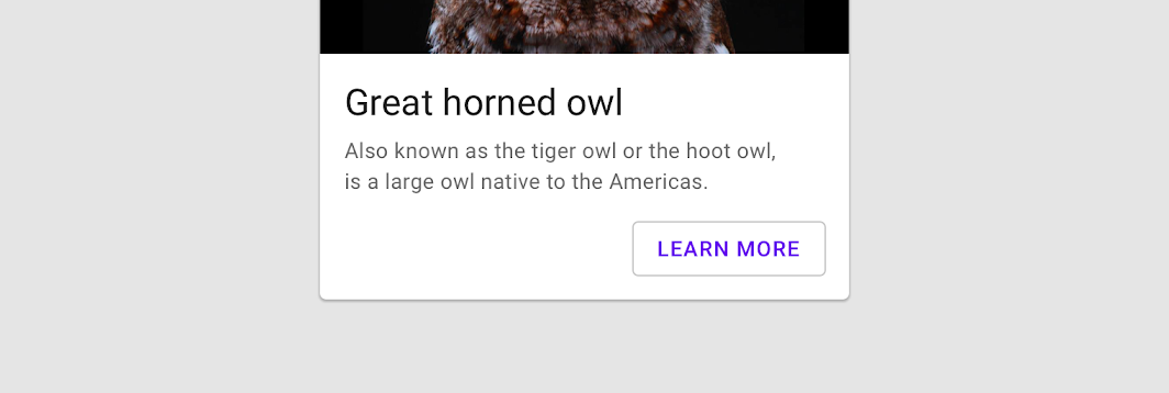
The default text style for internal Text components will be set to Typography.button.
import androidx.compose.material.Button import androidx.compose.material.OutlinedButton import androidx.compose.material.Text OutlinedButton(onClick = { /* Do something! */ }) { Text("Outlined Button") }
| Parameters | |
|---|---|
onClick: () -> Unit |
Will be called when the user clicks the button |
modifier: Modifier = Modifier |
Modifier to be applied to the button |
enabled: Boolean = true |
Controls the enabled state of the button. When |
interactionSource: MutableInteractionSource? = null |
an optional hoisted |
elevation: ButtonElevation? = null |
|
shape: Shape = MaterialTheme.shapes.small |
Defines the button's shape as well as its shadow |
border: BorderStroke? = ButtonDefaults.outlinedBorder |
Border to draw around the button |
colors: ButtonColors = ButtonDefaults.outlinedButtonColors() |
|
contentPadding: PaddingValues = ButtonDefaults.ContentPadding |
The spacing values to apply internally between the container and the content |
content: @Composable RowScope.() -> Unit |
The content displayed on the button, expected to be text, icon or image. |
OutlinedSecureTextField
@Composable
fun OutlinedSecureTextField(
state: TextFieldState,
modifier: Modifier = Modifier,
enabled: Boolean = true,
textStyle: TextStyle = LocalTextStyle.current,
label: (@Composable () -> Unit)? = null,
placeholder: (@Composable () -> Unit)? = null,
leadingIcon: (@Composable () -> Unit)? = null,
trailingIcon: (@Composable () -> Unit)? = null,
isError: Boolean = false,
inputTransformation: InputTransformation? = null,
textObfuscationMode: TextObfuscationMode = TextObfuscationMode.RevealLastTyped,
textObfuscationCharacter: Char = DefaultObfuscationCharacter,
keyboardOptions: KeyboardOptions = SecureTextFieldKeyboardOptions,
onKeyboardAction: KeyboardActionHandler? = null,
shape: Shape = TextFieldDefaults.OutlinedTextFieldShape,
colors: TextFieldColors = TextFieldDefaults.outlinedTextFieldColors(),
interactionSource: MutableInteractionSource? = null
): Unit
Material Design outlined text field for secure content
Text fields allow users to enter text into a UI. OutlinedSecureTextField is specifically designed for password entry fields. It only supports a single line of content and comes with default settings that are appropriate for entering secure content. Additionally, some context menu actions like cut, copy, and drag are disabled for added security.
Outlined text fields have less visual emphasis than filled text fields. When they appear in places like forms, where many text fields are placed together, their reduced emphasis helps simplify the layout. For a filled version, see SecureTextField.
| Parameters | |
|---|---|
state: TextFieldState |
|
modifier: Modifier = Modifier |
a |
enabled: Boolean = true |
controls the enabled state of the |
textStyle: TextStyle = LocalTextStyle.current |
the style to be applied to the input text. The default |
label: (@Composable () -> Unit)? = null |
the optional label to be displayed inside the text field container. The default text style for internal |
placeholder: (@Composable () -> Unit)? = null |
the optional placeholder to be displayed when the text field is in focus and the input text is empty. The default text style for internal |
leadingIcon: (@Composable () -> Unit)? = null |
the optional leading icon to be displayed at the beginning of the text field container |
trailingIcon: (@Composable () -> Unit)? = null |
the optional trailing icon to be displayed at the end of the text field container |
isError: Boolean = false |
indicates if the text field's current value is in error. If set to true, the label, bottom indicator and trailing icon by default will be displayed in error color |
inputTransformation: InputTransformation? = null |
Optional |
textObfuscationMode: TextObfuscationMode = TextObfuscationMode.RevealLastTyped |
the method used to obscure the input text. |
textObfuscationCharacter: Char = DefaultObfuscationCharacter |
the character to use while obfuscating the text. It doesn't have an effect when |
keyboardOptions: KeyboardOptions = SecureTextFieldKeyboardOptions |
software keyboard options that contains configuration such as |
onKeyboardAction: KeyboardActionHandler? = null |
Called when the user presses the action button in the input method editor (IME), or by pressing the enter key on a hardware keyboard. By default this parameter is null, and would execute the default behavior for a received IME Action e.g., |
shape: Shape = TextFieldDefaults.OutlinedTextFieldShape |
the shape of the text field's border |
colors: TextFieldColors = TextFieldDefaults.outlinedTextFieldColors() |
|
interactionSource: MutableInteractionSource? = null |
an optional hoisted |
OutlinedTextField
@Composable
fun OutlinedTextField(
state: TextFieldState,
modifier: Modifier = Modifier,
enabled: Boolean = true,
readOnly: Boolean = false,
textStyle: TextStyle = LocalTextStyle.current,
label: (@Composable () -> Unit)? = null,
placeholder: (@Composable () -> Unit)? = null,
leadingIcon: (@Composable () -> Unit)? = null,
trailingIcon: (@Composable () -> Unit)? = null,
isError: Boolean = false,
inputTransformation: InputTransformation? = null,
outputTransformation: OutputTransformation? = null,
keyboardOptions: KeyboardOptions = KeyboardOptions.Default,
onKeyboardAction: KeyboardActionHandler? = null,
lineLimits: TextFieldLineLimits = TextFieldLineLimits.Default,
scrollState: ScrollState = rememberScrollState(),
shape: Shape = TextFieldDefaults.OutlinedTextFieldShape,
colors: TextFieldColors = TextFieldDefaults.outlinedTextFieldColors(),
interactionSource: MutableInteractionSource? = null
): Unit
Material Design outlined text field.
Outlined text fields have less visual emphasis than filled text fields. When they appear in places like forms, where many text fields are placed together, their reduced emphasis helps simplify the layout.
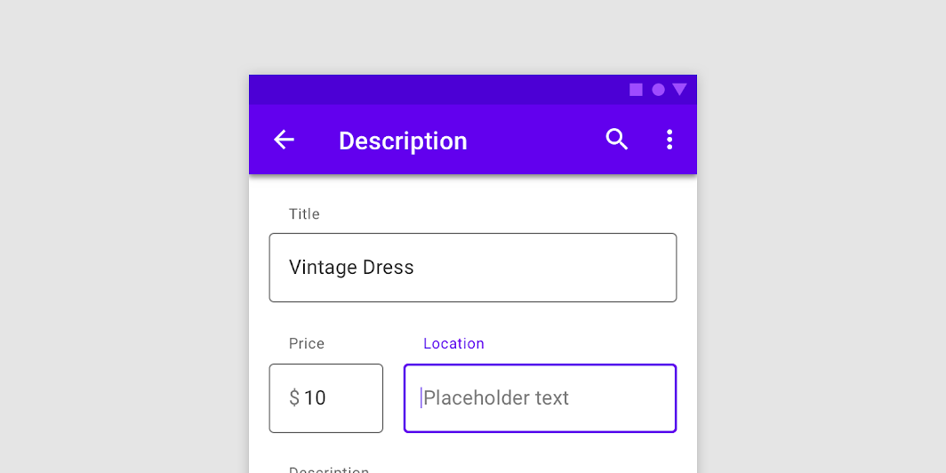
If you are looking for a filled version, see TextField. For a text field specifically designed for passwords or other secure content, see OutlinedSecureTextField.
This overload of OutlinedTextField uses TextFieldState to keep track of its text content and position of the cursor or selection.
See example usage:
import androidx.compose.foundation.text.input.TextFieldLineLimits import androidx.compose.foundation.text.input.rememberTextFieldState import androidx.compose.material.OutlinedTextField import androidx.compose.material.Text import androidx.compose.material.TextField import androidx.compose.runtime.remember OutlinedTextField( state = rememberTextFieldState(), label = { Text("Label") }, lineLimits = TextFieldLineLimits.SingleLine, )
import androidx.compose.foundation.text.input.TextFieldLineLimits import androidx.compose.foundation.text.input.rememberTextFieldState import androidx.compose.material.OutlinedTextField import androidx.compose.material.Text import androidx.compose.material.TextField import androidx.compose.runtime.remember import androidx.compose.ui.text.TextRange val state = rememberTextFieldState("Initial text", TextRange(0, 12)) OutlinedTextField( state = state, label = { Text("Label") }, lineLimits = TextFieldLineLimits.SingleLine, )
| Parameters | |
|---|---|
state: TextFieldState |
|
modifier: Modifier = Modifier |
a |
enabled: Boolean = true |
controls the enabled state of the |
readOnly: Boolean = false |
controls the editable state of the |
textStyle: TextStyle = LocalTextStyle.current |
the style to be applied to the input text. The default |
label: (@Composable () -> Unit)? = null |
the optional label to be displayed inside the text field container. The default text style for internal |
placeholder: (@Composable () -> Unit)? = null |
the optional placeholder to be displayed when the text field is in focus and the input text is empty. The default text style for internal |
leadingIcon: (@Composable () -> Unit)? = null |
the optional leading icon to be displayed at the beginning of the text field container |
trailingIcon: (@Composable () -> Unit)? = null |
the optional trailing icon to be displayed at the end of the text field container |
isError: Boolean = false |
indicates if the text field's current value is in error. If set to true, the label, bottom indicator and trailing icon by default will be displayed in error color |
inputTransformation: InputTransformation? = null |
Optional |
outputTransformation: OutputTransformation? = null |
An |
keyboardOptions: KeyboardOptions = KeyboardOptions.Default |
software keyboard options that contains configuration such as |
onKeyboardAction: KeyboardActionHandler? = null |
Called when the user presses the action button in the input method editor (IME), or by pressing the enter key on a hardware keyboard. By default this parameter is null, and would execute the default behavior for a received IME Action e.g., |
lineLimits: TextFieldLineLimits = TextFieldLineLimits.Default |
Whether the text field should be |
scrollState: ScrollState = rememberScrollState() |
Scroll state that manages either horizontal or vertical scroll of the text field. If |
shape: Shape = TextFieldDefaults.OutlinedTextFieldShape |
the shape of the text field's border |
colors: TextFieldColors = TextFieldDefaults.outlinedTextFieldColors() |
|
interactionSource: MutableInteractionSource? = null |
an optional hoisted |
OutlinedTextField
@Composable
fun OutlinedTextField(
value: String,
onValueChange: (String) -> Unit,
modifier: Modifier = Modifier,
enabled: Boolean = true,
readOnly: Boolean = false,
textStyle: TextStyle = LocalTextStyle.current,
label: (@Composable () -> Unit)? = null,
placeholder: (@Composable () -> Unit)? = null,
leadingIcon: (@Composable () -> Unit)? = null,
trailingIcon: (@Composable () -> Unit)? = null,
isError: Boolean = false,
visualTransformation: VisualTransformation = VisualTransformation.None,
keyboardOptions: KeyboardOptions = KeyboardOptions.Default,
keyboardActions: KeyboardActions = KeyboardActions.Default,
singleLine: Boolean = false,
maxLines: Int = if (singleLine) 1 else Int.MAX_VALUE,
minLines: Int = 1,
interactionSource: MutableInteractionSource? = null,
shape: Shape = TextFieldDefaults.OutlinedTextFieldShape,
colors: TextFieldColors = TextFieldDefaults.outlinedTextFieldColors()
): Unit
Material Design outlined text field.
Outlined text fields have less visual emphasis than filled text fields. When they appear in places like forms, where many text fields are placed together, their reduced emphasis helps simplify the layout.
If apart from input text change you also want to observe the cursor location, selection range, or IME composition use the OutlinedTextField overload with the TextFieldValue parameter instead.
| Parameters | |
|---|---|
value: String |
the input text to be shown in the text field |
onValueChange: (String) -> Unit |
the callback that is triggered when the input service updates the text. An updated text comes as a parameter of the callback |
modifier: Modifier = Modifier |
a |
enabled: Boolean = true |
controls the enabled state of the |
readOnly: Boolean = false |
controls the editable state of the |
textStyle: TextStyle = LocalTextStyle.current |
the style to be applied to the input text. The default |
label: (@Composable () -> Unit)? = null |
the optional label to be displayed inside the text field container. The default text style for internal |
placeholder: (@Composable () -> Unit)? = null |
the optional placeholder to be displayed when the text field is in focus and the input text is empty. The default text style for internal |
leadingIcon: (@Composable () -> Unit)? = null |
the optional leading icon to be displayed at the beginning of the text field container |
trailingIcon: (@Composable () -> Unit)? = null |
the optional trailing icon to be displayed at the end of the text field container |
isError: Boolean = false |
indicates if the text field's current value is in error. If set to true, the label, bottom indicator and trailing icon by default will be displayed in error color |
visualTransformation: VisualTransformation = VisualTransformation.None |
transforms the visual representation of the input |
keyboardOptions: KeyboardOptions = KeyboardOptions.Default |
software keyboard options that contains configuration such as |
keyboardActions: KeyboardActions = KeyboardActions.Default |
when the input service emits an IME action, the corresponding callback is called. Note that this IME action may be different from what you specified in |
singleLine: Boolean = false |
when set to true, this text field becomes a single horizontally scrolling text field instead of wrapping onto multiple lines. The keyboard will be informed to not show the return key as the |
maxLines: Int = if (singleLine) 1 else Int.MAX_VALUE |
the maximum height in terms of maximum number of visible lines. It is required that 1 <= |
minLines: Int = 1 |
the minimum height in terms of minimum number of visible lines. It is required that 1 <= |
interactionSource: MutableInteractionSource? = null |
an optional hoisted |
shape: Shape = TextFieldDefaults.OutlinedTextFieldShape |
the shape of the text field's border |
colors: TextFieldColors = TextFieldDefaults.outlinedTextFieldColors() |
|
OutlinedTextField
@Composable
fun OutlinedTextField(
value: TextFieldValue,
onValueChange: (TextFieldValue) -> Unit,
modifier: Modifier = Modifier,
enabled: Boolean = true,
readOnly: Boolean = false,
textStyle: TextStyle = LocalTextStyle.current,
label: (@Composable () -> Unit)? = null,
placeholder: (@Composable () -> Unit)? = null,
leadingIcon: (@Composable () -> Unit)? = null,
trailingIcon: (@Composable () -> Unit)? = null,
isError: Boolean = false,
visualTransformation: VisualTransformation = VisualTransformation.None,
keyboardOptions: KeyboardOptions = KeyboardOptions.Default,
keyboardActions: KeyboardActions = KeyboardActions(),
singleLine: Boolean = false,
maxLines: Int = if (singleLine) 1 else Int.MAX_VALUE,
minLines: Int = 1,
interactionSource: MutableInteractionSource? = null,
shape: Shape = TextFieldDefaults.OutlinedTextFieldShape,
colors: TextFieldColors = TextFieldDefaults.outlinedTextFieldColors()
): Unit
Material Design outlined text field.
Outlined text fields have less visual emphasis than filled text fields. When they appear in places like forms, where many text fields are placed together, their reduced emphasis helps simplify the layout.
This overload provides access to the input text, cursor position and selection range and IME composition. If you only want to observe an input text change, use the OutlinedTextField overload with the String parameter instead.
| Parameters | |
|---|---|
value: TextFieldValue |
the input |
onValueChange: (TextFieldValue) -> Unit |
the callback that is triggered when the input service updates values in |
modifier: Modifier = Modifier |
a |
enabled: Boolean = true |
controls the enabled state of the |
readOnly: Boolean = false |
controls the editable state of the |
textStyle: TextStyle = LocalTextStyle.current |
the style to be applied to the input text. The default |
label: (@Composable () -> Unit)? = null |
the optional label to be displayed inside the text field container. The default text style for internal |
placeholder: (@Composable () -> Unit)? = null |
the optional placeholder to be displayed when the text field is in focus and the input text is empty. The default text style for internal |
leadingIcon: (@Composable () -> Unit)? = null |
the optional leading icon to be displayed at the beginning of the text field container |
trailingIcon: (@Composable () -> Unit)? = null |
the optional trailing icon to be displayed at the end of the text field container |
isError: Boolean = false |
indicates if the text field's current value is in error state. If set to true, the label, bottom indicator and trailing icon by default will be displayed in error color |
visualTransformation: VisualTransformation = VisualTransformation.None |
transforms the visual representation of the input |
keyboardOptions: KeyboardOptions = KeyboardOptions.Default |
software keyboard options that contains configuration such as |
keyboardActions: KeyboardActions = KeyboardActions() |
when the input service emits an IME action, the corresponding callback is called. Note that this IME action may be different from what you specified in |
singleLine: Boolean = false |
when set to true, this text field becomes a single horizontally scrolling text field instead of wrapping onto multiple lines. The keyboard will be informed to not show the return key as the |
maxLines: Int = if (singleLine) 1 else Int.MAX_VALUE |
the maximum height in terms of maximum number of visible lines. It is required that 1 <= |
minLines: Int = 1 |
the minimum height in terms of minimum number of visible lines. It is required that 1 <= |
interactionSource: MutableInteractionSource? = null |
an optional hoisted |
shape: Shape = TextFieldDefaults.OutlinedTextFieldShape |
the shape of the text field's border |
colors: TextFieldColors = TextFieldDefaults.outlinedTextFieldColors() |
|
ProvideTextStyle
@Composable
fun ProvideTextStyle(value: TextStyle, content: @Composable () -> Unit): Unit
This function is used to set the current value of LocalTextStyle, merging the given style with the current style values for any missing attributes. Any Text components included in this component's content will be styled with this style unless styled explicitly.
| See also | |
|---|---|
LocalTextStyle |
RadioButton
@Composable
fun RadioButton(
selected: Boolean,
onClick: (() -> Unit)?,
modifier: Modifier = Modifier,
enabled: Boolean = true,
interactionSource: MutableInteractionSource? = null,
colors: RadioButtonColors = RadioButtonDefaults.colors()
): Unit
Radio buttons allow users to select one option from a set.
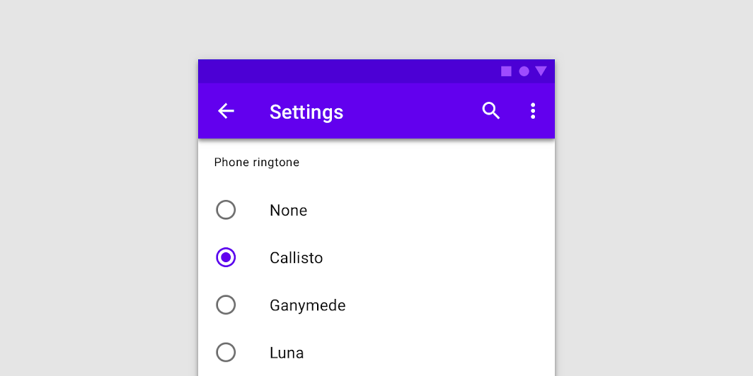
import androidx.compose.foundation.layout.Row import androidx.compose.foundation.selection.selectable import androidx.compose.foundation.selection.selectableGroup import androidx.compose.material.RadioButton import androidx.compose.runtime.mutableStateOf import androidx.compose.runtime.remember import androidx.compose.ui.Modifier // We have two radio buttons and only one can be selected var state by remember { mutableStateOf(true) } // Note that Modifier.selectableGroup() is essential to ensure correct accessibility behavior Row(Modifier.selectableGroup()) { RadioButton(selected = state, onClick = { state = true }) RadioButton(selected = !state, onClick = { state = false }) }
RadioButtons can be combined together with Text in the desired layout (e.g. Column or Row) to achieve radio group-like behaviour, where the entire layout is selectable:
import androidx.compose.foundation.layout.Column import androidx.compose.foundation.layout.Row import androidx.compose.foundation.layout.fillMaxWidth import androidx.compose.foundation.layout.height import androidx.compose.foundation.layout.padding import androidx.compose.foundation.selection.selectable import androidx.compose.foundation.selection.selectableGroup import androidx.compose.material.MaterialTheme import androidx.compose.material.RadioButton import androidx.compose.material.Text import androidx.compose.runtime.mutableStateOf import androidx.compose.runtime.remember import androidx.compose.ui.Alignment import androidx.compose.ui.Modifier import androidx.compose.ui.semantics.Role import androidx.compose.ui.semantics.role import androidx.compose.ui.unit.dp val radioOptions = listOf("Calls", "Missed", "Friends") val (selectedOption, onOptionSelected) = remember { mutableStateOf(radioOptions[0]) } // Note that Modifier.selectableGroup() is essential to ensure correct accessibility behavior Column(Modifier.selectableGroup()) { radioOptions.forEach { text -> Row( Modifier.fillMaxWidth() .height(56.dp) .selectable( selected = (text == selectedOption), onClick = { onOptionSelected(text) }, role = Role.RadioButton, ) .padding(horizontal = 16.dp), verticalAlignment = Alignment.CenterVertically, ) { RadioButton( selected = (text == selectedOption), onClick = null, // null recommended for accessibility with screenreaders ) Text( text = text, style = MaterialTheme.typography.body1.merge(), modifier = Modifier.padding(start = 16.dp), ) } } }
| Parameters | |
|---|---|
selected: Boolean |
whether this radio button is selected or not |
onClick: (() -> Unit)? |
callback to be invoked when the RadioButton is clicked. If null, then this RadioButton will not handle input events, and only act as a visual indicator of |
modifier: Modifier = Modifier |
Modifier to be applied to the radio button |
enabled: Boolean = true |
Controls the enabled state of the |
interactionSource: MutableInteractionSource? = null |
an optional hoisted |
colors: RadioButtonColors = RadioButtonDefaults.colors() |
|
RangeSlider
@Composable
@ExperimentalMaterialApi
fun RangeSlider(
value: ClosedFloatingPointRange<Float>,
onValueChange: (ClosedFloatingPointRange<Float>) -> Unit,
modifier: Modifier = Modifier,
enabled: Boolean = true,
valueRange: ClosedFloatingPointRange<Float> = 0f..1f,
steps: @IntRange(from = 0) Int = 0,
onValueChangeFinished: (() -> Unit)? = null,
colors: SliderColors = SliderDefaults.colors()
): Unit
Range Sliders expand upon Slider using the same concepts but allow the user to select 2 values.
The two values are still bounded by the value range but they also cannot cross each other.
Use continuous Range Sliders to allow users to make meaningful selections that don’t require a specific values:
import androidx.compose.foundation.layout.Column import androidx.compose.foundation.layout.padding import androidx.compose.material.RangeSlider import androidx.compose.material.Slider import androidx.compose.material.Text import androidx.compose.runtime.mutableStateOf import androidx.compose.runtime.remember import androidx.compose.ui.Modifier import androidx.compose.ui.unit.dp var sliderPosition by remember { mutableStateOf(0f..100f) } Column(modifier = Modifier.padding(horizontal = 16.dp)) { val rangeStart = "%.2f".format(sliderPosition.start) val rangeEnd = "%.2f".format(sliderPosition.endInclusive) Text(text = "$rangeStart .. $rangeEnd") RangeSlider( value = sliderPosition, onValueChange = { sliderPosition = it }, valueRange = 0f..100f, onValueChangeFinished = { // launch some business logic update with the state you hold // viewModel.updateSelectedSliderValue(sliderPosition) }, ) }
You can allow the user to choose only between predefined set of values by specifying the amount of steps between min and max values:
import androidx.compose.foundation.layout.Column import androidx.compose.foundation.layout.padding import androidx.compose.material.MaterialTheme import androidx.compose.material.RangeSlider import androidx.compose.material.Slider import androidx.compose.material.SliderDefaults import androidx.compose.material.Text import androidx.compose.runtime.mutableStateOf import androidx.compose.runtime.remember import androidx.compose.ui.Modifier import androidx.compose.ui.unit.dp var sliderPosition by remember { mutableStateOf(0f..100f) } Column(modifier = Modifier.padding(horizontal = 16.dp)) { val rangeStart = sliderPosition.start.roundToInt() val rangeEnd = sliderPosition.endInclusive.roundToInt() Text(text = "$rangeStart .. $rangeEnd") RangeSlider( value = sliderPosition, onValueChange = { sliderPosition = it }, valueRange = 0f..100f, onValueChangeFinished = { // launch some business logic update with the state you hold // viewModel.updateSelectedSliderValue(sliderPosition) }, // Only allow multiples of 10. Excluding the endpoints of `valueRange`, // there are 9 steps (10, 20, ..., 90). steps = 9, colors = SliderDefaults.colors( thumbColor = MaterialTheme.colors.secondary, activeTrackColor = MaterialTheme.colors.secondary, ), ) }
| Parameters | |
|---|---|
value: ClosedFloatingPointRange<Float> |
current values of the RangeSlider. If either value is outside of |
onValueChange: (ClosedFloatingPointRange<Float>) -> Unit |
lambda in which values should be updated |
modifier: Modifier = Modifier |
modifiers for the Range Slider layout |
enabled: Boolean = true |
whether or not component is enabled and can we interacted with or not |
valueRange: ClosedFloatingPointRange<Float> = 0f..1f |
range of values that Range Slider values can take. Passed |
steps: @IntRange(from = 0) Int = 0 |
if positive, specifies the amount of discrete allowable values between the endpoints of |
onValueChangeFinished: (() -> Unit)? = null |
lambda to be invoked when value change has ended. This callback shouldn't be used to update the range slider values (use |
colors: SliderColors = SliderDefaults.colors() |
|
Scaffold
@Composable
fun Scaffold(
modifier: Modifier = Modifier,
scaffoldState: ScaffoldState = rememberScaffoldState(),
topBar: @Composable () -> Unit = {},
bottomBar: @Composable () -> Unit = {},
snackbarHost: @Composable (SnackbarHostState) -> Unit = { SnackbarHost(it) },
floatingActionButton: @Composable () -> Unit = {},
floatingActionButtonPosition: FabPosition = FabPosition.End,
isFloatingActionButtonDocked: Boolean = false,
drawerContent: (@Composable ColumnScope.() -> Unit)? = null,
drawerGesturesEnabled: Boolean = true,
drawerShape: Shape = MaterialTheme.shapes.large,
drawerElevation: Dp = DrawerDefaults.Elevation,
drawerBackgroundColor: Color = MaterialTheme.colors.surface,
drawerContentColor: Color = contentColorFor(drawerBackgroundColor),
drawerScrimColor: Color = DrawerDefaults.scrimColor,
backgroundColor: Color = MaterialTheme.colors.background,
contentColor: Color = contentColorFor(backgroundColor),
content: @Composable (PaddingValues) -> Unit
): Unit
Scaffold implements the basic Material Design visual layout structure.
This component provides API to put together several Material components to construct your screen, by ensuring proper layout strategy for them and collecting necessary data so these components will work together correctly.
For similar components that implement different layout structures, see BackdropScaffold, which uses a backdrop as the centerpiece of the screen, and BottomSheetScaffold, which uses a persistent bottom sheet as the centerpiece of the screen.
Simple example of a Scaffold with TopAppBar, FloatingActionButton and drawer:
import androidx.compose.foundation.background import androidx.compose.foundation.layout.Box import androidx.compose.foundation.layout.fillMaxWidth import androidx.compose.foundation.layout.height import androidx.compose.foundation.lazy.LazyColumn import androidx.compose.material.ExtendedFloatingActionButton import androidx.compose.material.FabPosition import androidx.compose.material.Icon import androidx.compose.material.IconButton import androidx.compose.material.Scaffold import androidx.compose.material.ScaffoldDefaults import androidx.compose.material.Text import androidx.compose.material.TopAppBar import androidx.compose.material.icons.Icons import androidx.compose.material.icons.filled.Menu import androidx.compose.material.rememberScaffoldState import androidx.compose.runtime.remember import androidx.compose.runtime.rememberCoroutineScope import androidx.compose.ui.Modifier import androidx.compose.ui.unit.dp val scaffoldState = rememberScaffoldState() val scope = rememberCoroutineScope() Scaffold( scaffoldState = scaffoldState, drawerContent = { Text("Drawer content") }, topBar = { TopAppBar( title = { Text("Simple Scaffold Screen") }, navigationIcon = { IconButton(onClick = { scope.launch { scaffoldState.drawerState.open() } }) { Icon(Icons.Filled.Menu, contentDescription = "Localized description") } }, ) }, floatingActionButtonPosition = FabPosition.End, floatingActionButton = { ExtendedFloatingActionButton( text = { Text("Inc") }, onClick = { /* fab click handler */ }, ) }, contentWindowInsets = ScaffoldDefaults.contentWindowInsets, content = { innerPadding -> LazyColumn(contentPadding = innerPadding) { items(count = 100) { Box(Modifier.fillMaxWidth().height(50.dp).background(colors[it % colors.size])) } } }, )
More fancy usage with BottomAppBar with cutout and docked FloatingActionButton, which animates its shape when clicked:
import androidx.compose.animation.core.Animatable import androidx.compose.animation.core.TweenSpec import androidx.compose.foundation.background import androidx.compose.foundation.layout.Box import androidx.compose.foundation.layout.fillMaxWidth import androidx.compose.foundation.layout.height import androidx.compose.foundation.lazy.LazyColumn import androidx.compose.foundation.shape.CircleShape import androidx.compose.foundation.shape.CutCornerShape import androidx.compose.foundation.shape.RoundedCornerShape import androidx.compose.material.BottomAppBar import androidx.compose.material.ExtendedFloatingActionButton import androidx.compose.material.FabPosition import androidx.compose.material.Icon import androidx.compose.material.IconButton import androidx.compose.material.Scaffold import androidx.compose.material.ScaffoldDefaults import androidx.compose.material.Text import androidx.compose.material.TopAppBar import androidx.compose.material.icons.Icons import androidx.compose.material.icons.filled.Menu import androidx.compose.material.rememberScaffoldState import androidx.compose.runtime.getValue import androidx.compose.runtime.remember import androidx.compose.runtime.rememberCoroutineScope import androidx.compose.ui.Modifier import androidx.compose.ui.unit.dp val scaffoldState = rememberScaffoldState() // Consider negative values to mean 'cut corner' and positive values to mean 'round corner' val sharpEdgePercent = -50f val roundEdgePercent = 45f // Start with sharp edges val animatedProgress = remember { Animatable(sharpEdgePercent) } // Create a coroutineScope for the animation val coroutineScope = rememberCoroutineScope() // animation value to animate shape val progress = animatedProgress.value.roundToInt() // When progress is 0, there is no modification to the edges so we are just drawing a rectangle. // This allows for a smooth transition between cut corners and round corners. val fabShape = if (progress < 0) { CutCornerShape(abs(progress)) } else if (progress == roundEdgePercent.toInt()) { CircleShape } else { RoundedCornerShape(progress) } // lambda to call to trigger shape animation val changeShape: () -> Unit = { val target = animatedProgress.targetValue val nextTarget = if (target == roundEdgePercent) sharpEdgePercent else roundEdgePercent coroutineScope.launch { animatedProgress.animateTo( targetValue = nextTarget, animationSpec = TweenSpec(durationMillis = 600), ) } } Scaffold( scaffoldState = scaffoldState, drawerContent = { Text("Drawer content") }, topBar = { TopAppBar(title = { Text("Scaffold with bottom cutout") }) }, bottomBar = { BottomAppBar(cutoutShape = fabShape) { IconButton( onClick = { coroutineScope.launch { scaffoldState.drawerState.open() } } ) { Icon(Icons.Filled.Menu, contentDescription = "Localized description") } } }, floatingActionButton = { ExtendedFloatingActionButton( text = { Text("Change shape") }, onClick = changeShape, shape = fabShape, ) }, contentWindowInsets = ScaffoldDefaults.contentWindowInsets, floatingActionButtonPosition = FabPosition.Center, isFloatingActionButtonDocked = true, content = { innerPadding -> LazyColumn(contentPadding = innerPadding) { items(count = 100) { Box(Modifier.fillMaxWidth().height(50.dp).background(colors[it % colors.size])) } } }, )
To show a Snackbar, use SnackbarHostState.showSnackbar. Scaffold state already have ScaffoldState.snackbarHostState when created
import androidx.compose.foundation.layout.fillMaxSize import androidx.compose.foundation.layout.padding import androidx.compose.foundation.layout.wrapContentSize import androidx.compose.material.ExtendedFloatingActionButton import androidx.compose.material.Scaffold import androidx.compose.material.ScaffoldDefaults import androidx.compose.material.Snackbar import androidx.compose.material.Text import androidx.compose.material.rememberScaffoldState import androidx.compose.runtime.mutableStateOf import androidx.compose.runtime.remember import androidx.compose.runtime.rememberCoroutineScope import androidx.compose.ui.Modifier val scaffoldState = rememberScaffoldState() val scope = rememberCoroutineScope() Scaffold( scaffoldState = scaffoldState, floatingActionButton = { var clickCount by remember { mutableStateOf(0) } ExtendedFloatingActionButton( text = { Text("Show snackbar") }, onClick = { // show snackbar as a suspend function scope.launch { scaffoldState.snackbarHostState.showSnackbar("Snackbar # ${++clickCount}") } }, ) }, contentWindowInsets = ScaffoldDefaults.contentWindowInsets, content = { innerPadding -> Text( text = "Body content", modifier = Modifier.padding(innerPadding).fillMaxSize().wrapContentSize(), ) }, )
| Parameters | |
|---|---|
modifier: Modifier = Modifier |
optional Modifier for the root of the |
scaffoldState: ScaffoldState = rememberScaffoldState() |
state of this scaffold widget. It contains the state of the screen, e.g. variables to provide manual control over the drawer behavior, sizes of components, etc |
topBar: @Composable () -> Unit = {} |
top app bar of the screen. Consider using |
bottomBar: @Composable () -> Unit = {} |
bottom bar of the screen. Consider using |
snackbarHost: @Composable (SnackbarHostState) -> Unit = { SnackbarHost(it) } |
component to host |
floatingActionButton: @Composable () -> Unit = {} |
Main action button of your screen. Consider using |
floatingActionButtonPosition: FabPosition = FabPosition.End |
position of the FAB on the screen. See |
isFloatingActionButtonDocked: Boolean = false |
whether |
drawerContent: (@Composable ColumnScope.() -> Unit)? = null |
content of the Drawer sheet that can be pulled from the left side (right for RTL). |
drawerGesturesEnabled: Boolean = true |
whether or not drawer (if set) can be interacted with via gestures |
drawerShape: Shape = MaterialTheme.shapes.large |
shape of the drawer sheet (if set) |
drawerElevation: Dp = DrawerDefaults.Elevation |
drawer sheet elevation. This controls the size of the shadow below the drawer sheet (if set) |
drawerBackgroundColor: Color = MaterialTheme.colors.surface |
background color to be used for the drawer sheet |
drawerContentColor: Color = contentColorFor(drawerBackgroundColor) |
color of the content to use inside the drawer sheet. Defaults to either the matching content color for |
drawerScrimColor: Color = DrawerDefaults.scrimColor |
color of the scrim that obscures content when the drawer is open |
backgroundColor: Color = MaterialTheme.colors.background |
background of the scaffold body |
contentColor: Color = contentColorFor(backgroundColor) |
color of the content in scaffold body. Defaults to either the matching content color for |
content: @Composable (PaddingValues) -> Unit |
content of your screen. The lambda receives an |
Scaffold
@Composable
fun Scaffold(
contentWindowInsets: WindowInsets,
modifier: Modifier = Modifier,
scaffoldState: ScaffoldState = rememberScaffoldState(),
topBar: @Composable () -> Unit = {},
bottomBar: @Composable () -> Unit = {},
snackbarHost: @Composable (SnackbarHostState) -> Unit = { SnackbarHost(it) },
floatingActionButton: @Composable () -> Unit = {},
floatingActionButtonPosition: FabPosition = FabPosition.End,
isFloatingActionButtonDocked: Boolean = false,
drawerContent: (@Composable ColumnScope.() -> Unit)? = null,
drawerGesturesEnabled: Boolean = true,
drawerShape: Shape = MaterialTheme.shapes.large,
drawerElevation: Dp = DrawerDefaults.Elevation,
drawerBackgroundColor: Color = MaterialTheme.colors.surface,
drawerContentColor: Color = contentColorFor(drawerBackgroundColor),
drawerScrimColor: Color = DrawerDefaults.scrimColor,
backgroundColor: Color = MaterialTheme.colors.background,
contentColor: Color = contentColorFor(backgroundColor),
content: @Composable (PaddingValues) -> Unit
): Unit
Scaffold implements the basic Material Design visual layout structure.
This component provides API to put together several Material components to construct your screen, by ensuring proper layout strategy for them and collecting necessary data so these components will work together correctly.
For similar components that implement different layout structures, see BackdropScaffold, which uses a backdrop as the centerpiece of the screen, and BottomSheetScaffold, which uses a persistent bottom sheet as the centerpiece of the screen.
This particular overload provides ability to specify WindowInsets. Recommended value can be found in ScaffoldDefaults.contentWindowInsets.
Simple example of a Scaffold with TopAppBar, FloatingActionButton and drawer:
import androidx.compose.foundation.background import androidx.compose.foundation.layout.Box import androidx.compose.foundation.layout.fillMaxWidth import androidx.compose.foundation.layout.height import androidx.compose.foundation.lazy.LazyColumn import androidx.compose.material.ExtendedFloatingActionButton import androidx.compose.material.FabPosition import androidx.compose.material.Icon import androidx.compose.material.IconButton import androidx.compose.material.Scaffold import androidx.compose.material.ScaffoldDefaults import androidx.compose.material.Text import androidx.compose.material.TopAppBar import androidx.compose.material.icons.Icons import androidx.compose.material.icons.filled.Menu import androidx.compose.material.rememberScaffoldState import androidx.compose.runtime.remember import androidx.compose.runtime.rememberCoroutineScope import androidx.compose.ui.Modifier import androidx.compose.ui.unit.dp val scaffoldState = rememberScaffoldState() val scope = rememberCoroutineScope() Scaffold( scaffoldState = scaffoldState, drawerContent = { Text("Drawer content") }, topBar = { TopAppBar( title = { Text("Simple Scaffold Screen") }, navigationIcon = { IconButton(onClick = { scope.launch { scaffoldState.drawerState.open() } }) { Icon(Icons.Filled.Menu, contentDescription = "Localized description") } }, ) }, floatingActionButtonPosition = FabPosition.End, floatingActionButton = { ExtendedFloatingActionButton( text = { Text("Inc") }, onClick = { /* fab click handler */ }, ) }, contentWindowInsets = ScaffoldDefaults.contentWindowInsets, content = { innerPadding -> LazyColumn(contentPadding = innerPadding) { items(count = 100) { Box(Modifier.fillMaxWidth().height(50.dp).background(colors[it % colors.size])) } } }, )
More fancy usage with BottomAppBar with cutout and docked FloatingActionButton, which animates its shape when clicked:
import androidx.compose.animation.core.Animatable import androidx.compose.animation.core.TweenSpec import androidx.compose.foundation.background import androidx.compose.foundation.layout.Box import androidx.compose.foundation.layout.fillMaxWidth import androidx.compose.foundation.layout.height import androidx.compose.foundation.lazy.LazyColumn import androidx.compose.foundation.shape.CircleShape import androidx.compose.foundation.shape.CutCornerShape import androidx.compose.foundation.shape.RoundedCornerShape import androidx.compose.material.BottomAppBar import androidx.compose.material.ExtendedFloatingActionButton import androidx.compose.material.FabPosition import androidx.compose.material.Icon import androidx.compose.material.IconButton import androidx.compose.material.Scaffold import androidx.compose.material.ScaffoldDefaults import androidx.compose.material.Text import androidx.compose.material.TopAppBar import androidx.compose.material.icons.Icons import androidx.compose.material.icons.filled.Menu import androidx.compose.material.rememberScaffoldState import androidx.compose.runtime.getValue import androidx.compose.runtime.remember import androidx.compose.runtime.rememberCoroutineScope import androidx.compose.ui.Modifier import androidx.compose.ui.unit.dp val scaffoldState = rememberScaffoldState() // Consider negative values to mean 'cut corner' and positive values to mean 'round corner' val sharpEdgePercent = -50f val roundEdgePercent = 45f // Start with sharp edges val animatedProgress = remember { Animatable(sharpEdgePercent) } // Create a coroutineScope for the animation val coroutineScope = rememberCoroutineScope() // animation value to animate shape val progress = animatedProgress.value.roundToInt() // When progress is 0, there is no modification to the edges so we are just drawing a rectangle. // This allows for a smooth transition between cut corners and round corners. val fabShape = if (progress < 0) { CutCornerShape(abs(progress)) } else if (progress == roundEdgePercent.toInt()) { CircleShape } else { RoundedCornerShape(progress) } // lambda to call to trigger shape animation val changeShape: () -> Unit = { val target = animatedProgress.targetValue val nextTarget = if (target == roundEdgePercent) sharpEdgePercent else roundEdgePercent coroutineScope.launch { animatedProgress.animateTo( targetValue = nextTarget, animationSpec = TweenSpec(durationMillis = 600), ) } } Scaffold( scaffoldState = scaffoldState, drawerContent = { Text("Drawer content") }, topBar = { TopAppBar(title = { Text("Scaffold with bottom cutout") }) }, bottomBar = { BottomAppBar(cutoutShape = fabShape) { IconButton( onClick = { coroutineScope.launch { scaffoldState.drawerState.open() } } ) { Icon(Icons.Filled.Menu, contentDescription = "Localized description") } } }, floatingActionButton = { ExtendedFloatingActionButton( text = { Text("Change shape") }, onClick = changeShape, shape = fabShape, ) }, contentWindowInsets = ScaffoldDefaults.contentWindowInsets, floatingActionButtonPosition = FabPosition.Center, isFloatingActionButtonDocked = true, content = { innerPadding -> LazyColumn(contentPadding = innerPadding) { items(count = 100) { Box(Modifier.fillMaxWidth().height(50.dp).background(colors[it % colors.size])) } } }, )
To show a Snackbar, use SnackbarHostState.showSnackbar. Scaffold state already have ScaffoldState.snackbarHostState when created.
import androidx.compose.foundation.layout.fillMaxSize import androidx.compose.foundation.layout.padding import androidx.compose.foundation.layout.wrapContentSize import androidx.compose.material.ExtendedFloatingActionButton import androidx.compose.material.Scaffold import androidx.compose.material.ScaffoldDefaults import androidx.compose.material.Snackbar import androidx.compose.material.Text import androidx.compose.material.rememberScaffoldState import androidx.compose.runtime.mutableStateOf import androidx.compose.runtime.remember import androidx.compose.runtime.rememberCoroutineScope import androidx.compose.ui.Modifier val scaffoldState = rememberScaffoldState() val scope = rememberCoroutineScope() Scaffold( scaffoldState = scaffoldState, floatingActionButton = { var clickCount by remember { mutableStateOf(0) } ExtendedFloatingActionButton( text = { Text("Show snackbar") }, onClick = { // show snackbar as a suspend function scope.launch { scaffoldState.snackbarHostState.showSnackbar("Snackbar # ${++clickCount}") } }, ) }, contentWindowInsets = ScaffoldDefaults.contentWindowInsets, content = { innerPadding -> Text( text = "Body content", modifier = Modifier.padding(innerPadding).fillMaxSize().wrapContentSize(), ) }, )
| Parameters | |
|---|---|
contentWindowInsets: WindowInsets |
window insets to be passed to |
modifier: Modifier = Modifier |
optional Modifier for the root of the |
scaffoldState: ScaffoldState = rememberScaffoldState() |
state of this scaffold widget. It contains the state of the screen, e.g. variables to provide manual control over the drawer behavior, sizes of components, etc |
topBar: @Composable () -> Unit = {} |
top app bar of the screen. Consider using |
bottomBar: @Composable () -> Unit = {} |
bottom bar of the screen. Consider using |
snackbarHost: @Composable (SnackbarHostState) -> Unit = { SnackbarHost(it) } |
component to host |
floatingActionButton: @Composable () -> Unit = {} |
Main action button of your screen. Consider using |
floatingActionButtonPosition: FabPosition = FabPosition.End |
position of the FAB on the screen. See |
isFloatingActionButtonDocked: Boolean = false |
whether |
drawerContent: (@Composable ColumnScope.() -> Unit)? = null |
content of the Drawer sheet that can be pulled from the left side (right for RTL). |
drawerGesturesEnabled: Boolean = true |
whether or not drawer (if set) can be interacted with via gestures |
drawerShape: Shape = MaterialTheme.shapes.large |
shape of the drawer sheet (if set) |
drawerElevation: Dp = DrawerDefaults.Elevation |
drawer sheet elevation. This controls the size of the shadow below the drawer sheet (if set) |
drawerBackgroundColor: Color = MaterialTheme.colors.surface |
background color to be used for the drawer sheet |
drawerContentColor: Color = contentColorFor(drawerBackgroundColor) |
color of the content to use inside the drawer sheet. Defaults to either the matching content color for |
drawerScrimColor: Color = DrawerDefaults.scrimColor |
color of the scrim that obscures content when the drawer is open |
backgroundColor: Color = MaterialTheme.colors.background |
background of the scaffold body |
contentColor: Color = contentColorFor(backgroundColor) |
color of the content in scaffold body. Defaults to either the matching content color for |
content: @Composable (PaddingValues) -> Unit |
content of your screen. The lambda receives an |
ScrollableTabRow
@Composable
@UiComposable
fun ScrollableTabRow(
selectedTabIndex: Int,
modifier: Modifier = Modifier,
backgroundColor: Color = MaterialTheme.colors.primarySurface,
contentColor: Color = contentColorFor(backgroundColor),
edgePadding: Dp = TabRowDefaults.ScrollableTabRowPadding,
indicator: @Composable @UiComposable (tabPositions: List<TabPosition>) -> Unit = @Composable { tabPositions -> TabRowDefaults.Indicator(Modifier.tabIndicatorOffset(tabPositions[selectedTabIndex])) },
divider: @Composable @UiComposable () -> Unit = @Composable { TabRowDefaults.Divider() },
tabs: @Composable @UiComposable () -> Unit
): Unit
Material Design scrollable tabs
When a set of tabs cannot fit on screen, use scrollable tabs. Scrollable tabs can use longer text labels and a larger number of tabs. They are best used for browsing on touch interfaces.
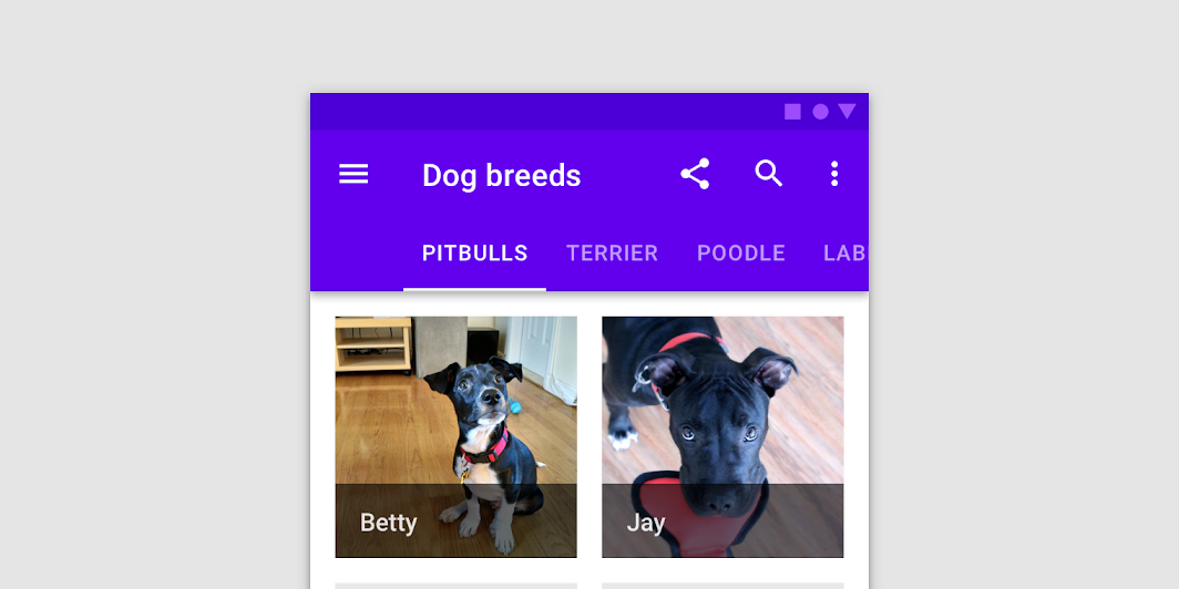
A ScrollableTabRow contains a row of Tabs, and displays an indicator underneath the currently selected tab. A ScrollableTabRow places its tabs offset from the starting edge, and allows scrolling to tabs that are placed off screen. For a fixed tab row that does not allow scrolling, and evenly places its tabs, see TabRow.
| Parameters | |
|---|---|
selectedTabIndex: Int |
the index of the currently selected tab |
modifier: Modifier = Modifier |
optional |
backgroundColor: Color = MaterialTheme.colors.primarySurface |
The background color for the ScrollableTabRow. Use |
contentColor: Color = contentColorFor(backgroundColor) |
The preferred content color provided by this ScrollableTabRow to its children. Defaults to either the matching content color for |
edgePadding: Dp = TabRowDefaults.ScrollableTabRowPadding |
the padding between the starting and ending edge of ScrollableTabRow, and the tabs inside the ScrollableTabRow. This padding helps inform the user that this tab row can be scrolled, unlike a |
indicator: @Composable @UiComposable (tabPositions: List<TabPosition>) -> Unit = @Composable { tabPositions ->
TabRowDefaults.Indicator(Modifier.tabIndicatorOffset(tabPositions[selectedTabIndex]))
} |
the indicator that represents which tab is currently selected. By default this will be a |
divider: @Composable @UiComposable () -> Unit = @Composable { TabRowDefaults.Divider() } |
the divider displayed at the bottom of the ScrollableTabRow. This provides a layer of separation between the ScrollableTabRow and the content displayed underneath. |
tabs: @Composable @UiComposable () -> Unit |
the tabs inside this ScrollableTabRow. Typically this will be multiple |
SecureTextField
@Composable
fun SecureTextField(
state: TextFieldState,
modifier: Modifier = Modifier,
enabled: Boolean = true,
textStyle: TextStyle = LocalTextStyle.current,
label: (@Composable () -> Unit)? = null,
placeholder: (@Composable () -> Unit)? = null,
leadingIcon: (@Composable () -> Unit)? = null,
trailingIcon: (@Composable () -> Unit)? = null,
isError: Boolean = false,
inputTransformation: InputTransformation? = null,
textObfuscationMode: TextObfuscationMode = TextObfuscationMode.RevealLastTyped,
textObfuscationCharacter: Char = DefaultObfuscationCharacter,
keyboardOptions: KeyboardOptions = SecureTextFieldKeyboardOptions,
onKeyboardAction: KeyboardActionHandler? = null,
shape: Shape = TextFieldDefaults.TextFieldShape,
colors: TextFieldColors = TextFieldDefaults.textFieldColors(),
interactionSource: MutableInteractionSource? = null
): Unit
Material Design filled text field for secure content
Text fields allow users to enter text into a UI. SecureTextField is specifically designed for password entry fields. It only supports a single line of content and comes with default settings that are appropriate for entering secure content. Additionally, some context menu actions like cut, copy, and drag are disabled for added security.
Filled text fields have more visual emphasis than outlined text fields, making them stand out when surrounded by other content and components. For an outlined version, see OutlinedSecureTextField.
Example of a password text field:
import androidx.compose.foundation.text.input.TextObfuscationMode import androidx.compose.foundation.text.input.rememberTextFieldState import androidx.compose.material.Icon import androidx.compose.material.IconButton import androidx.compose.material.SecureTextField import androidx.compose.material.Text import androidx.compose.material.TextField import androidx.compose.material.icons.Icons import androidx.compose.runtime.mutableStateOf import androidx.compose.runtime.remember import androidx.compose.runtime.saveable.rememberSaveable var passwordHidden by rememberSaveable { mutableStateOf(true) } SecureTextField( state = rememberTextFieldState(), label = { Text("Enter password") }, textObfuscationMode = if (passwordHidden) TextObfuscationMode.RevealLastTyped else TextObfuscationMode.Visible, trailingIcon = { IconButton(onClick = { passwordHidden = !passwordHidden }) { val visibilityIcon = if (passwordHidden) Icons.Filled.Visibility else Icons.Filled.VisibilityOff // Provide localized description for accessibility services val description = if (passwordHidden) "Show password" else "Hide password" Icon(imageVector = visibilityIcon, contentDescription = description) } }, )
| Parameters | |
|---|---|
state: TextFieldState |
|
modifier: Modifier = Modifier |
a |
enabled: Boolean = true |
controls the enabled state of the |
textStyle: TextStyle = LocalTextStyle.current |
the style to be applied to the input text. The default |
label: (@Composable () -> Unit)? = null |
the optional label to be displayed inside the text field container. The default text style for internal |
placeholder: (@Composable () -> Unit)? = null |
the optional placeholder to be displayed when the text field is in focus and the input text is empty. The default text style for internal |
leadingIcon: (@Composable () -> Unit)? = null |
the optional leading icon to be displayed at the beginning of the text field container. |
trailingIcon: (@Composable () -> Unit)? = null |
the optional trailing icon to be displayed at the end of the text field container. |
isError: Boolean = false |
indicates if the text field's current value is in error. If set to true, the label, bottom indicator and trailing icon by default will be displayed in error color. |
inputTransformation: InputTransformation? = null |
Optional |
textObfuscationMode: TextObfuscationMode = TextObfuscationMode.RevealLastTyped |
the method used to obscure the input text. |
textObfuscationCharacter: Char = DefaultObfuscationCharacter |
the character to use while obfuscating the text. It doesn't have an effect when |
keyboardOptions: KeyboardOptions = SecureTextFieldKeyboardOptions |
software keyboard options that contains configuration such as |
onKeyboardAction: KeyboardActionHandler? = null |
Called when the user presses the action button in the input method editor (IME), or by pressing the enter key on a hardware keyboard. By default this parameter is null, and would execute the default behavior for a received IME Action e.g., |
shape: Shape = TextFieldDefaults.TextFieldShape |
the shape of the text field's container |
colors: TextFieldColors = TextFieldDefaults.textFieldColors() |
|
interactionSource: MutableInteractionSource? = null |
an optional hoisted |
Slider
@Composable
fun Slider(
value: Float,
onValueChange: (Float) -> Unit,
modifier: Modifier = Modifier,
enabled: Boolean = true,
valueRange: ClosedFloatingPointRange<Float> = 0f..1f,
steps: @IntRange(from = 0) Int = 0,
onValueChangeFinished: (() -> Unit)? = null,
interactionSource: MutableInteractionSource? = null,
colors: SliderColors = SliderDefaults.colors()
): Unit
Sliders allow users to make selections from a range of values.
Sliders reflect a range of values along a bar, from which users may select a single value. They are ideal for adjusting settings such as volume, brightness, or applying image filters.

Use continuous sliders to allow users to make meaningful selections that don’t require a specific value:
import androidx.compose.foundation.layout.Column import androidx.compose.foundation.layout.padding import androidx.compose.material.Slider import androidx.compose.material.Text import androidx.compose.runtime.mutableStateOf import androidx.compose.runtime.remember import androidx.compose.ui.Modifier import androidx.compose.ui.unit.dp var sliderPosition by remember { mutableStateOf(0f) } Column(modifier = Modifier.padding(horizontal = 16.dp)) { Text(text = "%.2f".format(sliderPosition)) Slider(value = sliderPosition, onValueChange = { sliderPosition = it }) }
You can allow the user to choose only between predefined set of values by specifying the amount of steps between min and max values:
import androidx.compose.foundation.layout.Column import androidx.compose.foundation.layout.padding import androidx.compose.material.MaterialTheme import androidx.compose.material.Slider import androidx.compose.material.SliderDefaults import androidx.compose.material.Text import androidx.compose.runtime.mutableStateOf import androidx.compose.runtime.remember import androidx.compose.ui.Modifier import androidx.compose.ui.unit.dp var sliderPosition by remember { mutableStateOf(0f) } Column(modifier = Modifier.padding(horizontal = 16.dp)) { Text(text = sliderPosition.roundToInt().toString()) Slider( value = sliderPosition, onValueChange = { sliderPosition = it }, valueRange = 0f..100f, onValueChangeFinished = { // launch some business logic update with the state you hold // viewModel.updateSelectedSliderValue(sliderPosition) }, // Only allow multiples of 10. Excluding the endpoints of `valueRange`, // there are 9 steps (10, 20, ..., 90). steps = 9, colors = SliderDefaults.colors( thumbColor = MaterialTheme.colors.secondary, activeTrackColor = MaterialTheme.colors.secondary, ), ) }
| Parameters | |
|---|---|
value: Float |
current value of the Slider. If outside of |
onValueChange: (Float) -> Unit |
lambda in which value should be updated |
modifier: Modifier = Modifier |
modifiers for the Slider layout |
enabled: Boolean = true |
whether or not component is enabled and can be interacted with or not |
valueRange: ClosedFloatingPointRange<Float> = 0f..1f |
range of values that Slider value can take. Passed |
steps: @IntRange(from = 0) Int = 0 |
if positive, specifies the amount of discrete allowable values between the endpoints of |
onValueChangeFinished: (() -> Unit)? = null |
lambda to be invoked when value change has ended. This callback shouldn't be used to update the slider value (use |
interactionSource: MutableInteractionSource? = null |
an optional hoisted |
colors: SliderColors = SliderDefaults.colors() |
|
Snackbar
@Composable
fun Snackbar(
modifier: Modifier = Modifier,
action: (@Composable () -> Unit)? = null,
actionOnNewLine: Boolean = false,
shape: Shape = MaterialTheme.shapes.small,
backgroundColor: Color = SnackbarDefaults.backgroundColor,
contentColor: Color = MaterialTheme.colors.surface,
elevation: Dp = 6.dp,
content: @Composable () -> Unit
): Unit
Snackbars provide brief messages about app processes at the bottom of the screen.
Snackbars inform users of a process that an app has performed or will perform. They appear temporarily, towards the bottom of the screen. They shouldn’t interrupt the user experience, and they don’t require user input to disappear.
A Snackbar can contain a single action. Because Snackbar disappears automatically, the action shouldn't be "Dismiss" or "Cancel".
This components provides only the visuals of the Snackbar. If you need to show a Snackbar with defaults on the screen, use ScaffoldState.snackbarHostState and SnackbarHostState.showSnackbar:
import androidx.compose.foundation.layout.fillMaxSize import androidx.compose.foundation.layout.padding import androidx.compose.foundation.layout.wrapContentSize import androidx.compose.material.ExtendedFloatingActionButton import androidx.compose.material.Scaffold import androidx.compose.material.ScaffoldDefaults import androidx.compose.material.Snackbar import androidx.compose.material.Text import androidx.compose.material.rememberScaffoldState import androidx.compose.runtime.mutableStateOf import androidx.compose.runtime.remember import androidx.compose.runtime.rememberCoroutineScope import androidx.compose.ui.Modifier val scaffoldState = rememberScaffoldState() val scope = rememberCoroutineScope() Scaffold( scaffoldState = scaffoldState, floatingActionButton = { var clickCount by remember { mutableStateOf(0) } ExtendedFloatingActionButton( text = { Text("Show snackbar") }, onClick = { // show snackbar as a suspend function scope.launch { scaffoldState.snackbarHostState.showSnackbar("Snackbar # ${++clickCount}") } }, ) }, contentWindowInsets = ScaffoldDefaults.contentWindowInsets, content = { innerPadding -> Text( text = "Body content", modifier = Modifier.padding(innerPadding).fillMaxSize().wrapContentSize(), ) }, )
If you want to customize appearance of the Snackbar, you can pass your own version as a child of the SnackbarHost to the Scaffold:
import androidx.compose.foundation.border import androidx.compose.foundation.layout.fillMaxSize import androidx.compose.foundation.layout.padding import androidx.compose.foundation.layout.wrapContentSize import androidx.compose.material.ExtendedFloatingActionButton import androidx.compose.material.MaterialTheme import androidx.compose.material.Scaffold import androidx.compose.material.ScaffoldDefaults import androidx.compose.material.Snackbar import androidx.compose.material.SnackbarHost import androidx.compose.material.Text import androidx.compose.material.rememberScaffoldState import androidx.compose.runtime.mutableStateOf import androidx.compose.runtime.remember import androidx.compose.runtime.rememberCoroutineScope import androidx.compose.ui.Modifier import androidx.compose.ui.unit.dp val scaffoldState = rememberScaffoldState() val scope = rememberCoroutineScope() Scaffold( scaffoldState = scaffoldState, snackbarHost = { // reuse default SnackbarHost to have default animation and timing handling SnackbarHost(it) { data -> // custom snackbar with the custom border Snackbar( modifier = Modifier.border(2.dp, MaterialTheme.colors.secondary), snackbarData = data, ) } }, floatingActionButton = { var clickCount by remember { mutableStateOf(0) } ExtendedFloatingActionButton( text = { Text("Show snackbar") }, onClick = { scope.launch { scaffoldState.snackbarHostState.showSnackbar("Snackbar # ${++clickCount}") } }, ) }, contentWindowInsets = ScaffoldDefaults.contentWindowInsets, content = { innerPadding -> Text( text = "Custom Snackbar Demo", modifier = Modifier.padding(innerPadding).fillMaxSize().wrapContentSize(), ) }, )
| Parameters | |
|---|---|
modifier: Modifier = Modifier |
modifiers for the Snackbar layout |
action: (@Composable () -> Unit)? = null |
action / button component to add as an action to the snackbar. Consider using |
actionOnNewLine: Boolean = false |
whether or not action should be put on the separate line. Recommended for action with long action text |
shape: Shape = MaterialTheme.shapes.small |
Defines the Snackbar's shape as well as its shadow |
backgroundColor: Color = SnackbarDefaults.backgroundColor |
background color of the Snackbar |
contentColor: Color = MaterialTheme.colors.surface |
color of the content to use inside the snackbar. Defaults to either the matching content color for |
elevation: Dp = 6.dp |
The z-coordinate at which to place the SnackBar. This controls the size of the shadow below the SnackBar |
content: @Composable () -> Unit |
content to show information about a process that an app has performed or will perform |
Snackbar
@Composable
fun Snackbar(
snackbarData: SnackbarData,
modifier: Modifier = Modifier,
actionOnNewLine: Boolean = false,
shape: Shape = MaterialTheme.shapes.small,
backgroundColor: Color = SnackbarDefaults.backgroundColor,
contentColor: Color = MaterialTheme.colors.surface,
actionColor: Color = SnackbarDefaults.primaryActionColor,
elevation: Dp = 6.dp
): Unit
Snackbars provide brief messages about app processes at the bottom of the screen.
Snackbars inform users of a process that an app has performed or will perform. They appear temporarily, towards the bottom of the screen. They shouldn’t interrupt the user experience, and they don’t require user input to disappear.
A Snackbar can contain a single action. Because they disappear automatically, the action shouldn't be "Dismiss" or "Cancel".
This version of snackbar is designed to work with SnackbarData provided by the SnackbarHost, which is usually used inside of the Scaffold.
This components provides only the visuals of the Snackbar. If you need to show a Snackbar with defaults on the screen, use ScaffoldState.snackbarHostState and SnackbarHostState.showSnackbar:
import androidx.compose.foundation.layout.fillMaxSize import androidx.compose.foundation.layout.padding import androidx.compose.foundation.layout.wrapContentSize import androidx.compose.material.ExtendedFloatingActionButton import androidx.compose.material.Scaffold import androidx.compose.material.ScaffoldDefaults import androidx.compose.material.Snackbar import androidx.compose.material.Text import androidx.compose.material.rememberScaffoldState import androidx.compose.runtime.mutableStateOf import androidx.compose.runtime.remember import androidx.compose.runtime.rememberCoroutineScope import androidx.compose.ui.Modifier val scaffoldState = rememberScaffoldState() val scope = rememberCoroutineScope() Scaffold( scaffoldState = scaffoldState, floatingActionButton = { var clickCount by remember { mutableStateOf(0) } ExtendedFloatingActionButton( text = { Text("Show snackbar") }, onClick = { // show snackbar as a suspend function scope.launch { scaffoldState.snackbarHostState.showSnackbar("Snackbar # ${++clickCount}") } }, ) }, contentWindowInsets = ScaffoldDefaults.contentWindowInsets, content = { innerPadding -> Text( text = "Body content", modifier = Modifier.padding(innerPadding).fillMaxSize().wrapContentSize(), ) }, )
If you want to customize appearance of the Snackbar, you can pass your own version as a child of the SnackbarHost to the Scaffold:
import androidx.compose.foundation.border import androidx.compose.foundation.layout.fillMaxSize import androidx.compose.foundation.layout.padding import androidx.compose.foundation.layout.wrapContentSize import androidx.compose.material.ExtendedFloatingActionButton import androidx.compose.material.MaterialTheme import androidx.compose.material.Scaffold import androidx.compose.material.ScaffoldDefaults import androidx.compose.material.Snackbar import androidx.compose.material.SnackbarHost import androidx.compose.material.Text import androidx.compose.material.rememberScaffoldState import androidx.compose.runtime.mutableStateOf import androidx.compose.runtime.remember import androidx.compose.runtime.rememberCoroutineScope import androidx.compose.ui.Modifier import androidx.compose.ui.unit.dp val scaffoldState = rememberScaffoldState() val scope = rememberCoroutineScope() Scaffold( scaffoldState = scaffoldState, snackbarHost = { // reuse default SnackbarHost to have default animation and timing handling SnackbarHost(it) { data -> // custom snackbar with the custom border Snackbar( modifier = Modifier.border(2.dp, MaterialTheme.colors.secondary), snackbarData = data, ) } }, floatingActionButton = { var clickCount by remember { mutableStateOf(0) } ExtendedFloatingActionButton( text = { Text("Show snackbar") }, onClick = { scope.launch { scaffoldState.snackbarHostState.showSnackbar("Snackbar # ${++clickCount}") } }, ) }, contentWindowInsets = ScaffoldDefaults.contentWindowInsets, content = { innerPadding -> Text( text = "Custom Snackbar Demo", modifier = Modifier.padding(innerPadding).fillMaxSize().wrapContentSize(), ) }, )
| Parameters | |
|---|---|
snackbarData: SnackbarData |
data about the current snackbar showing via |
modifier: Modifier = Modifier |
modifiers for the Snackbar layout |
actionOnNewLine: Boolean = false |
whether or not action should be put on the separate line. Recommended for action with long action text |
shape: Shape = MaterialTheme.shapes.small |
Defines the Snackbar's shape as well as its shadow |
backgroundColor: Color = SnackbarDefaults.backgroundColor |
background color of the Snackbar |
contentColor: Color = MaterialTheme.colors.surface |
color of the content to use inside the snackbar. Defaults to either the matching content color for |
actionColor: Color = SnackbarDefaults.primaryActionColor |
color of the action |
elevation: Dp = 6.dp |
The z-coordinate at which to place the SnackBar. This controls the size of the shadow below the SnackBar |
SnackbarHost
@Composable
fun SnackbarHost(
hostState: SnackbarHostState,
modifier: Modifier = Modifier,
snackbar: @Composable (SnackbarData) -> Unit = { Snackbar(it) }
): Unit
Host for Snackbars to be used in Scaffold to properly show, hide and dismiss items based on material specification and the hostState.
This component with default parameters comes build-in with Scaffold, if you need to show a default Snackbar, use use ScaffoldState.snackbarHostState and SnackbarHostState.showSnackbar.
import androidx.compose.foundation.layout.fillMaxSize import androidx.compose.foundation.layout.padding import androidx.compose.foundation.layout.wrapContentSize import androidx.compose.material.ExtendedFloatingActionButton import androidx.compose.material.Scaffold import androidx.compose.material.ScaffoldDefaults import androidx.compose.material.Snackbar import androidx.compose.material.Text import androidx.compose.material.rememberScaffoldState import androidx.compose.runtime.mutableStateOf import androidx.compose.runtime.remember import androidx.compose.runtime.rememberCoroutineScope import androidx.compose.ui.Modifier val scaffoldState = rememberScaffoldState() val scope = rememberCoroutineScope() Scaffold( scaffoldState = scaffoldState, floatingActionButton = { var clickCount by remember { mutableStateOf(0) } ExtendedFloatingActionButton( text = { Text("Show snackbar") }, onClick = { // show snackbar as a suspend function scope.launch { scaffoldState.snackbarHostState.showSnackbar("Snackbar # ${++clickCount}") } }, ) }, contentWindowInsets = ScaffoldDefaults.contentWindowInsets, content = { innerPadding -> Text( text = "Body content", modifier = Modifier.padding(innerPadding).fillMaxSize().wrapContentSize(), ) }, )
If you want to customize appearance of the Snackbar, you can pass your own version as a child of the SnackbarHost to the Scaffold:
import androidx.compose.foundation.border import androidx.compose.foundation.layout.fillMaxSize import androidx.compose.foundation.layout.padding import androidx.compose.foundation.layout.wrapContentSize import androidx.compose.material.ExtendedFloatingActionButton import androidx.compose.material.MaterialTheme import androidx.compose.material.Scaffold import androidx.compose.material.ScaffoldDefaults import androidx.compose.material.Snackbar import androidx.compose.material.SnackbarHost import androidx.compose.material.Text import androidx.compose.material.rememberScaffoldState import androidx.compose.runtime.mutableStateOf import androidx.compose.runtime.remember import androidx.compose.runtime.rememberCoroutineScope import androidx.compose.ui.Modifier import androidx.compose.ui.unit.dp val scaffoldState = rememberScaffoldState() val scope = rememberCoroutineScope() Scaffold( scaffoldState = scaffoldState, snackbarHost = { // reuse default SnackbarHost to have default animation and timing handling SnackbarHost(it) { data -> // custom snackbar with the custom border Snackbar( modifier = Modifier.border(2.dp, MaterialTheme.colors.secondary), snackbarData = data, ) } }, floatingActionButton = { var clickCount by remember { mutableStateOf(0) } ExtendedFloatingActionButton( text = { Text("Show snackbar") }, onClick = { scope.launch { scaffoldState.snackbarHostState.showSnackbar("Snackbar # ${++clickCount}") } }, ) }, contentWindowInsets = ScaffoldDefaults.contentWindowInsets, content = { innerPadding -> Text( text = "Custom Snackbar Demo", modifier = Modifier.padding(innerPadding).fillMaxSize().wrapContentSize(), ) }, )
| Parameters | |
|---|---|
hostState: SnackbarHostState |
state of this component to read and show |
modifier: Modifier = Modifier |
optional modifier for this component |
snackbar: @Composable (SnackbarData) -> Unit = { Snackbar(it) } |
the instance of the |
Surface
@Composable
fun Surface(
modifier: Modifier = Modifier,
shape: Shape = RectangleShape,
color: Color = MaterialTheme.colors.surface,
contentColor: Color = contentColorFor(color),
border: BorderStroke? = null,
elevation: Dp = 0.dp,
content: @Composable () -> Unit
): Unit
Material surface is the central metaphor in material design. Each surface exists at a given elevation, which influences how that piece of surface visually relates to other surfaces and how that surface casts shadows.
See the other overloads for clickable, selectable, and toggleable surfaces.
The Surface is responsible for:
-
Clipping: Surface clips its children to the shape specified by
shape -
Elevation: Surface draws a shadow to represent depth, where
elevationrepresents the depth of this surface. If the passedshapeis concave the shadow will not be drawn on Android versions less than 10. -
Borders: If
shapehas a border, then it will also be drawn. -
Background: Surface fills the shape specified by
shapewith thecolor. IfcolorisColors.surface, theElevationOverlayfromLocalElevationOverlaywill be used to apply an overlay - by default this will only occur in dark theme. The color of the overlay depends on theelevationof this Surface, and theLocalAbsoluteElevationset by any parent surfaces. This ensures that a Surface never appears to have a lower elevation overlay than its ancestors, by summing the elevation of all previous Surfaces. -
Content color: Surface uses
contentColorto specify a preferred color for the content of this surface - this is used by theTextandIconcomponents as a default color. -
Blocking touch propagation behind the surface.
If no contentColor is set, this surface will try and match its background color to a color defined in the theme Colors, and return the corresponding content color. For example, if the color of this surface is Colors.surface, contentColor will be set to Colors.onSurface. If color is not part of the theme palette, contentColor will keep the same value set above this Surface.
import androidx.compose.material.MaterialTheme import androidx.compose.material.Surface import androidx.compose.material.Text Surface(color = MaterialTheme.colors.background) { Text("Text color is `onBackground`") }
To modify these default style values used by text, use ProvideTextStyle or explicitly pass a new TextStyle to your text.
To manually retrieve the content color inside a surface, use LocalContentColor.
| Parameters | |
|---|---|
modifier: Modifier = Modifier |
Modifier to be applied to the layout corresponding to the surface |
shape: Shape = RectangleShape |
Defines the surface's shape as well its shadow. A shadow is only displayed if the |
color: Color = MaterialTheme.colors.surface |
The background color. Use |
contentColor: Color = contentColorFor(color) |
The preferred content color provided by this Surface to its children. Defaults to either the matching content color for |
border: BorderStroke? = null |
Optional border to draw on top of the surface |
elevation: Dp = 0.dp |
The size of the shadow below the surface. Note that It will not affect z index of the Surface. If you want to change the drawing order you can use |
content: @Composable () -> Unit |
The content to be displayed on this Surface |
Surface
@ExperimentalMaterialApi
@Composable
fun Surface(
onClick: () -> Unit,
modifier: Modifier = Modifier,
enabled: Boolean = true,
shape: Shape = RectangleShape,
color: Color = MaterialTheme.colors.surface,
contentColor: Color = contentColorFor(color),
border: BorderStroke? = null,
elevation: Dp = 0.dp,
interactionSource: MutableInteractionSource? = null,
content: @Composable () -> Unit
): Unit
Material surface is the central metaphor in material design. Each surface exists at a given elevation, which influences how that piece of surface visually relates to other surfaces and how that surface casts shadows.
This version of Surface is responsible for a click handling as well al everything else that a regular Surface does:
This clickable Surface is responsible for:
-
Clipping: Surface clips its children to the shape specified by
shape -
Elevation: Surface draws a shadow to represent depth, where
elevationrepresents the depth of this surface. If the passedshapeis convex the shadow will not be drawn on Android versions less than 10. -
Borders: If
shapehas a border, then it will also be drawn. -
Background: Surface fills the shape specified by
shapewith thecolor. IfcolorisColors.surface, theElevationOverlayfromLocalElevationOverlaywill be used to apply an overlay - by default this will only occur in dark theme. The color of the overlay depends on theelevationof this Surface, and theLocalAbsoluteElevationset by any parent surfaces. This ensures that a Surface never appears to have a lower elevation overlay than its ancestors, by summing the elevation of all previous Surfaces. -
Content color: Surface uses
contentColorto specify a preferred color for the content of this surface - this is used by theTextandIconcomponents as a default color. If nocontentColoris set, this surface will try and match its background color to a color defined in the themeColors, and return the corresponding content color. For example, if thecolorof this surface isColors.surface,contentColorwill be set toColors.onSurface. Ifcoloris not part of the theme palette,contentColorwill keep the same value set above this Surface. -
Click handling. This version of surface will react to the clicks, calling
onClicklambda, updating theinteractionSourcewhen PressInteraction occurs, and showing ripple indication in response to press events. If you don't need click handling, consider using the Surface function that doesn't requireonClickparam. -
Semantics for clicks. Just like with
Modifier.clickable, clickable version of Surface will produce semantics to indicate that it is clicked. No semantic role is set by default, you may specify one by passing a desired Role with aModifier.semantics.
import androidx.compose.material.MaterialTheme import androidx.compose.material.Surface import androidx.compose.material.Text import androidx.compose.runtime.mutableStateOf import androidx.compose.runtime.remember var count by remember { mutableStateOf(0) } Surface(onClick = { count++ }, color = MaterialTheme.colors.background) { Text("Clickable surface Text with `onBackground` color and count: $count") }
To modify these default style values used by text, use ProvideTextStyle or explicitly pass a new TextStyle to your text.
To manually retrieve the content color inside a surface, use LocalContentColor.
| Parameters | |
|---|---|
onClick: () -> Unit |
callback to be called when the surface is clicked |
modifier: Modifier = Modifier |
Modifier to be applied to the layout corresponding to the surface |
enabled: Boolean = true |
Controls the enabled state of the surface. When |
shape: Shape = RectangleShape |
Defines the surface's shape as well its shadow. A shadow is only displayed if the |
color: Color = MaterialTheme.colors.surface |
The background color. Use |
contentColor: Color = contentColorFor(color) |
The preferred content color provided by this Surface to its children. Defaults to either the matching content color for |
border: BorderStroke? = null |
Optional border to draw on top of the surface |
elevation: Dp = 0.dp |
The size of the shadow below the surface. Note that It will not affect z index of the Surface. If you want to change the drawing order you can use |
interactionSource: MutableInteractionSource? = null |
an optional hoisted |
content: @Composable () -> Unit |
The content to be displayed on this Surface |
Surface
@ExperimentalMaterialApi
@Composable
fun Surface(
checked: Boolean,
onCheckedChange: (Boolean) -> Unit,
modifier: Modifier = Modifier,
enabled: Boolean = true,
shape: Shape = RectangleShape,
color: Color = MaterialTheme.colors.surface,
contentColor: Color = contentColorFor(color),
border: BorderStroke? = null,
elevation: Dp = 0.dp,
interactionSource: MutableInteractionSource? = null,
content: @Composable () -> Unit
): Unit
Material surface is the central metaphor in material design. Each surface exists at a given elevation, which influences how that piece of surface visually relates to other surfaces and how that surface casts shadows.
This version of Surface is responsible for a toggling its checked state as well as everything else that a regular Surface does:
This toggleable Surface is responsible for:
-
Clipping: Surface clips its children to the shape specified by
shape -
Elevation: Surface draws a shadow to represent depth, where
elevationrepresents the depth of this surface. If the passedshapeis convex the shadow will not be drawn on Android versions less than 10. -
Borders: If
shapehas a border, then it will also be drawn. -
Background: Surface fills the shape specified by
shapewith thecolor. IfcolorisColors.surface, theElevationOverlayfromLocalElevationOverlaywill be used to apply an overlay - by default this will only occur in dark theme. The color of the overlay depends on theelevationof this Surface, and theLocalAbsoluteElevationset by any parent surfaces. This ensures that a Surface never appears to have a lower elevation overlay than its ancestors, by summing the elevation of all previous Surfaces. -
Content color: Surface uses
contentColorto specify a preferred color for the content of this surface - this is used by theTextandIconcomponents as a default color. If nocontentColoris set, this surface will try and match its background color to a color defined in the themeColors, and return the corresponding content color. For example, if thecolorof this surface isColors.surface,contentColorwill be set toColors.onSurface. Ifcoloris not part of the theme palette,contentColorwill keep the same value set above this Surface. -
Click handling. This version of surface will react to the check toggles, calling
onCheckedChangelambda, updating theinteractionSourcewhen PressInteraction occurs, and showing ripple indication in response to press events. If you don't need check handling, consider using a Surface function that doesn't requireonCheckedChangeparam. -
Semantics for toggle. Just like with
Modifier.toggleable, toggleable version of Surface will produce semantics to indicate that it is checked. No semantic role is set by default, you may specify one by passing a desired Role with aModifier.semantics.
import androidx.compose.material.MaterialTheme import androidx.compose.material.Surface import androidx.compose.material.Text import androidx.compose.runtime.mutableStateOf import androidx.compose.runtime.remember import androidx.compose.ui.text.style.TextAlign var checked by remember { mutableStateOf(false) } Surface( checked = checked, onCheckedChange = { checked = !checked }, color = if (checked) { MaterialTheme.colors.primary } else { MaterialTheme.colors.background }, ) { Text(text = if (checked) "ON" else "OFF", textAlign = TextAlign.Center) }
To modify these default style values used by text, use ProvideTextStyle or explicitly pass a new TextStyle to your text.
To manually retrieve the content color inside a surface, use LocalContentColor.
| Parameters | |
|---|---|
checked: Boolean |
whether or not this Surface is toggled on or off |
onCheckedChange: (Boolean) -> Unit |
callback to be invoked when the toggleable Surface is clicked |
modifier: Modifier = Modifier |
Modifier to be applied to the layout corresponding to the surface |
enabled: Boolean = true |
Controls the enabled state of the surface. When |
shape: Shape = RectangleShape |
Defines the surface's shape as well its shadow. A shadow is only displayed if the |
color: Color = MaterialTheme.colors.surface |
The background color. Use |
contentColor: Color = contentColorFor(color) |
The preferred content color provided by this Surface to its children. Defaults to either the matching content color for |
border: BorderStroke? = null |
Optional border to draw on top of the surface |
elevation: Dp = 0.dp |
The size of the shadow below the surface. Note that It will not affect z index of the Surface. If you want to change the drawing order you can use |
interactionSource: MutableInteractionSource? = null |
an optional hoisted |
content: @Composable () -> Unit |
The content to be displayed on this Surface |
Surface
@ExperimentalMaterialApi
@Composable
fun Surface(
selected: Boolean,
onClick: () -> Unit,
modifier: Modifier = Modifier,
enabled: Boolean = true,
shape: Shape = RectangleShape,
color: Color = MaterialTheme.colors.surface,
contentColor: Color = contentColorFor(color),
border: BorderStroke? = null,
elevation: Dp = 0.dp,
interactionSource: MutableInteractionSource? = null,
content: @Composable () -> Unit
): Unit
Material surface is the central metaphor in material design. Each surface exists at a given elevation, which influences how that piece of surface visually relates to other surfaces and how that surface casts shadows.
This version of Surface is responsible for a selection handling as well as everything else that a regular Surface does:
This selectable Surface is responsible for:
-
Clipping: Surface clips its children to the shape specified by
shape -
Elevation: Surface draws a shadow to represent depth, where
elevationrepresents the depth of this surface. If the passedshapeis convex the shadow will not be drawn on Android versions less than 10. -
Borders: If
shapehas a border, then it will also be drawn. -
Background: Surface fills the shape specified by
shapewith thecolor. IfcolorisColors.surface, theElevationOverlayfromLocalElevationOverlaywill be used to apply an overlay - by default this will only occur in dark theme. The color of the overlay depends on theelevationof this Surface, and theLocalAbsoluteElevationset by any parent surfaces. This ensures that a Surface never appears to have a lower elevation overlay than its ancestors, by summing the elevation of all previous Surfaces. -
Content color: Surface uses
contentColorto specify a preferred color for the content of this surface - this is used by theTextandIconcomponents as a default color. If nocontentColoris set, this surface will try and match its background color to a color defined in the themeColors, and return the corresponding content color. For example, if thecolorof this surface isColors.surface,contentColorwill be set toColors.onSurface. Ifcoloris not part of the theme palette,contentColorwill keep the same value set above this Surface. -
Click handling. This version of surface will react to the clicks, calling
onClicklambda, updating theinteractionSourcewhen PressInteraction occurs, and showing ripple indication in response to press events. If you don't need click handling, consider using the Surface function that doesn't requireonClickparam. -
Semantics for selection. Just like with
Modifier.selectable, selectable version of Surface will produce semantics to indicate that it is selected. No semantic role is set by default, you may specify one by passing a desired Role with aModifier.semantics.
import androidx.compose.material.MaterialTheme import androidx.compose.material.Surface import androidx.compose.material.Text import androidx.compose.runtime.mutableStateOf import androidx.compose.runtime.remember import androidx.compose.ui.text.style.TextAlign var selected by remember { mutableStateOf(false) } Surface( selected = selected, onClick = { selected = !selected }, color = MaterialTheme.colors.background, ) { Text(text = if (selected) "Selected" else "Not Selected", textAlign = TextAlign.Center) }
To modify these default style values used by text, use ProvideTextStyle or explicitly pass a new TextStyle to your text.
To manually retrieve the content color inside a surface, use LocalContentColor.
| Parameters | |
|---|---|
selected: Boolean |
whether this Surface is selected |
onClick: () -> Unit |
callback to be called when the surface is clicked |
modifier: Modifier = Modifier |
Modifier to be applied to the layout corresponding to the surface |
enabled: Boolean = true |
Controls the enabled state of the surface. When |
shape: Shape = RectangleShape |
Defines the surface's shape as well its shadow. A shadow is only displayed if the |
color: Color = MaterialTheme.colors.surface |
The background color. Use |
contentColor: Color = contentColorFor(color) |
The preferred content color provided by this Surface to its children. Defaults to either the matching content color for |
border: BorderStroke? = null |
Optional border to draw on top of the surface |
elevation: Dp = 0.dp |
The size of the shadow below the surface. Note that It will not affect z index of the Surface. If you want to change the drawing order you can use |
interactionSource: MutableInteractionSource? = null |
an optional hoisted |
content: @Composable () -> Unit |
The content to be displayed on this Surface |
SwipeToDismiss
@Composable
@ExperimentalMaterialApi
fun SwipeToDismiss(
state: DismissState,
modifier: Modifier = Modifier,
directions: Set<DismissDirection> = setOf(EndToStart, StartToEnd),
dismissThresholds: (DismissDirection) -> ThresholdConfig = { FixedThreshold(DISMISS_THRESHOLD) },
background: @Composable RowScope.() -> Unit,
dismissContent: @Composable RowScope.() -> Unit
): Unit
A composable that can be dismissed by swiping left or right.
import androidx.compose.animation.animateColorAsState import androidx.compose.animation.core.animateDpAsState import androidx.compose.animation.core.animateFloatAsState import androidx.compose.foundation.background import androidx.compose.foundation.layout.Box import androidx.compose.foundation.layout.fillMaxSize import androidx.compose.foundation.layout.padding import androidx.compose.foundation.lazy.LazyColumn import androidx.compose.foundation.lazy.items import androidx.compose.material.Card import androidx.compose.material.DismissDirection.EndToStart import androidx.compose.material.DismissDirection.StartToEnd import androidx.compose.material.DismissValue.Default import androidx.compose.material.DismissValue.DismissedToEnd import androidx.compose.material.DismissValue.DismissedToStart import androidx.compose.material.Icon import androidx.compose.material.ListItem import androidx.compose.material.SwipeToDismiss import androidx.compose.material.Text import androidx.compose.material.icons.Icons import androidx.compose.material.icons.filled.Delete import androidx.compose.material.icons.filled.Done import androidx.compose.material.rememberDismissState import androidx.compose.runtime.getValue import androidx.compose.runtime.mutableStateOf import androidx.compose.runtime.remember import androidx.compose.ui.Alignment import androidx.compose.ui.Modifier import androidx.compose.ui.draw.scale import androidx.compose.ui.graphics.Color import androidx.compose.ui.text.font.FontWeight import androidx.compose.ui.unit.dp // This is an example of a list of dismissible items, similar to what you would see in an // email app. Swiping left reveals a 'delete' icon and swiping right reveals a 'done' icon. // The background will start as grey, but once the dismiss threshold is reached, the colour // will animate to red if you're swiping left or green if you're swiping right. When you let // go, the item will animate out of the way if you're swiping left (like deleting an email) or // back to its default position if you're swiping right (like marking an email as read/unread). LazyColumn { items(items) { item -> var unread by remember { mutableStateOf(false) } val dismissState = rememberDismissState( confirmStateChange = { if (it == DismissedToEnd) unread = !unread it != DismissedToEnd } ) SwipeToDismiss( state = dismissState, modifier = Modifier.padding(vertical = 4.dp), directions = setOf(StartToEnd, EndToStart), background = { val direction = dismissState.dismissDirection ?: return@SwipeToDismiss val color by animateColorAsState( when (dismissState.targetValue) { Default -> Color.LightGray DismissedToEnd -> Color.Green DismissedToStart -> Color.Red } ) val alignment = when (direction) { StartToEnd -> Alignment.CenterStart EndToStart -> Alignment.CenterEnd } val icon = when (direction) { StartToEnd -> Icons.Default.Done EndToStart -> Icons.Default.Delete } val scale by animateFloatAsState(if (dismissState.targetValue == Default) 0.75f else 1f) Box( Modifier.fillMaxSize().background(color).padding(horizontal = 20.dp), contentAlignment = alignment, ) { Icon( icon, contentDescription = "Localized description", modifier = Modifier.scale(scale), ) } }, dismissContent = { Card( elevation = animateDpAsState( if (dismissState.dismissDirection != null) 4.dp else 0.dp ) .value ) { ListItem( text = { Text(item, fontWeight = if (unread) FontWeight.Bold else null) }, secondaryText = { Text("Swipe me left or right!") }, ) } }, ) } }
| Parameters | |
|---|---|
state: DismissState |
The state of this component. |
modifier: Modifier = Modifier |
Optional |
directions: Set<DismissDirection> = setOf(EndToStart, StartToEnd) |
The set of directions in which the component can be dismissed. |
dismissThresholds: (DismissDirection) -> ThresholdConfig = {
FixedThreshold(DISMISS_THRESHOLD)
} |
The thresholds the item needs to be swiped in order to be dismissed. |
background: @Composable RowScope.() -> Unit |
A composable that is stacked behind the content and is exposed when the content is swiped. You can/should use the |
dismissContent: @Composable RowScope.() -> Unit |
The content that can be dismissed. |
Switch
@Composable
fun Switch(
checked: Boolean,
onCheckedChange: ((Boolean) -> Unit)?,
modifier: Modifier = Modifier,
enabled: Boolean = true,
interactionSource: MutableInteractionSource? = null,
colors: SwitchColors = SwitchDefaults.colors()
): Unit
Switches toggle the state of a single item on or off.
import androidx.compose.foundation.layout.Row import androidx.compose.foundation.layout.Spacer import androidx.compose.foundation.layout.padding import androidx.compose.foundation.layout.width import androidx.compose.foundation.selection.toggleable import androidx.compose.material.Switch import androidx.compose.material.Text import androidx.compose.runtime.mutableStateOf import androidx.compose.runtime.remember import androidx.compose.ui.Modifier import androidx.compose.ui.semantics.Role import androidx.compose.ui.semantics.role import androidx.compose.ui.unit.dp val checkedState = remember { mutableStateOf(true) } Switch(checked = checkedState.value, onCheckedChange = { checkedState.value = it }) var pineappleOnPizza by remember { mutableStateOf(true) } Row( Modifier.padding(16.dp) .toggleable( role = Role.Switch, value = pineappleOnPizza, onValueChange = { pineappleOnPizza = it }, ) ) { Switch(checked = pineappleOnPizza, onCheckedChange = null) Spacer(Modifier.width(8.dp)) Text("Pineapple on pizza?") }
| Parameters | |
|---|---|
checked: Boolean |
whether or not this component is checked |
onCheckedChange: ((Boolean) -> Unit)? |
callback to be invoked when Switch is being clicked, therefore the change of checked state is requested. If null, then this is passive and relies entirely on a higher-level component to control the "checked" state. |
modifier: Modifier = Modifier |
Modifier to be applied to the switch layout |
enabled: Boolean = true |
whether the component is enabled or grayed out |
interactionSource: MutableInteractionSource? = null |
an optional hoisted |
colors: SwitchColors = SwitchDefaults.colors() |
|
Tab
@Composable
fun Tab(
selected: Boolean,
onClick: () -> Unit,
modifier: Modifier = Modifier,
enabled: Boolean = true,
interactionSource: MutableInteractionSource? = null,
selectedContentColor: Color = LocalContentColor.current,
unselectedContentColor: Color = selectedContentColor.copy(alpha = ContentAlpha.medium),
content: @Composable ColumnScope.() -> Unit
): Unit
Tabs organize content across different screens, data sets, and other interactions.
Generic Tab overload that is not opinionated about content / color. See the other overload for a Tab that has specific slots for text and / or an icon, as well as providing the correct colors for selected / unselected states.
A custom tab using this API may look like:
import androidx.compose.foundation.background import androidx.compose.foundation.layout.Arrangement import androidx.compose.foundation.layout.Box import androidx.compose.foundation.layout.Column import androidx.compose.foundation.layout.fillMaxWidth import androidx.compose.foundation.layout.height import androidx.compose.foundation.layout.padding import androidx.compose.foundation.layout.size import androidx.compose.material.MaterialTheme import androidx.compose.material.Tab import androidx.compose.material.Text import androidx.compose.ui.Alignment import androidx.compose.ui.Modifier import androidx.compose.ui.graphics.Color import androidx.compose.ui.unit.dp Tab(selected, onClick) { Column( Modifier.padding(10.dp).height(50.dp).fillMaxWidth(), verticalArrangement = Arrangement.SpaceBetween, ) { Box( Modifier.size(10.dp) .align(Alignment.CenterHorizontally) .background(color = if (selected) Color.Red else Color.White) ) Text( text = title, style = MaterialTheme.typography.body1, modifier = Modifier.align(Alignment.CenterHorizontally), ) } }
| Parameters | |
|---|---|
selected: Boolean |
whether this tab is selected or not |
onClick: () -> Unit |
the callback to be invoked when this tab is selected |
modifier: Modifier = Modifier |
optional |
enabled: Boolean = true |
controls the enabled state of this tab. When |
interactionSource: MutableInteractionSource? = null |
an optional hoisted |
selectedContentColor: Color = LocalContentColor.current |
the color for the content of this tab when selected, and the color of the ripple. |
unselectedContentColor: Color = selectedContentColor.copy(alpha = ContentAlpha.medium) |
the color for the content of this tab when not selected |
content: @Composable ColumnScope.() -> Unit |
the content of this tab |
Tab
@Composable
fun Tab(
selected: Boolean,
onClick: () -> Unit,
modifier: Modifier = Modifier,
enabled: Boolean = true,
text: (@Composable () -> Unit)? = null,
icon: (@Composable () -> Unit)? = null,
interactionSource: MutableInteractionSource? = null,
selectedContentColor: Color = LocalContentColor.current,
unselectedContentColor: Color = selectedContentColor.copy(alpha = ContentAlpha.medium)
): Unit
Tabs organize content across different screens, data sets, and other interactions.
A Tab represents a single page of content using a text label and/or icon. It represents its selected state by tinting the text label and/or image with selectedContentColor.
This should typically be used inside of a TabRow, see the corresponding documentation for example usage.
This Tab has slots for text and/or icon - see the other Tab overload for a generic Tab that is not opinionated about its content.
| Parameters | |
|---|---|
selected: Boolean |
whether this tab is selected or not |
onClick: () -> Unit |
the callback to be invoked when this tab is selected |
modifier: Modifier = Modifier |
optional |
enabled: Boolean = true |
controls the enabled state of this tab. When |
text: (@Composable () -> Unit)? = null |
the text label displayed in this tab |
icon: (@Composable () -> Unit)? = null |
the icon displayed in this tab |
interactionSource: MutableInteractionSource? = null |
an optional hoisted |
selectedContentColor: Color = LocalContentColor.current |
the color for the content of this tab when selected, and the color of the ripple. |
unselectedContentColor: Color = selectedContentColor.copy(alpha = ContentAlpha.medium) |
the color for the content of this tab when not selected |
| See also | |
|---|---|
LeadingIconTab |
TabRow
@Composable
@UiComposable
fun TabRow(
selectedTabIndex: Int,
modifier: Modifier = Modifier,
backgroundColor: Color = MaterialTheme.colors.primarySurface,
contentColor: Color = contentColorFor(backgroundColor),
indicator: @Composable @UiComposable (tabPositions: List<TabPosition>) -> Unit = @Composable { tabPositions -> TabRowDefaults.Indicator(Modifier.tabIndicatorOffset(tabPositions[selectedTabIndex])) },
divider: @Composable @UiComposable () -> Unit = @Composable { TabRowDefaults.Divider() },
tabs: @Composable @UiComposable () -> Unit
): Unit
Fixed tabs display all tabs in a set simultaneously. They are best for switching between related content quickly, such as between transportation methods in a map. To navigate between fixed tabs, tap an individual tab, or swipe left or right in the content area.
A TabRow contains a row of Tabs, and displays an indicator underneath the currently selected tab. A TabRow places its tabs evenly spaced along the entire row, with each tab taking up an equal amount of space. See ScrollableTabRow for a tab row that does not enforce equal size, and allows scrolling to tabs that do not fit on screen.
A simple example with text tabs looks like:
import androidx.compose.foundation.layout.Column import androidx.compose.material.MaterialTheme import androidx.compose.material.Tab import androidx.compose.material.TabRow import androidx.compose.material.Text import androidx.compose.runtime.mutableStateOf import androidx.compose.runtime.remember import androidx.compose.ui.Alignment import androidx.compose.ui.Modifier var state by remember { mutableStateOf(0) } val titles = listOf("TAB 1", "TAB 2", "TAB 3 WITH LOTS OF TEXT") Column { TabRow(selectedTabIndex = state) { titles.forEachIndexed { index, title -> Tab(text = { Text(title) }, selected = state == index, onClick = { state = index }) } } Text( modifier = Modifier.align(Alignment.CenterHorizontally), text = "Text tab ${state + 1} selected", style = MaterialTheme.typography.body1, ) }
You can also provide your own custom tab, such as:
import androidx.compose.foundation.layout.Column import androidx.compose.material.MaterialTheme import androidx.compose.material.Tab import androidx.compose.material.TabRow import androidx.compose.material.Text import androidx.compose.runtime.mutableStateOf import androidx.compose.runtime.remember import androidx.compose.ui.Alignment import androidx.compose.ui.Modifier var state by remember { mutableStateOf(0) } val titles = listOf("TAB 1", "TAB 2", "TAB 3") Column { TabRow(selectedTabIndex = state) { titles.forEachIndexed { index, title -> FancyTab(title = title, onClick = { state = index }, selected = (index == state)) } } Text( modifier = Modifier.align(Alignment.CenterHorizontally), text = "Fancy tab ${state + 1} selected", style = MaterialTheme.typography.body1, ) }
Where the custom tab itself could look like:
import androidx.compose.foundation.background import androidx.compose.foundation.layout.Arrangement import androidx.compose.foundation.layout.Box import androidx.compose.foundation.layout.Column import androidx.compose.foundation.layout.fillMaxWidth import androidx.compose.foundation.layout.height import androidx.compose.foundation.layout.padding import androidx.compose.foundation.layout.size import androidx.compose.material.MaterialTheme import androidx.compose.material.Tab import androidx.compose.material.Text import androidx.compose.ui.Alignment import androidx.compose.ui.Modifier import androidx.compose.ui.graphics.Color import androidx.compose.ui.unit.dp Tab(selected, onClick) { Column( Modifier.padding(10.dp).height(50.dp).fillMaxWidth(), verticalArrangement = Arrangement.SpaceBetween, ) { Box( Modifier.size(10.dp) .align(Alignment.CenterHorizontally) .background(color = if (selected) Color.Red else Color.White) ) Text( text = title, style = MaterialTheme.typography.body1, modifier = Modifier.align(Alignment.CenterHorizontally), ) } }
As well as customizing the tab, you can also provide a custom indicator, to customize the indicator displayed for a tab. indicator will be placed to fill the entire TabRow, so it should internally take care of sizing and positioning the indicator to match changes to selectedTabIndex.
For example, given an indicator that draws a rounded rectangle near the edges of the Tab:
import androidx.compose.foundation.BorderStroke import androidx.compose.foundation.border import androidx.compose.foundation.layout.Box import androidx.compose.foundation.layout.fillMaxSize import androidx.compose.foundation.layout.padding import androidx.compose.foundation.shape.RoundedCornerShape import androidx.compose.material.Tab import androidx.compose.ui.graphics.Color import androidx.compose.ui.unit.dp // Draws a rounded rectangular with border around the Tab, with a 5.dp padding from the edges // Color is passed in as a parameter [color] Box( modifier .padding(5.dp) .fillMaxSize() .border(BorderStroke(2.dp, color), RoundedCornerShape(5.dp)) )
We can reuse TabRowDefaults.tabIndicatorOffset and just provide this indicator, as we aren't changing how the size and position of the indicator changes between tabs:
import androidx.compose.foundation.layout.Column import androidx.compose.foundation.layout.offset import androidx.compose.material.MaterialTheme import androidx.compose.material.Tab import androidx.compose.material.TabPosition import androidx.compose.material.TabRow import androidx.compose.material.TabRowDefaults.tabIndicatorOffset import androidx.compose.material.Text import androidx.compose.runtime.Composable import androidx.compose.runtime.mutableStateOf import androidx.compose.runtime.remember import androidx.compose.ui.Alignment import androidx.compose.ui.Modifier import androidx.compose.ui.graphics.Color var state by remember { mutableStateOf(0) } val titles = listOf("TAB 1", "TAB 2", "TAB 3") // Reuse the default offset animation modifier, but use our own indicator val indicator = @Composable { tabPositions: List<TabPosition> -> FancyIndicator(Color.White, Modifier.tabIndicatorOffset(tabPositions[state])) } Column { TabRow(selectedTabIndex = state, indicator = indicator) { titles.forEachIndexed { index, title -> Tab(text = { Text(title) }, selected = state == index, onClick = { state = index }) } } Text( modifier = Modifier.align(Alignment.CenterHorizontally), text = "Fancy indicator tab ${state + 1} selected", style = MaterialTheme.typography.body1, ) }
You may also want to use a custom transition, to allow you to dynamically change the appearance of the indicator as it animates between tabs, such as changing its color or size. indicator is stacked on top of the entire TabRow, so you just need to provide a custom transition that animates the offset of the indicator from the start of the TabRow. For example, take the following example that uses a transition to animate the offset, width, and color of the same FancyIndicator from before, also adding a physics based 'spring' effect to the indicator in the direction of motion:
import androidx.compose.animation.animateColor import androidx.compose.animation.core.animateDp import androidx.compose.animation.core.spring import androidx.compose.animation.core.updateTransition import androidx.compose.foundation.layout.fillMaxSize import androidx.compose.foundation.layout.offset import androidx.compose.foundation.layout.size import androidx.compose.foundation.layout.width import androidx.compose.foundation.layout.wrapContentSize import androidx.compose.material.Tab import androidx.compose.material.TabRow import androidx.compose.ui.Alignment import androidx.compose.ui.Modifier import androidx.compose.ui.graphics.Color import androidx.compose.ui.unit.IntOffset val colors = listOf(Color.Yellow, Color.Red, Color.Green) val transition = updateTransition(selectedTabIndex) val indicatorStart by transition.animateDp( transitionSpec = { // Handle directionality here, if we are moving to the right, we // want the right side of the indicator to move faster, if we are // moving to the left, we want the left side to move faster. if (initialState < targetState) { spring(dampingRatio = 1f, stiffness = 50f) } else { spring(dampingRatio = 1f, stiffness = 1000f) } } ) { tabPositions[it].left } val indicatorEnd by transition.animateDp( transitionSpec = { // Handle directionality here, if we are moving to the right, we // want the right side of the indicator to move faster, if we are // moving to the left, we want the left side to move faster. if (initialState < targetState) { spring(dampingRatio = 1f, stiffness = 1000f) } else { spring(dampingRatio = 1f, stiffness = 50f) } } ) { tabPositions[it].right } val indicatorColor by transition.animateColor { colors[it % colors.size] } FancyIndicator( // Pass the current color to the indicator indicatorColor, modifier = Modifier // Fill up the entire TabRow, and place the indicator at the start .fillMaxSize() .wrapContentSize(align = Alignment.BottomStart) // Apply an offset from the start to correctly position the indicator around the tab .offset { IntOffset(indicatorStart.roundToPx(), 0) } // Make the width of the indicator follow the animated width as we move between tabs .width(indicatorEnd - indicatorStart), )
We can now just pass this indicator directly to TabRow:
import androidx.compose.foundation.layout.Column import androidx.compose.material.MaterialTheme import androidx.compose.material.Tab import androidx.compose.material.TabPosition import androidx.compose.material.TabRow import androidx.compose.material.Text import androidx.compose.runtime.Composable import androidx.compose.runtime.mutableStateOf import androidx.compose.runtime.remember import androidx.compose.ui.Alignment import androidx.compose.ui.Modifier var state by remember { mutableStateOf(0) } val titles = listOf("TAB 1", "TAB 2", "TAB 3") val indicator = @Composable { tabPositions: List<TabPosition> -> FancyAnimatedIndicator(tabPositions = tabPositions, selectedTabIndex = state) } Column { TabRow(selectedTabIndex = state, indicator = indicator) { titles.forEachIndexed { index, title -> Tab(text = { Text(title) }, selected = state == index, onClick = { state = index }) } } Text( modifier = Modifier.align(Alignment.CenterHorizontally), text = "Fancy transition tab ${state + 1} selected", style = MaterialTheme.typography.body1, ) }
| Parameters | |
|---|---|
selectedTabIndex: Int |
the index of the currently selected tab |
modifier: Modifier = Modifier |
optional |
backgroundColor: Color = MaterialTheme.colors.primarySurface |
The background color for the TabRow. Use |
contentColor: Color = contentColorFor(backgroundColor) |
The preferred content color provided by this TabRow to its children. Defaults to either the matching content color for |
indicator: @Composable @UiComposable (tabPositions: List<TabPosition>) -> Unit = @Composable { tabPositions ->
TabRowDefaults.Indicator(Modifier.tabIndicatorOffset(tabPositions[selectedTabIndex]))
} |
the indicator that represents which tab is currently selected. By default this will be a |
divider: @Composable @UiComposable () -> Unit = @Composable { TabRowDefaults.Divider() } |
the divider displayed at the bottom of the TabRow. This provides a layer of separation between the TabRow and the content displayed underneath. |
tabs: @Composable @UiComposable () -> Unit |
the tabs inside this TabRow. Typically this will be multiple |
Text
@Composable
fun Text(
text: String,
modifier: Modifier = Modifier,
color: Color = Color.Unspecified,
fontSize: TextUnit = TextUnit.Unspecified,
fontStyle: FontStyle? = null,
fontWeight: FontWeight? = null,
fontFamily: FontFamily? = null,
letterSpacing: TextUnit = TextUnit.Unspecified,
textDecoration: TextDecoration? = null,
textAlign: TextAlign? = null,
lineHeight: TextUnit = TextUnit.Unspecified,
overflow: TextOverflow = TextOverflow.Clip,
softWrap: Boolean = true,
maxLines: Int = Int.MAX_VALUE,
minLines: Int = 1,
onTextLayout: ((TextLayoutResult) -> Unit)? = null,
style: TextStyle = LocalTextStyle.current
): Unit
High level element that displays text and provides semantics / accessibility information.
The default style uses the LocalTextStyle provided by the MaterialTheme / components. If you are setting your own style, you may want to consider first retrieving LocalTextStyle, and using TextStyle.copy to keep any theme defined attributes, only modifying the specific attributes you want to override.
For ease of use, commonly used parameters from TextStyle are also present here. The order of precedence is as follows:
-
If a parameter is explicitly set here (i.e, it is not
nullorTextUnit.Unspecified), then this parameter will always be used. -
If a parameter is not set, (
nullorTextUnit.Unspecified), then the corresponding value fromstylewill be used instead.
Additionally, for color, if color is not set, and style does not have a color, then LocalContentColor will be used with an alpha of LocalContentAlpha- this allows this Text or element containing this Text to adapt to different background colors and still maintain contrast and accessibility.
| Parameters | |
|---|---|
text: String |
The text to be displayed. |
modifier: Modifier = Modifier |
|
color: Color = Color.Unspecified |
|
fontSize: TextUnit = TextUnit.Unspecified |
The size of glyphs to use when painting the text. See |
fontStyle: FontStyle? = null |
The typeface variant to use when drawing the letters (e.g., italic). See |
fontWeight: FontWeight? = null |
The typeface thickness to use when painting the text (e.g., |
fontFamily: FontFamily? = null |
The font family to be used when rendering the text. See |
letterSpacing: TextUnit = TextUnit.Unspecified |
The amount of space to add between each letter. See |
textDecoration: TextDecoration? = null |
The decorations to paint on the text (e.g., an underline). See |
textAlign: TextAlign? = null |
The alignment of the text within the lines of the paragraph. See |
lineHeight: TextUnit = TextUnit.Unspecified |
Line height for the |
overflow: TextOverflow = TextOverflow.Clip |
How visual overflow should be handled. |
softWrap: Boolean = true |
Whether the text should break at soft line breaks. If false, the glyphs in the text will be positioned as if there was unlimited horizontal space. If |
maxLines: Int = Int.MAX_VALUE |
An optional maximum number of lines for the text to span, wrapping if necessary. If the text exceeds the given number of lines, it will be truncated according to |
minLines: Int = 1 |
The minimum height in terms of minimum number of visible lines. It is required that 1 <= |
onTextLayout: ((TextLayoutResult) -> Unit)? = null |
Callback that is executed when a new text layout is calculated. A |
style: TextStyle = LocalTextStyle.current |
Style configuration for the text such as color, font, line height etc. |
Text
@Composable
fun Text(
text: AnnotatedString,
modifier: Modifier = Modifier,
color: Color = Color.Unspecified,
fontSize: TextUnit = TextUnit.Unspecified,
fontStyle: FontStyle? = null,
fontWeight: FontWeight? = null,
fontFamily: FontFamily? = null,
letterSpacing: TextUnit = TextUnit.Unspecified,
textDecoration: TextDecoration? = null,
textAlign: TextAlign? = null,
lineHeight: TextUnit = TextUnit.Unspecified,
overflow: TextOverflow = TextOverflow.Clip,
softWrap: Boolean = true,
maxLines: Int = Int.MAX_VALUE,
minLines: Int = 1,
inlineContent: Map<String, InlineTextContent> = mapOf(),
onTextLayout: (TextLayoutResult) -> Unit = {},
style: TextStyle = LocalTextStyle.current
): Unit
High level element that displays text and provides semantics / accessibility information.
The default style uses the LocalTextStyle provided by the MaterialTheme / components. If you are setting your own style, you may want to consider first retrieving LocalTextStyle, and using TextStyle.copy to keep any theme defined attributes, only modifying the specific attributes you want to override.
For ease of use, commonly used parameters from TextStyle are also present here. The order of precedence is as follows:
-
If a parameter is explicitly set here (i.e, it is not
nullorTextUnit.Unspecified), then this parameter will always be used. -
If a parameter is not set, (
nullorTextUnit.Unspecified), then the corresponding value fromstylewill be used instead.
Additionally, for color, if color is not set, and style does not have a color, then LocalContentColor will be used with an alpha of LocalContentAlpha- this allows this Text or element containing this Text to adapt to different background colors and still maintain contrast and accessibility.
See an example of displaying text with links where links apply the styling from the theme:
import androidx.compose.material.Text import androidx.compose.ui.text.LinkAnnotation import androidx.compose.ui.text.buildAnnotatedString import androidx.compose.ui.text.withLink val url = "https://developer.android.com/jetpack/compose" val annotatedString = buildAnnotatedString { append("Build better apps faster with ") // If the annotation's TextLinkStyles is null, // then the link style defaults to Material styling. withLink(LinkAnnotation.Url(url = url)) { append("Jetpack Compose") } } Text(annotatedString)
| Parameters | |
|---|---|
text: AnnotatedString |
The text to be displayed. |
modifier: Modifier = Modifier |
|
color: Color = Color.Unspecified |
|
fontSize: TextUnit = TextUnit.Unspecified |
The size of glyphs to use when painting the text. See |
fontStyle: FontStyle? = null |
The typeface variant to use when drawing the letters (e.g., italic). See |
fontWeight: FontWeight? = null |
The typeface thickness to use when painting the text (e.g., |
fontFamily: FontFamily? = null |
The font family to be used when rendering the text. See |
letterSpacing: TextUnit = TextUnit.Unspecified |
The amount of space to add between each letter. See |
textDecoration: TextDecoration? = null |
The decorations to paint on the text (e.g., an underline). See |
textAlign: TextAlign? = null |
The alignment of the text within the lines of the paragraph. See |
lineHeight: TextUnit = TextUnit.Unspecified |
Line height for the |
overflow: TextOverflow = TextOverflow.Clip |
How visual overflow should be handled. |
softWrap: Boolean = true |
Whether the text should break at soft line breaks. If false, the glyphs in the text will be positioned as if there was unlimited horizontal space. If |
maxLines: Int = Int.MAX_VALUE |
An optional maximum number of lines for the text to span, wrapping if necessary. If the text exceeds the given number of lines, it will be truncated according to |
minLines: Int = 1 |
The minimum height in terms of minimum number of visible lines. It is required that 1 <= |
inlineContent: Map<String, InlineTextContent> = mapOf() |
A map store composables that replaces certain ranges of the text. It's used to insert composables into text layout. Check |
onTextLayout: (TextLayoutResult) -> Unit = {} |
Callback that is executed when a new text layout is calculated. A |
style: TextStyle = LocalTextStyle.current |
Style configuration for the text such as color, font, line height etc. |
TextButton
@Composable
@NonRestartableComposable
fun TextButton(
onClick: () -> Unit,
modifier: Modifier = Modifier,
enabled: Boolean = true,
interactionSource: MutableInteractionSource? = null,
elevation: ButtonElevation? = null,
shape: Shape = MaterialTheme.shapes.small,
border: BorderStroke? = null,
colors: ButtonColors = ButtonDefaults.textButtonColors(),
contentPadding: PaddingValues = ButtonDefaults.TextButtonContentPadding,
content: @Composable RowScope.() -> Unit
): Unit
Text buttons are typically used for less-pronounced actions, including those located in dialogs and cards. In cards, text buttons help maintain an emphasis on card content.
The default text style for internal Text components will be set to Typography.button.
import androidx.compose.material.Button import androidx.compose.material.Text import androidx.compose.material.TextButton TextButton(onClick = { /* Do something! */ }) { Text("Text Button") }
| Parameters | |
|---|---|
onClick: () -> Unit |
Will be called when the user clicks the button |
modifier: Modifier = Modifier |
Modifier to be applied to the button |
enabled: Boolean = true |
Controls the enabled state of the button. When |
interactionSource: MutableInteractionSource? = null |
an optional hoisted |
elevation: ButtonElevation? = null |
|
shape: Shape = MaterialTheme.shapes.small |
Defines the button's shape as well as its shadow |
border: BorderStroke? = null |
Border to draw around the button |
colors: ButtonColors = ButtonDefaults.textButtonColors() |
|
contentPadding: PaddingValues = ButtonDefaults.TextButtonContentPadding |
The spacing values to apply internally between the container and the content |
content: @Composable RowScope.() -> Unit |
The content displayed on the button, expected to be text. |
TextField
@Composable
fun TextField(
state: TextFieldState,
modifier: Modifier = Modifier,
enabled: Boolean = true,
readOnly: Boolean = false,
textStyle: TextStyle = LocalTextStyle.current,
label: (@Composable () -> Unit)? = null,
placeholder: (@Composable () -> Unit)? = null,
leadingIcon: (@Composable () -> Unit)? = null,
trailingIcon: (@Composable () -> Unit)? = null,
isError: Boolean = false,
inputTransformation: InputTransformation? = null,
outputTransformation: OutputTransformation? = null,
keyboardOptions: KeyboardOptions = KeyboardOptions.Default,
onKeyboardAction: KeyboardActionHandler? = null,
lineLimits: TextFieldLineLimits = TextFieldLineLimits.Default,
scrollState: ScrollState = rememberScrollState(),
shape: Shape = TextFieldDefaults.TextFieldShape,
colors: TextFieldColors = TextFieldDefaults.textFieldColors(),
interactionSource: MutableInteractionSource? = null
): Unit
Material Design filled text field.
Filled text fields have more visual emphasis than outlined text fields, making them stand out when surrounded by other content and components.
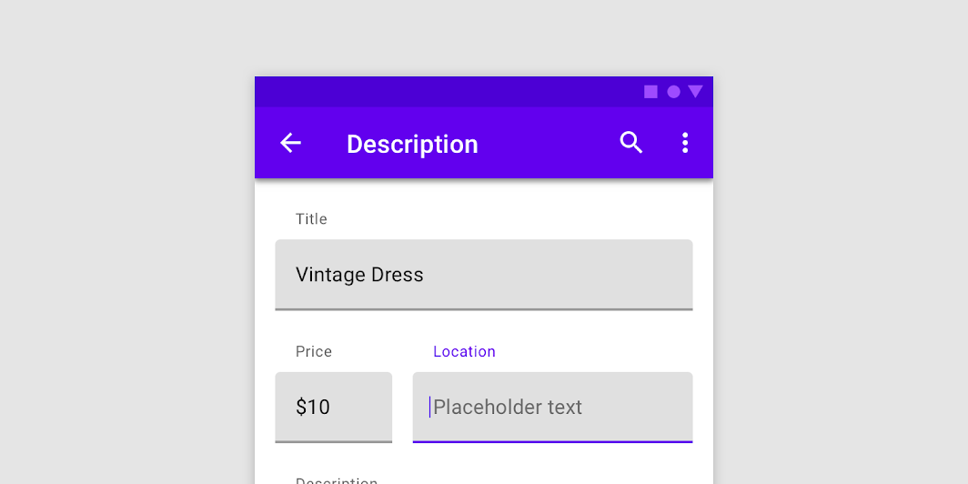
If you are looking for an outlined version, see OutlinedTextField.
This overload of TextField uses TextFieldState to keep track of its text content and position of the cursor or selection.
A simple single line text field looks like:
import androidx.compose.foundation.text.input.TextFieldLineLimits import androidx.compose.foundation.text.input.rememberTextFieldState import androidx.compose.material.Text import androidx.compose.material.TextField import androidx.compose.runtime.remember TextField( state = rememberTextFieldState(), label = { Text("Label") }, lineLimits = TextFieldLineLimits.SingleLine, )
You can control the initial text input and selection:
import androidx.compose.foundation.text.input.TextFieldLineLimits import androidx.compose.foundation.text.input.rememberTextFieldState import androidx.compose.material.Text import androidx.compose.material.TextField import androidx.compose.runtime.remember import androidx.compose.ui.text.TextRange val state = rememberTextFieldState("Initial text", TextRange(0, 12)) TextField(state = state, label = { Text("Label") }, lineLimits = TextFieldLineLimits.SingleLine)
You may provide a placeholder:
import androidx.compose.foundation.text.input.TextFieldLineLimits import androidx.compose.foundation.text.input.rememberTextFieldState import androidx.compose.material.Text import androidx.compose.material.TextField import androidx.compose.runtime.remember TextField( state = rememberTextFieldState(), lineLimits = TextFieldLineLimits.SingleLine, label = { Text("Email") }, placeholder = { Text("example@gmail.com") }, )
You can also provide leading and trailing icons:
import androidx.compose.foundation.text.input.TextFieldLineLimits import androidx.compose.foundation.text.input.clearText import androidx.compose.foundation.text.input.rememberTextFieldState import androidx.compose.material.Icon import androidx.compose.material.IconButton import androidx.compose.material.Text import androidx.compose.material.TextField import androidx.compose.material.icons.Icons import androidx.compose.material.icons.filled.Clear import androidx.compose.material.icons.filled.Favorite import androidx.compose.runtime.remember val state = rememberTextFieldState() TextField( state = state, lineLimits = TextFieldLineLimits.SingleLine, placeholder = { Text("placeholder") }, leadingIcon = { Icon(Icons.Filled.Favorite, contentDescription = null) }, trailingIcon = { IconButton(onClick = { state.clearText() }) { Icon(Icons.Filled.Clear, contentDescription = "Clear text") } }, )
To handle the error input state, use isError parameter:
import androidx.compose.foundation.text.KeyboardOptions import androidx.compose.foundation.text.input.TextFieldLineLimits import androidx.compose.foundation.text.input.rememberTextFieldState import androidx.compose.material.Text import androidx.compose.material.TextField import androidx.compose.runtime.LaunchedEffect import androidx.compose.runtime.mutableStateOf import androidx.compose.runtime.remember import androidx.compose.runtime.saveable.rememberSaveable import androidx.compose.runtime.snapshotFlow import androidx.compose.ui.Modifier import androidx.compose.ui.semantics.error import androidx.compose.ui.semantics.semantics import androidx.compose.ui.text.input.KeyboardType val state = rememberTextFieldState() var isError by rememberSaveable { mutableStateOf(false) } fun validate(text: CharSequence) { val atIndex = text.indexOf('@') isError = atIndex < 0 || text.indexOf('.', startIndex = atIndex) < 0 } LaunchedEffect(Unit) { snapshotFlow { state.text } .collect { // Do something whenever text field value changes isError = false } } TextField( state = state, lineLimits = TextFieldLineLimits.SingleLine, label = { Text(if (isError) "Email*" else "Email") }, isError = isError, keyboardOptions = KeyboardOptions(keyboardType = KeyboardType.Email), onKeyboardAction = { validate(state.text) }, modifier = Modifier.semantics { // Provide localized description of the error if (isError) error("Email format is invalid.") }, )
Additionally, you may provide additional message at the bottom:
import androidx.compose.foundation.layout.Column import androidx.compose.foundation.layout.padding import androidx.compose.foundation.text.input.TextFieldLineLimits import androidx.compose.foundation.text.input.rememberTextFieldState import androidx.compose.material.ContentAlpha import androidx.compose.material.MaterialTheme import androidx.compose.material.Text import androidx.compose.material.TextField import androidx.compose.runtime.remember import androidx.compose.ui.Modifier import androidx.compose.ui.unit.dp Column { TextField( state = rememberTextFieldState(), label = { Text("Label") }, lineLimits = TextFieldLineLimits.SingleLine, ) Text( text = "Helper message", color = MaterialTheme.colors.onSurface.copy(alpha = ContentAlpha.medium), style = MaterialTheme.typography.caption, modifier = Modifier.padding(start = 16.dp), ) }
Hiding a software keyboard on IME action performed:
import androidx.compose.foundation.text.KeyboardOptions import androidx.compose.foundation.text.input.rememberTextFieldState import androidx.compose.material.Text import androidx.compose.material.TextField import androidx.compose.runtime.remember import androidx.compose.ui.platform.LocalSoftwareKeyboardController import androidx.compose.ui.text.input.ImeAction val keyboardController = LocalSoftwareKeyboardController.current TextField( state = rememberTextFieldState(), label = { Text("Label") }, keyboardOptions = KeyboardOptions(imeAction = ImeAction.Done), onKeyboardAction = { keyboardController?.hide() }, )
| Parameters | |
|---|---|
state: TextFieldState |
|
modifier: Modifier = Modifier |
a |
enabled: Boolean = true |
controls the enabled state of the |
readOnly: Boolean = false |
controls the editable state of the |
textStyle: TextStyle = LocalTextStyle.current |
the style to be applied to the input text. The default |
label: (@Composable () -> Unit)? = null |
the optional label to be displayed inside the text field container. The default text style for internal |
placeholder: (@Composable () -> Unit)? = null |
the optional placeholder to be displayed when the text field is in focus and the input text is empty. The default text style for internal |
leadingIcon: (@Composable () -> Unit)? = null |
the optional leading icon to be displayed at the beginning of the text field container |
trailingIcon: (@Composable () -> Unit)? = null |
the optional trailing icon to be displayed at the end of the text field container |
isError: Boolean = false |
indicates if the text field's current value is in error. If set to true, the label, bottom indicator and trailing icon by default will be displayed in error color |
inputTransformation: InputTransformation? = null |
Optional |
outputTransformation: OutputTransformation? = null |
An |
keyboardOptions: KeyboardOptions = KeyboardOptions.Default |
software keyboard options that contains configuration such as |
onKeyboardAction: KeyboardActionHandler? = null |
Called when the user presses the action button in the input method editor (IME), or by pressing the enter key on a hardware keyboard. By default this parameter is null, and would execute the default behavior for a received IME Action e.g., |
lineLimits: TextFieldLineLimits = TextFieldLineLimits.Default |
Whether the text field should be |
scrollState: ScrollState = rememberScrollState() |
Scroll state that manages either horizontal or vertical scroll of the text field. If |
shape: Shape = TextFieldDefaults.TextFieldShape |
the shape of the text field's container |
colors: TextFieldColors = TextFieldDefaults.textFieldColors() |
|
interactionSource: MutableInteractionSource? = null |
an optional hoisted |
TextField
@Composable
fun TextField(
value: String,
onValueChange: (String) -> Unit,
modifier: Modifier = Modifier,
enabled: Boolean = true,
readOnly: Boolean = false,
textStyle: TextStyle = LocalTextStyle.current,
label: (@Composable () -> Unit)? = null,
placeholder: (@Composable () -> Unit)? = null,
leadingIcon: (@Composable () -> Unit)? = null,
trailingIcon: (@Composable () -> Unit)? = null,
isError: Boolean = false,
visualTransformation: VisualTransformation = VisualTransformation.None,
keyboardOptions: KeyboardOptions = KeyboardOptions.Default,
keyboardActions: KeyboardActions = KeyboardActions(),
singleLine: Boolean = false,
maxLines: Int = if (singleLine) 1 else Int.MAX_VALUE,
minLines: Int = 1,
interactionSource: MutableInteractionSource? = null,
shape: Shape = TextFieldDefaults.TextFieldShape,
colors: TextFieldColors = TextFieldDefaults.textFieldColors()
): Unit
Material Design filled text field.
Filled text fields have more visual emphasis than outlined text fields, making them stand out when surrounded by other content and components.
If you are looking for an outlined version, see OutlinedTextField.
If apart from input text change you also want to observe the cursor location, selection range, or IME composition use the TextField overload with the TextFieldValue parameter instead.
| Parameters | |
|---|---|
value: String |
the input text to be shown in the text field |
onValueChange: (String) -> Unit |
the callback that is triggered when the input service updates the text. An updated text comes as a parameter of the callback |
modifier: Modifier = Modifier |
a |
enabled: Boolean = true |
controls the enabled state of the |
readOnly: Boolean = false |
controls the editable state of the |
textStyle: TextStyle = LocalTextStyle.current |
the style to be applied to the input text. The default |
label: (@Composable () -> Unit)? = null |
the optional label to be displayed inside the text field container. The default text style for internal |
placeholder: (@Composable () -> Unit)? = null |
the optional placeholder to be displayed when the text field is in focus and the input text is empty. The default text style for internal |
leadingIcon: (@Composable () -> Unit)? = null |
the optional leading icon to be displayed at the beginning of the text field container |
trailingIcon: (@Composable () -> Unit)? = null |
the optional trailing icon to be displayed at the end of the text field container |
isError: Boolean = false |
indicates if the text field's current value is in error. If set to true, the label, bottom indicator and trailing icon by default will be displayed in error color |
visualTransformation: VisualTransformation = VisualTransformation.None |
transforms the visual representation of the input |
keyboardOptions: KeyboardOptions = KeyboardOptions.Default |
software keyboard options that contains configuration such as |
keyboardActions: KeyboardActions = KeyboardActions() |
when the input service emits an IME action, the corresponding callback is called. Note that this IME action may be different from what you specified in |
singleLine: Boolean = false |
when set to true, this text field becomes a single horizontally scrolling text field instead of wrapping onto multiple lines. The keyboard will be informed to not show the return key as the |
maxLines: Int = if (singleLine) 1 else Int.MAX_VALUE |
the maximum height in terms of maximum number of visible lines. It is required that 1 <= |
minLines: Int = 1 |
the minimum height in terms of minimum number of visible lines. It is required that 1 <= |
interactionSource: MutableInteractionSource? = null |
an optional hoisted |
shape: Shape = TextFieldDefaults.TextFieldShape |
the shape of the text field's container |
colors: TextFieldColors = TextFieldDefaults.textFieldColors() |
|
TextField
@Composable
fun TextField(
value: TextFieldValue,
onValueChange: (TextFieldValue) -> Unit,
modifier: Modifier = Modifier,
enabled: Boolean = true,
readOnly: Boolean = false,
textStyle: TextStyle = LocalTextStyle.current,
label: (@Composable () -> Unit)? = null,
placeholder: (@Composable () -> Unit)? = null,
leadingIcon: (@Composable () -> Unit)? = null,
trailingIcon: (@Composable () -> Unit)? = null,
isError: Boolean = false,
visualTransformation: VisualTransformation = VisualTransformation.None,
keyboardOptions: KeyboardOptions = KeyboardOptions.Default,
keyboardActions: KeyboardActions = KeyboardActions(),
singleLine: Boolean = false,
maxLines: Int = if (singleLine) 1 else Int.MAX_VALUE,
minLines: Int = 1,
interactionSource: MutableInteractionSource? = null,
shape: Shape = TextFieldDefaults.TextFieldShape,
colors: TextFieldColors = TextFieldDefaults.textFieldColors()
): Unit
Material Design filled text field.
Filled text fields have more visual emphasis than outlined text fields, making them stand out when surrounded by other content and components.
If you are looking for an outlined version, see OutlinedTextField. For a text field specifically designed for passwords or other secure content, see SecureTextField.
This overload provides access to the input text, cursor position, selection range and IME composition. If you only want to observe an input text change, use the TextField overload with the String parameter instead.
| Parameters | |
|---|---|
value: TextFieldValue |
the input |
onValueChange: (TextFieldValue) -> Unit |
the callback that is triggered when the input service updates values in |
modifier: Modifier = Modifier |
a |
enabled: Boolean = true |
controls the enabled state of the |
readOnly: Boolean = false |
controls the editable state of the |
textStyle: TextStyle = LocalTextStyle.current |
the style to be applied to the input text. The default |
label: (@Composable () -> Unit)? = null |
the optional label to be displayed inside the text field container. The default text style for internal |
placeholder: (@Composable () -> Unit)? = null |
the optional placeholder to be displayed when the text field is in focus and the input text is empty. The default text style for internal |
leadingIcon: (@Composable () -> Unit)? = null |
the optional leading icon to be displayed at the beginning of the text field container |
trailingIcon: (@Composable () -> Unit)? = null |
the optional trailing icon to be displayed at the end of the text field container |
isError: Boolean = false |
indicates if the text field's current value is in error state. If set to true, the label, bottom indicator and trailing icon by default will be displayed in error color |
visualTransformation: VisualTransformation = VisualTransformation.None |
transforms the visual representation of the input |
keyboardOptions: KeyboardOptions = KeyboardOptions.Default |
software keyboard options that contains configuration such as |
keyboardActions: KeyboardActions = KeyboardActions() |
when the input service emits an IME action, the corresponding callback is called. Note that this IME action may be different from what you specified in |
singleLine: Boolean = false |
when set to true, this text field becomes a single horizontally scrolling text field instead of wrapping onto multiple lines. The keyboard will be informed to not show the return key as the |
maxLines: Int = if (singleLine) 1 else Int.MAX_VALUE |
the maximum height in terms of maximum number of visible lines. It is required that 1 <= |
minLines: Int = 1 |
the minimum height in terms of minimum number of visible lines. It is required that 1 <= |
interactionSource: MutableInteractionSource? = null |
an optional hoisted |
shape: Shape = TextFieldDefaults.TextFieldShape |
the shape of the text field's container |
colors: TextFieldColors = TextFieldDefaults.textFieldColors() |
|
TopAppBar
@Composable
fun TopAppBar(
modifier: Modifier = Modifier,
backgroundColor: Color = MaterialTheme.colors.primarySurface,
contentColor: Color = contentColorFor(backgroundColor),
elevation: Dp = AppBarDefaults.TopAppBarElevation,
contentPadding: PaddingValues = AppBarDefaults.ContentPadding,
content: @Composable RowScope.() -> Unit
): Unit
The top app bar displays information and actions relating to the current screen.
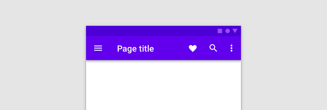
This TopAppBar has no pre-defined slots for content, allowing you to customize the layout of content inside. See the other TopAppBar overload for a TopAppBar that has opinionated slots for title, navigation icon, and trailing actions.
The LocalContentAlpha inside this TopAppBar is ContentAlpha.medium - this is the default for trailing and overflow icons. It is recommended that any text, and leading icons at the start of the TopAppBar use ContentAlpha.high instead.
| Parameters | |
|---|---|
modifier: Modifier = Modifier |
The |
backgroundColor: Color = MaterialTheme.colors.primarySurface |
The background color for the TopAppBar. Use |
contentColor: Color = contentColorFor(backgroundColor) |
The preferred content color provided by this TopAppBar to its children. Defaults to either the matching content color for |
elevation: Dp = AppBarDefaults.TopAppBarElevation |
the elevation of this TopAppBar. |
contentPadding: PaddingValues = AppBarDefaults.ContentPadding |
the padding applied to the content of this TopAppBar |
content: @Composable RowScope.() -> Unit |
the content of this TopAppBar.The default layout here is a |
TopAppBar
@Composable
fun TopAppBar(
title: @Composable () -> Unit,
modifier: Modifier = Modifier,
navigationIcon: (@Composable () -> Unit)? = null,
actions: @Composable RowScope.() -> Unit = {},
backgroundColor: Color = MaterialTheme.colors.primarySurface,
contentColor: Color = contentColorFor(backgroundColor),
elevation: Dp = AppBarDefaults.TopAppBarElevation
): Unit
The top app bar displays information and actions relating to the current screen.
This TopAppBar has slots for a title, navigation icon, and actions. Note that the title slot is inset from the start according to spec - for custom use cases such as horizontally centering the title, use the other TopAppBar overload for a generic TopAppBar with no restriction on content.
import androidx.compose.material.AppBarDefaults import androidx.compose.material.Icon import androidx.compose.material.IconButton import androidx.compose.material.Text import androidx.compose.material.TopAppBar import androidx.compose.material.icons.Icons import androidx.compose.material.icons.filled.Favorite import androidx.compose.material.icons.filled.Menu TopAppBar( windowInsets = AppBarDefaults.topAppBarWindowInsets, title = { Text("Simple TopAppBar") }, navigationIcon = { IconButton(onClick = { /* doSomething() */ }) { Icon(Icons.Filled.Menu, contentDescription = null) } }, actions = { // RowScope here, so these icons will be placed horizontally IconButton(onClick = { /* doSomething() */ }) { Icon(Icons.Filled.Favorite, contentDescription = "Localized description") } IconButton(onClick = { /* doSomething() */ }) { Icon(Icons.Filled.Favorite, contentDescription = "Localized description") } }, )
| Parameters | |
|---|---|
title: @Composable () -> Unit |
The title to be displayed in the center of the TopAppBar |
modifier: Modifier = Modifier |
The |
navigationIcon: (@Composable () -> Unit)? = null |
The navigation icon displayed at the start of the TopAppBar. This should typically be an |
actions: @Composable RowScope.() -> Unit = {} |
The actions displayed at the end of the TopAppBar. This should typically be |
backgroundColor: Color = MaterialTheme.colors.primarySurface |
The background color for the TopAppBar. Use |
contentColor: Color = contentColorFor(backgroundColor) |
The preferred content color provided by this TopAppBar to its children. Defaults to either the matching content color for |
elevation: Dp = AppBarDefaults.TopAppBarElevation |
the elevation of this TopAppBar. |
TopAppBar
@Composable
fun TopAppBar(
windowInsets: WindowInsets,
modifier: Modifier = Modifier,
backgroundColor: Color = MaterialTheme.colors.primarySurface,
contentColor: Color = contentColorFor(backgroundColor),
elevation: Dp = AppBarDefaults.TopAppBarElevation,
contentPadding: PaddingValues = AppBarDefaults.ContentPadding,
content: @Composable RowScope.() -> Unit
): Unit
The top app bar displays information and actions relating to the current screen.
This particular overload provides ability to specify WindowInsets. Recommended value can be found in AppBarDefaults.topAppBarWindowInsets.
This TopAppBar has no pre-defined slots for content, allowing you to customize the layout of content inside. See the other TopAppBar overload for a TopAppBar that has opinionated slots for title, navigation icon, and trailing actions.
The LocalContentAlpha inside this TopAppBar is ContentAlpha.medium - this is the default for trailing and overflow icons. It is recommended that any text, and leading icons at the start of the TopAppBar use ContentAlpha.high instead.
| Parameters | |
|---|---|
windowInsets: WindowInsets |
a window insets that app bar will respect. |
modifier: Modifier = Modifier |
The |
backgroundColor: Color = MaterialTheme.colors.primarySurface |
The background color for the TopAppBar. Use |
contentColor: Color = contentColorFor(backgroundColor) |
The preferred content color provided by this TopAppBar to its children. Defaults to either the matching content color for |
elevation: Dp = AppBarDefaults.TopAppBarElevation |
the elevation of this TopAppBar. |
contentPadding: PaddingValues = AppBarDefaults.ContentPadding |
the padding applied to the content of this TopAppBar |
content: @Composable RowScope.() -> Unit |
the content of this TopAppBar.The default layout here is a |
TopAppBar
@Composable
fun TopAppBar(
title: @Composable () -> Unit,
windowInsets: WindowInsets,
modifier: Modifier = Modifier,
navigationIcon: (@Composable () -> Unit)? = null,
actions: @Composable RowScope.() -> Unit = {},
backgroundColor: Color = MaterialTheme.colors.primarySurface,
contentColor: Color = contentColorFor(backgroundColor),
elevation: Dp = AppBarDefaults.TopAppBarElevation
): Unit
The top app bar displays information and actions relating to the current screen.
This particular overload provides ability to specify WindowInsets. Recommended value can be found in AppBarDefaults.topAppBarWindowInsets.
This TopAppBar has slots for a title, navigation icon, and actions. Note that the title slot is inset from the start according to spec - for custom use cases such as horizontally centering the title, use the other TopAppBar overload for a generic TopAppBar with no restriction on content.
import androidx.compose.material.AppBarDefaults import androidx.compose.material.Icon import androidx.compose.material.IconButton import androidx.compose.material.Text import androidx.compose.material.TopAppBar import androidx.compose.material.icons.Icons import androidx.compose.material.icons.filled.Favorite import androidx.compose.material.icons.filled.Menu TopAppBar( windowInsets = AppBarDefaults.topAppBarWindowInsets, title = { Text("Simple TopAppBar") }, navigationIcon = { IconButton(onClick = { /* doSomething() */ }) { Icon(Icons.Filled.Menu, contentDescription = null) } }, actions = { // RowScope here, so these icons will be placed horizontally IconButton(onClick = { /* doSomething() */ }) { Icon(Icons.Filled.Favorite, contentDescription = "Localized description") } IconButton(onClick = { /* doSomething() */ }) { Icon(Icons.Filled.Favorite, contentDescription = "Localized description") } }, )
| Parameters | |
|---|---|
title: @Composable () -> Unit |
The title to be displayed in the center of the TopAppBar |
windowInsets: WindowInsets |
a window insets that app bar will respect. |
modifier: Modifier = Modifier |
The |
navigationIcon: (@Composable () -> Unit)? = null |
The navigation icon displayed at the start of the TopAppBar. This should typically be an |
actions: @Composable RowScope.() -> Unit = {} |
The actions displayed at the end of the TopAppBar. This should typically be |
backgroundColor: Color = MaterialTheme.colors.primarySurface |
The background color for the TopAppBar. Use |
contentColor: Color = contentColorFor(backgroundColor) |
The preferred content color provided by this TopAppBar to its children. Defaults to either the matching content color for |
elevation: Dp = AppBarDefaults.TopAppBarElevation |
the elevation of this TopAppBar. |
TriStateCheckbox
@Composable
fun TriStateCheckbox(
state: ToggleableState,
onClick: (() -> Unit)?,
modifier: Modifier = Modifier,
enabled: Boolean = true,
interactionSource: MutableInteractionSource? = null,
colors: CheckboxColors = CheckboxDefaults.colors()
): Unit
Checkboxes can have a parent-child relationship with other checkboxes. When the parent checkbox is checked, all child checkboxes are checked. If a parent checkbox is unchecked, all child checkboxes are unchecked. If some, but not all, child checkboxes are checked, the parent checkbox becomes an indeterminate checkbox.
import androidx.compose.foundation.layout.Column import androidx.compose.foundation.layout.Spacer import androidx.compose.foundation.layout.padding import androidx.compose.foundation.layout.size import androidx.compose.material.Checkbox import androidx.compose.material.CheckboxDefaults import androidx.compose.material.MaterialTheme import androidx.compose.material.TriStateCheckbox import androidx.compose.runtime.mutableStateOf import androidx.compose.runtime.remember import androidx.compose.ui.Modifier import androidx.compose.ui.state.ToggleableState import androidx.compose.ui.unit.dp Column { // define dependent checkboxes states val (state, onStateChange) = remember { mutableStateOf(true) } val (state2, onStateChange2) = remember { mutableStateOf(true) } // TriStateCheckbox state reflects state of dependent checkboxes val parentState = remember(state, state2) { if (state && state2) ToggleableState.On else if (!state && !state2) ToggleableState.Off else ToggleableState.Indeterminate } // click on TriStateCheckbox can set state for dependent checkboxes val onParentClick = { val s = parentState != ToggleableState.On onStateChange(s) onStateChange2(s) } TriStateCheckbox( state = parentState, onClick = onParentClick, colors = CheckboxDefaults.colors(checkedColor = MaterialTheme.colors.primary), ) Spacer(Modifier.size(25.dp)) Column(Modifier.padding(10.dp, 0.dp, 0.dp, 0.dp)) { Checkbox(state, onStateChange) Spacer(Modifier.size(25.dp)) Checkbox(state2, onStateChange2) } }
| Parameters | |
|---|---|
state: ToggleableState |
whether TriStateCheckbox is checked, unchecked or in indeterminate state |
onClick: (() -> Unit)? |
callback to be invoked when checkbox is being clicked, therefore the change of ToggleableState state is requested. If null, then this is passive and relies entirely on a higher-level component to control the state. |
modifier: Modifier = Modifier |
Modifier to be applied to the layout of the checkbox |
enabled: Boolean = true |
whether the component is enabled or grayed out |
interactionSource: MutableInteractionSource? = null |
an optional hoisted |
colors: CheckboxColors = CheckboxDefaults.colors() |
|
| See also | |
|---|---|
Checkbox |
if you want a simple component that represents Boolean state |
contentColorFor
@Composable
fun contentColorFor(backgroundColor: Color): Color
The Material color system contains pairs of colors that are typically used for the background and content color inside a component. For example, a Button typically uses primary for its background, and onPrimary for the color of its content (usually text or iconography).
This function tries to match the provided backgroundColor to a 'background' color in this Colors, and then will return the corresponding color used for content. For example, when backgroundColor is Colors.primary, this will return Colors.onPrimary.
If backgroundColor does not match a background color in the theme, this will return the current value of LocalContentColor as a best-effort color.
| Returns | |
|---|---|
Color |
the matching content color for |
| See also | |
|---|---|
contentColorFor |
darkColors
fun darkColors(
primary: Color = Color(0xFFBB86FC),
primaryVariant: Color = Color(0xFF3700B3),
secondary: Color = Color(0xFF03DAC6),
secondaryVariant: Color = secondary,
background: Color = Color(0xFF121212),
surface: Color = Color(0xFF121212),
error: Color = Color(0xFFCF6679),
onPrimary: Color = Color.Black,
onSecondary: Color = Color.Black,
onBackground: Color = Color.White,
onSurface: Color = Color.White,
onError: Color = Color.Black
): Colors
Creates a complete color definition for the Material color specification using the default dark theme values.
Note: secondaryVariant is typically the same as secondary in dark theme since contrast levels are higher, and hence there is less need for a separate secondary color.
| See also | |
|---|---|
lightColors |
lightColors
fun lightColors(
primary: Color = Color(0xFF6200EE),
primaryVariant: Color = Color(0xFF3700B3),
secondary: Color = Color(0xFF03DAC6),
secondaryVariant: Color = Color(0xFF018786),
background: Color = Color.White,
surface: Color = Color.White,
error: Color = Color(0xFFB00020),
onPrimary: Color = Color.White,
onSecondary: Color = Color.Black,
onBackground: Color = Color.Black,
onSurface: Color = Color.Black,
onError: Color = Color.White
): Colors
Creates a complete color definition for the Material color specification using the default light theme values.
| See also | |
|---|---|
darkColors |
rememberBackdropScaffoldState
@Composable
fun rememberBackdropScaffoldState(
initialValue: BackdropValue,
animationSpec: AnimationSpec<Float> = BackdropScaffoldDefaults.AnimationSpec,
confirmStateChange: (BackdropValue) -> Boolean = { true },
snackbarHostState: SnackbarHostState = remember { SnackbarHostState() }
): BackdropScaffoldState
Create and remember a BackdropScaffoldState.
| Parameters | |
|---|---|
initialValue: BackdropValue |
The initial value of the state. |
animationSpec: AnimationSpec<Float> = BackdropScaffoldDefaults.AnimationSpec |
The default animation that will be used to animate to a new state. |
confirmStateChange: (BackdropValue) -> Boolean = { true } |
Optional callback invoked to confirm or veto a pending state change. |
snackbarHostState: SnackbarHostState = remember { SnackbarHostState() } |
The |
rememberBottomDrawerState
@Composable
fun rememberBottomDrawerState(
initialValue: BottomDrawerValue,
confirmStateChange: (BottomDrawerValue) -> Boolean = { true },
animationSpec: AnimationSpec<Float> = DrawerDefaults.AnimationSpec
): BottomDrawerState
Create and remember a BottomDrawerState.
| Parameters | |
|---|---|
initialValue: BottomDrawerValue |
The initial value of the state. |
confirmStateChange: (BottomDrawerValue) -> Boolean = { true } |
Optional callback invoked to confirm or veto a pending state change. |
animationSpec: AnimationSpec<Float> = DrawerDefaults.AnimationSpec |
The animation spec to be used for open/close animations, as well as settling when a user lets go. |
rememberBottomSheetScaffoldState
@Composable
fun rememberBottomSheetScaffoldState(
bottomSheetState: BottomSheetState = rememberBottomSheetState(Collapsed),
snackbarHostState: SnackbarHostState = remember { SnackbarHostState() }
): BottomSheetScaffoldState
Create and remember a BottomSheetScaffoldState.
| Parameters | |
|---|---|
bottomSheetState: BottomSheetState = rememberBottomSheetState(Collapsed) |
The state of the persistent bottom sheet. |
snackbarHostState: SnackbarHostState = remember { SnackbarHostState() } |
The |
rememberBottomSheetState
@Composable
fun rememberBottomSheetState(
initialValue: BottomSheetValue,
animationSpec: AnimationSpec<Float> = BottomSheetScaffoldDefaults.AnimationSpec,
confirmStateChange: (BottomSheetValue) -> Boolean = { true }
): BottomSheetState
Create a BottomSheetState and remember it.
| Parameters | |
|---|---|
initialValue: BottomSheetValue |
The initial value of the state. |
animationSpec: AnimationSpec<Float> = BottomSheetScaffoldDefaults.AnimationSpec |
The default animation that will be used to animate to a new state. |
confirmStateChange: (BottomSheetValue) -> Boolean = { true } |
Optional callback invoked to confirm or veto a pending state change. |
rememberDismissState
@Composable
@ExperimentalMaterialApi
fun rememberDismissState(
initialValue: DismissValue = Default,
confirmStateChange: (DismissValue) -> Boolean = { true }
): DismissState
Create and remember a DismissState.
| Parameters | |
|---|---|
initialValue: DismissValue = Default |
The initial value of the state. |
confirmStateChange: (DismissValue) -> Boolean = { true } |
Optional callback invoked to confirm or veto a pending state change. |
rememberDrawerState
@Composable
fun rememberDrawerState(
initialValue: DrawerValue,
confirmStateChange: (DrawerValue) -> Boolean = { true }
): DrawerState
Create and remember a DrawerState.
| Parameters | |
|---|---|
initialValue: DrawerValue |
The initial value of the state. |
confirmStateChange: (DrawerValue) -> Boolean = { true } |
Optional callback invoked to confirm or veto a pending state change. |
rememberModalBottomSheetState
@Composable
fun rememberModalBottomSheetState(
initialValue: ModalBottomSheetValue,
animationSpec: AnimationSpec<Float> = ModalBottomSheetDefaults.AnimationSpec,
confirmValueChange: (ModalBottomSheetValue) -> Boolean = { true },
skipHalfExpanded: Boolean = false
): ModalBottomSheetState
Create a ModalBottomSheetState and remember it.
| Parameters | |
|---|---|
initialValue: ModalBottomSheetValue |
The initial value of the state. |
animationSpec: AnimationSpec<Float> = ModalBottomSheetDefaults.AnimationSpec |
The default animation that will be used to animate to a new state. |
confirmValueChange: (ModalBottomSheetValue) -> Boolean = { true } |
Optional callback invoked to confirm or veto a pending state change. |
skipHalfExpanded: Boolean = false |
Whether the half expanded state, if the sheet is tall enough, should be skipped. If true, the sheet will always expand to the |
rememberScaffoldState
@Composable
fun rememberScaffoldState(
drawerState: DrawerState = rememberDrawerState(DrawerValue.Closed),
snackbarHostState: SnackbarHostState = remember { SnackbarHostState() }
): ScaffoldState
Creates a ScaffoldState with the default animation clock and memoizes it.
| Parameters | |
|---|---|
drawerState: DrawerState = rememberDrawerState(DrawerValue.Closed) |
the drawer state |
snackbarHostState: SnackbarHostState = remember { SnackbarHostState() } |
instance of |
rememberSwipeableState
@Composable
@ExperimentalMaterialApi
fun <T : Any>rememberSwipeableState(
initialValue: T,
animationSpec: AnimationSpec<Float> = AnimationSpec,
confirmStateChange: (newValue) -> Boolean = { true }
): SwipeableState<T>
Create and remember a SwipeableState with the default animation clock.
| Parameters | |
|---|---|
initialValue: T |
The initial value of the state. |
animationSpec: AnimationSpec<Float> = AnimationSpec |
The default animation that will be used to animate to a new state. |
confirmStateChange: (newValue) -> Boolean = { true } |
Optional callback invoked to confirm or veto a pending state change. |
ripple
fun ripple(
bounded: Boolean = true,
radius: Dp = Dp.Unspecified,
color: Color = Color.Unspecified
): IndicationNodeFactory
Creates a Ripple using the provided values and values inferred from the theme.
A Ripple is a Material implementation of Indication that expresses different Interactions by drawing ripple animations and state layers.
A Ripple responds to PressInteraction.Press by starting a new animation, and responds to other Interactions by showing a fixed state layer with varying alpha values depending on the Interaction.
MaterialTheme provides Ripples using androidx.compose.foundation.LocalIndication, so a Ripple will be used as the default Indication inside components such as androidx.compose.foundation.clickable and androidx.compose.foundation.indication, in addition to Material provided components that use a Ripple as well.
You can also explicitly create a Ripple and provide it to custom components in order to change the parameters from the default, such as to create an unbounded ripple with a fixed size.
To create a Ripple with a manually defined color that can change over time, see the other ripple overload with a ColorProducer parameter. This will avoid unnecessary recompositions when changing the color, and preserve existing ripple state when the color changes.
| Parameters | |
|---|---|
bounded: Boolean = true |
If true, ripples are clipped by the bounds of the target layout. Unbounded ripples always animate from the target layout center, bounded ripples animate from the touch position. |
radius: Dp = Dp.Unspecified |
the radius for the ripple. If |
color: Color = Color.Unspecified |
the color of the ripple. This color is usually the same color used by the text or iconography in the component. This color will then have |
ripple
fun ripple(
color: ColorProducer,
bounded: Boolean = true,
radius: Dp = Dp.Unspecified
): IndicationNodeFactory
Creates a Ripple using the provided values and values inferred from the theme.
A Ripple is a Material implementation of Indication that expresses different Interactions by drawing ripple animations and state layers.
A Ripple responds to PressInteraction.Press by starting a new ripple animation, and responds to other Interactions by showing a fixed state layer with varying alpha values depending on the Interaction.
MaterialTheme provides Ripples using androidx.compose.foundation.LocalIndication, so a Ripple will be used as the default Indication inside components such as androidx.compose.foundation.clickable and androidx.compose.foundation.indication, in addition to Material provided components that use a Ripple as well.
You can also explicitly create a Ripple and provide it to custom components in order to change the parameters from the default, such as to create an unbounded ripple with a fixed size.
To create a Ripple with a static color, see the ripple overload with a Color parameter. This overload is optimized for Ripples that have dynamic colors that change over time, to reduce unnecessary recompositions.
| Parameters | |
|---|---|
color: ColorProducer |
the color of the ripple. This color is usually the same color used by the text or iconography in the component. This color will then have |
bounded: Boolean = true |
If true, ripples are clipped by the bounds of the target layout. Unbounded ripples always animate from the target layout center, bounded ripples animate from the touch position. |
radius: Dp = Dp.Unspecified |
the radius for the ripple. If |
Extension functions
BottomNavigationItem
@Composable
fun RowScope.BottomNavigationItem(
selected: Boolean,
onClick: () -> Unit,
icon: @Composable () -> Unit,
modifier: Modifier = Modifier,
enabled: Boolean = true,
label: (@Composable () -> Unit)? = null,
alwaysShowLabel: Boolean = true,
interactionSource: MutableInteractionSource? = null,
selectedContentColor: Color = LocalContentColor.current,
unselectedContentColor: Color = selectedContentColor.copy(alpha = ContentAlpha.medium)
): Unit
Material Design bottom navigation
The recommended configuration for a BottomNavigationItem depends on how many items there are inside a BottomNavigation:
-
Three destinations: Display icons and text labels for all destinations.
-
Four destinations: Active destinations display an icon and text label. Inactive destinations display icons, and text labels are recommended.
-
Five destinations: Active destinations display an icon and text label. Inactive destinations use icons, and use text labels if space permits.
A BottomNavigationItem always shows text labels (if it exists) when selected. Showing text labels if not selected is controlled by alwaysShowLabel.
| Parameters | |
|---|---|
selected: Boolean |
whether this item is selected |
onClick: () -> Unit |
the callback to be invoked when this item is selected |
icon: @Composable () -> Unit |
icon for this item, typically this will be an |
modifier: Modifier = Modifier |
optional |
enabled: Boolean = true |
controls the enabled state of this item. When |
label: (@Composable () -> Unit)? = null |
optional text label for this item |
alwaysShowLabel: Boolean = true |
whether to always show the label for this item. If false, the label will only be shown when this item is selected. |
interactionSource: MutableInteractionSource? = null |
an optional hoisted |
selectedContentColor: Color = LocalContentColor.current |
the color of the text label and icon when this item is selected, and the color of the ripple. |
unselectedContentColor: Color = selectedContentColor.copy(alpha = ContentAlpha.medium) |
the color of the text label and icon when this item is not selected |
contentColorFor
fun Colors.contentColorFor(backgroundColor: Color): Color
The Material color system contains pairs of colors that are typically used for the background and content color inside a component. For example, a Button typically uses primary for its background, and onPrimary for the color of its content (usually text or iconography).
This function tries to match the provided backgroundColor to a 'background' color in this Colors, and then will return the corresponding color used for content. For example, when backgroundColor is Colors.primary, this will return Colors.onPrimary.
If backgroundColor does not match a background color in the theme, this will return Color.Unspecified.
| Returns | |
|---|---|
Color |
the matching content color for |
| See also | |
|---|---|
contentColorFor |
minimumInteractiveComponentSize
fun Modifier.minimumInteractiveComponentSize(): Modifier
Reserves at least 48.dp in size to disambiguate touch interactions if the element would measure smaller.
https://m2.material.io/design/usability/accessibility.html#layout-and-typography
This uses the Material recommended minimum size of 48.dp x 48.dp, which may not the same as the system enforced minimum size. The minimum clickable / touch target size (48.dp by default) is controlled by the system via ViewConfiguration and automatically expanded at the touch input layer.
This modifier is not needed for touch target expansion to happen. It only affects layout, to make sure there is adequate space for touch target expansion.
Because layout constraints are affected by modifier order, for this modifier to take effect, it must come before any size modifiers on the element that might limit its constraints.
swipeable
@ExperimentalMaterialApi
fun <T : Any?> Modifier.swipeable(
state: SwipeableState<T>,
anchors: Map<Float, T>,
orientation: Orientation,
enabled: Boolean = true,
reverseDirection: Boolean = false,
interactionSource: MutableInteractionSource? = null,
thresholds: (from, to) -> ThresholdConfig = { _, _ -> FixedThreshold(56.dp) },
resistance: ResistanceConfig? = resistanceConfig(anchors.keys),
velocityThreshold: Dp = VelocityThreshold
): Modifier
Enable swipe gestures between a set of predefined states.
To use this, you must provide a map of anchors (in pixels) to states (of type T). Note that this map cannot be empty and cannot have two anchors mapped to the same state.
When a swipe is detected, the offset of the SwipeableState will be updated with the swipe delta. You should use this offset to move your content accordingly (see Modifier.offsetPx). When the swipe ends, the offset will be animated to one of the anchors and when that anchor is reached, the value of the SwipeableState will also be updated to the state corresponding to the new anchor. The target anchor is calculated based on the provided positional thresholds.
Swiping is constrained between the minimum and maximum anchors. If the user attempts to swipe past these bounds, a resistance effect will be applied by default. The amount of resistance at each edge is specified by the resistance config. To disable all resistance, set it to null.
For an example of a swipeable with three states, see:
import androidx.compose.foundation.background import androidx.compose.foundation.gestures.Orientation import androidx.compose.foundation.layout.Box import androidx.compose.foundation.layout.offset import androidx.compose.foundation.layout.size import androidx.compose.foundation.layout.width import androidx.compose.material.FractionalThreshold import androidx.compose.material.Text import androidx.compose.material.rememberSwipeableState import androidx.compose.material.swipeable import androidx.compose.ui.Alignment import androidx.compose.ui.Modifier import androidx.compose.ui.graphics.Color import androidx.compose.ui.platform.LocalDensity import androidx.compose.ui.unit.IntOffset import androidx.compose.ui.unit.dp import androidx.compose.ui.unit.sp // Draw a slider-like composable consisting of a red square moving along a // black background, with three states: "A" (min), "B" (middle), and "C" (max). val width = 350.dp val squareSize = 50.dp val swipeableState = rememberSwipeableState("A") val sizePx = with(LocalDensity.current) { (width - squareSize).toPx() } val anchors = mapOf(0f to "A", sizePx / 2 to "B", sizePx to "C") Box( modifier = Modifier.width(width) .swipeable( state = swipeableState, anchors = anchors, thresholds = { _, _ -> FractionalThreshold(0.5f) }, orientation = Orientation.Horizontal, ) .background(Color.Black) ) { Box( Modifier.offset { IntOffset(swipeableState.offset.value.roundToInt(), 0) } .size(squareSize) .background(Color.Red), contentAlignment = Alignment.Center, ) { Text(swipeableState.currentValue, color = Color.White, fontSize = 24.sp) } }
| Parameters | |
|---|---|
<T : Any?> |
The type of the state. |
state: SwipeableState<T> |
The state of the |
anchors: Map<Float, T> |
Pairs of anchors and states, used to map anchors to states and vice versa. |
orientation: Orientation |
The orientation in which the |
enabled: Boolean = true |
Whether this |
reverseDirection: Boolean = false |
Whether to reverse the direction of the swipe, so a top to bottom swipe will behave like bottom to top, and a left to right swipe will behave like right to left. |
interactionSource: MutableInteractionSource? = null |
Optional |
thresholds: (from, to) -> ThresholdConfig = { _, _ -> FixedThreshold(56.dp) } |
Specifies where the thresholds between the states are. The thresholds will be used to determine which state to animate to when swiping stops. This is represented as a lambda that takes two states and returns the threshold between them in the form of a |
resistance: ResistanceConfig? = resistanceConfig(anchors.keys) |
Controls how much resistance will be applied when swiping past the bounds. |
velocityThreshold: Dp = VelocityThreshold |
The threshold (in dp per second) that the end velocity has to exceed in order to animate to the next state, even if the positional |
Top-level properties
LocalAbsoluteElevation
val LocalAbsoluteElevation: ProvidableCompositionLocal<Dp>
CompositionLocal containing the current absolute elevation provided by Surface components. This absolute elevation is a sum of all the previous elevations. Absolute elevation is only used for calculating elevation overlays in dark theme, and is not used for drawing the shadow in a Surface. See ElevationOverlay for more information on elevation overlays.
import androidx.compose.material.LocalAbsoluteElevation import androidx.compose.material.Surface import androidx.compose.ui.unit.dp Surface(elevation = 4.dp) { // This will equal 4.dp val elevation = LocalAbsoluteElevation.current Surface(elevation = 2.dp) { // This will equal 6.dp (4 + 2) val elevation = LocalAbsoluteElevation.current } }
LocalContentAlpha
val LocalContentAlpha: ProvidableCompositionLocal<Float>
CompositionLocal containing the preferred content alpha for a given position in the hierarchy. This alpha is used for text and iconography (Text and Icon) to emphasize / de-emphasize different parts of a component. See the Material guide on Text Legibility for more information on alpha levels used by text and iconography.
See ContentAlpha for the default levels used by most Material components.
MaterialTheme sets this to ContentAlpha.high by default, as this is the default alpha for body text.
import androidx.compose.foundation.layout.Column import androidx.compose.material.ContentAlpha import androidx.compose.material.LocalContentAlpha import androidx.compose.material.Text import androidx.compose.runtime.CompositionLocalProvider // Note the alpha values listed below are the values for light theme. The values are slightly // different in dark theme to provide proper contrast against the background. Column { Text( "No content alpha applied - uses the default content alpha set by MaterialTheme - " + "87% alpha" ) CompositionLocalProvider(LocalContentAlpha provides 1.00f) { Text("1.00f alpha applied - 100% alpha") } CompositionLocalProvider(LocalContentAlpha provides ContentAlpha.high) { Text("High content alpha applied - 87% alpha") } CompositionLocalProvider(LocalContentAlpha provides ContentAlpha.medium) { Text("Medium content alpha applied - 60% alpha") } CompositionLocalProvider(LocalContentAlpha provides ContentAlpha.disabled) { Text("Disabled content alpha applied - 38% alpha") } }
LocalContentColor
val LocalContentColor: ProvidableCompositionLocal<Color>
CompositionLocal containing the preferred content color for a given position in the hierarchy. This typically represents the on color for a color in Colors. For example, if the background color is Colors.surface, this color is typically set to Colors.onSurface.
This color should be used for any typography / iconography, to ensure that the color of these adjusts when the background color changes. For example, on a dark background, text should be light, and on a light background, text should be dark.
Defaults to Color.Black if no color has been explicitly set.
LocalElevationOverlay
val LocalElevationOverlay: ProvidableCompositionLocal<ElevationOverlay?>
CompositionLocal containing the ElevationOverlay used by Surface components. Provide null to turn off ElevationOverlays for the children within this CompositionLocal..
| See also | |
|---|---|
ElevationOverlay |
LocalMinimumInteractiveComponentEnforcement
@ExperimentalMaterialApi
val LocalMinimumInteractiveComponentEnforcement: ProvidableCompositionLocal<Boolean>
CompositionLocal that configures whether Material components that have a visual size that is lower than the minimum touch target size for accessibility (such as Button) will include extra space outside the component to ensure that they are accessible. If set to false there will be no extra space, and so it is possible that if the component is placed near the edge of a layout / near to another component without any padding, there will not be enough space for an accessible touch target.
LocalMinimumTouchTargetEnforcement
@ExperimentalMaterialApi
val LocalMinimumTouchTargetEnforcement: ProvidableCompositionLocal<Boolean>
CompositionLocal that configures whether Material components that have a visual size that is lower than the minimum touch target size for accessibility (such as Button) will include extra space outside the component to ensure that they are accessible. If set to false there will be no extra space, and so it is possible that if the component is placed near the edge of a layout / near to another component without any padding, there will not be enough space for an accessible touch target.
LocalRippleConfiguration
val LocalRippleConfiguration: ProvidableCompositionLocal<RippleConfiguration?>
CompositionLocal used for providing RippleConfiguration down the tree. This acts as a tree-local 'override' for ripples used inside components that you cannot directly control, such as to change the color of a specific component's ripple, or disable it entirely by providing null.
In most cases you should rely on the default theme behavior for consistency with other components
-
this exists as an escape hatch for individual components and is not intended to be used for full theme customization across an application. For this use case you should instead build your own custom ripple that queries your design system theme values directly using
createRippleModifierNode.
LocalTextStyle
val LocalTextStyle: ProvidableCompositionLocal<TextStyle>
CompositionLocal containing the preferred TextStyle that will be used by Text components by default. To set the value for this CompositionLocal, see ProvideTextStyle which will merge any missing TextStyle properties with the existing TextStyle set in this CompositionLocal.
| See also | |
|---|---|
ProvideTextStyle |
Extension properties
primarySurface
val Colors.primarySurface: Color
primarySurface represents the background color of components that are Colors.primary in light theme, and Colors.surface in dark theme, such as androidx.compose.material.TabRow and androidx.compose.material.TopAppBar. This is to reduce brightness of large surfaces in dark theme, aiding contrast and readability. See Dark Theme.
| Returns | |
|---|---|
Color |
|