Shapes
-
Cmn
class Shapes
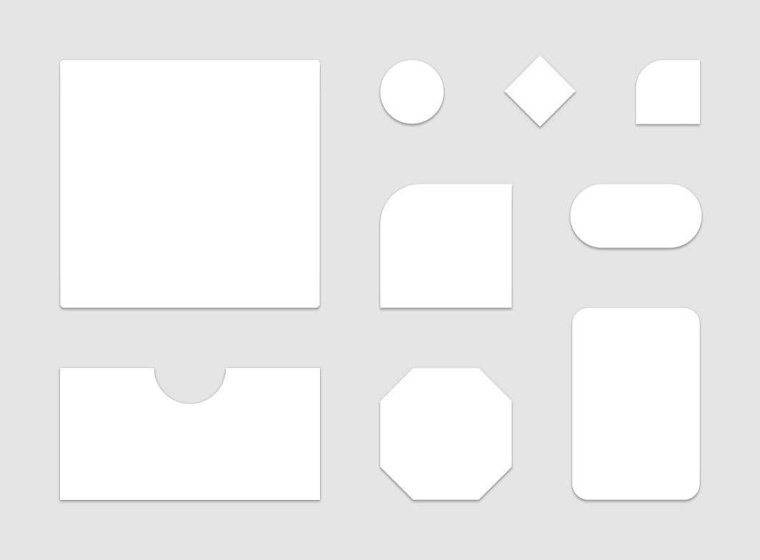
Material surfaces can be displayed in different shapes. Shapes direct attention, identify components, communicate state, and express brand.

Components are grouped into shape categories based on their size. These categories provide a way to change multiple component values at once, by changing the category’s values. Shape categories include:
-
Small components
-
Medium components
-
Large components
See Material shape specification
Summary
Public constructors |
|
|---|---|
Shapes( |
Cmn
|
Public functions |
||
|---|---|---|
Shapes |
copy(Returns a copy of this Shapes, optionally overriding some of the values. |
Cmn
|
open operator Boolean |
Cmn
|
|
open Int |
hashCode() |
Cmn
|
open String |
toString() |
Cmn
|
Public properties |
||
|---|---|---|
CornerBasedShape |
Shape used by large components like |
Cmn
|
CornerBasedShape |
Shape used by medium components like |
Cmn
|
CornerBasedShape |
Cmn
|
Public constructors
Shapes
Shapes(
    small: CornerBasedShape = RoundedCornerShape(4.dp),
    medium: CornerBasedShape = RoundedCornerShape(4.dp),
    large: CornerBasedShape = RoundedCornerShape(0.dp)
)
Public functions
copy
fun copy(
    small: CornerBasedShape = this.small,
    medium: CornerBasedShape = this.medium,
    large: CornerBasedShape = this.large
): Shapes
Returns a copy of this Shapes, optionally overriding some of the values.
Public properties
large
val large: CornerBasedShape
Shape used by large components like ModalDrawer or ModalBottomSheetLayout.
small
val small: CornerBasedShape
Shape used by small components like Button or Snackbar. Components like FloatingActionButton, ExtendedFloatingActionButton use this shape, but override the corner size to be 50%. TextField uses this shape with overriding the bottom corners to zero.
