
Colors
-
Cmn
class Colors
The Material Design color system can help you create a color theme that reflects your brand or style.
To create a light set of colors using the baseline values, use lightColors To create a dark set of colors using the baseline values, use darkColors
Summary
Public constructors |
|
|---|---|
|
Cmn
|
Public functions |
||
|---|---|---|
Colors |
copy(Returns a copy of this Colors, optionally overriding some of the values. |
Cmn
|
open String |
toString() |
Cmn
|
Public properties |
||
|---|---|---|
Color |
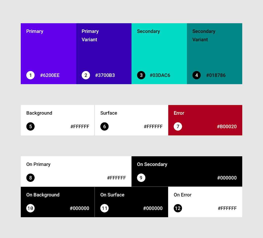
The background color appears behind scrollable content. |
Cmn
|
Color |
The error color is used to indicate error within components, such as text fields. |
Cmn
|
Boolean |
Whether this Colors is considered as a 'light' or 'dark' set of colors. |
Cmn
|
Color |
Color used for text and icons displayed on top of the background color. |
Cmn
|
Color |
Color used for text and icons displayed on top of the error color. |
Cmn
|
Color |
Color used for text and icons displayed on top of the primary color. |
Cmn
|
Color |
Color used for text and icons displayed on top of the secondary color. |
Cmn
|
Color |
Color used for text and icons displayed on top of the surface color. |
Cmn
|
Color |
The primary color is the color displayed most frequently across your app’s screens and components. |
Cmn
|
Color |
The primary variant color is used to distinguish two elements of the app using the primary color, such as the top app bar and the system bar. |
Cmn
|
Color |
The secondary color provides more ways to accent and distinguish your product. |
Cmn
|
Color |
The secondary variant color is used to distinguish two elements of the app using the secondary color. |
Cmn
|
Color |
The surface color is used on surfaces of components, such as cards, sheets and menus. |
Cmn
|
Extension functions |
||
|---|---|---|
Color |
Colors.contentColorFor(backgroundColor: Color)The Material color system contains pairs of colors that are typically used for the background and content color inside a component. |
Cmn
|
Extension properties |
||
|---|---|---|
Color |
primarySurface represents the background color of components that are |
Cmn
|
Public functions
copy
fun copy(
    primary: Color = this.primary,
    primaryVariant: Color = this.primaryVariant,
    secondary: Color = this.secondary,
    secondaryVariant: Color = this.secondaryVariant,
    background: Color = this.background,
    surface: Color = this.surface,
    error: Color = this.error,
    onPrimary: Color = this.onPrimary,
    onSecondary: Color = this.onSecondary,
    onBackground: Color = this.onBackground,
    onSurface: Color = this.onSurface,
    onError: Color = this.onError,
    isLight: Boolean = this.isLight
): Colors
Returns a copy of this Colors, optionally overriding some of the values.
Public properties
error
val error: Color
The error color is used to indicate error within components, such as text fields.
isLight
val isLight: Boolean
Whether this Colors is considered as a 'light' or 'dark' set of colors. This affects default behavior for some components: for example, in a light theme a TopAppBar will use primary by default for its background color, when in a dark theme it will use surface.
onBackground
val onBackground: Color
Color used for text and icons displayed on top of the background color.
onSecondary
val onSecondary: Color
Color used for text and icons displayed on top of the secondary color.
primary
val primary: Color
The primary color is the color displayed most frequently across your app’s screens and components.
primaryVariant
val primaryVariant: Color
The primary variant color is used to distinguish two elements of the app using the primary color, such as the top app bar and the system bar.
secondary
val secondary: Color
The secondary color provides more ways to accent and distinguish your product. Secondary colors are best for:
-
Floating action buttons
-
Selection controls, like checkboxes and radio buttons
-
Highlighting selected text
-
Links and headlines
secondaryVariant
val secondaryVariant: Color
The secondary variant color is used to distinguish two elements of the app using the secondary color.
Extension functions
contentColorFor
fun Colors.contentColorFor(backgroundColor: Color): Color
The Material color system contains pairs of colors that are typically used for the background and content color inside a component. For example, a Button typically uses primary for its background, and onPrimary for the color of its content (usually text or iconography).
This function tries to match the provided backgroundColor to a 'background' color in this Colors, and then will return the corresponding color used for content. For example, when backgroundColor is Colors.primary, this will return Colors.onPrimary.
If backgroundColor does not match a background color in the theme, this will return Color.Unspecified.
| Returns | |
|---|---|
Color |
the matching content color for |
| See also | |
|---|---|
contentColorFor |
Extension properties
primarySurface
val Colors.primarySurface: Color
primarySurface represents the background color of components that are Colors.primary in light theme, and Colors.surface in dark theme, such as androidx.compose.material.TabRow and androidx.compose.material.TopAppBar. This is to reduce brightness of large surfaces in dark theme, aiding contrast and readability. See Dark Theme.
| Returns | |
|---|---|
Color |
|