
androidx.wear.compose.material
Interfaces
ButtonBorder |
Represents the border stroke used in a |
ButtonColors |
Represents the background and content colors used in a button in different states. |
CheckboxColors |
Represents the content colors used in |
ChipBorder |
Represents the border stroke used in a |
ChipColors |
Represents the background and content colors used in a chip in different states. |
InlineSliderColors |
Represents the background and content colors used in |
PageIndicatorState |
An interface for connection between Pager and |
PickerScope |
Receiver scope which is used by |
PositionIndicatorState |
An object representing the relative position of a scrollbar or rolling side button or rotating bezel position. |
RadioButtonColors |
Represents the content colors used in |
ScalingLazyListItemInfo |
This interface is deprecated. Was moved to androidx.wear.compose.foundation.lazy package. |
ScalingLazyListItemScope |
This interface is deprecated. Was moved to androidx.wear.compose.foundation.lazy package. |
ScalingLazyListLayoutInfo |
This interface is deprecated. Was moved to androidx.wear.compose.foundation.lazy package. |
ScalingLazyListScope |
This interface is deprecated. Was moved to androidx.wear.compose.foundation.lazy package. |
ScalingParams |
This interface is deprecated. Was moved to androidx.wear.compose.foundation.lazy package. |
SelectableChipColors |
Represents the background and content colors used in |
SplitSelectableChipColors |
Represents the background and content colors used in |
SplitToggleChipColors |
Represents the background and content colors used in |
SwitchColors |
Represents the content colors used in |
ThresholdConfig |
Interface to compute a threshold between two anchors/states in a |
TimeSource |
An interface which is responsible for retrieving a formatted time. |
ToggleButtonColors |
Represents the background and content colors used in a toggle button in different states. |
ToggleChipColors |
Represents the background and content colors used in |
TouchExplorationStateProvider |
A functional interface for providing the state of touch exploration services. |
Classes
AutoCenteringParams |
This class is deprecated. Was moved to androidx.wear.compose.foundation.lazy package. |
Colors |
|
FixedThreshold |
A fixed threshold will be at an |
FractionalThreshold |
A fractional threshold will be at a |
PageIndicatorStyle |
The style of |
PickerGroupItem |
A class for representing |
PickerGroupState |
A state object that can be used to observe the selected |
PickerState |
A state object that can be hoisted to observe item selection. |
PlaceholderState |
A state object that can be used to control placeholders. |
PositionIndicatorAlignment |
Specifies where in the screen the Position indicator will be. |
PositionIndicatorVisibility |
Enum used by adapters to specify if the Position Indicator needs to be shown, hidden, or hidden after a small delay. |
ResistanceConfig |
Specifies how resistance is calculated in |
RevealActionType |
Different values which can trigger the state change from one |
RevealDirection |
Different values |
RevealState |
A class to keep track of the state of the composable. |
RevealValue |
Different values that determine the state of the |
ScalingLazyListAnchorType |
This class is deprecated. Was moved to androidx.wear.compose.foundation.lazy package. |
ScalingLazyListState |
This class is deprecated. Was moved to androidx.wear.compose.foundation.lazy package. |
Shapes |
Components are grouped into shape categories based on common features. |
SwipeProgress |
Collects information about the ongoing swipe or animation in |
SwipeToDismissBoxState |
This class is deprecated. SwipeToDismissBoxState has been migrated, please import it from androidx.wear.compose.foundation. |
SwipeToRevealActionColors |
A class representing the colors applied in |
SwipeableState |
State of the |
Typography |
Class holding typography definitions as defined by the Wear Material typography specification. |
VignettePosition |
Possible combinations for vignette state. |
Objects
ButtonDefaults |
Contains the default values used by |
CardDefaults |
Contains the default values used by |
CheckboxDefaults |
Contains the default values used by |
ChipDefaults |
Contains the default values used by |
ContentAlpha |
Default alpha levels used by Material components. |
InlineSliderDefaults |
Defaults used by slider |
MaterialTheme |
|
PageIndicatorDefaults |
Contains the default values used by |
PickerDefaults |
Contains the default values used by |
PlaceholderDefaults |
Contains the default values used for providing placeholders. |
PositionIndicatorDefaults |
Contains the default values used for |
ProgressIndicatorDefaults |
Contains the default values used for |
RadioButtonDefaults |
Contains the default values used by |
ScalingLazyColumnDefaults |
This object is deprecated. Was moved to androidx.wear.compose.foundation.lazy package. |
SelectableChipDefaults |
Contains the default values used by |
StepperDefaults |
Defaults used by stepper |
SwipeToDismissBoxDefaults |
This object is deprecated. Please import SwipeToDismissBoxDefaults from androidx.wear.compose.foundation. |
SwipeToRevealDefaults |
Defaults for Material |
SwipeableDefaults |
Contains useful defaults for |
SwitchDefaults |
Contains the default values used by |
TimeTextDefaults |
Contains the default values used by |
ToggleButtonDefaults |
Contains the default values used by |
ToggleChipDefaults |
Contains the default values used by |
Annotations
ExperimentalWearMaterialApi |
|
ScalingLazyScopeMarker |
This annotation is deprecated. Was moved to androidx.wear.compose.foundation.lazy package. |
Enums
SwipeToDismissKeys |
Keys used to persistent state in |
SwipeToDismissValue |
This enum is deprecated. SwipeToDismiss has been migrated to androidx.wear.compose.foundation. |
Top-level functions summary
Unit |
@ComposableOpinionated Wear Material |
Unit |
@ComposableWear Material |
Unit |
@ComposableBase level Wear Material |
Unit |
@Composable
|
Unit |
@ComposableBase level Wear Material |
Unit |
@ComposableWear Material |
Unit |
@ComposableIndeterminate Material Design circular progress indicator. |
Unit |
@ComposableDeterminate Material Design circular progress indicator. |
Unit |
@ComposableWear Material |
Unit |
@ComposableA compact Wear Material Chip that offers two slots and a specific layout for an icon and label. |
Unit |
@ComposableA horizontal indicator for a Pager, representing the currently active page and total pages drawn using a |
Unit |
@ComposableIcon component that draws |
Unit |
@ComposableIcon component that draws |
Unit |
Icon component that draws a |
Unit |
@Composable
|
Unit |
@Composable
|
Unit |
@ComposableA slot based composable for creating a list header item. |
Unit |
@ComposableMaterialTheme defines the styling principles from the WearOS Material design specification which extends the Material design specification. |
Unit |
@ComposableWear Material |
Unit |
@ComposableWear Material |
Unit |
@ComposableWear Material |
Unit |
@ComposableA compact Outlined Wear Material Chip that offers two slots and a specific layout for an icon and label. |
Unit |
@ComposableThis function is deprecated. This overload is provided for backwards compatibility with Compose for Wear OS 1.0.A newer overload is available with additional contentDescription, onSelected and userScrollEnabled parameters, which improves accessibility of [Picker]. |
Unit |
@ComposableA scrollable list of items to pick from. |
Unit |
@ComposableA group of |
Unit |
@ComposableThis function is deprecated. This overload is provided for backwards compatibility with Compose for Wear OS 1.1.A newer overload is available which uses ScalingLazyListState from androidx.wear.compose.foundation.lazy package |
Unit |
@ComposableCreates an |
Unit |
@ComposableCreates an |
Unit |
@ComposableCreates an |
Unit |
@ComposableCreates a |
Unit |
@ComposableAn indicator on one side of the screen to show the current |
Unit |
@ComposableThis function is used to set the current value of |
Unit |
@Composable
|
Unit |
@ComposableScaffold implements the basic Wear Material Design visual layout structure. |
Unit |
@ComposableThis function is deprecated. Was moved to androidx.wear.compose.foundation.lazy package. |
Unit |
@ComposableA |
Unit |
@ComposableA |
Unit |
@ComposableA |
Unit |
@Composable
|
Unit |
@Composable
|
Unit |
@ComposableWear Material |
Unit |
@ComposableThis function is deprecated. This overload is provided for backwards compatibility. |
Unit |
@ComposableWear Material |
Unit |
@ExperimentalWearMaterialApi
|
Unit |
@ExperimentalWearMaterialApi
|
Unit |
@ExperimentalWearMaterialApiA composable which can be used for setting the primary action of material |
Unit |
@ExperimentalWearMaterialApiA composable which can be used for setting the secondary action of material |
Unit |
@ExperimentalWearMaterialApiA composable which can be used for setting the undo action of material |
Unit |
@Composable
|
Unit |
@ComposableHigh level element that displays text and provides semantics / accessibility information. |
Unit |
@ComposableHigh level element that displays text and provides semantics / accessibility information. |
Unit |
@ComposableLayout to show the current time and a label at the top of the screen. |
Unit |
@ComposableOpinionated Wear Material |
Unit |
@ComposableWear Material |
Unit |
@ComposableA |
Unit |
@ComposableVignette is whole screen decoration used to blur the top and bottom of the edges of a wearable screen when scrolling content is displayed. |
Color |
@ComposableThe Material color system contains pairs of colors that are typically used for the background and content color inside a component. |
PickerGroupState |
@ComposableCreates a |
PickerState |
@ComposableCreates a |
PlaceholderState |
@ExperimentalWearMaterialApiCreates a |
RevealState |
@ExperimentalWearMaterialApiCreate and |
ScalingLazyListState |
@ComposableThis function is deprecated. Was moved to androidx.wear.compose.foundation.lazy package. |
SwipeToDismissBoxState |
@ComposableThis function is deprecated. Please import rememberSwipeToDismissBoxState from androidx.wear.compose.foundation. |
SwipeableState<T> |
@ComposableCreate and |
IndicationNodeFactory |
Creates a Ripple using the provided values and values inferred from the theme. |
IndicationNodeFactory |
ripple(color: ColorProducer, bounded: Boolean, radius: Dp)Creates a Ripple using the provided values and values inferred from the theme. |
Extension functions summary
Color |
Colors.contentColorFor(backgroundColor: Color)The Material color system contains pairs of colors that are typically used for the background and content color inside a component. |
Unit |
CurvedScope.curvedText(CurvedText is a component allowing developers to easily write curved text following the curvature a circle (usually at the edge of a circular screen). |
Modifier |
Modifier.This function is deprecated. SwipeToDismiss has been migrated to androidx.wear.compose.foundation. |
inline Unit |
<T : Any?> ScalingLazyListScope.This function is deprecated. Was moved to androidx.wear.compose.foundation.lazy package. |
inline Unit |
<T : Any?> ScalingLazyListScope.This function is deprecated. Was moved to androidx.wear.compose.foundation.lazy package. |
inline Unit |
<T : Any?> ScalingLazyListScope.This function is deprecated. Was moved to androidx.wear.compose.foundation.lazy package. |
inline Unit |
<T : Any?> ScalingLazyListScope.This function is deprecated. Was moved to androidx.wear.compose.foundation.lazy package. |
Modifier |
@ExperimentalWearMaterialApiDraws a placeholder shape over the top of a composable and animates a wipe off effect to remove the placeholder. |
Modifier |
@ExperimentalWearMaterialApiModifier to draw a placeholder shimmer over a component. |
Modifier |
Modifier.scrollAway(scrollState: ScrollState, offset: Dp)Scroll an item vertically in/out of view based on a |
Modifier |
Modifier.scrollAway(Scroll an item vertically in/out of view based on a |
Modifier |
Modifier.scrollAway(Scroll an item vertically in/out of view based on a |
Modifier |
Modifier.This function is deprecated. This overload is provided for backwards compatibility with Compose for Wear OS 1.1.A newer overload is available which uses ScalingLazyListState from wear.compose.foundation.lazy package |
Modifier |
@ExperimentalWearMaterialApiEnable swipe gestures between a set of predefined states. |
Top-level properties summary
ProvidableCompositionLocal<Float> |
CompositionLocal containing the preferred content alpha for a given position in the hierarchy. |
ProvidableCompositionLocal<Color> |
CompositionLocal containing the preferred content color for a given position in the hierarchy. |
ProvidableCompositionLocal<TextStyle> |
CompositionLocal containing the preferred |
Top-level functions
AppCard
@Composable
fun AppCard(
onClick: () -> Unit,
appName: @Composable RowScope.() -> Unit,
time: @Composable RowScope.() -> Unit,
title: @Composable RowScope.() -> Unit,
modifier: Modifier = Modifier,
enabled: Boolean = true,
appImage: (@Composable RowScope.() -> Unit)? = null,
backgroundPainter: Painter = CardDefaults.cardBackgroundPainter(),
contentColor: Color = MaterialTheme.colors.onSurfaceVariant,
appColor: Color = contentColor,
timeColor: Color = contentColor,
titleColor: Color = MaterialTheme.colors.onSurface,
content: @Composable ColumnScope.() -> Unit
): Unit
Opinionated Wear Material Card that offers a specific 5 slot layout to show information about an application, e.g. a notification. AppCards are designed to show interactive elements from multiple applications. They will typically be used by the system UI, e.g. for showing a list of notifications from different applications. However it could also be adapted by individual application developers to show information about different parts of their application.
The first row of the layout has three slots, 1) a small optional application Image or Icon of size CardDefaults.AppImageSizexCardDefaults.AppImageSize dp, 2) an application name (emphasised with the CardColors.appColor() color), it is expected to be a short start aligned Text composable, and 3) the time that the application activity has occurred which will be shown on the top row of the card, this is expected to be an end aligned Text composable showing a time relevant to the contents of the Card.
The second row shows a title, this is expected to be a single row of start aligned Text.
The rest of the Card contains the content which can be either Text or an Image. If the content is text it can be single or multiple line and is expected to be Top and Start aligned.
If more than one composable is provided in the content slot it is the responsibility of the caller to determine how to layout the contents, e.g. provide either a row or a column.
Example of an AppCard with icon, title, time and two lines of body text:
import androidx.compose.foundation.Image import androidx.compose.foundation.layout.size import androidx.compose.foundation.layout.wrapContentSize import androidx.compose.ui.Alignment import androidx.compose.ui.Modifier import androidx.compose.ui.res.painterResource import androidx.wear.compose.material.AppCard import androidx.wear.compose.material.CardDefaults import androidx.wear.compose.material.Icon import androidx.wear.compose.material.Text AppCard( onClick = {}, appName = { Text("AppName") }, appImage = { Icon( painter = painterResource(id = R.drawable.ic_airplanemode_active_24px), contentDescription = "airplane", modifier = Modifier.size(CardDefaults.AppImageSize) .wrapContentSize(align = Alignment.Center), ) }, title = { Text("AppCard") }, time = { Text("now") }, ) { Text("Some body content") Text("and some more body content") }
Example of an AppCard with image content:
import androidx.compose.foundation.Image import androidx.compose.foundation.layout.Spacer import androidx.compose.foundation.layout.aspectRatio import androidx.compose.foundation.layout.height import androidx.compose.foundation.layout.padding import androidx.compose.foundation.layout.size import androidx.compose.foundation.layout.wrapContentSize import androidx.compose.foundation.shape.RoundedCornerShape import androidx.compose.ui.Alignment import androidx.compose.ui.Modifier import androidx.compose.ui.draw.clip import androidx.compose.ui.layout.ContentScale import androidx.compose.ui.res.painterResource import androidx.compose.ui.unit.dp import androidx.wear.compose.material.AppCard import androidx.wear.compose.material.CardDefaults import androidx.wear.compose.material.Icon import androidx.wear.compose.material.Text AppCard( onClick = {}, appName = { Text("App name") }, appImage = { Icon( painter = painterResource(id = R.drawable.ic_airplanemode_active_24px), contentDescription = "airplane", modifier = Modifier.size(CardDefaults.AppImageSize) .wrapContentSize(align = Alignment.Center), ) }, title = { Text(text = "Title with maximum two lines", maxLines = 2) }, time = { Text("now") }, ) { Spacer(Modifier.height(6.dp)) Image( modifier = Modifier.padding(end = 28.dp).aspectRatio(16f / 9f).clip(RoundedCornerShape(16.dp)), painter = painterResource(R.drawable.card_background), contentScale = ContentScale.Crop, contentDescription = null, ) }
For more information, see the Cards guide.
| Parameters | |
|---|---|
onClick: () -> Unit |
Will be called when the user clicks the card |
appName: @Composable RowScope.() -> Unit |
A slot for displaying the application name, expected to be a single line of start aligned text of |
time: @Composable RowScope.() -> Unit |
A slot for displaying the time relevant to the contents of the card, expected to be a short piece of end aligned text. |
title: @Composable RowScope.() -> Unit |
A slot for displaying the title of the card, expected to be one or two lines of start aligned text of |
modifier: Modifier = Modifier |
Modifier to be applied to the card |
enabled: Boolean = true |
Controls the enabled state of the card. When false, this card will not be clickable and there will be no ripple effect on click. Wear cards do not have any specific elevation or alpha differences when not enabled - they are simply not clickable. |
appImage: (@Composable RowScope.() -> Unit)? = null |
A slot for a small ( |
backgroundPainter: Painter = CardDefaults.cardBackgroundPainter() |
A painter used to paint the background of the card. A card will normally have a gradient background. Use |
contentColor: Color = MaterialTheme.colors.onSurfaceVariant |
The default color to use for content() slot unless explicitly set. |
appColor: Color = contentColor |
The default color to use for appName() and appImage() slots unless explicitly set. |
timeColor: Color = contentColor |
The default color to use for time() slot unless explicitly set. |
titleColor: Color = MaterialTheme.colors.onSurface |
The default color to use for title() slot unless explicitly set. |
content: @Composable ColumnScope.() -> Unit |
Slot for composable body content displayed on the Card |
Button
@Composable
fun Button(
onClick: () -> Unit,
modifier: Modifier = Modifier,
enabled: Boolean = true,
colors: ButtonColors = ButtonDefaults.primaryButtonColors(),
interactionSource: MutableInteractionSource? = null,
shape: Shape = CircleShape,
border: ButtonBorder = ButtonDefaults.buttonBorder(),
content: @Composable BoxScope.() -> Unit
): Unit
Wear Material Button that offers a single slot to take any content (text, icon or image).
The recommended Button sizes can be obtained from ButtonDefaults - see ButtonDefaults.DefaultButtonSize, ButtonDefaults.LargeButtonSize, ButtonDefaults.SmallButtonSize. Icon content should be of size ButtonDefaults.DefaultIconSize, ButtonDefaults.LargeIconSize or ButtonDefaults.SmallIconSize respectively.
The recommended set of ButtonColors styles can be obtained from ButtonDefaults, e.g. ButtonDefaults.primaryButtonColors to get a color scheme for a primary Button which by default will have a solid background of Colors.primary and content color of Colors.onPrimary.
Buttons can be enabled or disabled. A disabled button will not respond to click events.
Example of a Button displaying an icon:
import androidx.compose.foundation.layout.size import androidx.compose.foundation.layout.wrapContentSize import androidx.compose.ui.Alignment import androidx.compose.ui.Modifier import androidx.compose.ui.res.painterResource import androidx.wear.compose.material.Button import androidx.wear.compose.material.ButtonDefaults import androidx.wear.compose.material.Icon Button(onClick = { /* Do something */ }, enabled = true) { Icon( painter = painterResource(id = R.drawable.ic_airplanemode_active_24px), contentDescription = "airplane", modifier = Modifier.size(ButtonDefaults.DefaultIconSize) .wrapContentSize(align = Alignment.Center), ) }
Example of a large Button displaying an icon:
import androidx.compose.foundation.layout.size import androidx.compose.foundation.layout.wrapContentSize import androidx.compose.ui.Alignment import androidx.compose.ui.Modifier import androidx.compose.ui.res.painterResource import androidx.wear.compose.material.Button import androidx.wear.compose.material.ButtonDefaults import androidx.wear.compose.material.Icon Button( onClick = { /* Do something */ }, enabled = true, modifier = Modifier.size(ButtonDefaults.LargeButtonSize), ) { Icon( painter = painterResource(id = R.drawable.ic_airplanemode_active_24px), contentDescription = "airplane", modifier = Modifier.size(ButtonDefaults.LargeIconSize) .wrapContentSize(align = Alignment.Center), ) }
Example of a Button with text content and size modified to LargeButtonSize:
import androidx.compose.foundation.layout.size import androidx.compose.ui.Modifier import androidx.wear.compose.material.Button import androidx.wear.compose.material.ButtonDefaults import androidx.wear.compose.material.Text Button( onClick = { /* Do something */ }, enabled = true, modifier = Modifier.size(ButtonDefaults.LargeButtonSize), ) { Text("Big") }
For more information, see the Buttons guide.
| Parameters | |
|---|---|
onClick: () -> Unit |
Will be called when the user clicks the button. |
modifier: Modifier = Modifier |
Modifier to be applied to the button. |
enabled: Boolean = true |
Controls the enabled state of the button. When |
colors: ButtonColors = ButtonDefaults.primaryButtonColors() |
|
interactionSource: MutableInteractionSource? = null |
an optional hoisted |
shape: Shape = CircleShape |
Defines the button's shape. It is strongly recommended to use the default as this shape is a key characteristic of the Wear Material Theme. |
border: ButtonBorder = ButtonDefaults.buttonBorder() |
|
content: @Composable BoxScope.() -> Unit |
The content displayed on the |
Card
@Composable
fun Card(
onClick: () -> Unit,
modifier: Modifier = Modifier,
backgroundPainter: Painter = CardDefaults.cardBackgroundPainter(),
contentColor: Color = MaterialTheme.colors.onSurfaceVariant,
enabled: Boolean = true,
contentPadding: PaddingValues = CardDefaults.ContentPadding,
shape: Shape = MaterialTheme.shapes.large,
interactionSource: MutableInteractionSource? = null,
role: Role? = null,
content: @Composable ColumnScope.() -> Unit
): Unit
Base level Wear Material Card that offers a single slot to take any content.
Is used as the container for more opinionated Card components that take specific content such as icons, images, titles, subtitles and labels.
The Card is Rectangle shaped rounded corners by default.
Cards can be enabled or disabled. A disabled card will not respond to click events.
For more information, see the Cards Wear OS Material design guide.
Note that the Wear OS design guidance recommends a gradient or image background for Cards which is not the case for Mobile Cards. As a result you will see a backgroundPainter rather than a backgroundColor for Cards. If you want to workaround this recommendation you could use a ColorPainter to produce a solid colored background.
| Parameters | |
|---|---|
onClick: () -> Unit |
Will be called when the user clicks the card |
modifier: Modifier = Modifier |
Modifier to be applied to the card |
backgroundPainter: Painter = CardDefaults.cardBackgroundPainter() |
A painter used to paint the background of the card. A card will normally have a gradient background. Use |
contentColor: Color = MaterialTheme.colors.onSurfaceVariant |
The default color to use for content() unless explicitly set. |
enabled: Boolean = true |
Controls the enabled state of the card. When false, this card will not be clickable and there will be no ripple effect on click. Wear cards do not have any specific elevation or alpha differences when not enabled - they are simply not clickable. |
contentPadding: PaddingValues = CardDefaults.ContentPadding |
The spacing values to apply internally between the container and the content |
shape: Shape = MaterialTheme.shapes.large |
Defines the card's shape. It is strongly recommended to use the default as this shape is a key characteristic of the Wear Material Theme |
interactionSource: MutableInteractionSource? = null |
an optional hoisted |
role: Role? = null |
The type of user interface element. Accessibility services might use this to describe the element or do customizations |
content: @Composable ColumnScope.() -> Unit |
Slot for composable body content displayed on the Card |
Checkbox
@Composable
fun Checkbox(
checked: Boolean,
modifier: Modifier = Modifier,
colors: CheckboxColors = CheckboxDefaults.colors(),
enabled: Boolean = true,
onCheckedChange: ((Boolean) -> Unit)? = null,
interactionSource: MutableInteractionSource? = null
): Unit
Checkbox provides an animated checkbox for use as a toggle control in ToggleChip or SplitToggleChip.
Example of a SplitToggleChip with Checkbox toggle control:
import androidx.compose.runtime.mutableStateOf import androidx.compose.runtime.remember import androidx.compose.ui.text.style.TextOverflow import androidx.wear.compose.material.Checkbox import androidx.wear.compose.material.Icon import androidx.wear.compose.material.SplitToggleChip import androidx.wear.compose.material.Text import androidx.wear.compose.material.ToggleChip var checked by remember { mutableStateOf(true) } // The primary label should have a maximum 3 lines of text // and the secondary label should have max 2 lines of text. SplitToggleChip( label = { Text("Split with CheckboxIcon", maxLines = 3, overflow = TextOverflow.Ellipsis) }, checked = checked, toggleControl = { Checkbox(checked = checked, enabled = true) }, onCheckedChange = { checked = it }, onClick = { /* Do something */ }, enabled = true, )
| Parameters | |
|---|---|
checked: Boolean |
Boolean flag indicating whether this checkbox is currently checked. |
modifier: Modifier = Modifier |
Modifier to be applied to the checkbox. This can be used to provide a content description for accessibility. |
colors: CheckboxColors = CheckboxDefaults.colors() |
|
enabled: Boolean = true |
Boolean flag indicating the enabled state of the |
onCheckedChange: ((Boolean) -> Unit)? = null |
Callback to be invoked when Checkbox is clicked. If null, then this is passive and relies entirely on a higher-level component to control the state (such as |
interactionSource: MutableInteractionSource? = null |
When also providing |
Chip
@Composable
fun Chip(
onClick: () -> Unit,
colors: ChipColors,
border: ChipBorder,
modifier: Modifier = Modifier,
enabled: Boolean = true,
contentPadding: PaddingValues = ChipDefaults.ContentPadding,
shape: Shape = MaterialTheme.shapes.large,
interactionSource: MutableInteractionSource? = null,
role: Role? = Role.Button,
content: @Composable RowScope.() -> Unit
): Unit
Base level Wear Material Chip that offers a single slot to take any content.
Is used as the container for more opinionated Chip components that take specific content such as icons and labels.
The Chip is Stadium shaped and has a max height designed to take no more than two lines of text of Typography.button style. The Chip can have an icon or image horizontally parallel to the two lines of text. With localisation and/or large font sizes, the Chip height adjusts to accommodate the contents.
The Chip can have different styles with configurable content colors, background colors including gradients, these are provided by ChipColors implementations.
The recommended set of ChipColors styles can be obtained from ChipDefaults, e.g. ChipDefaults.primaryChipColors to get a color scheme for a primary Chip which by default will have a solid background of Colors.primary and content color of Colors.onPrimary.
Chips can be enabled or disabled. A disabled chip will not respond to click events.
For more information, see the Chips guide.
| Parameters | |
|---|---|
onClick: () -> Unit |
Will be called when the user clicks the chip |
colors: ChipColors |
|
border: ChipBorder |
|
modifier: Modifier = Modifier |
Modifier to be applied to the chip |
enabled: Boolean = true |
Controls the enabled state of the chip. When |
contentPadding: PaddingValues = ChipDefaults.ContentPadding |
The spacing values to apply internally between the container and the content |
shape: Shape = MaterialTheme.shapes.large |
Defines the chip's shape. It is strongly recommended to use the default as this shape is a key characteristic of the Wear Material Theme |
interactionSource: MutableInteractionSource? = null |
an optional hoisted |
role: Role? = Role.Button |
The type of user interface element. Accessibility services might use this to describe the element or do customizations |
content: @Composable RowScope.() -> Unit |
Slot for composable body content displayed on the Chip |
Chip
@Composable
fun Chip(
label: @Composable RowScope.() -> Unit,
onClick: () -> Unit,
modifier: Modifier = Modifier,
secondaryLabel: (@Composable RowScope.() -> Unit)? = null,
icon: (@Composable BoxScope.() -> Unit)? = null,
colors: ChipColors = ChipDefaults.primaryChipColors(),
enabled: Boolean = true,
interactionSource: MutableInteractionSource? = null,
contentPadding: PaddingValues = ChipDefaults.ContentPadding,
shape: Shape = MaterialTheme.shapes.large,
border: ChipBorder = ChipDefaults.chipBorder()
): Unit
Wear Material Chip that offers three slots and a specific layout for an icon, label and secondaryLabel. The icon and secondaryLabel are optional. The items are laid out with the icon, if provided, at the start of a row, with a column next containing the two label slots.
The Chip is Stadium shaped and has a max height designed to take no more than two lines of text of Typography.button style. If no secondary label is provided then the label can be two lines of text. The label and secondary label should be consistently aligned. With localisation and/or large font sizes, the Chip height adjusts to accommodate the contents.
If a icon is provided then the labels should be "start" aligned, e.g. left aligned in ltr so that the text starts next to the icon.
The Chip can have different styles with configurable content colors, background colors including gradients, these are provided by ChipColors implementations.
The recommended set of ChipColors styles can be obtained from ChipDefaults, e.g. ChipDefaults.primaryChipColors to get a color scheme for a primary Chip which by default will have a solid background of Colors.primary and content color of Colors.onPrimary.
Chips can be enabled or disabled. A disabled chip will not respond to click events.
Example of a Chip with icon and a label only with longer text:
import androidx.compose.foundation.layout.size import androidx.compose.foundation.layout.wrapContentSize import androidx.compose.ui.Alignment import androidx.compose.ui.Modifier import androidx.compose.ui.res.painterResource import androidx.compose.ui.text.style.TextOverflow import androidx.wear.compose.material.Chip import androidx.wear.compose.material.ChipDefaults import androidx.wear.compose.material.Icon import androidx.wear.compose.material.Text Chip( onClick = { /* Do something */ }, enabled = true, // Primary label can have up to 3 lines of text label = { Text( text = "Main label can span up to 3 lines", maxLines = 3, overflow = TextOverflow.Ellipsis, ) }, icon = { Icon( painter = painterResource(id = R.drawable.ic_airplanemode_active_24px), contentDescription = "airplane", modifier = Modifier.size(ChipDefaults.IconSize).wrapContentSize(align = Alignment.Center), ) }, )
Example of a Chip with icon, label and secondary label:
import androidx.compose.foundation.layout.size import androidx.compose.foundation.layout.wrapContentSize import androidx.compose.ui.Alignment import androidx.compose.ui.Modifier import androidx.compose.ui.res.painterResource import androidx.compose.ui.text.style.TextOverflow import androidx.wear.compose.material.Chip import androidx.wear.compose.material.ChipDefaults import androidx.wear.compose.material.Icon import androidx.wear.compose.material.Text Chip( onClick = { /* Do something */ }, enabled = true, // Primary label has maximum 3 lines, Secondary label has maximum 2 lines. label = { Text(text = "Main label", maxLines = 3, overflow = TextOverflow.Ellipsis) }, secondaryLabel = { Text(text = "secondary label", maxLines = 2, overflow = TextOverflow.Ellipsis) }, icon = { Icon( painter = painterResource(id = R.drawable.ic_airplanemode_active_24px), contentDescription = "airplane", modifier = Modifier.size(ChipDefaults.IconSize).wrapContentSize(align = Alignment.Center), ) }, )
For more information, see the Chips guide.
| Parameters | |
|---|---|
label: @Composable RowScope.() -> Unit |
A slot for providing the chip's main label. The contents are expected to be text which is "start" aligned if there is an icon preset and "start" or "center" aligned if not. |
onClick: () -> Unit |
Will be called when the user clicks the chip |
modifier: Modifier = Modifier |
Modifier to be applied to the chip |
secondaryLabel: (@Composable RowScope.() -> Unit)? = null |
A slot for providing the chip's secondary label. The contents are expected to be text which is "start" aligned if there is an icon preset and "start" or "center" aligned if not. label and secondaryLabel contents should be consistently aligned. |
icon: (@Composable BoxScope.() -> Unit)? = null |
A slot for providing the chip's icon. The contents are expected to be a horizontally and vertically aligned icon of size |
colors: ChipColors = ChipDefaults.primaryChipColors() |
|
enabled: Boolean = true |
Controls the enabled state of the chip. When |
interactionSource: MutableInteractionSource? = null |
an optional hoisted |
contentPadding: PaddingValues = ChipDefaults.ContentPadding |
The spacing values to apply internally between the container and the content |
shape: Shape = MaterialTheme.shapes.large |
Defines the chip's shape. It is strongly recommended to use the default as this shape is a key characteristic of the Wear Material Theme |
border: ChipBorder = ChipDefaults.chipBorder() |
|
CircularProgressIndicator
@Composable
fun CircularProgressIndicator(
modifier: Modifier = Modifier,
startAngle: Float = 270.0f,
indicatorColor: Color = MaterialTheme.colors.onBackground,
trackColor: Color = MaterialTheme.colors.onBackground.copy(alpha = 0.3f),
strokeWidth: Dp = IndeterminateStrokeWidth
): Unit
Indeterminate Material Design circular progress indicator.
Indeterminate progress indicator expresses an unspecified wait time and spins indefinitely.
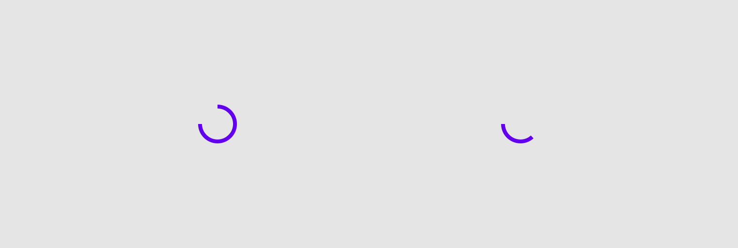
Example of indeterminate progress indicator:
import androidx.wear.compose.material.CircularProgressIndicator CircularProgressIndicator()
| Parameters | |
|---|---|
modifier: Modifier = Modifier |
Modifier to be applied to the CircularProgressIndicator |
startAngle: Float = 270.0f |
The starting position of the progress arc, measured clockwise in degrees (0 to 360) from the 3 o'clock position. For example, 0 and 360 represent 3 o'clock, 90 and 180 represent 6 o'clock and 9 o'clock respectively. Default is 270 degrees (top of the screen) |
indicatorColor: Color = MaterialTheme.colors.onBackground |
The color of the progress indicator bar. |
trackColor: Color = MaterialTheme.colors.onBackground.copy(alpha = 0.3f) |
The color of the background progress track |
strokeWidth: Dp = IndeterminateStrokeWidth |
The stroke width for the progress indicator. |
CircularProgressIndicator
@Composable
fun CircularProgressIndicator(
progress: @FloatRange(from = 0.0, to = 1.0) Float,
modifier: Modifier = Modifier,
startAngle: Float = 270.0f,
endAngle: Float = startAngle,
indicatorColor: Color = MaterialTheme.colors.primary,
trackColor: Color = MaterialTheme.colors.onBackground.copy(alpha = 0.1f),
strokeWidth: Dp = ProgressIndicatorDefaults.StrokeWidth
): Unit
Determinate Material Design circular progress indicator.
Progress indicators express the proportion of completion of an ongoing task.
There is no animation between progress values by default, but progress can be animated with the recommended ProgressIndicatorDefaults.ProgressAnimationSpec, as in the following example:
import androidx.compose.animation.core.animateFloatAsState import androidx.compose.foundation.layout.Column import androidx.compose.foundation.layout.Spacer import androidx.compose.foundation.layout.requiredHeight import androidx.compose.foundation.layout.width import androidx.compose.runtime.getValue import androidx.compose.runtime.mutableStateOf import androidx.compose.runtime.remember import androidx.compose.ui.Alignment import androidx.compose.ui.Modifier import androidx.compose.ui.unit.dp import androidx.wear.compose.material.CircularProgressIndicator import androidx.wear.compose.material.CompactChip import androidx.wear.compose.material.ProgressIndicatorDefaults import androidx.wear.compose.material.Text var progress by remember { mutableStateOf(0.1f) } val animatedProgress by animateFloatAsState( targetValue = progress, animationSpec = ProgressIndicatorDefaults.ProgressAnimationSpec, ) Column(horizontalAlignment = Alignment.CenterHorizontally) { CircularProgressIndicator(progress = animatedProgress) Spacer(Modifier.requiredHeight(10.dp)) CompactChip( modifier = Modifier.width(90.dp), onClick = { if (progress < 1f) progress += 0.1f }, label = { Text("Increase") }, ) }
CircularProgressIndicator supports a gap in the circular track between endAngle and startAngle, which leaves room for other content, such as TimeText at the top of the screen. This sample also shows how to disable accessibility semantics for the fullscreen CircularProgressIndicator:
import androidx.compose.foundation.layout.fillMaxSize import androidx.compose.foundation.layout.padding import androidx.compose.ui.Modifier import androidx.compose.ui.semantics.clearAndSetSemantics import androidx.compose.ui.unit.dp import androidx.wear.compose.material.CircularProgressIndicator import androidx.wear.compose.material.ProgressIndicatorDefaults CircularProgressIndicator( modifier = Modifier.fillMaxSize().padding(all = 1.dp).clearAndSetSemantics {}, startAngle = 295.5f, endAngle = 245.5f, progress = 0.3f, strokeWidth = ProgressIndicatorDefaults.FullScreenStrokeWidth, )
| Parameters | |
|---|---|
progress: @FloatRange(from = 0.0, to = 1.0) Float |
The progress of this progress indicator where 0.0 represents no progress and 1.0 represents completion. Values outside of this range are coerced into the range 0..1. |
modifier: Modifier = Modifier |
Modifier to be applied to the CircularProgressIndicator |
startAngle: Float = 270.0f |
The starting position of the progress arc, measured clockwise in degrees (0 to 360) from the 3 o'clock position. For example, 0 and 360 represent 3 o'clock, 90 and 180 represent 6 o'clock and 9 o'clock respectively. Default is 270 degrees (top of the screen) |
endAngle: Float = startAngle |
The ending position of the progress arc, measured clockwise in degrees (0 to 360) from the 3 o'clock position. For example, 0 and 360 represent 3 o'clock, 90 and 180 represent 6 o'clock and 9 o'clock respectively. By default equal to |
indicatorColor: Color = MaterialTheme.colors.primary |
The color of the progress indicator bar. |
trackColor: Color = MaterialTheme.colors.onBackground.copy(alpha = 0.1f) |
The color of the background progress track. |
strokeWidth: Dp = ProgressIndicatorDefaults.StrokeWidth |
The stroke width for the progress indicator. |
CompactButton
@Composable
fun CompactButton(
onClick: () -> Unit,
modifier: Modifier = Modifier,
enabled: Boolean = true,
colors: ButtonColors = ButtonDefaults.primaryButtonColors(),
backgroundPadding: Dp = ButtonDefaults.CompactButtonBackgroundPadding,
interactionSource: MutableInteractionSource? = null,
shape: Shape = CircleShape,
border: ButtonBorder = ButtonDefaults.buttonBorder(),
content: @Composable BoxScope.() -> Unit
): Unit
Wear Material CompactButton that offers a single slot to take any content (text, icon or image).
The CompactButton has background size ButtonDefaults.ExtraSmallButtonSize. There is an optional transparent padding around the background, defaulted to ButtonDefaults.CompactButtonBackgroundPadding, which increases the clickable area. Icon content should have size ButtonDefaults.SmallIconSize.
The recommended set of ButtonColors styles can be obtained from ButtonDefaults, e.g. ButtonDefaults.primaryButtonColors to get a color scheme for a primary Button which by default will have a solid background of Colors.primary and content color of Colors.onPrimary.
CompactButtons can be enabled or disabled. A disabled button will not respond to click events.
Example usage:
import androidx.compose.foundation.layout.size import androidx.compose.foundation.layout.wrapContentSize import androidx.compose.ui.Alignment import androidx.compose.ui.Modifier import androidx.compose.ui.res.painterResource import androidx.wear.compose.material.Button import androidx.wear.compose.material.ButtonDefaults import androidx.wear.compose.material.CompactButton import androidx.wear.compose.material.Icon CompactButton(onClick = { /* Do something */ }, enabled = true) { Icon( painter = painterResource(id = R.drawable.ic_airplanemode_active_24px), contentDescription = "airplane", modifier = Modifier.size(ButtonDefaults.SmallIconSize) .wrapContentSize(align = Alignment.Center), ) }
For more information, see the Buttons guide.
| Parameters | |
|---|---|
onClick: () -> Unit |
Will be called when the user clicks the button. |
modifier: Modifier = Modifier |
Modifier to be applied to the button. |
enabled: Boolean = true |
Controls the enabled state of the button. When |
colors: ButtonColors = ButtonDefaults.primaryButtonColors() |
|
backgroundPadding: Dp = ButtonDefaults.CompactButtonBackgroundPadding |
Increases the transparent clickable area around the background, defaults to |
interactionSource: MutableInteractionSource? = null |
an optional hoisted |
shape: Shape = CircleShape |
Defines the button's shape. It is strongly recommended to use the default as this shape is a key characteristic of the Wear Material Theme. |
border: ButtonBorder = ButtonDefaults.buttonBorder() |
|
content: @Composable BoxScope.() -> Unit |
The content displayed on the |
CompactChip
@Composable
fun CompactChip(
onClick: () -> Unit,
modifier: Modifier = Modifier,
label: (@Composable RowScope.() -> Unit)? = null,
icon: (@Composable BoxScope.() -> Unit)? = null,
colors: ChipColors = ChipDefaults.primaryChipColors(),
enabled: Boolean = true,
interactionSource: MutableInteractionSource? = null,
contentPadding: PaddingValues = ChipDefaults.CompactChipContentPadding,
shape: Shape = MaterialTheme.shapes.large,
border: ChipBorder = ChipDefaults.chipBorder()
): Unit
A compact Wear Material Chip that offers two slots and a specific layout for an icon and label. Both the icon and label are optional however it is expected that at least one will be provided.
The CompactChip is Stadium shaped and has a max height designed to take no more than one line of text of Typography.caption1 style and/or one icon. The default max height is ChipDefaults.CompactChipHeight. This includes a visible chip height of 32.dp and 8.dp of padding above and below the chip in order to meet accessibility guidelines that request a minimum of 48.dp height and width of tappable area.
If a icon is provided then the labels should be "start" aligned, e.g. left aligned in ltr so that the text starts next to the icon.
The items are laid out as follows.
-
If a label is provided then the chip will be laid out with the optional icon at the start of a row followed by the label with a default max height of
ChipDefaults.CompactChipHeight. -
If only an icon is provided it will be laid out vertically and horizontally centered with a default height of
ChipDefaults.CompactChipHeightand the default width ofChipDefaults.IconOnlyCompactChipWidth
If neither icon nor label is provided then the chip will displayed like an icon only chip but with no contents and ChipColors.background() color.
The CompactChip can have different styles with configurable content colors, background colors including gradients, these are provided by ChipColors implementations.
The recommended set of ChipColors styles can be obtained from ChipDefaults, e.g. ChipDefaults.primaryChipColors to get a color scheme for a primary Chip which by default will have a solid background of Colors.primary and content color of Colors.onPrimary.
Chips can be enabled or disabled. A disabled chip will not respond to click events.
Example of a CompactChip with icon and single line of label text:
import androidx.compose.foundation.layout.size import androidx.compose.ui.Modifier import androidx.compose.ui.res.painterResource import androidx.compose.ui.text.style.TextOverflow import androidx.wear.compose.material.Chip import androidx.wear.compose.material.ChipDefaults import androidx.wear.compose.material.CompactChip import androidx.wear.compose.material.Icon import androidx.wear.compose.material.Text CompactChip( onClick = { /* Do something */ }, enabled = true, // CompactChip label should be no more than 1 line of text label = { Text("Single line label", maxLines = 1, overflow = TextOverflow.Ellipsis) }, icon = { Icon( painter = painterResource(id = R.drawable.ic_airplanemode_active_24px), contentDescription = "airplane", modifier = Modifier.size(ChipDefaults.SmallIconSize), ) }, )
Example of a CompactChip with a label, note that the text is center aligned:
import androidx.compose.foundation.layout.fillMaxWidth import androidx.compose.ui.Modifier import androidx.compose.ui.text.style.TextAlign import androidx.compose.ui.text.style.TextOverflow import androidx.wear.compose.material.Chip import androidx.wear.compose.material.CompactChip import androidx.wear.compose.material.Text CompactChip( onClick = { /* Do something */ }, enabled = true, // CompactChip label should be no more than 1 line of text label = { Text( text = "Single line label", maxLines = 1, overflow = TextOverflow.Ellipsis, textAlign = TextAlign.Center, modifier = Modifier.fillMaxWidth(), ) }, )
Example of a CompactChip with an icon only, note that the recommended icon size is 24x24 when only an icon is displayed:
import androidx.compose.foundation.layout.size import androidx.compose.ui.Modifier import androidx.compose.ui.res.painterResource import androidx.wear.compose.material.Chip import androidx.wear.compose.material.ChipDefaults import androidx.wear.compose.material.CompactChip import androidx.wear.compose.material.Icon CompactChip( onClick = { /* Do something */ }, enabled = true, icon = { Icon( painter = painterResource(id = R.drawable.ic_airplanemode_active_24px), contentDescription = "airplane", modifier = Modifier.size(ChipDefaults.IconSize), ) }, )
For more information, see the Chips guide.
| Parameters | |
|---|---|
onClick: () -> Unit |
Will be called when the user clicks the chip |
modifier: Modifier = Modifier |
Modifier to be applied to the chip |
label: (@Composable RowScope.() -> Unit)? = null |
A slot for providing the chip's main label. The contents are expected to be text which is "start" aligned if there is an icon preset and "center" aligned if not. |
icon: (@Composable BoxScope.() -> Unit)? = null |
A slot for providing the chip's icon. The contents are expected to be a horizontally and vertically aligned icon of size |
colors: ChipColors = ChipDefaults.primaryChipColors() |
|
enabled: Boolean = true |
Controls the enabled state of the chip. When |
interactionSource: MutableInteractionSource? = null |
an optional hoisted |
contentPadding: PaddingValues = ChipDefaults.CompactChipContentPadding |
The spacing values to apply internally between the container and the content |
shape: Shape = MaterialTheme.shapes.large |
Defines the chip's shape. It is strongly recommended to use the default as this shape is a key characteristic of the Wear Material Theme |
border: ChipBorder = ChipDefaults.chipBorder() |
|
HorizontalPageIndicator
@Composable
fun HorizontalPageIndicator(
pageIndicatorState: PageIndicatorState,
modifier: Modifier = Modifier,
indicatorStyle: PageIndicatorStyle = PageIndicatorDefaults.style(),
selectedColor: Color = MaterialTheme.colors.onBackground,
unselectedColor: Color = selectedColor.copy(alpha = 0.3f),
indicatorSize: Dp = 6.dp,
spacing: Dp = 4.dp,
indicatorShape: Shape = CircleShape
): Unit
A horizontal indicator for a Pager, representing the currently active page and total pages drawn using a Shape. It shows up to 6 pages on the screen and doesn't represent the exact page index if there are more than 6 pages. Instead of showing the exact position, HorizontalPageIndicator shows a half-size indicator on the left or on the right if there are more pages.
Here's how different positions 0..10 might be visually represented: "X" is selected item, "O" and "o" full and half size items respectively.
O X O O O o - 2nd position out of 10. There are no more items on the left but more on the right o O O O X o - might be 6, 7 or 8 out of 10, as there are more possible items on the left and on the right o O O O X O - is 9 out of 10, as there're no more items on the right
HorizontalPageIndicator may be linear or curved, depending on indicatorStyle. By default it depends on the screen shape of the device - for circular screens it will be curved, whilst for square screens it will be linear.
This component also allows customising the indicatorShape, which defines how the indicator is visually represented.
import androidx.compose.animation.core.animateFloatAsState import androidx.compose.foundation.layout.Box import androidx.compose.foundation.layout.fillMaxSize import androidx.compose.foundation.layout.padding import androidx.compose.runtime.getValue import androidx.compose.runtime.mutableStateOf import androidx.compose.runtime.remember import androidx.compose.ui.Alignment import androidx.compose.ui.Modifier import androidx.compose.ui.unit.dp import androidx.wear.compose.material.HorizontalPageIndicator import androidx.wear.compose.material.Icon import androidx.wear.compose.material.InlineSlider import androidx.wear.compose.material.InlineSliderDefaults import androidx.wear.compose.material.PageIndicatorState val maxPages = 9 var selectedPage by remember { mutableStateOf(0) } var finalValue by remember { mutableStateOf(0) } val animatedSelectedPage by animateFloatAsState(targetValue = selectedPage.toFloat()) { finalValue = it.toInt() } val pageIndicatorState: PageIndicatorState = remember { object : PageIndicatorState { override val pageOffset: Float get() = animatedSelectedPage - finalValue override val selectedPage: Int get() = finalValue override val pageCount: Int get() = maxPages } } Box(modifier = Modifier.fillMaxSize().padding(6.dp)) { InlineSlider( modifier = Modifier.align(Alignment.Center), value = selectedPage, increaseIcon = { Icon(InlineSliderDefaults.Increase, "Increase") }, decreaseIcon = { Icon(InlineSliderDefaults.Decrease, "Decrease") }, valueProgression = 0 until maxPages, onValueChange = { selectedPage = it }, ) HorizontalPageIndicator(pageIndicatorState = pageIndicatorState) }
| Parameters | |
|---|---|
pageIndicatorState: PageIndicatorState |
The state object of a |
modifier: Modifier = Modifier |
Modifier to be applied to the |
indicatorStyle: PageIndicatorStyle = PageIndicatorDefaults.style() |
The style of |
selectedColor: Color = MaterialTheme.colors.onBackground |
The color of the selected |
unselectedColor: Color = selectedColor.copy(alpha = 0.3f) |
The color of unselected |
indicatorSize: Dp = 6.dp |
The size of each |
spacing: Dp = 4.dp |
The spacing between indicator items in |
indicatorShape: Shape = CircleShape |
The shape of each |
Icon
@Composable
fun Icon(
bitmap: ImageBitmap,
contentDescription: String?,
modifier: Modifier = Modifier,
tint: Color = LocalContentColor.current.copy(alpha = LocalContentAlpha.current)
): Unit
Icon component that draws bitmap using tint, defaulting to LocalContentColor. For a clickable icon, see Chip.
| Parameters | |
|---|---|
bitmap: ImageBitmap |
|
contentDescription: String? |
Text used by accessibility services to describe what this icon represents. This should always be provided unless this icon is used for decorative purposes, and does not represent a meaningful action that a user can take. This text should be localized, such as by using androidx.compose.ui.res.stringResource or similar |
modifier: Modifier = Modifier |
Optional |
tint: Color = LocalContentColor.current.copy(alpha = LocalContentAlpha.current) |
Tint to be applied to |
Icon
@Composable
fun Icon(
imageVector: ImageVector,
contentDescription: String?,
modifier: Modifier = Modifier,
tint: Color = LocalContentColor.current.copy(alpha = LocalContentAlpha.current)
): Unit
Icon component that draws imageVector using tint, defaulting to LocalContentColor. For a clickable icon, see Chip.
| Parameters | |
|---|---|
imageVector: ImageVector |
|
contentDescription: String? |
Text used by accessibility services to describe what this icon represents. This should always be provided unless this icon is used for decorative purposes, and does not represent a meaningful action that a user can take. This text should be localized, such as by using androidx.compose.ui.res.stringResource or similar |
modifier: Modifier = Modifier |
Optional |
tint: Color = LocalContentColor.current.copy(alpha = LocalContentAlpha.current) |
Tint to be applied to |
Icon
@Composable
fun Icon(
painter: Painter,
contentDescription: String?,
modifier: Modifier = Modifier,
tint: Color = LocalContentColor.current.copy(alpha = LocalContentAlpha.current)
): Unit
Icon component that draws a painter using tint, defaulting to LocalContentColor. For a clickable icon, see Chip.
| Parameters | |
|---|---|
painter: Painter |
|
contentDescription: String? |
Text used by accessibility services to describe what this icon represents. This should always be provided unless this icon is used for decorative purposes, and does not represent a meaningful action that a user can take. This text should be localized, such as by using androidx.compose.ui.res.stringResource or similar |
modifier: Modifier = Modifier |
Optional |
tint: Color = LocalContentColor.current.copy(alpha = LocalContentAlpha.current) |
Tint to be applied to |
InlineSlider
@Composable
fun InlineSlider(
value: Int,
onValueChange: (Int) -> Unit,
valueProgression: IntProgression,
decreaseIcon: @Composable () -> Unit,
increaseIcon: @Composable () -> Unit,
modifier: Modifier = Modifier,
enabled: Boolean = true,
segmented: Boolean = valueProgression.stepsNumber() <= 8,
colors: InlineSliderColors = InlineSliderDefaults.colors()
): Unit
InlineSlider allows users to make a selection from a range of values. The range of selections is shown as a bar between the minimum and maximum values of the range, from which users may select a single value. InlineSlider is ideal for adjusting settings such as volume or brightness.
Value can be increased and decreased by clicking on the increase and decrease buttons, located accordingly to the start and end of the control. Buttons can have custom icons - decreaseIcon and increaseIcon.
The bar in the middle of control can have separators if segmented flag is set to true. A number of steps is calculated as the difference between max and min values of valueProgression divided by valueProgression.step - 1. For example, with a range of 100..120 and a step 5, number of steps will be (120-100)/ 5 - 1 = 3. Steps are 100(first), 105, 110, 115, 120(last)
If valueProgression range is not equally divisible by valueProgression.step, then valueProgression.last will be adjusted to the closest divisible value in the range. For example, 1..13 range and a step = 5, steps will be 1(first) , 6 , 11(last)
A continuous non-segmented slider sample:
import androidx.compose.runtime.mutableStateOf import androidx.compose.runtime.remember import androidx.wear.compose.material.Icon import androidx.wear.compose.material.InlineSlider import androidx.wear.compose.material.InlineSliderDefaults var value by remember { mutableStateOf(4) } InlineSlider( value = value, onValueChange = { value = it }, increaseIcon = { Icon(InlineSliderDefaults.Increase, "Increase") }, decreaseIcon = { Icon(InlineSliderDefaults.Decrease, "Decrease") }, valueProgression = 0..10, segmented = false, )
A segmented slider sample:
import androidx.compose.runtime.mutableStateOf import androidx.compose.runtime.remember import androidx.wear.compose.material.Icon import androidx.wear.compose.material.InlineSlider import androidx.wear.compose.material.InlineSliderDefaults var value by remember { mutableStateOf(2f) } InlineSlider( value = value, onValueChange = { value = it }, increaseIcon = { Icon(InlineSliderDefaults.Increase, "Increase") }, decreaseIcon = { Icon(InlineSliderDefaults.Decrease, "Decrease") }, valueRange = 1f..4f, steps = 7, segmented = true, )
| Parameters | |
|---|---|
value: Int |
Current value of the Slider. If outside of |
onValueChange: (Int) -> Unit |
Lambda in which value should be updated |
valueProgression: IntProgression |
Progression of values that Slider value can take. Consists of rangeStart, rangeEnd and step. Range will be equally divided by step size |
decreaseIcon: @Composable () -> Unit |
A slot for an icon which is placed on the decrease (start) button |
increaseIcon: @Composable () -> Unit |
A slot for an icon which is placed on the increase (end) button |
modifier: Modifier = Modifier |
Modifiers for the Slider layout |
enabled: Boolean = true |
Controls the enabled state of the slider. When |
segmented: Boolean = valueProgression.stepsNumber() <= 8 |
A boolean value which specifies whether a bar will be split into segments or not. Recommendation is while using this flag do not have more than 8 steps as it might affect user experience. By default true if number of steps is <=8. |
colors: InlineSliderColors = InlineSliderDefaults.colors() |
|
InlineSlider
@Composable
fun InlineSlider(
value: Float,
onValueChange: (Float) -> Unit,
steps: Int,
decreaseIcon: @Composable () -> Unit,
increaseIcon: @Composable () -> Unit,
modifier: Modifier = Modifier,
enabled: Boolean = true,
valueRange: ClosedFloatingPointRange<Float> = 0f..(steps + 1).toFloat(),
segmented: Boolean = steps <= 8,
colors: InlineSliderColors = InlineSliderDefaults.colors()
): Unit
InlineSlider allows users to make a selection from a range of values. The range of selections is shown as a bar between the minimum and maximum values of the range, from which users may select a single value. InlineSlider is ideal for adjusting settings such as volume or brightness.
Value can be increased and decreased by clicking on the increase and decrease buttons, located accordingly to the start and end of the control. Buttons can have custom icons - decreaseIcon and increaseIcon.
The bar in the middle of control can have separators if segmented flag is set to true. A single step value is calculated as the difference between min and max values of valueRange divided by steps + 1 value.
A continuous non-segmented slider sample:
import androidx.compose.runtime.mutableStateOf import androidx.compose.runtime.remember import androidx.wear.compose.material.Icon import androidx.wear.compose.material.InlineSlider import androidx.wear.compose.material.InlineSliderDefaults var value by remember { mutableStateOf(4.5f) } InlineSlider( value = value, onValueChange = { value = it }, increaseIcon = { Icon(InlineSliderDefaults.Increase, "Increase") }, decreaseIcon = { Icon(InlineSliderDefaults.Decrease, "Decrease") }, valueRange = 3f..6f, steps = 5, segmented = false, )
A segmented slider sample:
import androidx.compose.runtime.mutableStateOf import androidx.compose.runtime.remember import androidx.wear.compose.material.Icon import androidx.wear.compose.material.InlineSlider import androidx.wear.compose.material.InlineSliderDefaults var value by remember { mutableStateOf(2f) } InlineSlider( value = value, onValueChange = { value = it }, increaseIcon = { Icon(InlineSliderDefaults.Increase, "Increase") }, decreaseIcon = { Icon(InlineSliderDefaults.Decrease, "Decrease") }, valueRange = 1f..4f, steps = 7, segmented = true, )
| Parameters | |
|---|---|
value: Float |
Current value of the Slider. If outside of |
onValueChange: (Float) -> Unit |
Lambda in which value should be updated |
steps: Int |
Specifies the number of discrete values, excluding min and max values, evenly distributed across the whole value range. Must not be negative. If 0, slider will have only min and max values and no steps in between |
decreaseIcon: @Composable () -> Unit |
A slot for an icon which is placed on the decrease (start) button |
increaseIcon: @Composable () -> Unit |
A slot for an icon which is placed on the increase (end) button |
modifier: Modifier = Modifier |
Modifiers for the Slider layout |
enabled: Boolean = true |
Controls the enabled state of the slider. When |
valueRange: ClosedFloatingPointRange<Float> = 0f..(steps + 1).toFloat() |
Range of values that Slider value can take. Passed |
segmented: Boolean = steps <= 8 |
A boolean value which specifies whether a bar will be split into segments or not. Recommendation is while using this flag do not have more than 8 |
colors: InlineSliderColors = InlineSliderDefaults.colors() |
|
ListHeader
@Composable
fun ListHeader(
modifier: Modifier = Modifier,
backgroundColor: Color = Color.Transparent,
contentColor: Color = MaterialTheme.colors.onSurfaceVariant,
content: @Composable RowScope.() -> Unit
): Unit
A slot based composable for creating a list header item. List header items are typically expected to be text. The contents provided will have text and colors effects applied based on the MaterialTheme. The contents will be start and end padded and should cover up to 3 lines of text.
Example usage:
import androidx.compose.foundation.layout.fillMaxWidth import androidx.compose.ui.Modifier import androidx.wear.compose.foundation.lazy.ScalingLazyColumn import androidx.wear.compose.material.Chip import androidx.wear.compose.material.ChipDefaults import androidx.wear.compose.material.ListHeader import androidx.wear.compose.material.Text ScalingLazyColumn(modifier = Modifier.fillMaxWidth()) { item { ListHeader { Text("Header1") } } items(5) { Chip( onClick = {}, label = { Text("List item $it") }, colors = ChipDefaults.secondaryChipColors(), ) } item { ListHeader { Text("Header2") } } items(5) { Chip( onClick = {}, label = { Text("List item ${it + 5}") }, colors = ChipDefaults.secondaryChipColors(), ) } }
| Parameters | |
|---|---|
modifier: Modifier = Modifier |
The modifier for the list header |
backgroundColor: Color = Color.Transparent |
The background color to apply - typically Color.Transparent |
contentColor: Color = MaterialTheme.colors.onSurfaceVariant |
The color to apply to content |
content: @Composable RowScope.() -> Unit |
Slot for displayed header text |
MaterialTheme
@Composable
fun MaterialTheme(
colors: Colors = MaterialTheme.colors,
typography: Typography = MaterialTheme.typography,
shapes: Shapes = MaterialTheme.shapes,
content: @Composable () -> Unit
): Unit
MaterialTheme defines the styling principles from the WearOS Material design specification which extends the Material design specification.
Wear Material components from package/sub-packages in androidx.wear.compose.material use values provided here when retrieving default values.
It defines colors as specified in the Wear Material Color theme spec, typography defined in the Wear Material Type Scale spec, and shapes defined in the Wear Shape scheme.
All values may be set by providing this component with the colors, typography, and shapes attributes. Use this to configure the overall theme of elements within this MaterialTheme.
Any values that are not set will inherit the current value from the theme, falling back to the defaults if there is no parent MaterialTheme. This allows using a MaterialTheme at the top of your application, and then separate MaterialTheme(s) for different screens / parts of your UI, overriding only the parts of the theme definition that need to change.
For more information, see the Theming guide.
| Parameters | |
|---|---|
colors: Colors = MaterialTheme.colors |
A complete definition of the Wear Material Color theme for this hierarchy |
typography: Typography = MaterialTheme.typography |
A set of text styles to be used as this hierarchy's typography system |
shapes: Shapes = MaterialTheme.shapes |
A set of shapes to be used by the components in this hierarchy |
content: @Composable () -> Unit |
Slot for composable content displayed with this theme |
OutlinedButton
@Composable
fun OutlinedButton(
onClick: () -> Unit,
modifier: Modifier = Modifier,
enabled: Boolean = true,
colors: ButtonColors = ButtonDefaults.outlinedButtonColors(),
interactionSource: MutableInteractionSource? = null,
shape: Shape = CircleShape,
border: ButtonBorder = ButtonDefaults.outlinedButtonBorder(),
content: @Composable BoxScope.() -> Unit
): Unit
Wear Material OutlinedButton that offers a single slot to take any content (text, icon or image).
The recommended Button sizes can be obtained from ButtonDefaults - see ButtonDefaults.DefaultButtonSize, ButtonDefaults.LargeButtonSize, ButtonDefaults.SmallButtonSize. Icon content should be of size ButtonDefaults.DefaultIconSize, ButtonDefaults.LargeIconSize or ButtonDefaults.SmallIconSize respectively.
Buttons can be enabled or disabled. A disabled button will not respond to click events.
An OutlinedButton has a transparent background and a thin border by default with content taking the theme primary color.
Example of a OutlinedButton displaying an icon:
import androidx.compose.foundation.layout.size import androidx.compose.foundation.layout.wrapContentSize import androidx.compose.ui.Alignment import androidx.compose.ui.Modifier import androidx.compose.ui.res.painterResource import androidx.wear.compose.material.Button import androidx.wear.compose.material.ButtonDefaults import androidx.wear.compose.material.Icon import androidx.wear.compose.material.OutlinedButton OutlinedButton(onClick = { /* Do something */ }, enabled = true) { Icon( painter = painterResource(id = R.drawable.ic_airplanemode_active_24px), contentDescription = "airplane", modifier = Modifier.size(ButtonDefaults.DefaultIconSize) .wrapContentSize(align = Alignment.Center), ) }
For more information, see the Buttons guide.
| Parameters | |
|---|---|
onClick: () -> Unit |
Will be called when the user clicks the button. |
modifier: Modifier = Modifier |
Modifier to be applied to the button. |
enabled: Boolean = true |
Controls the enabled state of the button. When |
colors: ButtonColors = ButtonDefaults.outlinedButtonColors() |
|
interactionSource: MutableInteractionSource? = null |
an optional hoisted |
shape: Shape = CircleShape |
Defines the button's shape. It is strongly recommended to use the default as this shape is a key characteristic of the Wear Material Theme. |
border: ButtonBorder = ButtonDefaults.outlinedButtonBorder() |
|
content: @Composable BoxScope.() -> Unit |
The content displayed on the |
OutlinedChip
@Composable
fun OutlinedChip(
label: @Composable RowScope.() -> Unit,
onClick: () -> Unit,
modifier: Modifier = Modifier,
secondaryLabel: (@Composable RowScope.() -> Unit)? = null,
icon: (@Composable BoxScope.() -> Unit)? = null,
colors: ChipColors = ChipDefaults.outlinedChipColors(),
enabled: Boolean = true,
interactionSource: MutableInteractionSource? = null,
contentPadding: PaddingValues = ChipDefaults.ContentPadding,
shape: Shape = MaterialTheme.shapes.large,
border: ChipBorder = ChipDefaults.outlinedChipBorder()
): Unit
Wear Material OutlinedChip that offers three slots and a specific layout for an icon, label and secondaryLabel. The icon and secondaryLabel are optional. The items are laid out with the icon, if provided, at the start of a row, with a column next containing the two label slots.
The OutlinedChip is Stadium shaped and has a max height designed to take no more than two lines of text of Typography.button style. If no secondary label is provided then the label can be two lines of text. The label and secondary label should be consistently aligned. With localisation and/or large font sizes, the OutlinedChip height adjusts to accommodate the contents.
If a icon is provided then the labels should be "start" aligned, e.g. left aligned in ltr so that the text starts next to the icon.
the OutlinedChip has a transparent background, a thin border and contents which are colored with the theme primary color. Colors can be obtained and customized using ChipDefaults.outlinedChipColors().
Chips can be enabled or disabled. A disabled chip will not respond to click events.
Example of a OutlinedChip with icon and a label only with longer text:
import androidx.compose.foundation.layout.size import androidx.compose.foundation.layout.wrapContentSize import androidx.compose.ui.Alignment import androidx.compose.ui.Modifier import androidx.compose.ui.res.painterResource import androidx.compose.ui.text.style.TextOverflow import androidx.wear.compose.material.Chip import androidx.wear.compose.material.ChipDefaults import androidx.wear.compose.material.Icon import androidx.wear.compose.material.OutlinedChip import androidx.wear.compose.material.Text OutlinedChip( onClick = { /* Do something */ }, enabled = true, // Primary label can have up to 3 lines of text label = { Text( text = "Main label can span up to 3 lines", maxLines = 3, overflow = TextOverflow.Ellipsis, ) }, icon = { Icon( painter = painterResource(id = R.drawable.ic_airplanemode_active_24px), contentDescription = "airplane", modifier = Modifier.size(ChipDefaults.IconSize).wrapContentSize(align = Alignment.Center), ) }, )
For more information, see the Chips guide.
| Parameters | |
|---|---|
label: @Composable RowScope.() -> Unit |
A slot for providing the chip's main label. The contents are expected to be text which is "start" aligned if there is an icon preset and "start" or "center" aligned if not. |
onClick: () -> Unit |
Will be called when the user clicks the chip |
modifier: Modifier = Modifier |
Modifier to be applied to the chip |
secondaryLabel: (@Composable RowScope.() -> Unit)? = null |
A slot for providing the chip's secondary label. The contents are expected to be text which is "start" aligned if there is an icon preset and "start" or "center" aligned if not. label and secondaryLabel contents should be consistently aligned. |
icon: (@Composable BoxScope.() -> Unit)? = null |
A slot for providing the chip's icon. The contents are expected to be a horizontally and vertically aligned icon of size |
colors: ChipColors = ChipDefaults.outlinedChipColors() |
|
enabled: Boolean = true |
Controls the enabled state of the chip. When |
interactionSource: MutableInteractionSource? = null |
an optional hoisted |
contentPadding: PaddingValues = ChipDefaults.ContentPadding |
The spacing values to apply internally between the container and the content |
shape: Shape = MaterialTheme.shapes.large |
Defines the chip's shape. It is strongly recommended to use the default as this shape is a key characteristic of the Wear Material Theme |
border: ChipBorder = ChipDefaults.outlinedChipBorder() |
|
OutlinedCompactButton
@Composable
fun OutlinedCompactButton(
onClick: () -> Unit,
modifier: Modifier = Modifier,
enabled: Boolean = true,
colors: ButtonColors = ButtonDefaults.outlinedButtonColors(),
backgroundPadding: Dp = ButtonDefaults.CompactButtonBackgroundPadding,
interactionSource: MutableInteractionSource? = null,
shape: Shape = CircleShape,
border: ButtonBorder = ButtonDefaults.outlinedButtonBorder(),
content: @Composable BoxScope.() -> Unit
): Unit
Wear Material OutlinedCompactButton that offers a single slot to take any content (text, icon or image).
The OutlinedCompactButton has background size ButtonDefaults.ExtraSmallButtonSize. There is an transparent padding around the background, defaulted to ButtonDefaults.CompactButtonBackgroundPadding, which increases the clickable area. Icon content should have size ButtonDefaults.SmallIconSize.
An OutlinedCompactButton has a transparent background and a thin border by default with content taking the theme primary color.
OutlinedCompactButtons can be enabled or disabled. A disabled button will not respond to click events.
Example usage:
import androidx.compose.foundation.layout.size import androidx.compose.foundation.layout.wrapContentSize import androidx.compose.ui.Alignment import androidx.compose.ui.Modifier import androidx.compose.ui.res.painterResource import androidx.wear.compose.material.Button import androidx.wear.compose.material.ButtonDefaults import androidx.wear.compose.material.CompactButton import androidx.wear.compose.material.Icon import androidx.wear.compose.material.OutlinedCompactButton OutlinedCompactButton(onClick = { /* Do something */ }, enabled = true) { Icon( painter = painterResource(id = R.drawable.ic_airplanemode_active_24px), contentDescription = "airplane", modifier = Modifier.size(ButtonDefaults.SmallIconSize) .wrapContentSize(align = Alignment.Center), ) }
For more information, see the Buttons guide.
| Parameters | |
|---|---|
onClick: () -> Unit |
Will be called when the user clicks the button. |
modifier: Modifier = Modifier |
Modifier to be applied to the button. |
enabled: Boolean = true |
Controls the enabled state of the button. When |
colors: ButtonColors = ButtonDefaults.outlinedButtonColors() |
|
backgroundPadding: Dp = ButtonDefaults.CompactButtonBackgroundPadding |
Increases the transparent clickable area around the background, defaults to |
interactionSource: MutableInteractionSource? = null |
an optional hoisted |
shape: Shape = CircleShape |
Defines the button's shape. It is strongly recommended to use the default as this shape is a key characteristic of the Wear Material Theme. |
border: ButtonBorder = ButtonDefaults.outlinedButtonBorder() |
|
content: @Composable BoxScope.() -> Unit |
The content displayed on the |
OutlinedCompactChip
@Composable
fun OutlinedCompactChip(
onClick: () -> Unit,
modifier: Modifier = Modifier,
label: (@Composable RowScope.() -> Unit)? = null,
icon: (@Composable BoxScope.() -> Unit)? = null,
colors: ChipColors = ChipDefaults.outlinedChipColors(),
enabled: Boolean = true,
interactionSource: MutableInteractionSource? = null,
contentPadding: PaddingValues = ChipDefaults.CompactChipContentPadding,
shape: Shape = MaterialTheme.shapes.large,
border: ChipBorder = ChipDefaults.outlinedChipBorder()
): Unit
A compact Outlined Wear Material Chip that offers two slots and a specific layout for an icon and label. Both the icon and label are optional however it is expected that at least one will be provided.
The CompactChip is Stadium shaped and has a max height designed to take no more than one line of text of Typography.caption1 style and/or one icon. The default max height is ChipDefaults.CompactChipHeight. This includes a visible chip height of 32.dp and 8.dp of padding above and below the chip in order to meet accessibility guidelines that request a minimum of 48.dp height and width of tappable area.
If a icon is provided then the labels should be "start" aligned, e.g. left aligned in ltr so that the text starts next to the icon.
The items are laid out as follows.
-
If a label is provided then the chip will be laid out with the optional icon at the start of a row followed by the label with a default max height of
ChipDefaults.CompactChipHeight. -
If only an icon is provided it will be laid out vertically and horizontally centered with a default height of
ChipDefaults.CompactChipHeightand the default width ofChipDefaults.IconOnlyCompactChipWidth
If neither icon nor label is provided then the chip will displayed like an icon only chip but with no contents and ChipColors.background() color.
the OutlinedCompactChip has a transparent background, a thin border and contents which are colored with the theme primary color. Colors can be obtained and customized using ChipDefaults.outlinedChipColors().
Chips can be enabled or disabled. A disabled chip will not respond to click events.
Example of a OutlinedCompactChip with icon and single line of label text:
import androidx.compose.foundation.layout.size import androidx.compose.ui.Modifier import androidx.compose.ui.res.painterResource import androidx.compose.ui.text.style.TextOverflow import androidx.wear.compose.material.Chip import androidx.wear.compose.material.ChipDefaults import androidx.wear.compose.material.CompactChip import androidx.wear.compose.material.Icon import androidx.wear.compose.material.OutlinedCompactChip import androidx.wear.compose.material.Text OutlinedCompactChip( onClick = { /* Do something */ }, enabled = true, // CompactChip label should be no more than 1 line of text label = { Text("Single line label", maxLines = 1, overflow = TextOverflow.Ellipsis) }, icon = { Icon( painter = painterResource(id = R.drawable.ic_airplanemode_active_24px), contentDescription = "airplane", modifier = Modifier.size(ChipDefaults.SmallIconSize), ) }, )
For more information, see the Chips guide.
| Parameters | |
|---|---|
onClick: () -> Unit |
Will be called when the user clicks the chip |
modifier: Modifier = Modifier |
Modifier to be applied to the chip |
label: (@Composable RowScope.() -> Unit)? = null |
A slot for providing the chip's main label. The contents are expected to be text which is "start" aligned if there is an icon preset and "center" aligned if not. |
icon: (@Composable BoxScope.() -> Unit)? = null |
A slot for providing the chip's icon. The contents are expected to be a horizontally and vertically aligned icon of size |
colors: ChipColors = ChipDefaults.outlinedChipColors() |
|
enabled: Boolean = true |
Controls the enabled state of the chip. When |
interactionSource: MutableInteractionSource? = null |
an optional hoisted |
contentPadding: PaddingValues = ChipDefaults.CompactChipContentPadding |
The spacing values to apply internally between the container and the content |
shape: Shape = MaterialTheme.shapes.large |
Defines the chip's shape. It is strongly recommended to use the default as this shape is a key characteristic of the Wear Material Theme |
border: ChipBorder = ChipDefaults.outlinedChipBorder() |
|
Picker
@Composable
funPicker(
state: PickerState,
modifier: Modifier = Modifier,
readOnly: Boolean = false,
readOnlyLabel: (@Composable BoxScope.() -> Unit)? = null,
scalingParams: ScalingParams = PickerDefaults.scalingParams(),
separation: Dp = 0.dp,
gradientRatio: @FloatRange(from = 0.0, to = 0.5) Float = PickerDefaults.DefaultGradientRatio,
gradientColor: Color = MaterialTheme.colors.background,
flingBehavior: FlingBehavior = PickerDefaults.flingBehavior(state),
option: @Composable PickerScope.(optionIndex: Int) -> Unit
): Unit
A scrollable list of items to pick from. By default, items will be repeated "infinitely" in both directions, unless PickerState#repeatItems is specified as false.
Example of a simple picker to select one of five options:
import androidx.compose.foundation.layout.Box import androidx.compose.foundation.layout.fillMaxSize import androidx.compose.foundation.layout.padding import androidx.compose.foundation.layout.size import androidx.compose.runtime.derivedStateOf import androidx.compose.runtime.remember import androidx.compose.ui.Alignment import androidx.compose.ui.Modifier import androidx.compose.ui.unit.dp import androidx.wear.compose.material.Picker import androidx.wear.compose.material.Text import androidx.wear.compose.material.rememberPickerState val items = listOf("One", "Two", "Three", "Four", "Five") val state = rememberPickerState(items.size) val contentDescription by remember { derivedStateOf { "${state.selectedOption + 1}" } } Box(modifier = Modifier.fillMaxSize(), contentAlignment = Alignment.Center) { Text( modifier = Modifier.align(Alignment.TopCenter).padding(top = 10.dp), text = "Selected: ${items[state.selectedOption]}", ) Picker( modifier = Modifier.size(100.dp, 100.dp), state = state, contentDescription = contentDescription, ) { Text(items[it]) } }
Example of dual pickers, where clicking switches which one is editable and which is read-only:
import androidx.compose.foundation.layout.Arrangement import androidx.compose.foundation.layout.Box import androidx.compose.foundation.layout.Row import androidx.compose.foundation.layout.Spacer import androidx.compose.foundation.layout.fillMaxSize import androidx.compose.foundation.layout.size import androidx.compose.foundation.layout.width import androidx.compose.foundation.layout.wrapContentSize import androidx.compose.runtime.Composable import androidx.compose.runtime.derivedStateOf import androidx.compose.runtime.mutableStateOf import androidx.compose.runtime.remember import androidx.compose.ui.Alignment import androidx.compose.ui.Modifier import androidx.compose.ui.input.pointer.pointerInteropFilter import androidx.compose.ui.unit.dp import androidx.wear.compose.material.MaterialTheme import androidx.wear.compose.material.Picker import androidx.wear.compose.material.Text import androidx.wear.compose.material.rememberPickerState var selectedColumn by remember { mutableStateOf(0) } val textStyle = MaterialTheme.typography.display1 @Composable fun Option(column: Int, text: String) = Box(modifier = Modifier.fillMaxSize()) { Text( text = text, style = textStyle, color = if (selectedColumn == column) MaterialTheme.colors.secondary else MaterialTheme.colors.onBackground, modifier = Modifier.align(Alignment.Center).wrapContentSize().pointerInteropFilter { if (it.action == MotionEvent.ACTION_DOWN) selectedColumn = column true }, ) } Row( modifier = Modifier.fillMaxSize(), verticalAlignment = Alignment.CenterVertically, horizontalArrangement = Arrangement.Center, ) { val hourState = rememberPickerState(initialNumberOfOptions = 12, initiallySelectedOption = 5) val hourContentDescription by remember { derivedStateOf { "${hourState.selectedOption + 1 } hours" } } Picker( readOnly = selectedColumn != 0, state = hourState, modifier = Modifier.size(64.dp, 100.dp), contentDescription = hourContentDescription, option = { hour: Int -> Option(0, "%2d".format(hour + 1)) }, ) Spacer(Modifier.width(8.dp)) Text(text = ":", style = textStyle, color = MaterialTheme.colors.onBackground) Spacer(Modifier.width(8.dp)) val minuteState = rememberPickerState(initialNumberOfOptions = 60, initiallySelectedOption = 0) val minuteContentDescription by remember { derivedStateOf { "${minuteState.selectedOption} minutes" } } Picker( readOnly = selectedColumn != 1, state = minuteState, modifier = Modifier.size(64.dp, 100.dp), contentDescription = minuteContentDescription, option = { minute: Int -> Option(1, "%02d".format(minute)) }, ) }
| Parameters | |
|---|---|
state: PickerState |
The state of the component |
modifier: Modifier = Modifier |
Modifier to be applied to the Picker |
readOnly: Boolean = false |
Determines whether the Picker should display other available options for this field, inviting the user to scroll to change the value. When readOnly = true, only displays the currently selected option (and optionally a label). This is intended to be used for screens that display multiple Pickers, only one of which has the focus at a time. |
readOnlyLabel: (@Composable BoxScope.() -> Unit)? = null |
A slot for providing a label, displayed above the selected option when the |
scalingParams: ScalingParams = PickerDefaults.scalingParams() |
The parameters to configure the scaling and transparency effects for the component. See |
separation: Dp = 0.dp |
The amount of separation in |
gradientRatio: @FloatRange(from = 0.0, to = 0.5) Float = PickerDefaults.DefaultGradientRatio |
The size relative to the Picker height that the top and bottom gradients take. These gradients blur the picker content on the top and bottom. The default is 0.33, so the top 1/3 and the bottom 1/3 of the picker are taken by gradients. Should be between 0.0 and 0.5. Use 0.0 to disable the gradient. |
gradientColor: Color = MaterialTheme.colors.background |
Should be the color outside of the Picker, so there is continuity. |
flingBehavior: FlingBehavior = PickerDefaults.flingBehavior(state) |
logic describing fling behavior. |
option: @Composable PickerScope.(optionIndex: Int) -> Unit |
A block which describes the content. Inside this block you can reference |
Picker
@Composable
fun Picker(
state: PickerState,
contentDescription: String?,
modifier: Modifier = Modifier,
readOnly: Boolean = false,
readOnlyLabel: (@Composable BoxScope.() -> Unit)? = null,
onSelected: () -> Unit = {},
scalingParams: ScalingParams = PickerDefaults.defaultScalingParams(),
separation: Dp = 0.dp,
gradientRatio: @FloatRange(from = 0.0, to = 0.5) Float = PickerDefaults.DefaultGradientRatio,
gradientColor: Color = MaterialTheme.colors.background,
flingBehavior: FlingBehavior = PickerDefaults.flingBehavior(state),
userScrollEnabled: Boolean = true,
rotaryScrollableBehavior: RotaryScrollableBehavior? = RotaryScrollableDefaults.snapBehavior(state, state.toRotarySnapLayoutInfoProvider()),
option: @Composable PickerScope.(optionIndex: Int) -> Unit
): Unit
A scrollable list of items to pick from. By default, items will be repeated "infinitely" in both directions, unless PickerState#repeatItems is specified as false.
This overload supports rotary input. Rotary input allows users to scroll the content of the Picker - by using a crown or a rotating bezel on their Wear OS device. It can be modified with rotaryScrollableBehavior param. Note that rotary scroll and touch scroll should be aligned. If rotaryScrollableBehavior is set for snap (using RotaryScrollableDefaults.snapBehavior), flingBehavior should be set for snap as well (using PickerDefaults.flingBehavior).
Example of a simple picker to select one of five options:
import androidx.compose.foundation.layout.Box import androidx.compose.foundation.layout.fillMaxSize import androidx.compose.foundation.layout.padding import androidx.compose.foundation.layout.size import androidx.compose.runtime.derivedStateOf import androidx.compose.runtime.remember import androidx.compose.ui.Alignment import androidx.compose.ui.Modifier import androidx.compose.ui.unit.dp import androidx.wear.compose.material.Picker import androidx.wear.compose.material.Text import androidx.wear.compose.material.rememberPickerState val items = listOf("One", "Two", "Three", "Four", "Five") val state = rememberPickerState(items.size) val contentDescription by remember { derivedStateOf { "${state.selectedOption + 1}" } } Box(modifier = Modifier.fillMaxSize(), contentAlignment = Alignment.Center) { Text( modifier = Modifier.align(Alignment.TopCenter).padding(top = 10.dp), text = "Selected: ${items[state.selectedOption]}", ) Picker( modifier = Modifier.size(100.dp, 100.dp), state = state, contentDescription = contentDescription, ) { Text(items[it]) } }
Example of dual pickers, where clicking switches which one is editable and which is read-only:
import androidx.compose.foundation.layout.Arrangement import androidx.compose.foundation.layout.Box import androidx.compose.foundation.layout.Row import androidx.compose.foundation.layout.Spacer import androidx.compose.foundation.layout.fillMaxSize import androidx.compose.foundation.layout.size import androidx.compose.foundation.layout.width import androidx.compose.foundation.layout.wrapContentSize import androidx.compose.runtime.Composable import androidx.compose.runtime.derivedStateOf import androidx.compose.runtime.mutableStateOf import androidx.compose.runtime.remember import androidx.compose.ui.Alignment import androidx.compose.ui.Modifier import androidx.compose.ui.input.pointer.pointerInteropFilter import androidx.compose.ui.unit.dp import androidx.wear.compose.material.MaterialTheme import androidx.wear.compose.material.Picker import androidx.wear.compose.material.Text import androidx.wear.compose.material.rememberPickerState var selectedColumn by remember { mutableStateOf(0) } val textStyle = MaterialTheme.typography.display1 @Composable fun Option(column: Int, text: String) = Box(modifier = Modifier.fillMaxSize()) { Text( text = text, style = textStyle, color = if (selectedColumn == column) MaterialTheme.colors.secondary else MaterialTheme.colors.onBackground, modifier = Modifier.align(Alignment.Center).wrapContentSize().pointerInteropFilter { if (it.action == MotionEvent.ACTION_DOWN) selectedColumn = column true }, ) } Row( modifier = Modifier.fillMaxSize(), verticalAlignment = Alignment.CenterVertically, horizontalArrangement = Arrangement.Center, ) { val hourState = rememberPickerState(initialNumberOfOptions = 12, initiallySelectedOption = 5) val hourContentDescription by remember { derivedStateOf { "${hourState.selectedOption + 1 } hours" } } Picker( readOnly = selectedColumn != 0, state = hourState, modifier = Modifier.size(64.dp, 100.dp), contentDescription = hourContentDescription, option = { hour: Int -> Option(0, "%2d".format(hour + 1)) }, ) Spacer(Modifier.width(8.dp)) Text(text = ":", style = textStyle, color = MaterialTheme.colors.onBackground) Spacer(Modifier.width(8.dp)) val minuteState = rememberPickerState(initialNumberOfOptions = 60, initiallySelectedOption = 0) val minuteContentDescription by remember { derivedStateOf { "${minuteState.selectedOption} minutes" } } Picker( readOnly = selectedColumn != 1, state = minuteState, modifier = Modifier.size(64.dp, 100.dp), contentDescription = minuteContentDescription, option = { minute: Int -> Option(1, "%02d".format(minute)) }, ) }
| Parameters | |
|---|---|
state: PickerState |
The state of the component |
contentDescription: String? |
Text used by accessibility services to describe what the selected option represents. This text should be localized, such as by using androidx.compose.ui.res.stringResource or similar. Typically, the content description is inferred via derivedStateOf to avoid unnecessary recompositions, like this: val description by remember { derivedStateOf { /* expression using state.selectedOption */ } } |
modifier: Modifier = Modifier |
Modifier to be applied to the Picker |
readOnly: Boolean = false |
Determines whether the Picker should display other available options for this field, inviting the user to scroll to change the value. When readOnly = true, only displays the currently selected option (and optionally a label). This is intended to be used for screens that display multiple Pickers, only one of which has the focus at a time. |
readOnlyLabel: (@Composable BoxScope.() -> Unit)? = null |
A slot for providing a label, displayed above the selected option when the |
onSelected: () -> Unit = {} |
Action triggered when the Picker is selected by clicking. Used by accessibility semantics, which facilitates implementation of multi-picker screens. |
scalingParams: ScalingParams = PickerDefaults.defaultScalingParams() |
The parameters to configure the scaling and transparency effects for the component. See |
separation: Dp = 0.dp |
The amount of separation in |
gradientRatio: @FloatRange(from = 0.0, to = 0.5) Float = PickerDefaults.DefaultGradientRatio |
The size relative to the Picker height that the top and bottom gradients take. These gradients blur the picker content on the top and bottom. The default is 0.33, so the top 1/3 and the bottom 1/3 of the picker are taken by gradients. Should be between 0.0 and 0.5. Use 0.0 to disable the gradient. |
gradientColor: Color = MaterialTheme.colors.background |
Should be the color outside of the Picker, so there is continuity. |
flingBehavior: FlingBehavior = PickerDefaults.flingBehavior(state) |
logic describing fling behavior. Note that when configuring fling or snap behavior, this flingBehavior parameter and the |
userScrollEnabled: Boolean = true |
Determines whether the picker should be scrollable or not. When userScrollEnabled = true, picker is scrollable. This is different from |
rotaryScrollableBehavior: RotaryScrollableBehavior? = RotaryScrollableDefaults.snapBehavior(state, state.toRotarySnapLayoutInfoProvider()) |
Parameter for changing rotary behavior. Supports scroll |
option: @Composable PickerScope.(optionIndex: Int) -> Unit |
A block which describes the content. Inside this block you can reference |
PickerGroup
@Composable
fun PickerGroup(
vararg pickers: PickerGroupItem,
modifier: Modifier = Modifier,
pickerGroupState: PickerGroupState = rememberPickerGroupState(),
onSelected: (selectedIndex: Int) -> Unit = {},
autoCenter: Boolean = true,
propagateMinConstraints: Boolean = false,
touchExplorationStateProvider: TouchExplorationStateProvider = DefaultTouchExplorationStateProvider(),
separator: (@Composable (Int) -> Unit)? = null
): Unit
A group of Pickers to build components where multiple pickers are required to be combined together. The component maintains the focus between different Pickers by using PickerGroupState. It can be handled from outside the component using the same instance and its properties. When touch exploration services are enabled, the focus moves to the picker which is clicked. To handle clicks in a different manner, use the onSelected lambda to control the focus of talkback and actual focus.
It is recommended to ensure that a Picker in non read only mode should have user scroll enabled when touch exploration services are running.
Example of a sample picker group with an hour and minute picker (24 hour format)
import androidx.compose.foundation.layout.Arrangement import androidx.compose.foundation.layout.Column import androidx.compose.foundation.layout.Spacer import androidx.compose.foundation.layout.fillMaxWidth import androidx.compose.foundation.layout.size import androidx.compose.ui.Alignment import androidx.compose.ui.Modifier import androidx.compose.ui.unit.dp import androidx.wear.compose.material.PickerGroup import androidx.wear.compose.material.PickerGroupItem import androidx.wear.compose.material.Text import androidx.wear.compose.material.rememberPickerGroupState import androidx.wear.compose.material.rememberPickerState val pickerGroupState = rememberPickerGroupState() val pickerStateHour = rememberPickerState(initialNumberOfOptions = 24) val pickerStateMinute = rememberPickerState(initialNumberOfOptions = 60) Column( modifier = Modifier.fillMaxWidth(), verticalArrangement = Arrangement.Center, horizontalAlignment = Alignment.CenterHorizontally, ) { Spacer(modifier = Modifier.size(30.dp)) Text(text = if (pickerGroupState.selectedIndex == 0) "Hours" else "Minutes") Spacer(modifier = Modifier.size(10.dp)) PickerGroup( PickerGroupItem( pickerState = pickerStateHour, option = { optionIndex, _ -> Text(text = "%02d".format(optionIndex)) }, modifier = Modifier.size(80.dp, 100.dp), ), PickerGroupItem( pickerState = pickerStateMinute, option = { optionIndex, _ -> Text(text = "%02d".format(optionIndex)) }, modifier = Modifier.size(80.dp, 100.dp), ), pickerGroupState = pickerGroupState, autoCenter = false, ) }
Example of an auto centering picker group where the total width exceeds screen's width
import androidx.compose.foundation.layout.Arrangement import androidx.compose.foundation.layout.Column import androidx.compose.foundation.layout.Spacer import androidx.compose.foundation.layout.fillMaxWidth import androidx.compose.foundation.layout.size import androidx.compose.ui.Alignment import androidx.compose.ui.Modifier import androidx.compose.ui.unit.dp import androidx.wear.compose.material.PickerGroup import androidx.wear.compose.material.PickerGroupItem import androidx.wear.compose.material.Text import androidx.wear.compose.material.rememberPickerGroupState import androidx.wear.compose.material.rememberPickerState val pickerGroupState = rememberPickerGroupState() val pickerStateHour = rememberPickerState(initialNumberOfOptions = 24) val pickerStateMinute = rememberPickerState(initialNumberOfOptions = 60) val pickerStateSeconds = rememberPickerState(initialNumberOfOptions = 60) val pickerStateMilliSeconds = rememberPickerState(initialNumberOfOptions = 1000) Column( modifier = Modifier.fillMaxWidth(), verticalArrangement = Arrangement.Center, horizontalAlignment = Alignment.CenterHorizontally, ) { val headingText = mapOf(0 to "Hours", 1 to "Minutes", 2 to "Seconds", 3 to "Milli") Spacer(modifier = Modifier.size(30.dp)) Text(text = headingText[pickerGroupState.selectedIndex]!!) Spacer(modifier = Modifier.size(10.dp)) PickerGroup( PickerGroupItem( pickerState = pickerStateHour, option = { optionIndex, _ -> Text(text = "%02d".format(optionIndex)) }, modifier = Modifier.size(80.dp, 100.dp), ), PickerGroupItem( pickerState = pickerStateMinute, option = { optionIndex, _ -> Text(text = "%02d".format(optionIndex)) }, modifier = Modifier.size(80.dp, 100.dp), ), PickerGroupItem( pickerState = pickerStateSeconds, option = { optionIndex, _ -> Text(text = "%02d".format(optionIndex)) }, modifier = Modifier.size(80.dp, 100.dp), ), PickerGroupItem( pickerState = pickerStateMilliSeconds, option = { optionIndex, _ -> Text(text = "%03d".format(optionIndex)) }, modifier = Modifier.size(80.dp, 100.dp), ), pickerGroupState = pickerGroupState, autoCenter = true, ) }
| Parameters | |
|---|---|
vararg pickers: PickerGroupItem |
List of |
modifier: Modifier = Modifier |
Modifier to be applied to the PickerGroup |
pickerGroupState: PickerGroupState = rememberPickerGroupState() |
The state of the component |
onSelected: (selectedIndex: Int) -> Unit = {} |
Action triggered when one of the |
autoCenter: Boolean = true |
Indicates whether the selected |
propagateMinConstraints: Boolean = false |
Whether the incoming min constraints should be passed to content. |
touchExplorationStateProvider: TouchExplorationStateProvider = DefaultTouchExplorationStateProvider() |
A |
separator: (@Composable (Int) -> Unit)? = null |
A composable block which describes the separator between different |
PositionIndicator
@Composable
funPositionIndicator(
scalingLazyListState: ScalingLazyListState,
modifier: Modifier = Modifier,
reverseDirection: Boolean = false
): Unit
Creates an PositionIndicator based on the values in a ScalingLazyListState object that a ScalingLazyColumn uses.
For more information, see the Scroll indicators guide.
| Parameters | |
|---|---|
scalingLazyListState: ScalingLazyListState |
the |
modifier: Modifier = Modifier |
The modifier to be applied to the component |
reverseDirection: Boolean = false |
Reverses direction of PositionIndicator if true |
PositionIndicator
@Composable
fun PositionIndicator(
lazyListState: LazyListState,
modifier: Modifier = Modifier,
reverseDirection: Boolean = false,
fadeInAnimationSpec: AnimationSpec<Float> = PositionIndicatorDefaults.visibilityAnimationSpec,
fadeOutAnimationSpec: AnimationSpec<Float> = PositionIndicatorDefaults.visibilityAnimationSpec,
positionAnimationSpec: AnimationSpec<Float> = PositionIndicatorDefaults.positionAnimationSpec
): Unit
Creates an PositionIndicator based on the values in a LazyListState object that a LazyColumn uses.
For more information, see the Scroll indicators guide.
| Parameters | |
|---|---|
lazyListState: LazyListState |
the |
modifier: Modifier = Modifier |
The modifier to be applied to the component |
reverseDirection: Boolean = false |
Reverses direction of PositionIndicator if true |
fadeInAnimationSpec: AnimationSpec<Float> = PositionIndicatorDefaults.visibilityAnimationSpec |
|
fadeOutAnimationSpec: AnimationSpec<Float> = PositionIndicatorDefaults.visibilityAnimationSpec |
|
positionAnimationSpec: AnimationSpec<Float> = PositionIndicatorDefaults.positionAnimationSpec |
|
PositionIndicator
@Composable
fun PositionIndicator(
scalingLazyListState: ScalingLazyListState,
modifier: Modifier = Modifier,
reverseDirection: Boolean = false,
fadeInAnimationSpec: AnimationSpec<Float> = PositionIndicatorDefaults.visibilityAnimationSpec,
fadeOutAnimationSpec: AnimationSpec<Float> = PositionIndicatorDefaults.visibilityAnimationSpec,
positionAnimationSpec: AnimationSpec<Float> = PositionIndicatorDefaults.positionAnimationSpec
): Unit
Creates an PositionIndicator based on the values in a ScalingLazyListState object that a ScalingLazyColumn uses.
For more information, see the Scroll indicators guide.
| Parameters | |
|---|---|
scalingLazyListState: ScalingLazyListState |
the |
modifier: Modifier = Modifier |
The modifier to be applied to the component |
reverseDirection: Boolean = false |
Reverses direction of PositionIndicator if true |
fadeInAnimationSpec: AnimationSpec<Float> = PositionIndicatorDefaults.visibilityAnimationSpec |
|
fadeOutAnimationSpec: AnimationSpec<Float> = PositionIndicatorDefaults.visibilityAnimationSpec |
|
positionAnimationSpec: AnimationSpec<Float> = PositionIndicatorDefaults.positionAnimationSpec |
|
PositionIndicator
@Composable
fun PositionIndicator(
scrollState: ScrollState,
modifier: Modifier = Modifier,
reverseDirection: Boolean = false,
fadeInAnimationSpec: AnimationSpec<Float> = PositionIndicatorDefaults.visibilityAnimationSpec,
fadeOutAnimationSpec: AnimationSpec<Float> = PositionIndicatorDefaults.visibilityAnimationSpec,
positionAnimationSpec: AnimationSpec<Float> = PositionIndicatorDefaults.positionAnimationSpec
): Unit
Creates an PositionIndicator based on the values in a ScrollState object. e.g. a Column implementing Modifier.verticalScroll provides a ScrollState.
For more information, see the Scroll indicators guide.
| Parameters | |
|---|---|
scrollState: ScrollState |
The scrollState to use as the basis for the PositionIndicatorState. |
modifier: Modifier = Modifier |
The modifier to be applied to the component |
reverseDirection: Boolean = false |
Reverses direction of PositionIndicator if true |
fadeInAnimationSpec: AnimationSpec<Float> = PositionIndicatorDefaults.visibilityAnimationSpec |
|
fadeOutAnimationSpec: AnimationSpec<Float> = PositionIndicatorDefaults.visibilityAnimationSpec |
|
positionAnimationSpec: AnimationSpec<Float> = PositionIndicatorDefaults.positionAnimationSpec |
|
PositionIndicator
@Composable
fun PositionIndicator(
value: () -> Float,
modifier: Modifier = Modifier,
range: ClosedFloatingPointRange<Float> = 0f..1f,
color: Color = MaterialTheme.colors.onBackground,
reverseDirection: Boolean = false,
position: PositionIndicatorAlignment = PositionIndicatorAlignment.OppositeRsb,
fadeInAnimationSpec: AnimationSpec<Float> = PositionIndicatorDefaults.visibilityAnimationSpec,
fadeOutAnimationSpec: AnimationSpec<Float> = PositionIndicatorDefaults.visibilityAnimationSpec,
positionAnimationSpec: AnimationSpec<Float> = PositionIndicatorDefaults.positionAnimationSpec
): Unit
Creates a PositionIndicator for controls like rotating side button, rotating bezel or slider.
For more information, see the Scroll indicators guide.
| Parameters | |
|---|---|
value: () -> Float |
Value of the indicator in the |
modifier: Modifier = Modifier |
Modifier to be applied to the component |
range: ClosedFloatingPointRange<Float> = 0f..1f |
range of values that |
color: Color = MaterialTheme.colors.onBackground |
Color to draw the indicator on. |
reverseDirection: Boolean = false |
Reverses direction of PositionIndicator if true |
position: PositionIndicatorAlignment = PositionIndicatorAlignment.OppositeRsb |
indicates where to put the PositionIndicator in the screen, default is PositionIndicatorPosition#OppositeRsb |
fadeInAnimationSpec: AnimationSpec<Float> = PositionIndicatorDefaults.visibilityAnimationSpec |
|
fadeOutAnimationSpec: AnimationSpec<Float> = PositionIndicatorDefaults.visibilityAnimationSpec |
|
positionAnimationSpec: AnimationSpec<Float> = PositionIndicatorDefaults.positionAnimationSpec |
|
PositionIndicator
@Composable
fun PositionIndicator(
state: PositionIndicatorState,
indicatorHeight: Dp,
indicatorWidth: Dp,
paddingHorizontal: Dp,
modifier: Modifier = Modifier,
background: Color = MaterialTheme.colors.onBackground.copy(alpha = 0.3f),
color: Color = MaterialTheme.colors.onBackground,
reverseDirection: Boolean = false,
position: PositionIndicatorAlignment = PositionIndicatorAlignment.End,
fadeInAnimationSpec: AnimationSpec<Float> = PositionIndicatorDefaults.visibilityAnimationSpec,
fadeOutAnimationSpec: AnimationSpec<Float> = PositionIndicatorDefaults.visibilityAnimationSpec,
positionAnimationSpec: AnimationSpec<Float> = PositionIndicatorDefaults.positionAnimationSpec
): Unit
An indicator on one side of the screen to show the current PositionIndicatorState.
Typically used with the Scaffold but can be used to decorate any full screen situation.
This composable should only be used to fill the whole screen as Wear Material Design language requires the placement of the position indicator to be right center of the screen as the indicator is curved on circular devices.
It detects if the screen is round or square and draws itself as a curve or line.
Note that the composable will take the whole screen, but it will be drawn with the given dimensions indicatorHeight and indicatorWidth, and position with respect to the edge of the screen according to paddingHorizontal
This PositionIndicator has 3 separate animation specs to control different animations.
-
fadeInAnimationSpec- controls fade-in animation. -
fadeOutAnimationSpec- controls fade-out animation. -
positionAnimationSpec- controls position change animation.
For performance reasons and for UX consistency, when PositionIndicator is used with scrollable list, we recommend to switch off fade-in and position animations by passing snap spec into fadeInAnimationSpec and positionAnimationSpec parameters. If PositionIndicator is used as a standalone indicator, for example as volume control, then we recommend to have all 3 animations turned on.
If color of PositionIndicator is not white and position animation is enabled - a short highlight animation will be triggered on any position change. This is a short animation accenting PositionIndicator with white color with 33% opacity.
For more information, see the Scroll indicators guide.
| Parameters | |
|---|---|
state: PositionIndicatorState |
the |
indicatorHeight: Dp |
the height of the position indicator in Dp. |
indicatorWidth: Dp |
the width of the position indicator in Dp. |
paddingHorizontal: Dp |
the padding to apply between the indicator and the border of the screen. |
modifier: Modifier = Modifier |
The modifier to be applied to the component. |
background: Color = MaterialTheme.colors.onBackground.copy(alpha = 0.3f) |
the color to draw the non-active part of the position indicator. |
color: Color = MaterialTheme.colors.onBackground |
the color to draw the active part of the indicator in. |
reverseDirection: Boolean = false |
Reverses direction of PositionIndicator if true. |
position: PositionIndicatorAlignment = PositionIndicatorAlignment.End |
indicates where to put the PositionIndicator on the screen, default is PositionIndicatorPosition#End |
fadeInAnimationSpec: AnimationSpec<Float> = PositionIndicatorDefaults.visibilityAnimationSpec |
|
fadeOutAnimationSpec: AnimationSpec<Float> = PositionIndicatorDefaults.visibilityAnimationSpec |
|
positionAnimationSpec: AnimationSpec<Float> = PositionIndicatorDefaults.positionAnimationSpec |
|
ProvideTextStyle
@Composable
fun ProvideTextStyle(value: TextStyle, content: @Composable () -> Unit): Unit
This function is used to set the current value of LocalTextStyle, merging the given style with the current style values for any missing attributes. Any Text components included in this component's content will be styled with this style unless styled explicitly.
| See also | |
|---|---|
LocalTextStyle |
RadioButton
@Composable
fun RadioButton(
selected: Boolean,
modifier: Modifier = Modifier,
colors: RadioButtonColors = RadioButtonDefaults.colors(),
enabled: Boolean = true,
onClick: (() -> Unit)? = null,
interactionSource: MutableInteractionSource? = null
): Unit
RadioButton provides an animated radio button for use as a toggle control in ToggleChip or SplitToggleChip.
Example of a ToggleChip with RadioButton toggle control:
import androidx.compose.foundation.layout.Arrangement import androidx.compose.foundation.layout.Column import androidx.compose.foundation.layout.Spacer import androidx.compose.foundation.layout.fillMaxSize import androidx.compose.foundation.layout.fillMaxWidth import androidx.compose.foundation.layout.height import androidx.compose.foundation.layout.size import androidx.compose.foundation.layout.wrapContentSize import androidx.compose.runtime.mutableStateOf import androidx.compose.runtime.remember import androidx.compose.ui.Alignment import androidx.compose.ui.Modifier import androidx.compose.ui.res.painterResource import androidx.compose.ui.text.style.TextOverflow import androidx.compose.ui.unit.dp import androidx.wear.compose.material.Icon import androidx.wear.compose.material.SelectableChip import androidx.wear.compose.material.Text var selectedRadioIndex by remember { mutableStateOf(0) } Column( modifier = Modifier.fillMaxSize(), verticalArrangement = Arrangement.Center, horizontalAlignment = Alignment.CenterHorizontally, ) { SelectableChip( modifier = Modifier.fillMaxWidth(), selected = selectedRadioIndex == 0, onClick = { selectedRadioIndex = 0 }, label = { // The primary label should have a maximum 3 lines of text Text("Primary label", maxLines = 3, overflow = TextOverflow.Ellipsis) }, secondaryLabel = { // and the secondary label should have max 2 lines of text. Text("Secondary label", maxLines = 2, overflow = TextOverflow.Ellipsis) }, appIcon = { Icon( painter = painterResource(id = R.drawable.ic_airplanemode_active_24px), contentDescription = "airplane", modifier = Modifier.size(24.dp).wrapContentSize(align = Alignment.Center), ) }, enabled = true, ) Spacer(modifier = Modifier.height(8.dp)) SelectableChip( modifier = Modifier.fillMaxWidth(), selected = selectedRadioIndex == 1, onClick = { selectedRadioIndex = 1 }, label = { // The primary label should have a maximum 3 lines of text Text("Alternative label", maxLines = 3, overflow = TextOverflow.Ellipsis) }, secondaryLabel = { // and the secondary label should have max 2 lines of text. Text("Alternative secondary", maxLines = 2, overflow = TextOverflow.Ellipsis) }, appIcon = { Icon( painter = painterResource(id = R.drawable.ic_airplanemode_active_24px), contentDescription = "airplane", modifier = Modifier.size(24.dp).wrapContentSize(align = Alignment.Center), ) }, enabled = true, ) }
| Parameters | |
|---|---|
selected: Boolean |
Boolean flag indicating whether this radio button is currently toggled on. |
modifier: Modifier = Modifier |
Modifier to be applied to the radio button. This can be used to provide a content description for accessibility. |
colors: RadioButtonColors = RadioButtonDefaults.colors() |
|
enabled: Boolean = true |
Boolean flag indicating the enabled state of the |
onClick: (() -> Unit)? = null |
Callback to be invoked when RadioButton is clicked. If null, then this is passive and relies entirely on a higher-level component to control the state (such as |
interactionSource: MutableInteractionSource? = null |
When also providing |
Scaffold
@Composable
fun Scaffold(
modifier: Modifier = Modifier,
vignette: (@Composable () -> Unit)? = null,
positionIndicator: (@Composable () -> Unit)? = null,
pageIndicator: (@Composable () -> Unit)? = null,
timeText: (@Composable () -> Unit)? = null,
content: @Composable () -> Unit
): Unit
Scaffold implements the basic Wear Material Design visual layout structure.
This component provides API to put together several material components to construct your screen, by ensuring proper layout strategy for them and collecting necessary data so these components will work together correctly.
The Scaffold provides the main application structure in a Wear Material application. It provides slots for the different parts of the application and sensible defaults were appropriate.
The layout of the Wear Scaffold is typically z-layered with decorations such as PositionIndicator, HorizontalPageIndicator and Vignette applied in the order laid out in the Wear Material Design guidance.
Simple example of a Scaffold with a ScalingLazyColumn as the main application content and a scroll indicator to show the position of the items in the ScalingLazyColumn as.
import androidx.compose.foundation.layout.PaddingValues import androidx.compose.foundation.layout.fillMaxWidth import androidx.compose.runtime.mutableStateOf import androidx.compose.ui.Modifier import androidx.compose.ui.unit.dp import androidx.wear.compose.foundation.lazy.ScalingLazyColumn import androidx.wear.compose.foundation.lazy.rememberScalingLazyListState import androidx.wear.compose.material.Chip import androidx.wear.compose.material.ChipDefaults import androidx.wear.compose.material.PositionIndicator import androidx.wear.compose.material.Scaffold import androidx.wear.compose.material.Text import androidx.wear.compose.material.TimeText import androidx.wear.compose.material.Vignette import androidx.wear.compose.material.VignettePosition val listState = rememberScalingLazyListState() val vignetteState = mutableStateOf(VignettePosition.TopAndBottom) val showVignette = mutableStateOf(true) Scaffold( positionIndicator = { PositionIndicator(scalingLazyListState = listState, modifier = Modifier) }, vignette = { if (showVignette.value) { Vignette(vignettePosition = vignetteState.value) } }, timeText = { TimeText() }, ) { ScalingLazyColumn( contentPadding = PaddingValues(top = 40.dp), state = listState, modifier = Modifier.fillMaxWidth(), ) { item { Chip( onClick = { showVignette.value = false }, label = { Text("No Vignette") }, colors = ChipDefaults.secondaryChipColors(), ) } item { Chip( onClick = { showVignette.value = true vignetteState.value = VignettePosition.Top }, label = { Text("Top Vignette only") }, colors = ChipDefaults.secondaryChipColors(), ) } item { Chip( onClick = { showVignette.value = true vignetteState.value = VignettePosition.Bottom }, label = { Text("Bottom Vignette only") }, colors = ChipDefaults.secondaryChipColors(), ) } item { Chip( onClick = { showVignette.value = true vignetteState.value = VignettePosition.TopAndBottom }, label = { Text("Top and Bottom Vignette") }, colors = ChipDefaults.secondaryChipColors(), ) } items(20) { Chip( onClick = {}, label = { Text("List item $it") }, colors = ChipDefaults.secondaryChipColors(), ) } } }
| Parameters | |
|---|---|
modifier: Modifier = Modifier |
optional Modifier for the root of the |
vignette: (@Composable () -> Unit)? = null |
a full screen slot for applying a vignette over the contents of the scaffold. The vignette is used to blur the screen edges when the main content is scrollable content that extends beyond the screen edge. |
positionIndicator: (@Composable () -> Unit)? = null |
slot for optional position indicator used to display information about the position of the Scaffold's contents. Usually a |
pageIndicator: (@Composable () -> Unit)? = null |
slot for optional page indicator used to display information about the selected page of the Scaffold's contents. Usually a |
timeText: (@Composable () -> Unit)? = null |
time and potential application status message to display at the top middle of the screen. Expected to be a TimeText component. |
content: @Composable () -> Unit |
Slot for composable screen content |
ScalingLazyColumn
@Composable
funScalingLazyColumn(
modifier: Modifier = Modifier,
state: ScalingLazyListState = rememberScalingLazyListState(),
contentPadding: PaddingValues = PaddingValues(horizontal = 10.dp),
reverseLayout: Boolean = false,
verticalArrangement: Arrangement.Vertical = Arrangement.spacedBy( space = 4.dp, alignment = if (!reverseLayout) Alignment.Top else Alignment.Bottom, ),
horizontalAlignment: Alignment.Horizontal = Alignment.CenterHorizontally,
flingBehavior: FlingBehavior = ScrollableDefaults.flingBehavior(),
userScrollEnabled: Boolean = true,
scalingParams: ScalingParams = ScalingLazyColumnDefaults.scalingParams(),
anchorType: ScalingLazyListAnchorType = ScalingLazyListAnchorType.ItemCenter,
autoCentering: AutoCenteringParams? = AutoCenteringParams(),
content: ScalingLazyListScope.() -> Unit
): Unit
A scrolling scaling/fisheye list component that forms a key part of the Wear Material Design language. Provides scaling and transparency effects to the content items.
ScalingLazyColumn is designed to be able to handle potentially large numbers of content items. Content items are only materialized and composed when needed.
If scaling/fisheye functionality is not required then a LazyColumn should be considered instead to avoid any overhead of measuring and calculating scaling and transparency effects for the content items.
Example of a ScalingLazyColumn with default parameters:
import androidx.compose.foundation.layout.fillMaxWidth import androidx.compose.ui.Modifier import androidx.wear.compose.foundation.lazy.ScalingLazyColumn import androidx.wear.compose.material.Chip import androidx.wear.compose.material.ChipDefaults import androidx.wear.compose.material.ListHeader import androidx.wear.compose.material.Text ScalingLazyColumn(modifier = Modifier.fillMaxWidth()) { item { ListHeader { Text(text = "List Header") } } items(20) { Chip( onClick = {}, label = { Text("List item $it") }, colors = ChipDefaults.secondaryChipColors(), ) } }
Example of a ScalingLazyColumn using ScalingLazyListAnchorType.ItemStart anchoring, in this configuration the edge of list items is aligned to the center of the screen. Also this example shows scrolling to a clicked list item with ScalingLazyListState.animateScrollToItem:
import androidx.compose.foundation.layout.Arrangement import androidx.compose.foundation.layout.fillMaxWidth import androidx.compose.runtime.rememberCoroutineScope import androidx.compose.ui.Modifier import androidx.compose.ui.platform.LocalDensity import androidx.compose.ui.unit.dp import androidx.wear.compose.foundation.lazy.AutoCenteringParams import androidx.wear.compose.foundation.lazy.ScalingLazyColumn import androidx.wear.compose.foundation.lazy.ScalingLazyListAnchorType import androidx.wear.compose.foundation.lazy.rememberScalingLazyListState import androidx.wear.compose.material.Chip import androidx.wear.compose.material.ChipDefaults import androidx.wear.compose.material.ListHeader import androidx.wear.compose.material.Text val coroutineScope = rememberCoroutineScope() val itemSpacing = 6.dp // Line up the gap between the items on the center-line val scrollOffset = with(LocalDensity.current) { -(itemSpacing / 2).roundToPx() } val state = rememberScalingLazyListState( initialCenterItemIndex = 1, initialCenterItemScrollOffset = scrollOffset, ) ScalingLazyColumn( modifier = Modifier.fillMaxWidth(), anchorType = ScalingLazyListAnchorType.ItemStart, verticalArrangement = Arrangement.spacedBy(itemSpacing), state = state, autoCentering = AutoCenteringParams(itemOffset = scrollOffset), ) { item { ListHeader { Text(text = "List Header") } } items(20) { Chip( onClick = { coroutineScope.launch { // Add +1 to allow for the ListHeader state.animateScrollToItem(it + 1, scrollOffset) } }, label = { Text("List item $it") }, colors = ChipDefaults.secondaryChipColors(), ) } }
Example of a ScalingLazyColumn with snap of items to the viewport center:
import androidx.compose.foundation.layout.fillMaxWidth import androidx.compose.ui.Modifier import androidx.wear.compose.foundation.lazy.ScalingLazyColumn import androidx.wear.compose.foundation.lazy.ScalingLazyColumnDefaults import androidx.wear.compose.foundation.lazy.rememberScalingLazyListState import androidx.wear.compose.material.Chip import androidx.wear.compose.material.ChipDefaults import androidx.wear.compose.material.ListHeader import androidx.wear.compose.material.Text val state = rememberScalingLazyListState() ScalingLazyColumn( modifier = Modifier.fillMaxWidth(), state = state, flingBehavior = ScalingLazyColumnDefaults.snapFlingBehavior(state = state), ) { item { ListHeader { Text(text = "List Header") } } items(20) { Chip( onClick = {}, label = { Text("List item $it") }, colors = ChipDefaults.secondaryChipColors(), ) } }
Example of a ScalingLazyColumn where autoCentering has been disabled and explicit contentPadding provided to ensure there is space above the first and below the last list item to allow them to be scrolled into view on circular screens:
import androidx.compose.foundation.layout.PaddingValues import androidx.compose.foundation.layout.fillMaxWidth import androidx.compose.ui.Modifier import androidx.compose.ui.unit.dp import androidx.wear.compose.foundation.lazy.ScalingLazyColumn import androidx.wear.compose.material.Chip import androidx.wear.compose.material.ChipDefaults import androidx.wear.compose.material.ListHeader import androidx.wear.compose.material.Text ScalingLazyColumn( modifier = Modifier.fillMaxWidth(), contentPadding = PaddingValues(top = 20.dp, bottom = 20.dp), autoCentering = null, ) { item { ListHeader { Text(text = "List Header") } } items(20) { Chip( onClick = {}, label = { Text("List item $it") }, colors = ChipDefaults.secondaryChipColors(), ) } }
For more information, see the Lists guide.
| Parameters | |
|---|---|
modifier: Modifier = Modifier |
The modifier to be applied to the component |
state: ScalingLazyListState = rememberScalingLazyListState() |
The state of the component |
contentPadding: PaddingValues = PaddingValues(horizontal = 10.dp) |
The padding to apply around the contents |
reverseLayout: Boolean = false |
reverse the direction of scrolling and layout, when |
verticalArrangement: Arrangement.Vertical = Arrangement.spacedBy(
space = 4.dp,
alignment = if (!reverseLayout) Alignment.Top else Alignment.Bottom,
) |
The vertical arrangement of the layout's children. This allows us to add spacing between items and specify the arrangement of the items when we have not enough of them to fill the whole minimum size |
horizontalAlignment: Alignment.Horizontal = Alignment.CenterHorizontally |
the horizontal alignment applied to the items |
flingBehavior: FlingBehavior = ScrollableDefaults.flingBehavior() |
Logic describing fling behavior. If snapping is required use |
userScrollEnabled: Boolean = true |
whether the scrolling via the user gestures or accessibility actions is allowed. You can still scroll programmatically using the state even when it is disabled. |
scalingParams: ScalingParams = ScalingLazyColumnDefaults.scalingParams() |
The parameters to configure the scaling and transparency effects for the component |
anchorType: ScalingLazyListAnchorType = ScalingLazyListAnchorType.ItemCenter |
How to anchor list items to the center-line of the viewport |
autoCentering: AutoCenteringParams? = AutoCenteringParams() |
AutoCenteringParams parameter to control whether space/padding should be automatically added to make sure that list items can be scrolled into the center of the viewport (based on their |
SelectableChip
@Composable
fun SelectableChip(
selected: Boolean,
onClick: (Boolean) -> Unit,
label: @Composable RowScope.() -> Unit,
modifier: Modifier = Modifier,
appIcon: (@Composable BoxScope.() -> Unit)? = null,
secondaryLabel: (@Composable RowScope.() -> Unit)? = null,
colors: SelectableChipColors = SelectableChipDefaults.selectableChipColors(),
enabled: Boolean = true,
interactionSource: MutableInteractionSource? = null,
contentPadding: PaddingValues = SelectableChipDefaults.ContentPadding,
shape: Shape = MaterialTheme.shapes.large,
selectionControl: @Composable () -> Unit = { RadioButton(selected = selected, enabled = enabled) }
): Unit
A SelectableChip is a specialized type of Chip that includes a slot for a bi-state selection control such as a radio button. This overload provides suitable accessibility semantics for a selectable control like RadioButton. For toggleable controls like Checkbox and Switch, use ToggleChip instead.
The Wear Material SelectableChip offers four slots and a specific layout for an application icon, a label, a secondaryLabel and selection control. The application icon and secondaryLabel are optional. The items are laid out in a row with the optional icon at the start, a column containing the two label slots in the middle and a slot for the selection control at the end.
The SelectableChip is Stadium shaped and has a max height designed to take no more than two lines of text of Typography.button style. With localisation and/or large font sizes, the SelectableChip height adjusts to accommodate the contents. The label and secondary label should be consistently aligned.
The recommended set of SelectableChipColors can be obtained from SelectableChipDefaults, e.g. SelectableChipDefaults.selectableChipColors.
Chips can be enabled or disabled. A disabled chip will not respond to click events.
Example of a SelectableChip with an icon, label and secondary label (defaults to radio button):
import androidx.compose.foundation.layout.Arrangement import androidx.compose.foundation.layout.Column import androidx.compose.foundation.layout.Spacer import androidx.compose.foundation.layout.fillMaxSize import androidx.compose.foundation.layout.fillMaxWidth import androidx.compose.foundation.layout.height import androidx.compose.foundation.layout.size import androidx.compose.foundation.layout.wrapContentSize import androidx.compose.runtime.mutableStateOf import androidx.compose.runtime.remember import androidx.compose.ui.Alignment import androidx.compose.ui.Modifier import androidx.compose.ui.res.painterResource import androidx.compose.ui.text.style.TextOverflow import androidx.compose.ui.unit.dp import androidx.wear.compose.material.Icon import androidx.wear.compose.material.SelectableChip import androidx.wear.compose.material.Text var selectedRadioIndex by remember { mutableStateOf(0) } Column( modifier = Modifier.fillMaxSize(), verticalArrangement = Arrangement.Center, horizontalAlignment = Alignment.CenterHorizontally, ) { SelectableChip( modifier = Modifier.fillMaxWidth(), selected = selectedRadioIndex == 0, onClick = { selectedRadioIndex = 0 }, label = { // The primary label should have a maximum 3 lines of text Text("Primary label", maxLines = 3, overflow = TextOverflow.Ellipsis) }, secondaryLabel = { // and the secondary label should have max 2 lines of text. Text("Secondary label", maxLines = 2, overflow = TextOverflow.Ellipsis) }, appIcon = { Icon( painter = painterResource(id = R.drawable.ic_airplanemode_active_24px), contentDescription = "airplane", modifier = Modifier.size(24.dp).wrapContentSize(align = Alignment.Center), ) }, enabled = true, ) Spacer(modifier = Modifier.height(8.dp)) SelectableChip( modifier = Modifier.fillMaxWidth(), selected = selectedRadioIndex == 1, onClick = { selectedRadioIndex = 1 }, label = { // The primary label should have a maximum 3 lines of text Text("Alternative label", maxLines = 3, overflow = TextOverflow.Ellipsis) }, secondaryLabel = { // and the secondary label should have max 2 lines of text. Text("Alternative secondary", maxLines = 2, overflow = TextOverflow.Ellipsis) }, appIcon = { Icon( painter = painterResource(id = R.drawable.ic_airplanemode_active_24px), contentDescription = "airplane", modifier = Modifier.size(24.dp).wrapContentSize(align = Alignment.Center), ) }, enabled = true, ) }
For more information, see the Toggle Chips guide.
| Parameters | |
|---|---|
selected: Boolean |
Boolean flag indicating whether this button is currently selected. |
onClick: (Boolean) -> Unit |
Callback to be invoked when this button is selected. |
label: @Composable RowScope.() -> Unit |
A slot for providing the chip's main label. The contents are expected to be text which is "start" aligned. |
modifier: Modifier = Modifier |
Modifier to be applied to the chip |
appIcon: (@Composable BoxScope.() -> Unit)? = null |
An optional slot for providing an icon to indicate the purpose of the chip. The contents are expected to be a horizontally and vertically centre aligned icon of size |
secondaryLabel: (@Composable RowScope.() -> Unit)? = null |
A slot for providing the chip's secondary label. The contents are expected to be text which is "start" aligned if there is an icon preset and "start" or "center" aligned if not. label and secondaryLabel contents should be consistently aligned. |
colors: SelectableChipColors = SelectableChipDefaults.selectableChipColors() |
|
enabled: Boolean = true |
Controls the enabled state of the chip. When |
interactionSource: MutableInteractionSource? = null |
an optional hoisted |
contentPadding: PaddingValues = SelectableChipDefaults.ContentPadding |
The spacing values to apply internally between the container and the content |
shape: Shape = MaterialTheme.shapes.large |
Defines the chip's shape. It is strongly recommended to use the default as this shape is a key characteristic of the Wear Material Theme |
selectionControl: @Composable () -> Unit = {
RadioButton(selected = selected, enabled = enabled)
} |
A slot for providing the chip's selection control. One built-in type of selection control is supported, see |
SplitSelectableChip
@Composable
fun SplitSelectableChip(
selected: Boolean,
onSelectionClick: (Boolean) -> Unit,
label: @Composable RowScope.() -> Unit,
onContainerClick: () -> Unit,
modifier: Modifier = Modifier,
secondaryLabel: (@Composable RowScope.() -> Unit)? = null,
colors: SplitSelectableChipColors = SelectableChipDefaults.splitSelectableChipColors(),
enabled: Boolean = true,
selectionInteractionSource: MutableInteractionSource? = null,
containerInteractionSource: MutableInteractionSource? = null,
contentPadding: PaddingValues = SelectableChipDefaults.ContentPadding,
shape: Shape = MaterialTheme.shapes.large,
selectionControl: @Composable BoxScope.() -> Unit = { RadioButton(selected = selected, enabled = enabled) }
): Unit
A SplitSelectableChip is a specialized type of Chip that includes a slot for a selection control, such as a radio button. The SplitSelectableChip differs from the SelectableChip by having two "tappable" areas, one clickable and one selectable.
The SplitSelectableChip provides suitable accessibility semantics for a selectable control like RadioButton. For toggleable controls like Checkbox and Switch, use SplitToggleChip.
The Wear Material SplitSelectableChip offers three slots and a specific layout for a label, secondaryLabel and selection control. The secondaryLabel is optional. The items are laid out with a column containing the two label slots and a slot for the selection control at the end.
A SplitSelectableChip has two tappable areas, one tap area for the labels and another for the selection control. The onContainerClick callback will be associated with the main body of the SplitSelectableChip with the onSelectionClick callback associated with the selection control area only.
For a SplitSelectableChip the background of the tappable background area behind the selection control will have a visual effect applied to provide a "divider" between the two tappable areas.
The SplitSelectableChip is Stadium shaped and has a max height designed to take no more than two lines of text of Typography.button style. With localisation and/or large font sizes, the SplitSelectableChip height adjusts to accommodate the contents. The label and secondary label should be consistently aligned.
The recommended set of SplitSelectableChipColors can be obtained from SelectableChipDefaults, e.g. SelectableChipDefaults.splitSelectableChipColors.
Chips can be enabled or disabled. A disabled chip will not respond to click events.
Example of a SplitSelectableChip with a label and the radio button selection control:
import androidx.compose.foundation.layout.Arrangement import androidx.compose.foundation.layout.Column import androidx.compose.foundation.layout.Spacer import androidx.compose.foundation.layout.fillMaxSize import androidx.compose.foundation.layout.fillMaxWidth import androidx.compose.foundation.layout.height import androidx.compose.runtime.mutableStateOf import androidx.compose.runtime.remember import androidx.compose.ui.Alignment import androidx.compose.ui.Modifier import androidx.compose.ui.text.style.TextOverflow import androidx.compose.ui.unit.dp import androidx.wear.compose.material.SelectableChip import androidx.wear.compose.material.SplitSelectableChip import androidx.wear.compose.material.Text var selectedRadioIndex by remember { mutableStateOf(0) } Column( modifier = Modifier.fillMaxSize(), verticalArrangement = Arrangement.Center, horizontalAlignment = Alignment.CenterHorizontally, ) { SplitSelectableChip( modifier = Modifier.fillMaxWidth(), selected = selectedRadioIndex == 0, onSelectionClick = { selectedRadioIndex = 0 }, label = { // The primary label should have a maximum 3 lines of text Text("Primary label", maxLines = 3, overflow = TextOverflow.Ellipsis) }, secondaryLabel = { // and the secondary label should have max 2 lines of text. Text("Secondary label", maxLines = 2, overflow = TextOverflow.Ellipsis) }, onContainerClick = { /* Do something */ }, enabled = true, ) Spacer(modifier = Modifier.height(8.dp)) SplitSelectableChip( modifier = Modifier.fillMaxWidth(), selected = selectedRadioIndex == 1, onSelectionClick = { selectedRadioIndex = 1 }, label = { // The primary label should have a maximum 3 lines of text Text("Alternative label", maxLines = 3, overflow = TextOverflow.Ellipsis) }, secondaryLabel = { // and the secondary label should have max 2 lines of text. Text("Alternative secondary", maxLines = 2, overflow = TextOverflow.Ellipsis) }, onContainerClick = { /* Do something */ }, enabled = true, ) }
For more information, see the Toggle Chips guide.
| Parameters | |
|---|---|
selected: Boolean |
Boolean flag indicating whether this button is currently selected. |
onSelectionClick: (Boolean) -> Unit |
Callback to be invoked when this button is selected. |
label: @Composable RowScope.() -> Unit |
A slot for providing the chip's main label. The contents are expected to be text which is "start" aligned. |
onContainerClick: () -> Unit |
Callback to be invoked when the user clicks the main body of the chip, the area containing the labels. |
modifier: Modifier = Modifier |
Modifier to be applied to the chip |
secondaryLabel: (@Composable RowScope.() -> Unit)? = null |
A slot for providing the chip's secondary label. The contents are expected to be "start" or "center" aligned. label and secondaryLabel contents should be consistently aligned. |
colors: SplitSelectableChipColors = SelectableChipDefaults.splitSelectableChipColors() |
|
enabled: Boolean = true |
Controls the enabled state of the chip. When |
selectionInteractionSource: MutableInteractionSource? = null |
an optional hoisted |
containerInteractionSource: MutableInteractionSource? = null |
an optional hoisted |
contentPadding: PaddingValues = SelectableChipDefaults.ContentPadding |
The spacing values to apply internally between the container and the content |
shape: Shape = MaterialTheme.shapes.large |
Defines the chip's shape. It is strongly recommended to use the default as this shape is a key characteristic of the Wear Material Theme |
selectionControl: @Composable BoxScope.() -> Unit = {
RadioButton(selected = selected, enabled = enabled)
} |
A slot for providing the chip's selection control. One built-in selection control is provided, see |
SplitToggleChip
@Composable
fun SplitToggleChip(
checked: Boolean,
onCheckedChange: (Boolean) -> Unit,
label: @Composable RowScope.() -> Unit,
onClick: () -> Unit,
toggleControl: @Composable BoxScope.() -> Unit,
modifier: Modifier = Modifier,
secondaryLabel: (@Composable RowScope.() -> Unit)? = null,
colors: SplitToggleChipColors = ToggleChipDefaults.splitToggleChipColors(),
enabled: Boolean = true,
checkedInteractionSource: MutableInteractionSource? = null,
clickInteractionSource: MutableInteractionSource? = null,
contentPadding: PaddingValues = ToggleChipDefaults.ContentPadding,
shape: Shape = MaterialTheme.shapes.large
): Unit
A SplitToggleChip is a specialized type of Chip that includes a slot for a toggle control, such as a toggle or checkbox. The SplitToggleChip differs from the ToggleChip by having two "tappable" areas, one clickable and one toggleable.
This overload provides suitable accessibility semantics for a toggleable control like Checkbox and Switch. For selectable controls like RadioButton, use SelectableChip instead.
The Wear Material SplitToggleChip offers three slots and a specific layout for a label, secondaryLabel and toggle control. The secondaryLabel is optional. The items are laid out with a column containing the two label slots and a slot for the toggle control at the end.
A SplitToggleChip has two tappable areas, one tap area for the labels and another for the toggle control. The onClick listener will be associated with the main body of the split toggle chip with the onCheckedChange listener associated with the toggle control area only.
For a split toggle chip the background of the tappable background area behind the toggle control will have a visual effect applied to provide a "divider" between the two tappable areas.
The SplitToggleChip is Stadium shaped and has a max height designed to take no more than two lines of text of Typography.button style. With localisation and/or large font sizes, the SplitToggleChip height adjusts to accommodate the contents. The label and secondary label should be consistently aligned.
The recommended set of SplitToggleChipColors can be obtained from ToggleChipDefaults, e.g. ToggleChipDefaults.splitToggleChipColors.
Chips can be enabled or disabled. A disabled chip will not respond to click events.
Example of a SplitToggleChip with a label and the toggle control changed to checkbox:
import androidx.compose.runtime.mutableStateOf import androidx.compose.runtime.remember import androidx.compose.ui.text.style.TextOverflow import androidx.wear.compose.material.Checkbox import androidx.wear.compose.material.Icon import androidx.wear.compose.material.SplitToggleChip import androidx.wear.compose.material.Text import androidx.wear.compose.material.ToggleChip var checked by remember { mutableStateOf(true) } // The primary label should have a maximum 3 lines of text // and the secondary label should have max 2 lines of text. SplitToggleChip( label = { Text("Split with CheckboxIcon", maxLines = 3, overflow = TextOverflow.Ellipsis) }, checked = checked, toggleControl = { Checkbox(checked = checked, enabled = true) }, onCheckedChange = { checked = it }, onClick = { /* Do something */ }, enabled = true, )
For more information, see the Toggle Chips guide.
| Parameters | |
|---|---|
checked: Boolean |
Boolean flag indicating whether this button is currently checked. |
onCheckedChange: (Boolean) -> Unit |
Callback to be invoked when this buttons checked status is changed. |
label: @Composable RowScope.() -> Unit |
A slot for providing the chip's main label. The contents are expected to be text which is "start" aligned. |
onClick: () -> Unit |
Click listener called when the user clicks the main body of the chip, the area behind the labels. |
toggleControl: @Composable BoxScope.() -> Unit |
A slot for providing the chip's toggle controls(s). Two built-in types of toggle control are supported, see |
modifier: Modifier = Modifier |
Modifier to be applied to the chip |
secondaryLabel: (@Composable RowScope.() -> Unit)? = null |
A slot for providing the chip's secondary label. The contents are expected to be "start" or "center" aligned. label and secondaryLabel contents should be consistently aligned. |
colors: SplitToggleChipColors = ToggleChipDefaults.splitToggleChipColors() |
|
enabled: Boolean = true |
Controls the enabled state of the chip. When |
checkedInteractionSource: MutableInteractionSource? = null |
an optional hoisted |
clickInteractionSource: MutableInteractionSource? = null |
an optional hoisted |
contentPadding: PaddingValues = ToggleChipDefaults.ContentPadding |
The spacing values to apply internally between the container and the content |
shape: Shape = MaterialTheme.shapes.large |
Defines the chip's shape. It is strongly recommended to use the default as this shape is a key characteristic of the Wear Material Theme |
Stepper
@Composable
fun Stepper(
value: Int,
onValueChange: (Int) -> Unit,
valueProgression: IntProgression,
decreaseIcon: @Composable () -> Unit,
increaseIcon: @Composable () -> Unit,
modifier: Modifier = Modifier,
backgroundColor: Color = MaterialTheme.colors.background,
contentColor: Color = contentColorFor(backgroundColor),
iconColor: Color = contentColor,
enableRangeSemantics: Boolean = true,
content: @Composable BoxScope.() -> Unit
): Unit
Stepper allows users to make a selection from a range of values. It's a full-screen control with increase button on the top, decrease button on the bottom and a slot (expected to have either Text or Chip) in the middle. Value can be increased and decreased by clicking on the increase and decrease buttons. Buttons can have custom icons - decreaseIcon and increaseIcon. Stepper itself doesn't show the current value but can be displayed via the content slot or PositionIndicator if required.
import androidx.compose.runtime.mutableStateOf import androidx.compose.runtime.remember import androidx.wear.compose.material.Icon import androidx.wear.compose.material.Stepper import androidx.wear.compose.material.StepperDefaults import androidx.wear.compose.material.Text var value by remember { mutableStateOf(2) } Stepper( value = value, onValueChange = { value = it }, increaseIcon = { Icon(StepperDefaults.Increase, "Increase") }, decreaseIcon = { Icon(StepperDefaults.Decrease, "Decrease") }, valueProgression = 1..10, ) { Text("Value: $value") }
A number of steps is calculated as the difference between max and min values of valueProgression divided by valueProgression.step - 1. For example, with a range of 100..120 and a step 5, number of steps will be (120-100)/ 5 - 1 = 3. Steps are 100(first), 105, 110, 115, 120(last)
If valueProgression range is not equally divisible by valueProgression.step, then valueProgression.last will be adjusted to the closest divisible value in the range. For example, 1..13 range and a step = 5, steps will be 1(first) , 6 , 11(last)
If value is not equal to any step value, then it will be coerced to the closest step value. However, the value itself will not be changed and onValueChange in this case will not be triggered.
| Parameters | |
|---|---|
value: Int |
Current value of the Stepper. If outside of |
onValueChange: (Int) -> Unit |
Lambda in which value should be updated |
valueProgression: IntProgression |
Progression of values that Stepper value can take. Consists of rangeStart, rangeEnd and step. Range will be equally divided by step size |
decreaseIcon: @Composable () -> Unit |
A slot for an icon which is placed on the decrease (bottom) button |
increaseIcon: @Composable () -> Unit |
A slot for an icon which is placed on the increase (top) button |
modifier: Modifier = Modifier |
Modifiers for the Stepper layout |
backgroundColor: Color = MaterialTheme.colors.background |
|
contentColor: Color = contentColorFor(backgroundColor) |
|
iconColor: Color = contentColor |
Icon tint |
enableRangeSemantics: Boolean = true |
Boolean to decide if default stepper semantics should be enabled. Set to false to disable default stepper range semantics. Alternatively to customize semantics set this value as false and chain new semantics to the modifier. |
content: @Composable BoxScope.() -> Unit |
Content body for the Stepper. |
Stepper
@Composable
fun Stepper(
value: Float,
onValueChange: (Float) -> Unit,
steps: Int,
decreaseIcon: @Composable () -> Unit,
increaseIcon: @Composable () -> Unit,
modifier: Modifier = Modifier,
valueRange: ClosedFloatingPointRange<Float> = 0f..(steps + 1).toFloat(),
backgroundColor: Color = MaterialTheme.colors.background,
contentColor: Color = contentColorFor(backgroundColor),
iconColor: Color = contentColor,
enableRangeSemantics: Boolean = true,
content: @Composable BoxScope.() -> Unit
): Unit
Stepper allows users to make a selection from a range of values. It's a full-screen control with increase button on the top, decrease button on the bottom and a slot (expected to have either Text or Chip) in the middle. Value can be increased and decreased by clicking on the increase and decrease buttons. Buttons can have custom icons - decreaseIcon and increaseIcon. Step value is calculated as the difference between min and max values divided by steps+1. Stepper itself doesn't show the current value but can be displayed via the content slot or PositionIndicator if required. If value is not equal to any step value, then it will be coerced to the closest step value. However, the value itself will not be changed and onValueChange in this case will not be triggered.
import androidx.compose.runtime.mutableStateOf import androidx.compose.runtime.remember import androidx.wear.compose.material.Icon import androidx.wear.compose.material.Stepper import androidx.wear.compose.material.StepperDefaults import androidx.wear.compose.material.Text var value by remember { mutableStateOf(2f) } Stepper( value = value, onValueChange = { value = it }, valueRange = 1f..4f, increaseIcon = { Icon(StepperDefaults.Increase, "Increase") }, decreaseIcon = { Icon(StepperDefaults.Decrease, "Decrease") }, steps = 7, ) { Text("Value: $value") }
import androidx.compose.runtime.mutableStateOf import androidx.compose.runtime.remember import androidx.wear.compose.material.Icon import androidx.wear.compose.material.Stepper import androidx.wear.compose.material.StepperDefaults import androidx.wear.compose.material.Text var value by remember { mutableStateOf(2f) } Stepper( value = value, onValueChange = { value = it }, valueRange = 1f..4f, increaseIcon = { Icon(StepperDefaults.Increase, "Increase") }, decreaseIcon = { Icon(StepperDefaults.Decrease, "Decrease") }, steps = 7, enableRangeSemantics = false, ) { Text("Value: $value") }
import androidx.compose.runtime.mutableStateOf import androidx.compose.runtime.remember import androidx.compose.ui.Modifier import androidx.wear.compose.material.Icon import androidx.wear.compose.material.Stepper import androidx.wear.compose.material.StepperDefaults import androidx.wear.compose.material.Text var value by remember { mutableStateOf(2f) } val valueRange = 1f..4f val onValueChange = { i: Float -> value = i } val steps = 7 Stepper( value = value, onValueChange = onValueChange, valueRange = valueRange, modifier = Modifier.customSemantics(value, true, onValueChange, valueRange, steps), increaseIcon = { Icon(StepperDefaults.Increase, "Increase") }, decreaseIcon = { Icon(StepperDefaults.Decrease, "Decrease") }, steps = steps, enableRangeSemantics = false, ) { Text("Value: $value") }
| Parameters | |
|---|---|
value: Float |
Current value of the Stepper. If outside of |
onValueChange: (Float) -> Unit |
Lambda in which value should be updated |
steps: Int |
Specifies the number of discrete values, excluding min and max values, evenly distributed across the whole value range. Must not be negative. If 0, stepper will have only min and max values and no steps in between |
decreaseIcon: @Composable () -> Unit |
A slot for an icon which is placed on the decrease (bottom) button |
increaseIcon: @Composable () -> Unit |
A slot for an icon which is placed on the increase (top) button |
modifier: Modifier = Modifier |
Modifiers for the Stepper layout |
valueRange: ClosedFloatingPointRange<Float> = 0f..(steps + 1).toFloat() |
Range of values that Stepper value can take. Passed |
backgroundColor: Color = MaterialTheme.colors.background |
|
contentColor: Color = contentColorFor(backgroundColor) |
|
iconColor: Color = contentColor |
Icon tint |
enableRangeSemantics: Boolean = true |
Boolean to decide if range semantics should be enabled. Set to false to disable default stepper range semantics. Alternatively to customize semantics set this value as false and chain new semantics to the modifier. |
content: @Composable BoxScope.() -> Unit |
Content body for the Stepper. |
SwipeToDismissBox
@Composable
fun SwipeToDismissBox(
state: SwipeToDismissBoxState,
modifier: Modifier = Modifier,
backgroundScrimColor: Color = MaterialTheme.colors.background,
contentScrimColor: Color = MaterialTheme.colors.background,
backgroundKey: Any = SwipeToDismissKeys.Background,
contentKey: Any = SwipeToDismissKeys.Content,
hasBackground: Boolean = true,
content: @Composable BoxScope.(isBackground: Boolean) -> Unit
): Unit
Wear Material SwipeToDismissBox that handles the swipe-to-dismiss gesture. Takes a single slot for the background (only displayed during the swipe gesture) and the foreground content.
Example of a SwipeToDismissBox with stateful composables:
import androidx.compose.foundation.background import androidx.compose.foundation.layout.Arrangement import androidx.compose.foundation.layout.Box import androidx.compose.foundation.layout.Column import androidx.compose.foundation.layout.fillMaxSize import androidx.compose.foundation.layout.height import androidx.compose.foundation.layout.padding import androidx.compose.runtime.Composable import androidx.compose.runtime.LaunchedEffect import androidx.compose.runtime.mutableStateOf import androidx.compose.runtime.remember import androidx.compose.runtime.saveable.rememberSaveable import androidx.compose.runtime.saveable.rememberSaveableStateHolder import androidx.compose.ui.Alignment import androidx.compose.ui.Modifier import androidx.compose.ui.unit.dp import androidx.wear.compose.foundation.SwipeToDismissValue import androidx.wear.compose.foundation.rememberSwipeToDismissBoxState import androidx.wear.compose.material.Icon import androidx.wear.compose.material.MaterialTheme import androidx.wear.compose.material.SplitToggleChip import androidx.wear.compose.material.SwipeToDismissBox import androidx.wear.compose.material.Text import androidx.wear.compose.material.ToggleChipDefaults // State for managing a 2-level navigation hierarchy between // MainScreen and ItemScreen composables. // Alternatively, use SwipeDismissableNavHost from wear.compose.navigation. var showMainScreen by remember { mutableStateOf(true) } val saveableStateHolder = rememberSaveableStateHolder() // Swipe gesture dismisses ItemScreen to return to MainScreen. val state = rememberSwipeToDismissBoxState() LaunchedEffect(state.currentValue) { if (state.currentValue == SwipeToDismissValue.Dismissed) { state.snapTo(SwipeToDismissValue.Default) showMainScreen = !showMainScreen } } // Hierarchy is ListScreen -> ItemScreen, so we show ListScreen as the background behind // the ItemScreen, otherwise there's no background to show. SwipeToDismissBox( state = state, hasBackground = !showMainScreen, backgroundKey = if (!showMainScreen) "MainKey" else "Background", contentKey = if (showMainScreen) "MainKey" else "ItemKey", ) { isBackground -> if (isBackground || showMainScreen) { // Best practice would be to use State Hoisting and leave this composable stateless. // Here, we want to support MainScreen being shown from different destinations // (either in the foreground or in the background during swiping) - that can be achieved // using SaveableStateHolder and rememberSaveable as shown below. saveableStateHolder.SaveableStateProvider( key = "MainKey", content = { // Composable that maintains its own state // and can be shown in foreground or background. val checked = rememberSaveable { mutableStateOf(true) } Column( modifier = Modifier.fillMaxSize().padding(horizontal = 8.dp, vertical = 8.dp), verticalArrangement = Arrangement.spacedBy(4.dp, Alignment.CenterVertically), ) { SplitToggleChip( checked = checked.value, label = { Text("Item details") }, modifier = Modifier.height(40.dp), onCheckedChange = { v -> checked.value = v }, onClick = { showMainScreen = false }, toggleControl = { Icon( imageVector = ToggleChipDefaults.checkboxIcon(checked = checked.value), contentDescription = null, ) }, ) } }, ) } else { Column( modifier = Modifier.fillMaxSize().background(MaterialTheme.colors.primary), horizontalAlignment = Alignment.CenterHorizontally, verticalArrangement = Arrangement.Center, ) { Text("Show details here...", color = MaterialTheme.colors.onPrimary) Text("Swipe right to dismiss", color = MaterialTheme.colors.onPrimary) } } }
Example of using Modifier.edgeSwipeToDismiss with SwipeToDismissBox
import androidx.compose.foundation.background import androidx.compose.foundation.horizontalScroll import androidx.compose.foundation.layout.Box import androidx.compose.foundation.layout.fillMaxSize import androidx.compose.foundation.rememberScrollState import androidx.compose.runtime.remember import androidx.compose.ui.Alignment import androidx.compose.ui.Modifier import androidx.wear.compose.foundation.edgeSwipeToDismiss import androidx.wear.compose.foundation.rememberSwipeToDismissBoxState import androidx.wear.compose.material.MaterialTheme import androidx.wear.compose.material.SwipeToDismissBox import androidx.wear.compose.material.Text val state = rememberSwipeToDismissBoxState() // When using Modifier.edgeSwipeToDismiss, it is required that the element on which the // modifier applies exists within a SwipeToDismissBox which shares the same state. SwipeToDismissBox(state = state, onDismissed = navigateBack) { isBackground -> val horizontalScrollState = rememberScrollState(0) if (isBackground) { Box(modifier = Modifier.fillMaxSize().background(MaterialTheme.colors.secondaryVariant)) } else { Box(modifier = Modifier.fillMaxSize()) { Text( modifier = Modifier.align(Alignment.Center) .edgeSwipeToDismiss(state) .horizontalScroll(horizontalScrollState), text = "This text can be scrolled horizontally - to dismiss, swipe " + "right from the left edge of the screen (called Edge Swiping)", ) } } }
For more information, see the Swipe to dismiss guide.
| Parameters | |
|---|---|
state: SwipeToDismissBoxState |
State containing information about ongoing swipe or animation. |
modifier: Modifier = Modifier |
Optional |
backgroundScrimColor: Color = MaterialTheme.colors.background |
Color for background scrim |
contentScrimColor: Color = MaterialTheme.colors.background |
Optional |
backgroundKey: Any = SwipeToDismissKeys.Background |
Optional |
contentKey: Any = SwipeToDismissKeys.Content |
Optional |
hasBackground: Boolean = true |
Optional |
content: @Composable BoxScope.(isBackground: Boolean) -> Unit |
Slot for content, with the isBackground parameter enabling content to be displayed behind the foreground content - the background is normally hidden, is shown behind a scrim during the swipe gesture, and is shown without scrim once the finger passes the swipe-to-dismiss threshold. |
SwipeToDismissBox
@Composable
funSwipeToDismissBox(
state: SwipeToDismissBoxState,
modifier: Modifier = Modifier,
backgroundScrimColor: Color = MaterialTheme.colors.background,
contentScrimColor: Color = MaterialTheme.colors.background,
backgroundKey: Any = SwipeToDismissKeys.Background,
contentKey: Any = SwipeToDismissKeys.Content,
hasBackground: Boolean = true,
content: @Composable BoxScope.(isBackground: Boolean) -> Unit
): Unit
Wear Material SwipeToDismissBox that handles the swipe-to-dismiss gesture. Takes a single slot for the background (only displayed during the swipe gesture) and the foreground content.
Example of a SwipeToDismissBox with stateful composables:
import androidx.compose.foundation.background import androidx.compose.foundation.layout.Arrangement import androidx.compose.foundation.layout.Box import androidx.compose.foundation.layout.Column import androidx.compose.foundation.layout.fillMaxSize import androidx.compose.foundation.layout.height import androidx.compose.foundation.layout.padding import androidx.compose.runtime.Composable import androidx.compose.runtime.LaunchedEffect import androidx.compose.runtime.mutableStateOf import androidx.compose.runtime.remember import androidx.compose.runtime.saveable.rememberSaveable import androidx.compose.runtime.saveable.rememberSaveableStateHolder import androidx.compose.ui.Alignment import androidx.compose.ui.Modifier import androidx.compose.ui.unit.dp import androidx.wear.compose.foundation.SwipeToDismissValue import androidx.wear.compose.foundation.rememberSwipeToDismissBoxState import androidx.wear.compose.material.Icon import androidx.wear.compose.material.MaterialTheme import androidx.wear.compose.material.SplitToggleChip import androidx.wear.compose.material.SwipeToDismissBox import androidx.wear.compose.material.Text import androidx.wear.compose.material.ToggleChipDefaults // State for managing a 2-level navigation hierarchy between // MainScreen and ItemScreen composables. // Alternatively, use SwipeDismissableNavHost from wear.compose.navigation. var showMainScreen by remember { mutableStateOf(true) } val saveableStateHolder = rememberSaveableStateHolder() // Swipe gesture dismisses ItemScreen to return to MainScreen. val state = rememberSwipeToDismissBoxState() LaunchedEffect(state.currentValue) { if (state.currentValue == SwipeToDismissValue.Dismissed) { state.snapTo(SwipeToDismissValue.Default) showMainScreen = !showMainScreen } } // Hierarchy is ListScreen -> ItemScreen, so we show ListScreen as the background behind // the ItemScreen, otherwise there's no background to show. SwipeToDismissBox( state = state, hasBackground = !showMainScreen, backgroundKey = if (!showMainScreen) "MainKey" else "Background", contentKey = if (showMainScreen) "MainKey" else "ItemKey", ) { isBackground -> if (isBackground || showMainScreen) { // Best practice would be to use State Hoisting and leave this composable stateless. // Here, we want to support MainScreen being shown from different destinations // (either in the foreground or in the background during swiping) - that can be achieved // using SaveableStateHolder and rememberSaveable as shown below. saveableStateHolder.SaveableStateProvider( key = "MainKey", content = { // Composable that maintains its own state // and can be shown in foreground or background. val checked = rememberSaveable { mutableStateOf(true) } Column( modifier = Modifier.fillMaxSize().padding(horizontal = 8.dp, vertical = 8.dp), verticalArrangement = Arrangement.spacedBy(4.dp, Alignment.CenterVertically), ) { SplitToggleChip( checked = checked.value, label = { Text("Item details") }, modifier = Modifier.height(40.dp), onCheckedChange = { v -> checked.value = v }, onClick = { showMainScreen = false }, toggleControl = { Icon( imageVector = ToggleChipDefaults.checkboxIcon(checked = checked.value), contentDescription = null, ) }, ) } }, ) } else { Column( modifier = Modifier.fillMaxSize().background(MaterialTheme.colors.primary), horizontalAlignment = Alignment.CenterHorizontally, verticalArrangement = Arrangement.Center, ) { Text("Show details here...", color = MaterialTheme.colors.onPrimary) Text("Swipe right to dismiss", color = MaterialTheme.colors.onPrimary) } } }
Example of using Modifier.edgeSwipeToDismiss with SwipeToDismissBox
import androidx.compose.foundation.background import androidx.compose.foundation.horizontalScroll import androidx.compose.foundation.layout.Box import androidx.compose.foundation.layout.fillMaxSize import androidx.compose.foundation.rememberScrollState import androidx.compose.runtime.remember import androidx.compose.ui.Alignment import androidx.compose.ui.Modifier import androidx.wear.compose.foundation.edgeSwipeToDismiss import androidx.wear.compose.foundation.rememberSwipeToDismissBoxState import androidx.wear.compose.material.MaterialTheme import androidx.wear.compose.material.SwipeToDismissBox import androidx.wear.compose.material.Text val state = rememberSwipeToDismissBoxState() // When using Modifier.edgeSwipeToDismiss, it is required that the element on which the // modifier applies exists within a SwipeToDismissBox which shares the same state. SwipeToDismissBox(state = state, onDismissed = navigateBack) { isBackground -> val horizontalScrollState = rememberScrollState(0) if (isBackground) { Box(modifier = Modifier.fillMaxSize().background(MaterialTheme.colors.secondaryVariant)) } else { Box(modifier = Modifier.fillMaxSize()) { Text( modifier = Modifier.align(Alignment.Center) .edgeSwipeToDismiss(state) .horizontalScroll(horizontalScrollState), text = "This text can be scrolled horizontally - to dismiss, swipe " + "right from the left edge of the screen (called Edge Swiping)", ) } } }
For more information, see the Swipe to dismiss guide.
| Parameters | |
|---|---|
state: SwipeToDismissBoxState |
State containing information about ongoing swipe or animation. |
modifier: Modifier = Modifier |
Optional |
backgroundScrimColor: Color = MaterialTheme.colors.background |
Color for background scrim |
contentScrimColor: Color = MaterialTheme.colors.background |
Optional |
backgroundKey: Any = SwipeToDismissKeys.Background |
Optional |
contentKey: Any = SwipeToDismissKeys.Content |
Optional |
hasBackground: Boolean = true |
Optional |
content: @Composable BoxScope.(isBackground: Boolean) -> Unit |
Slot for content, with the isBackground parameter enabling content to be displayed behind the foreground content - the background is normally hidden, is shown behind a scrim during the swipe gesture, and is shown without scrim once the finger passes the swipe-to-dismiss threshold. |
SwipeToDismissBox
@Composable
fun SwipeToDismissBox(
onDismissed: () -> Unit,
modifier: Modifier = Modifier,
state: SwipeToDismissBoxState = androidx.wear.compose.foundation.rememberSwipeToDismissBoxState(),
backgroundScrimColor: Color = MaterialTheme.colors.background,
contentScrimColor: Color = MaterialTheme.colors.background,
backgroundKey: Any = SwipeToDismissKeys.Background,
contentKey: Any = SwipeToDismissKeys.Content,
hasBackground: Boolean = true,
content: @Composable BoxScope.(isBackground: Boolean) -> Unit
): Unit
Wear Material SwipeToDismissBox that handles the swipe-to-dismiss gesture. This overload takes an onDismissed parameter which is used to execute a command when the swipe to dismiss has completed, such as navigating to another screen.
Example of a simple SwipeToDismissBox:
import androidx.compose.foundation.background import androidx.compose.foundation.layout.Arrangement import androidx.compose.foundation.layout.Box import androidx.compose.foundation.layout.Column import androidx.compose.foundation.layout.fillMaxSize import androidx.compose.runtime.remember import androidx.compose.ui.Alignment import androidx.compose.ui.Modifier import androidx.wear.compose.foundation.rememberSwipeToDismissBoxState import androidx.wear.compose.material.MaterialTheme import androidx.wear.compose.material.SwipeToDismissBox import androidx.wear.compose.material.Text val state = rememberSwipeToDismissBoxState() SwipeToDismissBox(state = state, onDismissed = navigateBack) { isBackground -> if (isBackground) { Box(modifier = Modifier.fillMaxSize().background(MaterialTheme.colors.secondaryVariant)) } else { Column( modifier = Modifier.fillMaxSize().background(MaterialTheme.colors.primary), horizontalAlignment = Alignment.CenterHorizontally, verticalArrangement = Arrangement.Center, ) { Text("Swipe right to dismiss", color = MaterialTheme.colors.onPrimary) } } }
Example of using Modifier.edgeSwipeToDismiss with SwipeToDismissBox
import androidx.compose.foundation.background import androidx.compose.foundation.horizontalScroll import androidx.compose.foundation.layout.Box import androidx.compose.foundation.layout.fillMaxSize import androidx.compose.foundation.rememberScrollState import androidx.compose.runtime.remember import androidx.compose.ui.Alignment import androidx.compose.ui.Modifier import androidx.wear.compose.foundation.edgeSwipeToDismiss import androidx.wear.compose.foundation.rememberSwipeToDismissBoxState import androidx.wear.compose.material.MaterialTheme import androidx.wear.compose.material.SwipeToDismissBox import androidx.wear.compose.material.Text val state = rememberSwipeToDismissBoxState() // When using Modifier.edgeSwipeToDismiss, it is required that the element on which the // modifier applies exists within a SwipeToDismissBox which shares the same state. SwipeToDismissBox(state = state, onDismissed = navigateBack) { isBackground -> val horizontalScrollState = rememberScrollState(0) if (isBackground) { Box(modifier = Modifier.fillMaxSize().background(MaterialTheme.colors.secondaryVariant)) } else { Box(modifier = Modifier.fillMaxSize()) { Text( modifier = Modifier.align(Alignment.Center) .edgeSwipeToDismiss(state) .horizontalScroll(horizontalScrollState), text = "This text can be scrolled horizontally - to dismiss, swipe " + "right from the left edge of the screen (called Edge Swiping)", ) } } }
For more information, see the Swipe to dismiss guide.
| Parameters | |
|---|---|
onDismissed: () -> Unit |
Executes when the swipe to dismiss has completed. |
modifier: Modifier = Modifier |
Optional |
state: SwipeToDismissBoxState = androidx.wear.compose.foundation.rememberSwipeToDismissBoxState() |
State containing information about ongoing swipe or animation. |
backgroundScrimColor: Color = MaterialTheme.colors.background |
Color for background scrim |
contentScrimColor: Color = MaterialTheme.colors.background |
Optional |
backgroundKey: Any = SwipeToDismissKeys.Background |
Optional |
contentKey: Any = SwipeToDismissKeys.Content |
Optional |
hasBackground: Boolean = true |
Optional |
content: @Composable BoxScope.(isBackground: Boolean) -> Unit |
Slot for content, with the isBackground parameter enabling content to be displayed behind the foreground content - the background is normally hidden, is shown behind a scrim during the swipe gesture, and is shown without scrim once the finger passes the swipe-to-dismiss threshold. |
SwipeToRevealCard
@ExperimentalWearMaterialApi
@Composable
fun SwipeToRevealCard(
primaryAction: @Composable () -> Unit,
revealState: RevealState,
onFullSwipe: () -> Unit,
modifier: Modifier = Modifier,
secondaryAction: (@Composable () -> Unit)? = null,
undoPrimaryAction: (@Composable () -> Unit)? = null,
undoSecondaryAction: (@Composable () -> Unit)? = null,
colors: SwipeToRevealActionColors = SwipeToRevealDefaults.actionColors(),
shape: Shape = SwipeToRevealDefaults.CardActionShape,
content: @Composable () -> Unit
): Unit
SwipeToReveal Material composable for Cards. This adds the option to configure up to two additional actions on the Card: a mandatory primaryAction and an optional secondaryAction. These actions are initially hidden and revealed only when the content is swiped. These additional actions can be triggered by clicking on them after they are revealed. It is recommended to trigger primaryAction on full swipe of the content.
For actions like "Delete", consider adding undoPrimaryAction (displayed when the primaryAction is activated) and/or undoSecondaryAction (displayed when the secondaryAction is activated). Adding undo composables allow users to undo the action that they just performed.
Example of SwipeToRevealCard with primary and secondary actions
import androidx.compose.foundation.layout.fillMaxWidth import androidx.compose.foundation.layout.size import androidx.compose.foundation.layout.wrapContentSize import androidx.compose.ui.Alignment import androidx.compose.ui.Modifier import androidx.compose.ui.res.painterResource import androidx.compose.ui.semantics.CustomAccessibilityAction import androidx.compose.ui.semantics.customActions import androidx.compose.ui.semantics.semantics import androidx.wear.compose.foundation.edgeSwipeToDismiss import androidx.wear.compose.material.AppCard import androidx.wear.compose.material.CardDefaults import androidx.wear.compose.material.Icon import androidx.wear.compose.material.SwipeToRevealCard import androidx.wear.compose.material.SwipeToRevealDefaults import androidx.wear.compose.material.SwipeToRevealPrimaryAction import androidx.wear.compose.material.SwipeToRevealSecondaryAction import androidx.wear.compose.material.SwipeToRevealUndoAction import androidx.wear.compose.material.Text import androidx.wear.compose.material.rememberRevealState val revealState = rememberRevealState() SwipeToRevealCard( revealState = revealState, modifier = Modifier.fillMaxWidth() // Use edgeSwipeToDismiss to allow SwipeToDismissBox to capture swipe events .edgeSwipeToDismiss(swipeToDismissBoxState), primaryAction = { SwipeToRevealPrimaryAction( revealState = revealState, icon = { Icon(SwipeToRevealDefaults.Delete, "Delete") }, label = { Text("Delete") }, onClick = { /* Add the click handler here */ }, ) }, secondaryAction = { SwipeToRevealSecondaryAction( revealState = revealState, onClick = { /* Add the click handler here */ }, ) { Icon(SwipeToRevealDefaults.MoreOptions, "More Options") } }, undoPrimaryAction = { SwipeToRevealUndoAction( revealState = revealState, label = { Text("Undo") }, onClick = { /* Add the undo handler for primary action */ }, ) }, undoSecondaryAction = { SwipeToRevealUndoAction( revealState = revealState, label = { Text("Undo") }, onClick = { /* Add the undo handler for secondary action */ }, ) }, onFullSwipe = { /* Add the full swipe handler here */ }, ) { AppCard( onClick = { /* Add the Card click handler */ }, appName = { Text("App name") }, appImage = { Icon( painter = painterResource(id = R.drawable.ic_airplanemode_active_24px), contentDescription = "airplane", modifier = Modifier.size(CardDefaults.AppImageSize) .wrapContentSize(align = Alignment.Center), ) }, title = { Text("App Card") }, time = { Text("now") }, modifier = Modifier.semantics { // Use custom actions to make the primary and secondary actions accessible customActions = listOf( CustomAccessibilityAction("Delete") { /* Add the primary action click handler here */ true }, CustomAccessibilityAction("More Options") { /* Add the secondary click handler here */ true }, ) }, ) { Text("Basic card with Swipe to Reveal actions") } }
| Parameters | |
|---|---|
primaryAction: @Composable () -> Unit |
A composable to describe the primary action when swiping. The action will be triggered on clicking the action. See |
revealState: RevealState |
|
onFullSwipe: () -> Unit |
A lambda which will be triggered on full swipe from either of the anchors. We recommend to keep this similar to primary action click action. This sets the |
modifier: Modifier = Modifier |
|
secondaryAction: (@Composable () -> Unit)? = null |
A composable to describe the contents of secondary action.The action will be triggered on clicking the action. See |
undoPrimaryAction: (@Composable () -> Unit)? = null |
A composable to describe the contents of undo action when the primary action was triggered. See |
undoSecondaryAction: (@Composable () -> Unit)? = null |
A composable to describe the contents of undo action when secondary action was triggered. See |
colors: SwipeToRevealActionColors = SwipeToRevealDefaults.actionColors() |
An instance of |
shape: Shape = SwipeToRevealDefaults.CardActionShape |
The shape of primary and secondary action composables. Recommended shape for cards is |
content: @Composable () -> Unit |
The initial content shown prior to the swipe-to-reveal gesture. Custom accessibility actions should always be added to the content using Modifier.semantics - examples are shown in the code samples. |
| See also | |
|---|---|
SwipeToReveal |
SwipeToRevealChip
@ExperimentalWearMaterialApi
@Composable
fun SwipeToRevealChip(
primaryAction: @Composable () -> Unit,
revealState: RevealState,
onFullSwipe: () -> Unit,
modifier: Modifier = Modifier,
secondaryAction: (@Composable () -> Unit)? = null,
undoPrimaryAction: (@Composable () -> Unit)? = null,
undoSecondaryAction: (@Composable () -> Unit)? = null,
colors: SwipeToRevealActionColors = SwipeToRevealDefaults.actionColors(),
shape: Shape = MaterialTheme.shapes.small,
content: @Composable () -> Unit
): Unit
SwipeToReveal Material composable for Chips. This adds the option to configure up to two additional actions on the Chip: a mandatory primaryAction and an optional secondaryAction. These actions are initially hidden and revealed only when the content is swiped. These additional actions can be triggered by clicking on them after they are revealed. It is recommended to trigger primaryAction on full swipe of the content.
For actions like "Delete", consider adding undoPrimaryAction (displayed when the primaryAction is activated) and/or undoSecondaryAction (displayed when the secondaryAction is activated). Adding undo composables allow users to undo the action that they just performed.
Example of SwipeToRevealChip with primary and secondary actions
import androidx.compose.foundation.layout.fillMaxWidth import androidx.compose.ui.Modifier import androidx.compose.ui.semantics.CustomAccessibilityAction import androidx.compose.ui.semantics.customActions import androidx.compose.ui.semantics.semantics import androidx.wear.compose.foundation.edgeSwipeToDismiss import androidx.wear.compose.material.Chip import androidx.wear.compose.material.ChipDefaults import androidx.wear.compose.material.Icon import androidx.wear.compose.material.SwipeToRevealChip import androidx.wear.compose.material.SwipeToRevealDefaults import androidx.wear.compose.material.SwipeToRevealPrimaryAction import androidx.wear.compose.material.SwipeToRevealSecondaryAction import androidx.wear.compose.material.SwipeToRevealUndoAction import androidx.wear.compose.material.Text import androidx.wear.compose.material.rememberRevealState val revealState = rememberRevealState() SwipeToRevealChip( revealState = revealState, modifier = Modifier.fillMaxWidth() // Use edgeSwipeToDismiss to allow SwipeToDismissBox to capture swipe events .edgeSwipeToDismiss(swipeToDismissBoxState), primaryAction = { SwipeToRevealPrimaryAction( revealState = revealState, icon = { Icon(SwipeToRevealDefaults.Delete, "Delete") }, label = { Text("Delete") }, onClick = { /* Add the click handler here */ }, ) }, secondaryAction = { SwipeToRevealSecondaryAction( revealState = revealState, onClick = { /* Add the click handler here */ }, ) { Icon(SwipeToRevealDefaults.MoreOptions, "More Options") } }, undoPrimaryAction = { SwipeToRevealUndoAction( revealState = revealState, label = { Text("Undo") }, onClick = { /* Add the undo handler for primary action */ }, ) }, undoSecondaryAction = { SwipeToRevealUndoAction( revealState = revealState, label = { Text("Undo") }, onClick = { /* Add the undo handler for secondary action */ }, ) }, onFullSwipe = { /* Add the full swipe handler here */ }, ) { Chip( modifier = Modifier.fillMaxWidth().semantics { // Use custom actions to make the primary and secondary actions accessible customActions = listOf( CustomAccessibilityAction("Delete") { /* Add the primary action click handler here */ true }, CustomAccessibilityAction("More Options") { /* Add the secondary click handler here */ true }, ) }, onClick = { /* Add the chip click handler here */ }, colors = ChipDefaults.primaryChipColors(), border = ChipDefaults.outlinedChipBorder(), label = { Text("Swipe to Reveal Chip", maxLines = 3) }, ) }
| Parameters | |
|---|---|
primaryAction: @Composable () -> Unit |
A composable to describe the primary action when swiping. The action will be triggered on clicking the action. See |
revealState: RevealState |
|
onFullSwipe: () -> Unit |
A lambda which will be triggered on full swipe from either of the anchors. We recommend to keep this similar to primary action click action. This sets the |
modifier: Modifier = Modifier |
|
secondaryAction: (@Composable () -> Unit)? = null |
A composable to describe the contents of secondary action. The action will be triggered on clicking the action. See |
undoPrimaryAction: (@Composable () -> Unit)? = null |
A composable to describe the contents of undo action when the primary action was triggered. See |
undoSecondaryAction: (@Composable () -> Unit)? = null |
composable to describe the contents of undo action when secondary action was triggered. See |
colors: SwipeToRevealActionColors = SwipeToRevealDefaults.actionColors() |
An instance of |
shape: Shape = MaterialTheme.shapes.small |
The shape of primary and secondary action composables. Recommended shape for chips is |
content: @Composable () -> Unit |
The initial content shown prior to the swipe-to-reveal gesture. Custom accessibility actions should always be added to the content using Modifier.semantics - examples are shown in the code samples. |
| See also | |
|---|---|
SwipeToReveal |
SwipeToRevealPrimaryAction
@ExperimentalWearMaterialApi
@Composable
fun SwipeToRevealPrimaryAction(
revealState: RevealState,
onClick: () -> Unit,
icon: @Composable () -> Unit,
label: @Composable () -> Unit,
modifier: Modifier = Modifier,
interactionSource: MutableInteractionSource? = null
): Unit
A composable which can be used for setting the primary action of material SwipeToRevealCard and SwipeToRevealChip.
| Parameters | |
|---|---|
revealState: RevealState |
The |
onClick: () -> Unit |
A lambda which gets triggered when the action is clicked. |
icon: @Composable () -> Unit |
The icon which will be displayed initially on the action |
label: @Composable () -> Unit |
The label which will be displayed on the expanded action |
modifier: Modifier = Modifier |
|
interactionSource: MutableInteractionSource? = null |
The |
SwipeToRevealSecondaryAction
@ExperimentalWearMaterialApi
@Composable
fun SwipeToRevealSecondaryAction(
revealState: RevealState,
onClick: () -> Unit,
modifier: Modifier = Modifier,
interactionSource: MutableInteractionSource? = null,
content: @Composable () -> Unit
): Unit
A composable which can be used for setting the secondary action of material SwipeToRevealCard and SwipeToRevealChip.
| Parameters | |
|---|---|
revealState: RevealState |
The |
onClick: () -> Unit |
A lambda which gets triggered when the action is clicked. |
modifier: Modifier = Modifier |
|
interactionSource: MutableInteractionSource? = null |
The |
content: @Composable () -> Unit |
The composable which will be displayed on the action. It is recommended to keep this content as an |
SwipeToRevealUndoAction
@ExperimentalWearMaterialApi
@Composable
fun SwipeToRevealUndoAction(
revealState: RevealState,
onClick: () -> Unit,
modifier: Modifier = Modifier,
interactionSource: MutableInteractionSource? = null,
icon: (@Composable () -> Unit)? = null,
label: (@Composable () -> Unit)? = null
): Unit
A composable which can be used for setting the undo action of material SwipeToRevealCard and SwipeToRevealChip.
| Parameters | |
|---|---|
revealState: RevealState |
The |
onClick: () -> Unit |
A lambda which gets triggered when the action is clicked. |
modifier: Modifier = Modifier |
|
interactionSource: MutableInteractionSource? = null |
The |
icon: (@Composable () -> Unit)? = null |
An optional icon which will be displayed on the action |
label: (@Composable () -> Unit)? = null |
An optional label which will be displayed on the action. We strongly recommend to set |
Switch
@Composable
fun Switch(
checked: Boolean,
modifier: Modifier = Modifier,
colors: SwitchColors = SwitchDefaults.colors(),
enabled: Boolean = true,
onCheckedChange: ((Boolean) -> Unit)? = null,
interactionSource: MutableInteractionSource? = null
): Unit
Switch provides an animated switch for use as a toggle control in ToggleChip or SplitToggleChip.
Example of a ToggleChip with Switch toggle control:
import androidx.compose.foundation.layout.size import androidx.compose.foundation.layout.wrapContentSize import androidx.compose.runtime.mutableStateOf import androidx.compose.runtime.remember import androidx.compose.ui.Alignment import androidx.compose.ui.Modifier import androidx.compose.ui.res.painterResource import androidx.compose.ui.text.style.TextOverflow import androidx.compose.ui.unit.dp import androidx.wear.compose.material.Icon import androidx.wear.compose.material.Switch import androidx.wear.compose.material.Text import androidx.wear.compose.material.ToggleChip import androidx.wear.compose.material.ToggleChipDefaults var checked by remember { mutableStateOf(true) } // The primary label should have a maximum 3 lines of text // and the secondary label should have max 2 lines of text. ToggleChip( label = { Text("SwitchIcon", maxLines = 3, overflow = TextOverflow.Ellipsis) }, secondaryLabel = { Text("With secondary label", maxLines = 2, overflow = TextOverflow.Ellipsis) }, checked = checked, // For Switch toggle controls the Wear Material UX guidance is to set the // unselected toggle control color to ToggleChipDefaults.switchUncheckedIconColor() // rather than the default. colors = ToggleChipDefaults.toggleChipColors( uncheckedToggleControlColor = ToggleChipDefaults.SwitchUncheckedIconColor ), toggleControl = { Switch(checked = checked, enabled = true) }, onCheckedChange = { checked = it }, appIcon = { Icon( painter = painterResource(id = R.drawable.ic_airplanemode_active_24px), contentDescription = "airplane", modifier = Modifier.size(24.dp).wrapContentSize(align = Alignment.Center), ) }, enabled = true, )
| Parameters | |
|---|---|
checked: Boolean |
Boolean flag indicating whether this switch is currently toggled on. |
modifier: Modifier = Modifier |
Modifier to be applied to the switch. This can be used to provide a content description for accessibility. |
colors: SwitchColors = SwitchDefaults.colors() |
|
enabled: Boolean = true |
Boolean flag indicating the enabled state of the |
onCheckedChange: ((Boolean) -> Unit)? = null |
Callback to be invoked when Switch is clicked. If null, then this is passive and relies entirely on a higher-level component to control the state (such as |
interactionSource: MutableInteractionSource? = null |
When also providing |
Text
@Composable
fun Text(
text: String,
modifier: Modifier = Modifier,
color: Color = Color.Unspecified,
fontSize: TextUnit = TextUnit.Unspecified,
fontStyle: FontStyle? = null,
fontWeight: FontWeight? = null,
fontFamily: FontFamily? = null,
letterSpacing: TextUnit = TextUnit.Unspecified,
textDecoration: TextDecoration? = null,
textAlign: TextAlign? = null,
lineHeight: TextUnit = TextUnit.Unspecified,
overflow: TextOverflow = TextOverflow.Clip,
softWrap: Boolean = true,
maxLines: Int = Int.MAX_VALUE,
minLines: Int = 1,
onTextLayout: (TextLayoutResult) -> Unit = {},
style: TextStyle = LocalTextStyle.current
): Unit
High level element that displays text and provides semantics / accessibility information.
The default style uses the LocalTextStyle provided by the MaterialTheme / components. If you are setting your own style, you may want to consider first retrieving LocalTextStyle, and using TextStyle.copy to keep any theme defined attributes, only modifying the specific attributes you want to override.
For ease of use, commonly used parameters from TextStyle are also present here. The order of precedence is as follows:
-
If a parameter is explicitly set here (i.e, it is not
nullorTextUnit.Unspecified), then this parameter will always be used. -
If a parameter is not set, (
nullorTextUnit.Unspecified), then the corresponding value fromstylewill be used instead.
Additionally, for color, if color is not set, and style does not have a color, then LocalContentColor will be used with an alpha of LocalContentAlpha- this allows this Text or element containing this Text to adapt to different background colors and still maintain contrast and accessibility.
| Parameters | |
|---|---|
text: String |
The text to be displayed. |
modifier: Modifier = Modifier |
|
color: Color = Color.Unspecified |
|
fontSize: TextUnit = TextUnit.Unspecified |
The size of glyphs to use when painting the text. See |
fontStyle: FontStyle? = null |
The typeface variant to use when drawing the letters (e.g., italic). See |
fontWeight: FontWeight? = null |
The typeface thickness to use when painting the text (e.g., |
fontFamily: FontFamily? = null |
The font family to be used when rendering the text. See |
letterSpacing: TextUnit = TextUnit.Unspecified |
The amount of space to add between each letter. See |
textDecoration: TextDecoration? = null |
The decorations to paint on the text (e.g., an underline). See |
textAlign: TextAlign? = null |
The alignment of the text within the lines of the paragraph. See |
lineHeight: TextUnit = TextUnit.Unspecified |
Line height for the |
overflow: TextOverflow = TextOverflow.Clip |
How visual overflow should be handled. |
softWrap: Boolean = true |
Whether the text should break at soft line breaks. If false, the glyphs in the text will be positioned as if there was unlimited horizontal space. If |
maxLines: Int = Int.MAX_VALUE |
An optional maximum number of lines for the text to span, wrapping if necessary. If the text exceeds the given number of lines, it will be truncated according to |
minLines: Int = 1 |
The minimum height in terms of minimum number of visible lines. It is required that 1 <= |
onTextLayout: (TextLayoutResult) -> Unit = {} |
Callback that is executed when a new text layout is calculated. A |
style: TextStyle = LocalTextStyle.current |
Style configuration for the text such as color, font, line height etc. |
Text
@Composable
fun Text(
text: AnnotatedString,
modifier: Modifier = Modifier,
color: Color = Color.Unspecified,
fontSize: TextUnit = TextUnit.Unspecified,
fontStyle: FontStyle? = null,
fontWeight: FontWeight? = null,
fontFamily: FontFamily? = null,
letterSpacing: TextUnit = TextUnit.Unspecified,
textDecoration: TextDecoration? = null,
textAlign: TextAlign? = null,
lineHeight: TextUnit = TextUnit.Unspecified,
overflow: TextOverflow = TextOverflow.Clip,
softWrap: Boolean = true,
maxLines: Int = Int.MAX_VALUE,
minLines: Int = 1,
inlineContent: Map<String, InlineTextContent> = mapOf(),
onTextLayout: (TextLayoutResult) -> Unit = {},
style: TextStyle = LocalTextStyle.current
): Unit
High level element that displays text and provides semantics / accessibility information.
The default style uses the LocalTextStyle provided by the MaterialTheme / components. If you are setting your own style, you may want to consider first retrieving LocalTextStyle, and using TextStyle.copy to keep any theme defined attributes, only modifying the specific attributes you want to override.
For ease of use, commonly used parameters from TextStyle are also present here. The order of precedence is as follows:
-
If a parameter is explicitly set here (i.e, it is not
nullorTextUnit.Unspecified), then this parameter will always be used. -
If a parameter is not set, (
nullorTextUnit.Unspecified), then the corresponding value fromstylewill be used instead.
Additionally, for color, if color is not set, and style does not have a color, then LocalContentColor will be used with an alpha of LocalContentAlpha- this allows this Text or element containing this Text to adapt to different background colors and still maintain contrast and accessibility.
| Parameters | |
|---|---|
text: AnnotatedString |
The text to be displayed, where |
modifier: Modifier = Modifier |
|
color: Color = Color.Unspecified |
|
fontSize: TextUnit = TextUnit.Unspecified |
The size of glyphs to use when painting the text. See |
fontStyle: FontStyle? = null |
The typeface variant to use when drawing the letters (e.g., italic). See |
fontWeight: FontWeight? = null |
The typeface thickness to use when painting the text (e.g., |
fontFamily: FontFamily? = null |
The font family to be used when rendering the text. See |
letterSpacing: TextUnit = TextUnit.Unspecified |
The amount of space to add between each letter. See |
textDecoration: TextDecoration? = null |
The decorations to paint on the text (e.g., an underline). See |
textAlign: TextAlign? = null |
The alignment of the text within the lines of the paragraph. See |
lineHeight: TextUnit = TextUnit.Unspecified |
Line height for the |
overflow: TextOverflow = TextOverflow.Clip |
How visual overflow should be handled. |
softWrap: Boolean = true |
Whether the text should break at soft line breaks. If false, the glyphs in the text will be positioned as if there was unlimited horizontal space. If |
maxLines: Int = Int.MAX_VALUE |
An optional maximum number of lines for the text to span, wrapping if necessary. If the text exceeds the given number of lines, it will be truncated according to |
minLines: Int = 1 |
The minimum height in terms of minimum number of visible lines. It is required that 1 <= |
inlineContent: Map<String, InlineTextContent> = mapOf() |
A map store composables that replaces certain ranges of the text. It's used to insert composables into text layout. Check |
onTextLayout: (TextLayoutResult) -> Unit = {} |
Callback that is executed when a new text layout is calculated. A |
style: TextStyle = LocalTextStyle.current |
Style configuration for the text such as color, font, line height etc. |
TimeText
@Composable
fun TimeText(
modifier: Modifier = Modifier,
timeSource: TimeSource = TimeTextDefaults.timeSource(timeFormat()),
timeTextStyle: TextStyle = TimeTextDefaults.timeTextStyle(),
contentPadding: PaddingValues = TimeTextDefaults.ContentPadding,
startLinearContent: (@Composable () -> Unit)? = null,
startCurvedContent: (CurvedScope.() -> Unit)? = null,
endLinearContent: (@Composable () -> Unit)? = null,
endCurvedContent: (CurvedScope.() -> Unit)? = null,
textLinearSeparator: @Composable () -> Unit = { TextSeparator(textStyle = timeTextStyle) },
textCurvedSeparator: CurvedScope.() -> Unit = { CurvedTextSeparator(curvedTextStyle = CurvedTextStyle(timeTextStyle)) }
): Unit
Layout to show the current time and a label at the top of the screen. If device has a round screen, then the time will be curved along the top edge of the screen, if rectangular - then the text and the time will be straight
This composable supports additional composable views to the left and to the right of the clock: Start Content and End Content. startCurvedContent, endCurvedContent and textCurvedSeparator are used for Round screens. startLinearContent, endLinearContent and textLinearSeparator are used for Square screens. For proper support of Square and Round screens both Linear and Curved methods should be implemented.
Note that Wear Material UX guidance recommends that time text should not be larger than 90 degrees of the screen edge on round devices and prefers short status messages be shown in start content only using the MaterialTheme.colors.primary color for the status message.
For more information, see the Curved Text guide.
A TimeText with a short app status message shown in the start content:
import androidx.wear.compose.foundation.CurvedTextStyle import androidx.wear.compose.material.MaterialTheme import androidx.wear.compose.material.Text import androidx.wear.compose.material.TimeText import androidx.wear.compose.material.TimeTextDefaults import androidx.wear.compose.material.curvedText val leadingTextStyle = TimeTextDefaults.timeTextStyle(color = MaterialTheme.colors.primary) TimeText( startLinearContent = { Text(text = "ETA 12:48", style = leadingTextStyle) }, startCurvedContent = { curvedText(text = "ETA 12:48", style = CurvedTextStyle(leadingTextStyle)) }, )
An example of a TimeText with a different date and time format:
import androidx.wear.compose.material.Text import androidx.wear.compose.material.TimeText import androidx.wear.compose.material.TimeTextDefaults TimeText( timeSource = TimeTextDefaults.timeSource( DateFormat.getBestDateTimePattern(Locale.getDefault(), "yyyy-MM-dd hh:mm") ) )
An example of a TimeText animating a message that is added or removed
import androidx.compose.animation.animateColor import androidx.compose.animation.core.CubicBezierEasing import androidx.compose.animation.core.animateFloat import androidx.compose.animation.core.tween import androidx.compose.animation.core.updateTransition import androidx.compose.foundation.layout.Box import androidx.compose.foundation.layout.Spacer import androidx.compose.foundation.layout.fillMaxSize import androidx.compose.foundation.layout.width import androidx.compose.foundation.layout.widthIn import androidx.compose.foundation.layout.wrapContentWidth import androidx.compose.runtime.mutableStateOf import androidx.compose.runtime.remember import androidx.compose.ui.Alignment import androidx.compose.ui.Modifier import androidx.compose.ui.draw.clipToBounds import androidx.compose.ui.graphics.Color import androidx.compose.ui.text.font.FontWeight import androidx.compose.ui.text.style.TextOverflow import androidx.compose.ui.unit.coerceAtMost import androidx.compose.ui.unit.dp import androidx.wear.compose.foundation.CurvedModifier import androidx.wear.compose.foundation.CurvedTextStyle import androidx.wear.compose.foundation.angularSize import androidx.wear.compose.foundation.curvedColumn import androidx.wear.compose.foundation.curvedRow import androidx.wear.compose.foundation.sizeIn import androidx.wear.compose.material.Button import androidx.wear.compose.material.Text import androidx.wear.compose.material.TimeText import androidx.wear.compose.material.TimeTextDefaults import androidx.wear.compose.material.curvedText var showState by remember { mutableStateOf(false) } val showTransition = updateTransition(showState) val time = 350 val animatedColor by showTransition.animateColor( label = "animatedColor", transitionSpec = { tween( time, easing = when { false isTransitioningTo true -> // Fade In CubicBezierEasing(0.4f, 0.0f, 1.0f, 1.0f) else -> // Fade Out CubicBezierEasing(0.0f, 0.0f, 0.2f, 1.0f) }, ) }, ) { state -> when (state) { true -> Color.White false -> Color.Transparent } } val animateSize by showTransition.animateFloat( label = "animatedSize", transitionSpec = { tween(time, easing = CubicBezierEasing(0.4f, 0.0f, 0.2f, 1.0f)) }, ) { state -> when (state) { true -> 1f false -> 0f } } val text = "Long text to animate" val curvedSeparatorSweep = 10f val curvedTextSweep = 80f val curvedAnimatedSweep = animateSize * (curvedSeparatorSweep + curvedTextSweep) val curvedSeparatorGap = curvedAnimatedSweep.coerceAtMost(curvedSeparatorSweep) / 2f val linearSeparatorSize = 10.dp val linearTextSize = 70.dp val linearAnimatedSize = animateSize * (linearSeparatorSize + linearTextSize) val linearSeparatorGap = linearAnimatedSize.coerceAtMost(linearSeparatorSize) / 2f val textStyle = TimeTextDefaults.timeTextStyle().copy(fontWeight = FontWeight.Normal, color = animatedColor) Box(Modifier.fillMaxSize(), contentAlignment = Alignment.Center) { TimeText( // Curved textCurvedSeparator = { curvedColumn(modifier = CurvedModifier.angularSize(curvedSeparatorGap)) {} curvedText("·", style = CurvedTextStyle(textStyle)) curvedColumn(modifier = CurvedModifier.angularSize(curvedSeparatorGap)) {} }, startCurvedContent = { curvedRow( modifier = CurvedModifier.sizeIn( maxSweepDegrees = (curvedAnimatedSweep - curvedSeparatorSweep).coerceAtLeast(0f) ) ) { curvedText( text, CurvedModifier.sizeIn(maxSweepDegrees = curvedTextSweep), style = CurvedTextStyle(textStyle), overflow = TextOverflow.Ellipsis, ) } }, // Linear textLinearSeparator = { Spacer(modifier = Modifier.width(linearSeparatorGap)) Text("·", style = textStyle) Spacer(modifier = Modifier.width(linearSeparatorGap)) }, startLinearContent = { Box( modifier = Modifier.clipToBounds() .widthIn( max = (linearAnimatedSize - linearSeparatorSize).coerceAtLeast(0.dp) ) ) { Text( text, maxLines = 1, style = textStyle, modifier = Modifier.wrapContentWidth(align = Alignment.Start, unbounded = true) .widthIn(max = linearTextSize), overflow = TextOverflow.Ellipsis, ) } }, ) Button(onClick = { showState = !showState }) { Text("Go!") } }
| Parameters | |
|---|---|
modifier: Modifier = Modifier |
Current modifier. |
timeSource: TimeSource = TimeTextDefaults.timeSource(timeFormat()) |
|
timeTextStyle: TextStyle = TimeTextDefaults.timeTextStyle() |
Optional textStyle for the time text itself |
contentPadding: PaddingValues = TimeTextDefaults.ContentPadding |
The spacing values between the container and the content |
startLinearContent: (@Composable () -> Unit)? = null |
a slot before the time which is used only on Square screens |
startCurvedContent: (CurvedScope.() -> Unit)? = null |
a slot before the time which is used only on Round screens |
endLinearContent: (@Composable () -> Unit)? = null |
a slot after the time which is used only on Square screens |
endCurvedContent: (CurvedScope.() -> Unit)? = null |
a slot after the time which is used only on Round screens |
textLinearSeparator: @Composable () -> Unit = { TextSeparator(textStyle = timeTextStyle) } |
a separator slot which is used only on Square screens |
textCurvedSeparator: CurvedScope.() -> Unit = {
CurvedTextSeparator(curvedTextStyle = CurvedTextStyle(timeTextStyle))
} |
a separator slot which is used only on Round screens |
TitleCard
@Composable
fun TitleCard(
onClick: () -> Unit,
title: @Composable RowScope.() -> Unit,
modifier: Modifier = Modifier,
enabled: Boolean = true,
time: (@Composable RowScope.() -> Unit)? = null,
backgroundPainter: Painter = CardDefaults.cardBackgroundPainter(),
contentColor: Color = MaterialTheme.colors.onSurfaceVariant,
titleColor: Color = MaterialTheme.colors.onSurface,
timeColor: Color = contentColor,
content: @Composable ColumnScope.() -> Unit
): Unit
Opinionated Wear Material Card that offers a specific 3 slot layout to show interactive information about an application, e.g. a message. TitleCards are designed for use within an application.
The first row of the layout has two slots. 1. a start aligned title (emphasised with the titleColor and expected to be start aligned text). The title text is expected to be a maximum of 2 lines of text. 2. An optional time that the application activity has occurred shown at the end of the row, expected to be an end aligned Text composable showing a time relevant to the contents of the Card.
The rest of the Card contains the content which is expected to be Text or a contained Image.
If the content is text it can be single or multiple line and is expected to be Top and Start aligned and of type of Typography.body1.
Overall the title and content text should be no more than 5 rows of text combined.
If more than one composable is provided in the content slot it is the responsibility of the caller to determine how to layout the contents, e.g. provide either a row or a column.
Example of a TitleCard with two lines of body text:
import androidx.wear.compose.material.Text import androidx.wear.compose.material.TitleCard TitleCard(onClick = {}, title = { Text("TitleCard") }, time = { Text("now") }) { Text("Some body content") Text("and some more body content") }
Example of a title card with a background image:
import androidx.compose.foundation.Image import androidx.compose.foundation.layout.Column import androidx.compose.foundation.layout.fillMaxSize import androidx.compose.foundation.layout.padding import androidx.compose.ui.Modifier import androidx.compose.ui.res.painterResource import androidx.compose.ui.unit.dp import androidx.wear.compose.material.CardDefaults import androidx.wear.compose.material.MaterialTheme import androidx.wear.compose.material.Text import androidx.wear.compose.material.TitleCard TitleCard( onClick = { /* Do something */ }, title = { Text("TitleCard With an ImageBackground") }, backgroundPainter = CardDefaults.imageWithScrimBackgroundPainter( backgroundImagePainter = painterResource(id = R.drawable.backgroundimage) ), contentColor = MaterialTheme.colors.onSurface, titleColor = MaterialTheme.colors.onSurface, ) { // Apply 24.dp padding in bottom for TitleCard with an ImageBackground. // Already 12.dp padding exists. Ref - [CardDefaults.ContentPadding] Column(modifier = Modifier.fillMaxSize().padding(bottom = 12.dp)) { Text("Text coloured to stand out on the image") } }
For more information, see the Cards guide.
| Parameters | |
|---|---|
onClick: () -> Unit |
Will be called when the user clicks the card |
title: @Composable RowScope.() -> Unit |
A slot for displaying the title of the card, expected to be one or two lines of text of |
modifier: Modifier = Modifier |
Modifier to be applied to the card |
enabled: Boolean = true |
Controls the enabled state of the card. When false, this card will not be clickable and there will be no ripple effect on click. Wear cards do not have any specific elevation or alpha differences when not enabled - they are simply not clickable. |
time: (@Composable RowScope.() -> Unit)? = null |
An optional slot for displaying the time relevant to the contents of the card, expected to be a short piece of end aligned text. |
backgroundPainter: Painter = CardDefaults.cardBackgroundPainter() |
A painter used to paint the background of the card. A title card can have either a gradient background or an image background, use |
contentColor: Color = MaterialTheme.colors.onSurfaceVariant |
The default color to use for content() slot unless explicitly set. |
titleColor: Color = MaterialTheme.colors.onSurface |
The default color to use for title() slot unless explicitly set. |
timeColor: Color = contentColor |
The default color to use for time() slot unless explicitly set. |
content: @Composable ColumnScope.() -> Unit |
Slot for composable body content displayed on the Card |
ToggleButton
@Composable
fun ToggleButton(
checked: Boolean,
onCheckedChange: (Boolean) -> Unit,
modifier: Modifier = Modifier,
enabled: Boolean = true,
colors: ToggleButtonColors = ToggleButtonDefaults.toggleButtonColors(),
interactionSource: MutableInteractionSource? = null,
shape: Shape = CircleShape,
role: Role = ToggleButtonDefaults.DefaultRole,
content: @Composable BoxScope.() -> Unit
): Unit
Wear Material ToggleButton that offers a single slot to take any content (text, icon or image).
The ToggleButton defaults to size ToggleButtonDefaults.DefaultToggleButtonSize or ToggleButtonDefaults.SmallToggleButtonSize. Icon content should be of size ToggleButtonDefaults.DefaultIconSize or ToggleButtonDefaults.SmallIconSize respectively.
The recommended set of checked and unchecked ToggleButtonColors can be obtained from ToggleButtonDefaults.toggleButtonColors, which defaults to checked colors being a solid background of Colors.primary with content color of Colors.onPrimary and unchecked colors being a solid background of Colors.surface with content color of Colors.onSurface.
ToggleButtons can be enabled or disabled. A disabled toggle button will not respond to click events.
Example of a ToggleButton with an icon:
import androidx.compose.foundation.layout.size import androidx.compose.foundation.layout.wrapContentSize import androidx.compose.runtime.mutableStateOf import androidx.compose.runtime.remember import androidx.compose.ui.Alignment import androidx.compose.ui.Modifier import androidx.compose.ui.res.painterResource import androidx.wear.compose.material.Icon import androidx.wear.compose.material.ToggleButton import androidx.wear.compose.material.ToggleButtonDefaults var checked by remember { mutableStateOf(true) } ToggleButton(checked = checked, onCheckedChange = { checked = it }, enabled = true) { Icon( painter = painterResource(id = R.drawable.ic_airplanemode_active_24px), contentDescription = "airplane", modifier = Modifier.size(ToggleButtonDefaults.DefaultIconSize) .wrapContentSize(align = Alignment.Center), ) }
For more information, see the Buttons guide.
| Parameters | |
|---|---|
checked: Boolean |
Boolean flag indicating whether this toggle button is currently checked. |
onCheckedChange: (Boolean) -> Unit |
Callback to be invoked when this toggle button is clicked. |
modifier: Modifier = Modifier |
Modifier to be applied to the toggle button. |
enabled: Boolean = true |
Controls the enabled state of the toggle button. When |
colors: ToggleButtonColors = ToggleButtonDefaults.toggleButtonColors() |
|
interactionSource: MutableInteractionSource? = null |
an optional hoisted |
shape: Shape = CircleShape |
Defines the shape for this toggle button. It is strongly recommended to use the default as this shape is a key characteristic of the Wear Material Theme. |
role: Role = ToggleButtonDefaults.DefaultRole |
Role semantics that accessibility services can use to provide more context to users. |
content: @Composable BoxScope.() -> Unit |
The icon, image or text to be drawn inside the toggle button. |
ToggleChip
@Composable
fun ToggleChip(
checked: Boolean,
onCheckedChange: (Boolean) -> Unit,
label: @Composable RowScope.() -> Unit,
toggleControl: @Composable () -> Unit,
modifier: Modifier = Modifier,
appIcon: (@Composable BoxScope.() -> Unit)? = null,
secondaryLabel: (@Composable RowScope.() -> Unit)? = null,
colors: ToggleChipColors = ToggleChipDefaults.toggleChipColors(),
enabled: Boolean = true,
interactionSource: MutableInteractionSource? = null,
contentPadding: PaddingValues = ToggleChipDefaults.ContentPadding,
shape: Shape = MaterialTheme.shapes.large
): Unit
A ToggleChip is a specialized type of Chip that includes a slot for a bi-state toggle control such as a toggle or checkbox. This overload provides suitable accessibility semantics for a toggleable control like Checkbox and Switch. For selectable controls like RadioButton, use SelectableChip in order to provide the correct semantics for accessibility.
The Wear Material ToggleChip offers four slots and a specific layout for an application icon, a label, a secondaryLabel and toggle control. The application icon and secondaryLabel are optional. The items are laid out in a row with the optional icon at the start, a column containing the two label slots in the middle and a slot for the toggle control at the end.
The ToggleChip is Stadium shaped and has a max height designed to take no more than two lines of text of Typography.button style. With localisation and/or large font sizes, the ToggleChip height adjusts to accommodate the contents. The label and secondary label should be consistently aligned.
The recommended set of ToggleChipColors can be obtained from ToggleChipDefaults, e.g. ToggleChipDefaults.toggleChipColors.
Chips can be enabled or disabled. A disabled chip will not respond to click events.
Example of a ToggleChip with an icon, label and secondary label (defaults to switch toggle):
import androidx.compose.foundation.layout.size import androidx.compose.foundation.layout.wrapContentSize import androidx.compose.runtime.mutableStateOf import androidx.compose.runtime.remember import androidx.compose.ui.Alignment import androidx.compose.ui.Modifier import androidx.compose.ui.res.painterResource import androidx.compose.ui.text.style.TextOverflow import androidx.compose.ui.unit.dp import androidx.wear.compose.material.Icon import androidx.wear.compose.material.Switch import androidx.wear.compose.material.Text import androidx.wear.compose.material.ToggleChip import androidx.wear.compose.material.ToggleChipDefaults var checked by remember { mutableStateOf(true) } // The primary label should have a maximum 3 lines of text // and the secondary label should have max 2 lines of text. ToggleChip( label = { Text("SwitchIcon", maxLines = 3, overflow = TextOverflow.Ellipsis) }, secondaryLabel = { Text("With secondary label", maxLines = 2, overflow = TextOverflow.Ellipsis) }, checked = checked, // For Switch toggle controls the Wear Material UX guidance is to set the // unselected toggle control color to ToggleChipDefaults.switchUncheckedIconColor() // rather than the default. colors = ToggleChipDefaults.toggleChipColors( uncheckedToggleControlColor = ToggleChipDefaults.SwitchUncheckedIconColor ), toggleControl = { Switch(checked = checked, enabled = true) }, onCheckedChange = { checked = it }, appIcon = { Icon( painter = painterResource(id = R.drawable.ic_airplanemode_active_24px), contentDescription = "airplane", modifier = Modifier.size(24.dp).wrapContentSize(align = Alignment.Center), ) }, enabled = true, )
For more information, see the Toggle Chips guide.
| Parameters | |
|---|---|
checked: Boolean |
Boolean flag indicating whether this button is currently checked. |
onCheckedChange: (Boolean) -> Unit |
Callback to be invoked when this button's checked status changes |
label: @Composable RowScope.() -> Unit |
A slot for providing the chip's main label. The contents are expected to be text which is "start" aligned. |
toggleControl: @Composable () -> Unit |
A slot for providing the chip's toggle control. Two built-in types of toggle control are supported - |
modifier: Modifier = Modifier |
Modifier to be applied to the chip |
appIcon: (@Composable BoxScope.() -> Unit)? = null |
An optional slot for providing an icon to indicate the purpose of the chip. The contents are expected to be a horizontally and vertically centre aligned icon of size |
secondaryLabel: (@Composable RowScope.() -> Unit)? = null |
A slot for providing the chip's secondary label. The contents are expected to be text which is "start" aligned if there is an icon preset and "start" or "center" aligned if not. label and secondaryLabel contents should be consistently aligned. |
colors: ToggleChipColors = ToggleChipDefaults.toggleChipColors() |
|
enabled: Boolean = true |
Controls the enabled state of the chip. When |
interactionSource: MutableInteractionSource? = null |
an optional hoisted |
contentPadding: PaddingValues = ToggleChipDefaults.ContentPadding |
The spacing values to apply internally between the container and the content |
shape: Shape = MaterialTheme.shapes.large |
Defines the chip's shape. It is strongly recommended to use the default as this shape is a key characteristic of the Wear Material Theme |
Vignette
@Composable
fun Vignette(vignettePosition: VignettePosition, modifier: Modifier = Modifier): Unit
Vignette is whole screen decoration used to blur the top and bottom of the edges of a wearable screen when scrolling content is displayed. The vignette is split between a top and bottom image which can be displayed independently depending on the use case.
The vignette is designed to be used as an overlay, typically in the Scaffold.
Simple example of a Vignette with a ScalingLazyColumn as the main application content where the top/bottom vignette images can be turned on/off can be found at
import androidx.compose.foundation.layout.PaddingValues import androidx.compose.foundation.layout.fillMaxWidth import androidx.compose.runtime.mutableStateOf import androidx.compose.ui.Modifier import androidx.compose.ui.unit.dp import androidx.wear.compose.foundation.lazy.ScalingLazyColumn import androidx.wear.compose.foundation.lazy.rememberScalingLazyListState import androidx.wear.compose.material.Chip import androidx.wear.compose.material.ChipDefaults import androidx.wear.compose.material.PositionIndicator import androidx.wear.compose.material.Scaffold import androidx.wear.compose.material.Text import androidx.wear.compose.material.TimeText import androidx.wear.compose.material.Vignette import androidx.wear.compose.material.VignettePosition val listState = rememberScalingLazyListState() val vignetteState = mutableStateOf(VignettePosition.TopAndBottom) val showVignette = mutableStateOf(true) Scaffold( positionIndicator = { PositionIndicator(scalingLazyListState = listState, modifier = Modifier) }, vignette = { if (showVignette.value) { Vignette(vignettePosition = vignetteState.value) } }, timeText = { TimeText() }, ) { ScalingLazyColumn( contentPadding = PaddingValues(top = 40.dp), state = listState, modifier = Modifier.fillMaxWidth(), ) { item { Chip( onClick = { showVignette.value = false }, label = { Text("No Vignette") }, colors = ChipDefaults.secondaryChipColors(), ) } item { Chip( onClick = { showVignette.value = true vignetteState.value = VignettePosition.Top }, label = { Text("Top Vignette only") }, colors = ChipDefaults.secondaryChipColors(), ) } item { Chip( onClick = { showVignette.value = true vignetteState.value = VignettePosition.Bottom }, label = { Text("Bottom Vignette only") }, colors = ChipDefaults.secondaryChipColors(), ) } item { Chip( onClick = { showVignette.value = true vignetteState.value = VignettePosition.TopAndBottom }, label = { Text("Top and Bottom Vignette") }, colors = ChipDefaults.secondaryChipColors(), ) } items(20) { Chip( onClick = {}, label = { Text("List item $it") }, colors = ChipDefaults.secondaryChipColors(), ) } } }
| Parameters | |
|---|---|
vignettePosition: VignettePosition |
whether to draw top and/or bottom images for this |
modifier: Modifier = Modifier |
optional Modifier for the root of the |
contentColorFor
@Composable
fun contentColorFor(backgroundColor: Color): Color
The Material color system contains pairs of colors that are typically used for the background and content color inside a component. For example, a Button typically uses primary for its background, and onPrimary for the color of its content (usually text or iconography).
This function tries to match the provided backgroundColor to a 'background' color in this Colors, and then will return the corresponding color used for content. For example, when backgroundColor is Colors.primary, this will return Colors.onPrimary.
If backgroundColor does not match a background color in the theme, this will return the current value of LocalContentColor as a best-effort color.
| Returns | |
|---|---|
Color |
the matching content color for |
| See also | |
|---|---|
contentColorFor |
rememberPickerGroupState
@Composable
fun rememberPickerGroupState(initiallySelectedIndex: Int = 0): PickerGroupState
Creates a PickerGroupState that is remembered across compositions.
| Parameters | |
|---|---|
initiallySelectedIndex: Int = 0 |
the picker index that will be initially focused |
rememberPickerState
@Composable
fun rememberPickerState(
initialNumberOfOptions: Int,
initiallySelectedOption: Int = 0,
repeatItems: Boolean = true
): PickerState
Creates a PickerState that is remembered across compositions.
rememberPlaceholderState
@ExperimentalWearMaterialApi
@Composable
fun rememberPlaceholderState(isContentReady: () -> Boolean): PlaceholderState
Creates a PlaceholderState that is remembered across compositions. To start placeholder animations run PlaceholderState.startPlaceholderAnimation.
A PlaceholderState should be created for each component that has placeholder data. The state is used to coordinate all of the different placeholder effects and animations.
Placeholder has a number of different effects designed to work together. Modifier.placeholder draws a placeholder shape on top of content that is waiting to load. There can be multiple placeholders in a component. Modifier.placeholderShimmer does a shimmer animation over the whole component that includes the placeholders. There should only be one placeholderShimmer for each component.
Background placeholder effects are used to mask the background of components like chips and cards until all of the data has loaded. Use PlaceholderDefaults.placeholderChipColors and PlaceholderDefaults.painterWithPlaceholderOverlayBackgroundBrush to draw the component background.
Once all of the components content is loaded, isContentReady is true the shimmer will stop and a wipe off animation will remove the placeholders to reveal the content.
| Parameters | |
|---|---|
isContentReady: () -> Boolean |
a lambda to determine whether all of the data/content has been loaded for a given component and is ready to be displayed. |
rememberRevealState
@ExperimentalWearMaterialApi
@Composable
fun rememberRevealState(
initialValue: RevealValue = RevealValue.Covered,
animationSpec: AnimationSpec<Float> = SwipeToRevealDefaults.AnimationSpec,
confirmValueChange: (RevealValue) -> Boolean = { true },
positionalThreshold: (totalDistance: Float) -> Float = SwipeToRevealDefaults.PositionalThreshold,
anchors: Map<RevealValue, Float> = createRevealAnchors()
): RevealState
Create and remember a RevealState.
| Parameters | |
|---|---|
initialValue: RevealValue = RevealValue.Covered |
The initial value of the |
animationSpec: AnimationSpec<Float> = SwipeToRevealDefaults.AnimationSpec |
The animation which will be applied on the top content. |
confirmValueChange: (RevealValue) -> Boolean = { true } |
Optional callback invoked to confirm or veto a pending state change. |
positionalThreshold: (totalDistance: Float) -> Float = SwipeToRevealDefaults.PositionalThreshold |
The positional threshold to be used when calculating the target state while the reveal is in progress and when settling after the revealing ends. This is the distance from the start of a transition. It will be, depending on the direction of the interaction, added or subtracted from/to the origin offset. It should always be a positive value. |
anchors: Map<RevealValue, Float> = createRevealAnchors() |
A map of |
rememberScalingLazyListState
@Composable
funrememberScalingLazyListState(
initialCenterItemIndex: Int = 1,
initialCenterItemScrollOffset: Int = 0
): ScalingLazyListState
Creates a ScalingLazyListState that is remembered across compositions.
| Parameters | |
|---|---|
initialCenterItemIndex: Int = 1 |
the initial value for |
initialCenterItemScrollOffset: Int = 0 |
the initial value for |
rememberSwipeToDismissBoxState
@Composable
funrememberSwipeToDismissBoxState(
animationSpec: AnimationSpec<Float> = SWIPE_TO_DISMISS_BOX_ANIMATION_SPEC,
confirmStateChange: (SwipeToDismissValue) -> Boolean = { true }
): SwipeToDismissBoxState
Create a SwipeToDismissBoxState and remember it.
| Parameters | |
|---|---|
animationSpec: AnimationSpec<Float> = SWIPE_TO_DISMISS_BOX_ANIMATION_SPEC |
The default animation used to animate to a new state. |
confirmStateChange: (SwipeToDismissValue) -> Boolean = { true } |
Optional callback to confirm or veto a pending state change. |
rememberSwipeableState
@Composable
@ExperimentalWearMaterialApi
fun <T : Any> rememberSwipeableState(
initialValue: T,
animationSpec: AnimationSpec<Float> = SwipeableDefaults.AnimationSpec,
confirmStateChange: (newValue) -> Boolean = { true }
): SwipeableState<T>
Create and remember a SwipeableState with the default animation clock.
| Parameters | |
|---|---|
initialValue: T |
The initial value of the state. |
animationSpec: AnimationSpec<Float> = SwipeableDefaults.AnimationSpec |
The default animation that will be used to animate to a new state. |
confirmStateChange: (newValue) -> Boolean = { true } |
Optional callback invoked to confirm or veto a pending state change. |
ripple
fun ripple(
bounded: Boolean = true,
radius: Dp = Dp.Unspecified,
color: Color = Color.Unspecified
): IndicationNodeFactory
Creates a Ripple using the provided values and values inferred from the theme.
A Ripple is a Material implementation of Indication that expresses different Interactions by drawing ripple animations and state layers.
A Ripple responds to PressInteraction.Press by starting a new animation, and responds to other Interactions by showing a fixed state layer with varying alpha values depending on the Interaction.
MaterialTheme provides Ripples using androidx.compose.foundation.LocalIndication, so a Ripple will be used as the default Indication inside components such as androidx.compose.foundation.clickable and androidx.compose.foundation.indication, in addition to Material provided components that use a Ripple as well.
You can also explicitly create a Ripple and provide it to custom components in order to change the parameters from the default, such as to create an unbounded ripple with a fixed size.
To create a Ripple with a manually defined color that can change over time, see the other ripple overload with a ColorProducer parameter. This will avoid unnecessary recompositions when changing the color, and preserve existing ripple state when the color changes.
| Parameters | |
|---|---|
bounded: Boolean = true |
If true, ripples are clipped by the bounds of the target layout. Unbounded ripples always animate from the target layout center, bounded ripples animate from the touch position. |
radius: Dp = Dp.Unspecified |
the radius for the ripple. If |
color: Color = Color.Unspecified |
the color of the ripple. This color is usually the same color used by the text or iconography in the component. This color will then have alpha applied to calculate the final color used to draw the ripple. If |
ripple
fun ripple(
color: ColorProducer,
bounded: Boolean = true,
radius: Dp = Dp.Unspecified
): IndicationNodeFactory
Creates a Ripple using the provided values and values inferred from the theme.
A Ripple is a Material implementation of Indication that expresses different Interactions by drawing ripple animations and state layers.
A Ripple responds to PressInteraction.Press by starting a new ripple animation, and responds to other Interactions by showing a fixed state layer with varying alpha values depending on the Interaction.
MaterialTheme provides Ripples using androidx.compose.foundation.LocalIndication, so a Ripple will be used as the default Indication inside components such as androidx.compose.foundation.clickable and androidx.compose.foundation.indication, in addition to Material provided components that use a Ripple as well.
You can also explicitly create a Ripple and provide it to custom components in order to change the parameters from the default, such as to create an unbounded ripple with a fixed size.
To create a Ripple with a static color, see the ripple overload with a Color parameter. This overload is optimized for Ripples that have dynamic colors that change over time, to reduce unnecessary recompositions.
| Parameters | |
|---|---|
color: ColorProducer |
the color of the ripple. This color is usually the same color used by the text or iconography in the component. This color will then have alpha applied to calculate the final * color used to draw the ripple. If you are creating this |
bounded: Boolean = true |
If true, ripples are clipped by the bounds of the target layout. Unbounded ripples always animate from the target layout center, bounded ripples animate from the touch position. |
radius: Dp = Dp.Unspecified |
the radius for the ripple. If |
Extension functions
contentColorFor
fun Colors.contentColorFor(backgroundColor: Color): Color
The Material color system contains pairs of colors that are typically used for the background and content color inside a component. For example, a Button typically uses primary for its background, and onPrimary for the color of its content (usually text or iconography).
This function tries to match the provided backgroundColor to a 'background' color in this Colors, and then will return the corresponding color used for content. For example, when backgroundColor is Colors.primary, this will return Colors.onPrimary.
If backgroundColor does not match a background color in the theme, this will return Color.Unspecified.
| Returns | |
|---|---|
Color |
the matching content color for |
| See also | |
|---|---|
contentColorFor |
curvedText
fun CurvedScope.curvedText(
text: String,
modifier: CurvedModifier = CurvedModifier,
background: Color = Color.Unspecified,
color: Color = Color.Unspecified,
fontSize: TextUnit = TextUnit.Unspecified,
fontFamily: FontFamily? = null,
fontWeight: FontWeight? = null,
fontStyle: FontStyle? = null,
fontSynthesis: FontSynthesis? = null,
style: CurvedTextStyle? = null,
angularDirection: CurvedDirection.Angular? = null,
overflow: TextOverflow = TextOverflow.Clip
): Unit
CurvedText is a component allowing developers to easily write curved text following the curvature a circle (usually at the edge of a circular screen). CurvedText can be only created within the CurvedLayout to ensure the best experience, like being able to specify to positioning.
The default style uses the LocalTextStyle provided by the MaterialTheme / components, converting it to a CurvedTextStyle. Note that not all parameters are used by curvedText.
If you are setting your own style, you may want to consider first retrieving LocalTextStyle, and using TextStyle.copy to keep any theme defined attributes, only modifying the specific attributes you want to override, then convert to CurvedTextStyle
For ease of use, commonly used parameters from CurvedTextStyle are also present here. The order of precedence is as follows:
-
If a parameter is explicitly set here (i.e, it is not
nullorTextUnit.Unspecified), then this parameter will always be used. -
If a parameter is not set, (
nullorTextUnit.Unspecified), then the corresponding value fromstylewill be used instead.
Additionally, for color, if color is not set, and style does not have a color, then LocalContentColor will be used with an alpha of LocalContentAlpha- this allows this curvedText or element containing this curvedText to adapt to different background colors and still maintain contrast and accessibility.
For samples explicitly specifying style see:
import androidx.compose.ui.graphics.Color import androidx.compose.ui.text.font.FontFamily import androidx.compose.ui.text.font.FontStyle import androidx.compose.ui.text.font.FontWeight import androidx.compose.ui.unit.dp import androidx.compose.ui.unit.sp import androidx.wear.compose.foundation.CurvedAlignment import androidx.wear.compose.foundation.CurvedLayout import androidx.wear.compose.foundation.CurvedModifier import androidx.wear.compose.foundation.curvedColumn import androidx.wear.compose.foundation.curvedRow import androidx.wear.compose.foundation.padding import androidx.wear.compose.material.curvedText CurvedLayout() { curvedColumn(angularAlignment = CurvedAlignment.Angular.Center) { curvedRow { curvedText("Red", color = Color.Red) curvedText( "White On Green", color = Color.White, background = Color.Green, modifier = CurvedModifier.padding(angular = 5.dp), ) curvedText("Big", fontSize = 24.sp) curvedText( "Extra Bold", fontWeight = FontWeight.ExtraBold, modifier = CurvedModifier.padding(angular = 5.dp), ) } curvedRow { curvedText("Default") curvedText( "Italic", fontStyle = FontStyle.Italic, modifier = CurvedModifier.padding(angular = 5.dp), ) curvedText("Monospaced", fontFamily = FontFamily.Monospace) } } }
For examples using CompositionLocal to specify the style, see:
import androidx.compose.runtime.CompositionLocalProvider import androidx.compose.ui.graphics.Color import androidx.compose.ui.text.TextStyle import androidx.compose.ui.text.font.FontFamily import androidx.compose.ui.text.font.FontWeight import androidx.wear.compose.foundation.CurvedLayout import androidx.wear.compose.foundation.CurvedTextStyle import androidx.wear.compose.material.LocalContentAlpha import androidx.wear.compose.material.LocalContentColor import androidx.wear.compose.material.LocalTextStyle import androidx.wear.compose.material.ProvideTextStyle import androidx.wear.compose.material.curvedText CompositionLocalProvider( LocalContentColor provides Color.Cyan, LocalContentAlpha provides 0.5f, LocalTextStyle provides TextStyle(fontFamily = FontFamily.Serif), ) { val greenStyle = LocalTextStyle.current.copy(color = Color.Green) CurvedLayout { curvedText("Serif Cyan 50%") curvedText("Green", style = CurvedTextStyle(greenStyle)) } } ProvideTextStyle( value = TextStyle(color = Color.Green, background = Color.White, fontWeight = FontWeight.Bold) ) { CurvedLayout(anchor = 90f) { curvedText("Green On White") } }
For more information, see the Curved Text guide.
| Parameters | |
|---|---|
text: String |
The text to display |
modifier: CurvedModifier = CurvedModifier |
The |
background: Color = Color.Unspecified |
The background color for the text. |
color: Color = Color.Unspecified |
|
fontSize: TextUnit = TextUnit.Unspecified |
The size of glyphs to use when painting the text. See |
fontFamily: FontFamily? = null |
The font family to be used when rendering the text. |
fontWeight: FontWeight? = null |
The thickness of the glyphs, in a range of 1, 1000. see |
fontStyle: FontStyle? = null |
The typeface variant to use when drawing the letters (e.g. italic). |
fontSynthesis: FontSynthesis? = null |
Whether to synthesize font weight and/or style when the requested weight or style cannot be found in the provided font family. |
style: CurvedTextStyle? = null |
Specifies the style to use. |
angularDirection: CurvedDirection.Angular? = null |
Specify if the text is laid out clockwise or anti-clockwise, and if those needs to be reversed in a Rtl layout. If not specified, it will be inherited from the enclosing |
overflow: TextOverflow = TextOverflow.Clip |
How visual overflow should be handled. Note that this takes into account only explicit size curved modifiers in this element, to size this element matching the parent's, add a CurvedModifier.weight here. |
edgeSwipeToDismiss
fun Modifier.edgeSwipeToDismiss(
swipeToDismissBoxState: SwipeToDismissBoxState,
edgeWidth: Dp = SwipeToDismissBoxDefaults.EdgeWidth
): Modifier
Handles swipe to dismiss from the edge of the viewport.
Used when the content of the BasicSwipeToDismissBox is handling all the gestures of the viewport, which prevents BasicSwipeToDismissBox from handling the swipe-to-dismiss gesture. Examples of this scenario are horizontal paging, such as 2-d scrolling a Map or swiping horizontally between pages.
Use of Modifier.edgeSwipeToDismiss defines a zone on the left side of the viewport of width edgeWidth in which the swipe-right gesture is intercepted. Other touch events are ignored - vertical scroll, click, long click, etc.
Currently Edge swipe, like swipe to dismiss, is only supported on the left part of the viewport regardless of layout direction as content is swiped away from left to right.
Requires that the element to which this modifier is applied exists within a BasicSwipeToDismissBox which is using the same SwipeToDismissBoxState instance.
Requires that the element to which this modifier is applied notifies the nested scroll system about the scrolling events that are happening on the element. For example, using a NestedScrollDispatcher.
Example of a modifier usage with SwipeToDismiss
import androidx.compose.foundation.background import androidx.compose.foundation.horizontalScroll import androidx.compose.foundation.layout.Box import androidx.compose.foundation.layout.fillMaxSize import androidx.compose.foundation.rememberScrollState import androidx.compose.runtime.remember import androidx.compose.ui.Alignment import androidx.compose.ui.Modifier import androidx.wear.compose.foundation.edgeSwipeToDismiss import androidx.wear.compose.foundation.rememberSwipeToDismissBoxState import androidx.wear.compose.material.MaterialTheme import androidx.wear.compose.material.SwipeToDismissBox import androidx.wear.compose.material.Text val state = rememberSwipeToDismissBoxState() // When using Modifier.edgeSwipeToDismiss, it is required that the element on which the // modifier applies exists within a SwipeToDismissBox which shares the same state. SwipeToDismissBox(state = state, onDismissed = navigateBack) { isBackground -> val horizontalScrollState = rememberScrollState(0) if (isBackground) { Box(modifier = Modifier.fillMaxSize().background(MaterialTheme.colors.secondaryVariant)) } else { Box(modifier = Modifier.fillMaxSize()) { Text( modifier = Modifier.align(Alignment.Center) .edgeSwipeToDismiss(state) .horizontalScroll(horizontalScrollState), text = "This text can be scrolled horizontally - to dismiss, swipe " + "right from the left edge of the screen (called Edge Swiping)", ) } } }
| Parameters | |
|---|---|
swipeToDismissBoxState: SwipeToDismissBoxState |
A state of SwipeToDismissBox. Used to trigger swipe gestures on SwipeToDismissBox |
edgeWidth: Dp = SwipeToDismissBoxDefaults.EdgeWidth |
A width of edge, where swipe should be recognised |
items
inline fun <T : Any?> ScalingLazyListScope.items(
items: Array<T>,
noinline key: ((item) -> Any)? = null,
crossinline itemContent: @Composable ScalingLazyListItemScope.(item) -> Unit
): Unit
Adds an array of items.
| Parameters | |
|---|---|
items: Array<T> |
the data array |
noinline key: ((item) -> Any)? = null |
a factory of stable and unique keys representing the item. Using the same key for multiple items in the list is not allowed. Type of the key should be saveable via Bundle on Android. If null is passed the position in the list will represent the key. When you specify the key the scroll position will be maintained based on the key, which means if you add/remove items before the current visible item the item with the given key will be kept as the first visible one. |
crossinline itemContent: @Composable ScalingLazyListItemScope.(item) -> Unit |
the content displayed by a single item |
items
inline fun <T : Any?> ScalingLazyListScope.items(
items: List<T>,
noinline key: ((item) -> Any)? = null,
crossinline itemContent: @Composable ScalingLazyListItemScope.(item) -> Unit
): Unit
Adds a list of items.
| Parameters | |
|---|---|
items: List<T> |
the data list |
noinline key: ((item) -> Any)? = null |
a factory of stable and unique keys representing the item. Using the same key for multiple items in the list is not allowed. Type of the key should be saveable via Bundle on Android. If null is passed the position in the list will represent the key. When you specify the key the scroll position will be maintained based on the key, which means if you add/remove items before the current visible item the item with the given key will be kept as the first visible one. |
crossinline itemContent: @Composable ScalingLazyListItemScope.(item) -> Unit |
the content displayed by a single item |
itemsIndexed
inline fun <T : Any?> ScalingLazyListScope.itemsIndexed(
items: Array<T>,
noinline key: ((index: Int, item) -> Any)? = null,
crossinline itemContent: @Composable ScalingLazyListItemScope.(index: Int, item) -> Unit
): Unit
Adds an array of items where the content of an item is aware of its index.
| Parameters | |
|---|---|
items: Array<T> |
the data array |
noinline key: ((index: Int, item) -> Any)? = null |
a factory of stable and unique keys representing the item. Using the same key for multiple items in the list is not allowed. Type of the key should be saveable via Bundle on Android. If null is passed the position in the list will represent the key. When you specify the key the scroll position will be maintained based on the key, which means if you add/remove items before the current visible item the item with the given key will be kept as the first visible one. |
crossinline itemContent: @Composable ScalingLazyListItemScope.(index: Int, item) -> Unit |
the content displayed by a single item |
itemsIndexed
inline fun <T : Any?> ScalingLazyListScope.itemsIndexed(
items: List<T>,
noinline key: ((index: Int, item) -> Any)? = null,
crossinline itemContent: @Composable ScalingLazyListItemScope.(index: Int, item) -> Unit
): Unit
Adds a list of items where the content of an item is aware of its index.
| Parameters | |
|---|---|
items: List<T> |
the data list |
noinline key: ((index: Int, item) -> Any)? = null |
a factory of stable and unique keys representing the item. Using the same key for multiple items in the list is not allowed. Type of the key should be saveable via Bundle on Android. If null is passed the position in the list will represent the key. When you specify the key the scroll position will be maintained based on the key, which means if you add/remove items before the current visible item the item with the given key will be kept as the first visible one. |
crossinline itemContent: @Composable ScalingLazyListItemScope.(index: Int, item) -> Unit |
the content displayed by a single item |
placeholder
@ExperimentalWearMaterialApi
@Composable
fun Modifier.placeholder(
placeholderState: PlaceholderState,
shape: Shape = MaterialTheme.shapes.small,
color: Color = MaterialTheme.colors.onSurface .copy(alpha = 0.1f) .compositeOver(MaterialTheme.colors.surface)
): Modifier
Draws a placeholder shape over the top of a composable and animates a wipe off effect to remove the placeholder. Typically used whilst content is 'loading' and then 'revealed'.
Example of a Chip with icon and a label that put placeholders over individual content slots:
import androidx.compose.foundation.layout.Box import androidx.compose.foundation.layout.fillMaxSize import androidx.compose.foundation.layout.fillMaxWidth import androidx.compose.foundation.layout.size import androidx.compose.foundation.layout.wrapContentSize import androidx.compose.runtime.LaunchedEffect import androidx.compose.runtime.mutableStateOf import androidx.compose.runtime.remember import androidx.compose.ui.Alignment import androidx.compose.ui.Modifier import androidx.compose.ui.res.painterResource import androidx.compose.ui.text.style.TextOverflow import androidx.wear.compose.material.Chip import androidx.wear.compose.material.ChipDefaults import androidx.wear.compose.material.Icon import androidx.wear.compose.material.PlaceholderDefaults import androidx.wear.compose.material.Text import androidx.wear.compose.material.placeholder import androidx.wear.compose.material.placeholderShimmer import androidx.wear.compose.material.rememberPlaceholderState var labelText by remember { mutableStateOf("") } var iconResource: Int? by remember { mutableStateOf(null) } val chipPlaceholderState = rememberPlaceholderState { labelText.isNotEmpty() && iconResource != null } Chip( onClick = { /* Do something */ }, enabled = true, label = { Text( text = labelText, maxLines = 2, overflow = TextOverflow.Ellipsis, modifier = Modifier.fillMaxWidth().placeholder(chipPlaceholderState), ) }, icon = { Box(modifier = Modifier.size(ChipDefaults.IconSize).placeholder(chipPlaceholderState)) { if (iconResource != null) { Icon( painter = painterResource(id = R.drawable.ic_airplanemode_active_24px), contentDescription = "airplane", modifier = Modifier.wrapContentSize(align = Alignment.Center) .size(ChipDefaults.IconSize) .fillMaxSize(), ) } } }, colors = PlaceholderDefaults.placeholderChipColors( originalChipColors = ChipDefaults.primaryChipColors(), placeholderState = chipPlaceholderState, ), modifier = Modifier.fillMaxWidth().placeholderShimmer(chipPlaceholderState), ) // Simulate content loading completing in stages LaunchedEffect(Unit) { delay(2000) iconResource = R.drawable.ic_airplanemode_active_24px delay(1000) labelText = "A label" } if (!chipPlaceholderState.isShowContent) { LaunchedEffect(chipPlaceholderState) { chipPlaceholderState.startPlaceholderAnimation() } }
Example of a Chip with icon and a primary and secondary labels that draws another Chip over the top of it when waiting for placeholder data to load:
import androidx.compose.foundation.layout.Box import androidx.compose.foundation.layout.fillMaxWidth import androidx.compose.foundation.layout.height import androidx.compose.foundation.layout.padding import androidx.compose.foundation.layout.size import androidx.compose.foundation.layout.wrapContentSize import androidx.compose.runtime.LaunchedEffect import androidx.compose.runtime.mutableStateOf import androidx.compose.runtime.remember import androidx.compose.ui.Alignment import androidx.compose.ui.Modifier import androidx.compose.ui.res.painterResource import androidx.compose.ui.text.style.TextOverflow import androidx.compose.ui.unit.dp import androidx.wear.compose.material.Chip import androidx.wear.compose.material.ChipDefaults import androidx.wear.compose.material.Icon import androidx.wear.compose.material.PlaceholderDefaults import androidx.wear.compose.material.Text import androidx.wear.compose.material.placeholder import androidx.wear.compose.material.placeholderShimmer import androidx.wear.compose.material.rememberPlaceholderState var labelText by remember { mutableStateOf("") } var secondaryLabelText by remember { mutableStateOf("") } var iconResource: Int? by remember { mutableStateOf(null) } val chipPlaceholderState = rememberPlaceholderState { labelText.isNotEmpty() && secondaryLabelText.isNotEmpty() && iconResource != null } Box { if (chipPlaceholderState.isShowContent || chipPlaceholderState.isWipeOff) { Chip( onClick = { /* Do something */ }, enabled = true, label = { Text( text = labelText, maxLines = 1, overflow = TextOverflow.Ellipsis, modifier = Modifier.fillMaxWidth(), ) }, secondaryLabel = { Text( text = secondaryLabelText, maxLines = 1, overflow = TextOverflow.Ellipsis, modifier = Modifier.fillMaxWidth(), ) }, icon = { if (iconResource != null) { Icon( painter = painterResource(id = R.drawable.ic_airplanemode_active_24px), contentDescription = "airplane", modifier = Modifier.wrapContentSize(align = Alignment.Center) .size(ChipDefaults.IconSize), ) } }, colors = ChipDefaults.gradientBackgroundChipColors(), modifier = Modifier.fillMaxWidth(), ) } if (!chipPlaceholderState.isShowContent) { Chip( onClick = { /* Do something */ }, enabled = true, label = { Box( modifier = Modifier.fillMaxWidth() .height(16.dp) .padding(top = 1.dp, bottom = 1.dp) .placeholder(placeholderState = chipPlaceholderState) ) }, secondaryLabel = { Box( modifier = Modifier.fillMaxWidth() .height(16.dp) .padding(top = 1.dp, bottom = 1.dp) .placeholder(placeholderState = chipPlaceholderState) ) }, icon = { Box( modifier = Modifier.size(ChipDefaults.IconSize).placeholder(chipPlaceholderState) ) // Simulate the icon becoming ready after a period of time LaunchedEffect(Unit) { delay(2000) iconResource = R.drawable.ic_airplanemode_active_24px } }, colors = PlaceholderDefaults.placeholderChipColors( placeholderState = chipPlaceholderState ), modifier = Modifier.fillMaxWidth().placeholderShimmer(chipPlaceholderState), ) } } // Simulate data being loaded after a delay LaunchedEffect(Unit) { delay(2500) secondaryLabelText = "A secondary label" delay(500) labelText = "A label" } if (!chipPlaceholderState.isShowContent) { LaunchedEffect(chipPlaceholderState) { chipPlaceholderState.startPlaceholderAnimation() } }
The placeholderState determines when to 'show' and 'wipe off' the placeholder.
NOTE: The order of modifiers is important. If you are adding both Modifier.placeholder and Modifier.placeholderShimmer to the same composable then the shimmer must be first in the modifier chain. Example of Text composable with both placeholderShimmer and placeholder modifiers.
import androidx.compose.foundation.layout.width import androidx.compose.runtime.LaunchedEffect import androidx.compose.runtime.mutableStateOf import androidx.compose.runtime.remember import androidx.compose.ui.Modifier import androidx.compose.ui.text.style.TextAlign import androidx.compose.ui.text.style.TextOverflow import androidx.compose.ui.unit.dp import androidx.wear.compose.material.Text import androidx.wear.compose.material.placeholder import androidx.wear.compose.material.placeholderShimmer import androidx.wear.compose.material.rememberPlaceholderState var labelText by remember { mutableStateOf("") } val chipPlaceholderState = rememberPlaceholderState { labelText.isNotEmpty() } Text( text = labelText, overflow = TextOverflow.Ellipsis, textAlign = TextAlign.Center, modifier = Modifier.width(90.dp) .placeholderShimmer(chipPlaceholderState) .placeholder(chipPlaceholderState), ) // Simulate content loading LaunchedEffect(Unit) { delay(3000) labelText = "A label" } if (!chipPlaceholderState.isShowContent) { LaunchedEffect(chipPlaceholderState) { chipPlaceholderState.startPlaceholderAnimation() } }
| Parameters | |
|---|---|
placeholderState: PlaceholderState |
determines whether the placeholder is visible and controls animation effects for the placeholder. |
shape: Shape = MaterialTheme.shapes.small |
the shape to apply to the placeholder |
color: Color = MaterialTheme.colors.onSurface
.copy(alpha = 0.1f)
.compositeOver(MaterialTheme.colors.surface) |
the color of the placeholder. |
placeholderShimmer
@ExperimentalWearMaterialApi
@Composable
fun Modifier.placeholderShimmer(
placeholderState: PlaceholderState,
shape: Shape = MaterialTheme.shapes.small,
color: Color = MaterialTheme.colors.onSurface
): Modifier
Modifier to draw a placeholder shimmer over a component. The placeholder shimmer is a 45 degree gradient from Top|Left of the screen to Bottom|Right. The shimmer is coordinated via the animation frame clock which orchestrates the shimmer so that every component will shimmer as the gradient progresses across the screen.
Example of a Chip with icon and a label that put placeholders over individual content slots and then draws a placeholder shimmer over the result:
import androidx.compose.foundation.layout.Box import androidx.compose.foundation.layout.fillMaxSize import androidx.compose.foundation.layout.fillMaxWidth import androidx.compose.foundation.layout.size import androidx.compose.foundation.layout.wrapContentSize import androidx.compose.runtime.LaunchedEffect import androidx.compose.runtime.mutableStateOf import androidx.compose.runtime.remember import androidx.compose.ui.Alignment import androidx.compose.ui.Modifier import androidx.compose.ui.res.painterResource import androidx.compose.ui.text.style.TextOverflow import androidx.wear.compose.material.Chip import androidx.wear.compose.material.ChipDefaults import androidx.wear.compose.material.Icon import androidx.wear.compose.material.PlaceholderDefaults import androidx.wear.compose.material.Text import androidx.wear.compose.material.placeholder import androidx.wear.compose.material.placeholderShimmer import androidx.wear.compose.material.rememberPlaceholderState var labelText by remember { mutableStateOf("") } var iconResource: Int? by remember { mutableStateOf(null) } val chipPlaceholderState = rememberPlaceholderState { labelText.isNotEmpty() && iconResource != null } Chip( onClick = { /* Do something */ }, enabled = true, label = { Text( text = labelText, maxLines = 2, overflow = TextOverflow.Ellipsis, modifier = Modifier.fillMaxWidth().placeholder(chipPlaceholderState), ) }, icon = { Box(modifier = Modifier.size(ChipDefaults.IconSize).placeholder(chipPlaceholderState)) { if (iconResource != null) { Icon( painter = painterResource(id = R.drawable.ic_airplanemode_active_24px), contentDescription = "airplane", modifier = Modifier.wrapContentSize(align = Alignment.Center) .size(ChipDefaults.IconSize) .fillMaxSize(), ) } } }, colors = PlaceholderDefaults.placeholderChipColors( originalChipColors = ChipDefaults.primaryChipColors(), placeholderState = chipPlaceholderState, ), modifier = Modifier.fillMaxWidth().placeholderShimmer(chipPlaceholderState), ) // Simulate content loading completing in stages LaunchedEffect(Unit) { delay(2000) iconResource = R.drawable.ic_airplanemode_active_24px delay(1000) labelText = "A label" } if (!chipPlaceholderState.isShowContent) { LaunchedEffect(chipPlaceholderState) { chipPlaceholderState.startPlaceholderAnimation() } }
Example of a Chip with icon and a primary and secondary labels that draws another Chip over the top of it when waiting for placeholder data to load and then draws a placeholder shimmer over the top:
import androidx.compose.foundation.layout.Box import androidx.compose.foundation.layout.fillMaxWidth import androidx.compose.foundation.layout.height import androidx.compose.foundation.layout.padding import androidx.compose.foundation.layout.size import androidx.compose.foundation.layout.wrapContentSize import androidx.compose.runtime.LaunchedEffect import androidx.compose.runtime.mutableStateOf import androidx.compose.runtime.remember import androidx.compose.ui.Alignment import androidx.compose.ui.Modifier import androidx.compose.ui.res.painterResource import androidx.compose.ui.text.style.TextOverflow import androidx.compose.ui.unit.dp import androidx.wear.compose.material.Chip import androidx.wear.compose.material.ChipDefaults import androidx.wear.compose.material.Icon import androidx.wear.compose.material.PlaceholderDefaults import androidx.wear.compose.material.Text import androidx.wear.compose.material.placeholder import androidx.wear.compose.material.placeholderShimmer import androidx.wear.compose.material.rememberPlaceholderState var labelText by remember { mutableStateOf("") } var secondaryLabelText by remember { mutableStateOf("") } var iconResource: Int? by remember { mutableStateOf(null) } val chipPlaceholderState = rememberPlaceholderState { labelText.isNotEmpty() && secondaryLabelText.isNotEmpty() && iconResource != null } Box { if (chipPlaceholderState.isShowContent || chipPlaceholderState.isWipeOff) { Chip( onClick = { /* Do something */ }, enabled = true, label = { Text( text = labelText, maxLines = 1, overflow = TextOverflow.Ellipsis, modifier = Modifier.fillMaxWidth(), ) }, secondaryLabel = { Text( text = secondaryLabelText, maxLines = 1, overflow = TextOverflow.Ellipsis, modifier = Modifier.fillMaxWidth(), ) }, icon = { if (iconResource != null) { Icon( painter = painterResource(id = R.drawable.ic_airplanemode_active_24px), contentDescription = "airplane", modifier = Modifier.wrapContentSize(align = Alignment.Center) .size(ChipDefaults.IconSize), ) } }, colors = ChipDefaults.gradientBackgroundChipColors(), modifier = Modifier.fillMaxWidth(), ) } if (!chipPlaceholderState.isShowContent) { Chip( onClick = { /* Do something */ }, enabled = true, label = { Box( modifier = Modifier.fillMaxWidth() .height(16.dp) .padding(top = 1.dp, bottom = 1.dp) .placeholder(placeholderState = chipPlaceholderState) ) }, secondaryLabel = { Box( modifier = Modifier.fillMaxWidth() .height(16.dp) .padding(top = 1.dp, bottom = 1.dp) .placeholder(placeholderState = chipPlaceholderState) ) }, icon = { Box( modifier = Modifier.size(ChipDefaults.IconSize).placeholder(chipPlaceholderState) ) // Simulate the icon becoming ready after a period of time LaunchedEffect(Unit) { delay(2000) iconResource = R.drawable.ic_airplanemode_active_24px } }, colors = PlaceholderDefaults.placeholderChipColors( placeholderState = chipPlaceholderState ), modifier = Modifier.fillMaxWidth().placeholderShimmer(chipPlaceholderState), ) } } // Simulate data being loaded after a delay LaunchedEffect(Unit) { delay(2500) secondaryLabelText = "A secondary label" delay(500) labelText = "A label" } if (!chipPlaceholderState.isShowContent) { LaunchedEffect(chipPlaceholderState) { chipPlaceholderState.startPlaceholderAnimation() } }
NOTE: The order of modifiers is important. If you are adding both Modifier.placeholder and Modifier.placeholderShimmer to the same composable then the shimmer must be before in the modifier chain. Example of Text composable with both placeholderShimmer and placeholder modifiers.
import androidx.compose.foundation.layout.width import androidx.compose.runtime.LaunchedEffect import androidx.compose.runtime.mutableStateOf import androidx.compose.runtime.remember import androidx.compose.ui.Modifier import androidx.compose.ui.text.style.TextAlign import androidx.compose.ui.text.style.TextOverflow import androidx.compose.ui.unit.dp import androidx.wear.compose.material.Text import androidx.wear.compose.material.placeholder import androidx.wear.compose.material.placeholderShimmer import androidx.wear.compose.material.rememberPlaceholderState var labelText by remember { mutableStateOf("") } val chipPlaceholderState = rememberPlaceholderState { labelText.isNotEmpty() } Text( text = labelText, overflow = TextOverflow.Ellipsis, textAlign = TextAlign.Center, modifier = Modifier.width(90.dp) .placeholderShimmer(chipPlaceholderState) .placeholder(chipPlaceholderState), ) // Simulate content loading LaunchedEffect(Unit) { delay(3000) labelText = "A label" } if (!chipPlaceholderState.isShowContent) { LaunchedEffect(chipPlaceholderState) { chipPlaceholderState.startPlaceholderAnimation() } }
| Parameters | |
|---|---|
placeholderState: PlaceholderState |
the current placeholder state that determine whether the placeholder shimmer should be shown. |
shape: Shape = MaterialTheme.shapes.small |
the shape of the component. |
color: Color = MaterialTheme.colors.onSurface |
the color to use in the shimmer. |
scrollAway
fun Modifier.scrollAway(scrollState: ScrollState, offset: Dp = 0.dp): Modifier
Scroll an item vertically in/out of view based on a ScrollState. Typically used to scroll a TimeText item out of view as the user starts to scroll a vertically scrollable Column of items upwards and bring additional items into view.
| Parameters | |
|---|---|
scrollState: ScrollState |
The |
offset: Dp = 0.dp |
Adjustment to the starting point for scrolling away. Positive values result in the scroll away starting later. |
scrollAway
fun Modifier.scrollAway(
scrollState: LazyListState,
itemIndex: Int = 0,
offset: Dp = 0.dp
): Modifier
Scroll an item vertically in/out of view based on a LazyListState. Typically used to scroll a TimeText item out of view as the user starts to scroll a LazyColumn of items upwards and bring additional items into view.
| Parameters | |
|---|---|
scrollState: LazyListState |
The |
itemIndex: Int = 0 |
The item for which the scroll offset will trigger scrolling away. |
offset: Dp = 0.dp |
Adjustment to the starting point for scrolling away. Positive values result in the scroll away starting later. |
scrollAway
fun Modifier.scrollAway(
scrollState: ScalingLazyListState,
itemIndex: Int = 1,
offset: Dp = 0.dp
): Modifier
Scroll an item vertically in/out of view based on a ScalingLazyListState. Typically used to scroll a TimeText item out of view as the user starts to scroll a ScalingLazyColumn of items upwards and bring additional items into view.
| Parameters | |
|---|---|
scrollState: ScalingLazyListState |
The |
itemIndex: Int = 1 |
The item for which the scroll offset will trigger scrolling away. |
offset: Dp = 0.dp |
Adjustment to the starting point for scrolling away. Positive values result in the scroll away starting later, negative values start scrolling away earlier. |
swipeable
@ExperimentalWearMaterialApi
fun <T : Any?> Modifier.swipeable(
state: SwipeableState<T>,
anchors: Map<Float, T>,
orientation: Orientation,
enabled: Boolean = true,
reverseDirection: Boolean = false,
interactionSource: MutableInteractionSource? = null,
thresholds: (from, to) -> ThresholdConfig = { _, _ -> FractionalThreshold(0.5f) },
resistance: ResistanceConfig? = resistanceConfig(anchors.keys),
velocityThreshold: Dp = VelocityThreshold
): Modifier
Enable swipe gestures between a set of predefined states.
To use this, you must provide a map of anchors (in pixels) to states (of type T). Note that this map cannot be empty and cannot have two anchors mapped to the same state.
When a swipe is detected, the offset of the SwipeableState will be updated with the swipe delta. You should use this offset to move your content accordingly (see Modifier.offsetPx). When the swipe ends, the offset will be animated to one of the anchors and when that anchor is reached, the value of the SwipeableState will also be updated to the state corresponding to the new anchor. The target anchor is calculated based on the provided positional thresholds.
Swiping is constrained between the minimum and maximum anchors. If the user attempts to swipe past these bounds, a resistance effect will be applied by default. The amount of resistance at each edge is specified by the resistance config. To disable all resistance, set it to null.
For an example of a swipeable with three states, see:
| Parameters | |
|---|---|
<T : Any?> |
The type of the state. |
state: SwipeableState<T> |
The state of the |
anchors: Map<Float, T> |
Pairs of anchors and states, used to map anchors to states and vice versa. |
orientation: Orientation |
The orientation in which the |
enabled: Boolean = true |
Whether this |
reverseDirection: Boolean = false |
Whether to reverse the direction of the swipe, so a top to bottom swipe will behave like bottom to top, and a left to right swipe will behave like right to left. |
interactionSource: MutableInteractionSource? = null |
Optional |
thresholds: (from, to) -> ThresholdConfig = { _, _ -> FractionalThreshold(0.5f) } |
Specifies where the thresholds between the states are. The thresholds will be used to determine which state to animate to when swiping stops. This is represented as a lambda that takes two states and returns the threshold between them in the form of a |
resistance: ResistanceConfig? = resistanceConfig(anchors.keys) |
Controls how much resistance will be applied when swiping past the bounds. |
velocityThreshold: Dp = VelocityThreshold |
The threshold (in dp per second) that the end velocity has to exceed in order to animate to the next state, even if the positional |
Top-level properties
LocalContentAlpha
val LocalContentAlpha: ProvidableCompositionLocal<Float>
CompositionLocal containing the preferred content alpha for a given position in the hierarchy. This alpha is used for text and iconography (Text and Icon) to emphasize / de-emphasize different parts of a component. See the Material guide on Text Legibility for more information on alpha levels used by text and iconography.
See ContentAlpha for the default levels used by most Material components.
MaterialTheme sets this to ContentAlpha.high by default, as this is the default alpha for body text.
LocalContentColor
val LocalContentColor: ProvidableCompositionLocal<Color>
CompositionLocal containing the preferred content color for a given position in the hierarchy. This typically represents the on color for a color in Colors. For example, if the background color is Colors.surface, this color is typically set to Colors.onSurface.
This color should be used for any typography / iconography, to ensure that the color of these adjusts when the background color changes. For example, on a dark background, text should be light, and on a light background, text should be dark.
Defaults to Color.White if no color has been explicitly set.
LocalTextStyle
val LocalTextStyle: ProvidableCompositionLocal<TextStyle>
CompositionLocal containing the preferred TextStyle that will be used by Text components by default. To set the value for this CompositionLocal, see ProvideTextStyle which will merge any missing TextStyle properties with the existing TextStyle set in this CompositionLocal.
| See also | |
|---|---|
ProvideTextStyle |