
Button
Functions summary
Unit |
@Composable |
Cmn
|
Functions
Button
@Composable
fun Button(
    onClick: () -> Unit,
    modifier: Modifier = Modifier,
    enabled: Boolean = true,
    interactionSource: MutableInteractionSource? = null,
    elevation: ButtonElevation? = ButtonDefaults.elevation(),
    shape: Shape = MaterialTheme.shapes.small,
    border: BorderStroke? = null,
    colors: ButtonColors = ButtonDefaults.buttonColors(),
    contentPadding: PaddingValues = ButtonDefaults.ContentPadding,
    content: @Composable RowScope.() -> Unit
): Unit
Material Design contained button
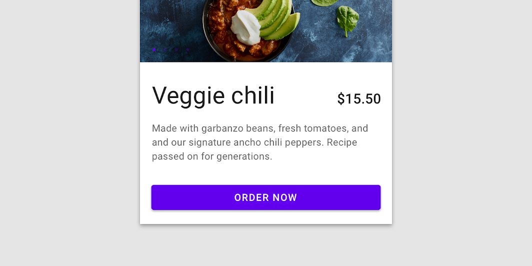
Contained buttons are high-emphasis, distinguished by their use of elevation and fill. They contain actions that are primary to your app.
The default text style for internal Text components will be set to Typography.button.
import androidx.compose.material.Button
import androidx.compose.material.Text

Button(onClick = { /* Do something! */ }) { Text("Button") }
If you need to add an icon just put it inside the content slot together with a spacing and a text:
import androidx.compose.foundation.layout.Spacer
import androidx.compose.foundation.layout.size
import androidx.compose.material.Button
import androidx.compose.material.ButtonDefaults
import androidx.compose.material.Icon
import androidx.compose.material.Text
import androidx.compose.material.icons.Icons
import androidx.compose.material.icons.filled.Favorite
import androidx.compose.ui.Modifier

Button(onClick = { /* Do something! */ }) {
    Icon(
        Icons.Filled.Favorite,
        contentDescription = null,
        modifier = Modifier.size(ButtonDefaults.IconSize),
    )
    Spacer(Modifier.size(ButtonDefaults.IconSpacing))
    Text("Like")
}
| Parameters | |
|---|---|
onClick: () -> Unit |
Will be called when the user clicks the button |
modifier: Modifier = Modifier |
Modifier to be applied to the button |
enabled: Boolean = true |
Controls the enabled state of the button. When |
interactionSource: MutableInteractionSource? = null |
an optional hoisted |
elevation: ButtonElevation? = ButtonDefaults.elevation() |
|
shape: Shape = MaterialTheme.shapes.small |
Defines the button's shape as well as its shadow |
border: BorderStroke? = null |
Border to draw around the button |
colors: ButtonColors = ButtonDefaults.buttonColors() |
|
contentPadding: PaddingValues = ButtonDefaults.ContentPadding |
The spacing values to apply internally between the container and the content |
content: @Composable RowScope.() -> Unit |
The content displayed on the button, expected to be text, icon or image. |