
Matplotlib is a Python library for creating static, interactive and animated visualizations from data. It provides flexible and customizable plotting functions that help in understanding data patterns, trends and relationships effectively.
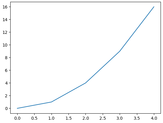
Example: Let's create a simple line plot using Matplotlib, showcasing the ease with which you can visualize data.
import matplotlib.pyplot as plt

x = [0, 1, 2, 3, 4]
y = [0, 1, 4, 9, 16]

plt.plot(x, y)
plt.show()
Output
Components or Parts of Matplotlib Figure
Anatomy of a Matplotlib Plot: This section dives into the key components of a Matplotlib plot, including figures, axes, titles and legends, essential for effective data visualization.

The parts of a Matplotlib figure include (as shown in the figure above):
- Figure: The overarching container that holds all plot elements, acting as the canvas for visualizations.
- Axes: The areas within the figure where data is plotted; each figure can contain multiple axes.
- Axis: Represents the x-axis and y-axis, defining limits, tick locations and labels for data interpretation.
- Lines and Markers: Lines connect data points to show trends, while markers denote individual data points in plots like scatter plots.
- Title and Labels: The title provides context for the plot, while axis labels describe what data is being represented on each axis.
Matplotlib Pyplot
Pyplot is a module within Matplotlib that provides a MATLAB-like interface for making plots. It simplifies the process of adding plot elements such as lines, images and text to the axes of the current figure.
Steps to Use Pyplot:
- Import Matplotlib: Start by importing matplotlib.pyplot as plt.
- Create Data: Prepare your data in the form of lists or arrays.
- Plot Data: Use plt.plot() to create the plot.
- Customize Plot: Add titles, labels and other elements using methods like plt.title(), plt.xlabel() and plt.ylabel().
- Display Plot: Use plt.show() to display the plot.
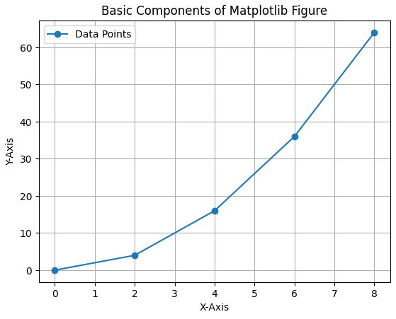
Let's visualize a basic plot and understand basic components of matplotlib figure:
import matplotlib.pyplot as plt

x = [0, 2, 4, 6, 8]
y = [0, 4, 16, 36, 64]
fig, ax = plt.subplots()
ax.plot(x, y, marker='o', label="Data Points")

ax.set_title("Basic Components of Matplotlib Figure")
ax.set_xlabel("X-Axis")
ax.set_ylabel("Y-Axis")

ax.legend()
plt.show()
Output
Different Types of Plots in Matplotlib
Matplotlib offers a wide range of plot types to suit various data visualization needs. Here are some of the most commonly used types of plots in Matplotlib:
1. Line Chart
Line chart is one of the basic plots and can be created using plot() function. It is used to represent a relationship between two data X and Y on a different axis.
Example: This code plots a simple line chart with labeled axes and a title using Matplotlib.
import matplotlib.pyplot as plt

x = [10, 20, 30, 40]
y = [20, 25, 35, 55]

plt.plot(x, y)
plt.title("Line Chart")
plt.ylabel('Y-Axis')
plt.xlabel('X-Axis')
plt.show()
Output

Syntax:
matplotlib.pyplot.plot(x, y)
Parameter: x, y Coordinates for data points.
2. Bar Chart
Bar chart displays categorical data using rectangular bars whose lengths are proportional to the values they represent. It can be plotted vertically or horizontally to compare different categories.
Example: This code creates a simple bar chart to show total bills for different days. X-axis represents the days and Y-axis shows total bill amount.
import matplotlib.pyplot as plt

x = ['Thur', 'Fri', 'Sat', 'Sun']
y = [170, 120, 250, 190]

plt.bar(x, y)
plt.title("Bar Chart")
plt.xlabel("Day")
plt.ylabel("Total Bill")
plt.show()
Output

Syntax:
matplotlib.pyplot.bar(x, height)
Parameter:
- x: Categories or positions on x-axis.
- height: Heights of the bars (y-axis values).
3. Histogram
Histogram shows the distribution of data by grouping values into bins. The hist() function is used to create it, with X-axis showing bins and Y-axis showing frequencies.
Example: This code plots a histogram to show frequency distribution of total bill values from the list x. It uses 10 bins and adds axis labels and a title for clarity.
import matplotlib.pyplot as plt

x = [7, 8, 9, 10, 10, 12, 12, 12, 13, 14, 14, 15, 16, 16, 17, 18, 18, 19, 20, 20,
     21, 22, 23, 24, 25, 25, 26, 28, 30, 32, 35, 36, 38, 40, 42, 44, 48, 50]

plt.hist(x, bins=10, color='steelblue')
plt.title("Histogram")
plt.xlabel("Total Bill")
plt.ylabel("Frequency")
plt.show()
Output

Syntax:
matplotlib.pyplot.hist(x, bins=None)
Parameter:
- x: Input data.
- bins: Number of bins (intervals) to group data.
4. Scatter Plot
Scatter plots are used to observe relationships between variables. The scatter() method in the matplotlib library is used to draw a scatter plot.
Example: This code creates a scatter plot to visualize the relationship between days and total bill amounts using scatter().
import matplotlib.pyplot as plt

x = [10, 15, 20, 25, 30]
y = [12, 18, 25, 28, 35]

plt.scatter(x, y)

plt.title("Scatter Plot")
plt.xlabel("Study Hours")
plt.ylabel("Marks")

plt.show()
Output

Syntax:
matplotlib.pyplot.scatter(x, y)
Parameter: x, y Coordinates of the points.
5. Pie Chart
Pie chart is a circular chart used to show data as proportions or percentages. It is created using the pie(), where each slice (wedge) represents a part of the whole.
Example: This code creates a simple pie chart to visualize distribution of different car brands. Each slice of pie represents the proportion of cars for each brand in the dataset.
import matplotlib.pyplot as plt

cars = ['AUDI', 'BMW', 'FORD','TESLA', 'JAGUAR',]
data = [23, 10, 35, 15, 12]

plt.pie(data, labels=cars, autopct='%1.1f%%')
plt.title(" Pie Chart")
plt.show()
Output

Syntax:
matplotlib.pyplot.pie(x, labels=None, autopct=None)
Parameter:
- x: Data values for pie slices.
- labels: Names for each slice.
- autopct: Format to display percentage (e.g., '%1.1f%%').
6. Box Plot
Box plot is a simple graph that shows how data is spread out. It displays the minimum, maximum, median and quartiles and also helps to spot outliers easily.
Example: This code creates a box plot to show the data distribution and compare three groups using matplotlib
import matplotlib.pyplot as plt

data = [ [10, 12, 14, 15, 18, 20, 22],
         [8, 9, 11, 13, 17, 19, 21],
         [14, 16, 18, 20, 23, 25, 27] ]

plt.boxplot(data)
plt.xlabel("Groups")
plt.ylabel("Values")
plt.title("Box Plot")
plt.show()
Output

Syntax:
matplotlib.pyplot.boxplot(x, notch=False, vert=True)
Parameter:
- x: Data for which box plot is to be drawn (usually a list or array).
- notch: If True, draws a notch to show the confidence interval around the median.
- vert: If True, boxes are vertical. If False, they are horizontal.
7. Heatmap
Heatmap is a graphical representation of data where values are shown as colors. It helps visualize patterns, correlations or intensity in a matrix-like format. It is created using imshow() method in Matplotlib.
Example: This code creates a heatmap of random 10×10 data using imshow(). It uses 'viridis' color map and colorbar() adds a color scale.
import matplotlib.pyplot as plt
import numpy as np

np.random.seed(0)
data = np.random.rand(10, 10)

plt.imshow(data, cmap='viridis', interpolation='nearest')

plt.colorbar()
plt.xlabel('X-axis Label')
plt.ylabel('Y-axis Label')
plt.title('Heatmap')
plt.show()
Output

Explanation:
- np.random.seed(0): Ensures same random values every time (reproducibility).
- np.random.rand(10, 10): Generates a 10×10 array of random numbers between 0 and 1.
Syntax:
matplotlib.pyplot.imshow(X, cmap='viridis')
Parameter:
- X: 2D array (data to display as an image or heatmap).
- cmap: Sets the color map.
Key Features of Matplotlib
- Versatile Plotting: Create a wide variety of visualizations, including line plots, scatter plots, bar charts and histograms.
- Extensive Customization: Control every aspect of your plots, from colors and markers to labels and annotations.
- Seamless Integration with NumPy: Effortlessly plot data arrays directly, enhancing data manipulation capabilities.
- High-Quality Graphics: Generate publication-ready plots with precise control over aesthetics.
- Cross-Platform Compatibility: Use Matplotlib on Windows, macOS and Linux without issues.
- Interactive Visualizations: Engage with your data dynamically through interactive plotting features.