
Add interactive charts in Numbers on iPad
An interactive chart presents data in stages so that you can emphasize the relationship between groups of data. You can use an interactive chart to show data like sales by group over time, expenses by department, and population changes by region per continent.
The interactive chart below shows the growth of three species during a three-year period.
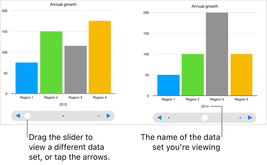
You can interact with the chart using a slider and buttons or buttons only.
To create these charts, you can add a blank chart to a sheet, then select the table cells with the data you want to use. Or, you can select the cells first, then create a chart that displays the data. Either way, when you change the data in the table, the chart updates automatically.
Tip: You can learn about different chart types in the Charting Basics template. With the document manager in browse view, tap Choose a Template, tap Basic, then tap Charting Basics. Tap the tabs near the top of the template (Column and Bar Charts, Interactive Chart, and so on) to view the different sheets—each sheet explains a different type of chart.
Create an interactive chart
This task describes how to add a chart first, then select the data. You can also select the data before creating your chart.
Go to the Numbers app
 on your iPad.
Open a spreadsheet, tap
 in the toolbar, then tap Interactive.
Tap a chart to add it to the sheet, then drag it to where you want it.
Select Tap to Add Data, then select the table cells with the data you want to use. Or, to add data from an entire row or column, tap the table, then tap the number or letter for that row or column.
You can select cells in one or more tables, including tables on different sheets. When you edit a chart’s data references, a dot appears on the tab for any sheet that contains data used in the chart.
To change whether rows or columns are plotted as a data series, tap
 in the toolbar, then tap an option.
The data series are always plotted in the interactive chart, but each data set is displayed separately.
To change the control for interacting with the chart, tap the chart, tap
 , tap Chart, then tap Buttons Only.