Feature Request: Label Grouping and Multi-Level Axis Labels #6321
Description
Even though users can deal with axis labels on a higher level through the Formatter and Text classes, Matplotlib's handling of Labels is still very flat. At best users can change the string formatting through the Formatter class and text formatting (font, size, rotation...) through the Text class.
Neither approach, however, offers users the ability to represent their data more accurately by using multiple label levels on the same plot in the way Excel, Root or R do.
In Root axes instances can be plotted individually as objects and each one be assigned a new Label instance which allows maximal flexibility for the user.
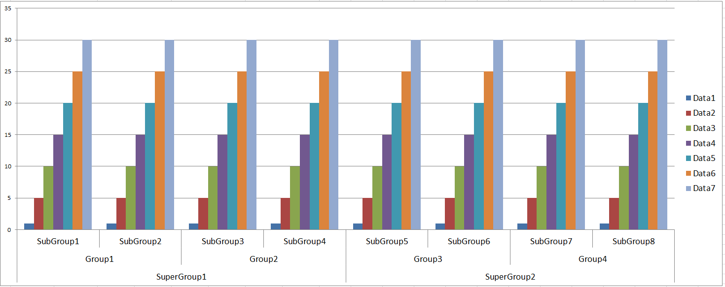
Excel and R handle this issue similarly by using the data-name in the legend, instead of as axis labels, and then use the group of the data-name as axis labels. In both cases the end result looks like:
No need to say that Root approach seems as an overkill and I'm more partial to Excel and R approach. A workaround by using hand-set text objects is provided in this StackOverflow question. The frequency of similar questions is the main motivation behind this request.