This branch contains the tutorial steps and processes used to implement the start-app shown below:

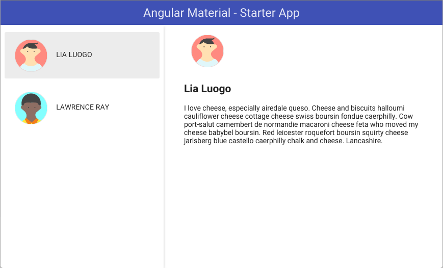
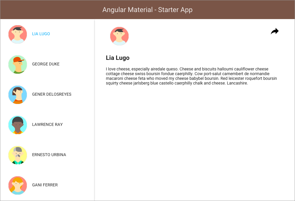
Above is a snapshot of the Starter-App with a Master-Detail layout: showing a list of users (left) and a user detail view (right).
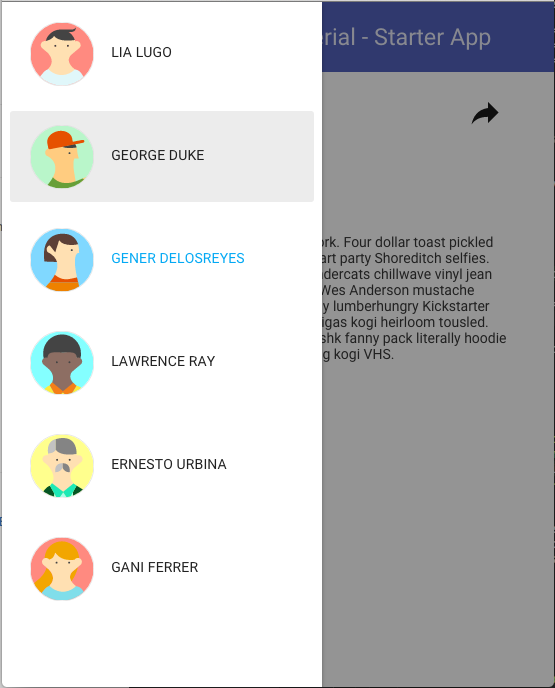
Also shown is the user experience that will be displayed for smaller device sizes. The responsive layout reveals the menu button that can be used to hide the user list and a share button that can be used to show the Share bottom sheet view.
This Starter app demonstrates how:
- Angular Material
layoutandflexoptions can easily configure HTML containers - Angular Material components
<md-toolbar>,<md-sidenav>,<md-icon>can be quickly used - Custom controllers can use and show
<md-bottomsheet>with HTML templates - Custom controller can easily, programmatically open & close the SideNav component.
- Responsive breakpoints and
$mdMediaare used - Theming can be altered/configured using
$mdThemingProvider
This sample application is purposed as both a learning tool and a skeleton application for a typical AngularJS Material web app: comprised of a Side navigation area and a content area. You can use it to quickly bootstrap your angular webapp projects and dev environment for these projects.
- - -
Here are some generalized steps that may be used to conceptualize the application implementation process:
- Plan your layout and the components you want to use; preferrably with a site UX design document.
- Use hard-coded HTML and mock content to make sure the components render as desired
- Integrate UI components to your custom application logic
Use the seamless integration possible with Angular directives and controllers
This integration assumes that you have unit tested your app logic
- Add Adaptive breakpoints
- Add Theming support
- Confirm ARIA compliance
- Write e2e Tests
It is important to validate your app logic with Angular Material UI components.
These tutorials assume that you have already cloned the repository, checked out this branch, and
executed the npm install command.
git clone https://github.com/angular/material-start
cd material-start
git checkout es5-tutorial
npm install
It is also recommended that you install live-server to view your application after each step of the tutorial.
npm install -g live-server
live-server --open=app
This repository contains two ES5 branches:
es5-tutorial(this branch) - Step-by-step instructions that clearly demonstrate how the Starter application can be created in minutes.es5- The final ES5 version which you complete in the last step of the tutorials above.
In this branch (es5-tutorial), you will notice html Tutorials #0 through #8: these will be used to guide you through the development process. By following these tutorials stages, you will be very quickly introduced to the powerful features of Angular Material.
Each tutorial presents the resulting changes for that stage. It is recommended, however, that you start with the preceding tutorial and manually make the changes requested. The effort you invest to implement these changes will highlight specific concepts at each Tutorial stage.
- - -
Here will modified the shell application [available in tutorial_0.html] to use Angular-Material.
- Use NPM to install angular-material with
npm install - In the HTML, load the CSS and JS modules:
- Configure the app dependency on 'ngMaterial'
  <head>
    <link href="../node_modules/angular-material/angular-material.css" rel="stylesheet" />
  </head>

  <body>
    <script src="../node_modules/angular/angular.js" type="text/javascript" ></script>
    <script src="../node_modules/angular-animate/angular-animate.js" type="text/javascript" ></script>
    <script src="../node_modules/angular-aria/angular-aria.js" type="text/javascript" ></script>
    <script src="../node_modules/angular-material/angular-material.js" type="text/javascript" ></script>

	<script>
		// Include the dependency upon ngMaterial - important !!
		angular.module('starterApp', ['ngMaterial']);
	</script>
  </body>
- - -
JSBin Demo for Step #1
- - -
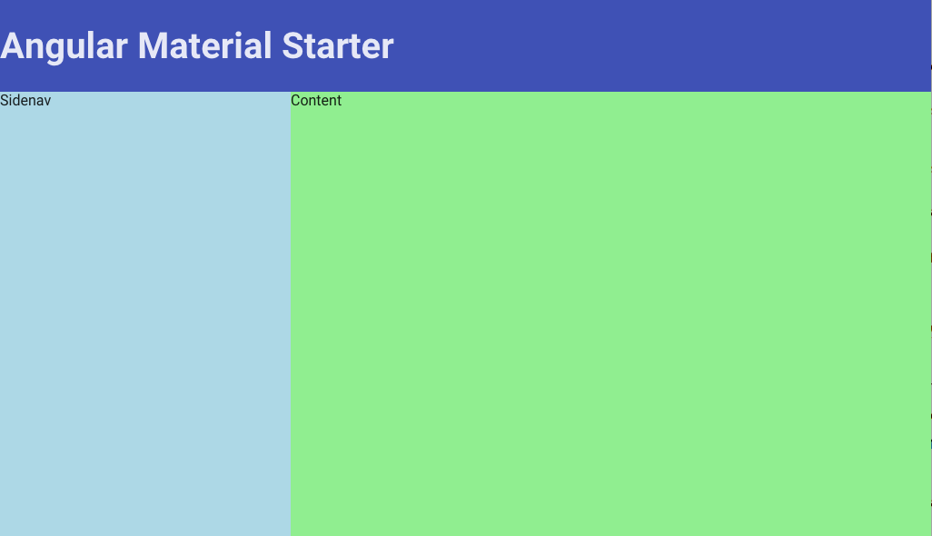
###### Wirefame
The illustration below shows how we planned the layout and identified the primary components that will be used in the Starter application:

Note that container #2 (above) is a simple
<div>container and not an Angular Material component.
- - -
- Add the
<md-toolbar>,<md-sidenav>,<md-content>containers. [Themd-sidenavis the container for the Users list view and themd-contentis the container for the selected User details view. - Add the layout and flex attributes to configure the container layouts and sizing aspects.
- Use
md-locked-opento lock the sidenav open on the left - Use the
md-whiteframe-z2to add a shadow the the sidenav
  <body ng-app="starterApp" layout="column">

	<!-- Container #1 (see wireframe) -->
    <md-toolbar layout="row" >
      <h1>Angular Material - Starter App</h1>
    </md-toolbar>

	<!-- Container #2 -->
    <div flex layout="row">

		<!-- Container #3 -->
        <md-sidenav md-is-locked-open="true" class="md-whiteframe-z2"></md-sidenav>

		<!-- Container #4 -->
        <md-content flex id="content"></md-content>

    </div>

  </body>
Here you used the wireframe planning and layout to identify the components and attributes needed. Then use the Angular Material Layout API to layout your containers and responsively adjust their sizes.
- - -
- - -
Here you will use hard-coded elements and Angular Material UI components to render and layout each container's children elements.
- Show a list of Users in the
md-sideNavcontainer- Use the
md-list,md-button, andmd-iconcomponents with mock data
- Use the
- Show mock user details in the
md-contentcontainer
Note: that the md-sidenav is the container for the master Users List view, and the md-content is the container for the detail User Detail view.
  <body ng-app="starterApp" layout="column">

	<md-sidenav md-is-locked-open="true" class="md-whiteframe-z2">
	  <md-list>

		<!-- List item #1 -->
		<md-list-item >
			<md-button>
			  <md-icon md-svg-src="./assets/svg/avatar-1.svg" class="avatar"></md-icon>
			  Lia Luogo
			</md-button>
		</md-list-item>

		<!-- List item #2 -->
		<md-list-item >
			<md-button>
			 <md-icon md-svg-src="./assets/svg/avatar-4.svg" class="avatar"></md-icon>
			  Lawrence Ray
			</md-button>
		</md-list-item>

	  </md-list>
	</md-sidenav>

	<md-content flex id="content">
	  <!-- User details sample -->

	  <md-icon md-svg-src="./assets/svg/avatar-1.svg" class="avatar"></md-icon>
	  <h2>Lia Luogo</h2>
	  <p>
		I love cheese...
	  </p>
	</md-content>

  </body>
- - -
- - -
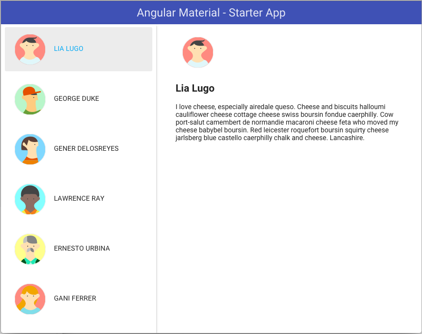
Here you will replace the hard-coded HTML with dynamic, mock user data. Let's do this in 2 stages:
- Build custom application logic for load the mock user data
- Build the HTML markup to render the dynamic, mock data
Then you integrate your custom, application logic.
- Define a Angular module 'users' for your custom code
- Define your data services, models, and controllers
- Load your custom code using script tags
- Configure your 'starterApp' to require (have a dependency upon) both 'ngMaterial' and 'users'.
<script src="./src/users/Users.js"></script>
<script src="./src/users/UserController_4.js"></script>
<script src="./src/users/UsersDataservice.js"></script>

<script type="text/javascript">

  angular.module('starterApp', ['ngMaterial', 'users']);

</script>
Now replace the hardcoded HTML with dynamic markup using Angular directives (eg ng-repeat)
and the standard Angular {{ }} interpolation markup.
- Attach the UserController to the
bodyusingng-controller. - Use dynamic HTML that will be compiled and rendered by Angular.
- Register a set of custom avatar icons; since each 'user' references an avatar ID.
<body ng-app="starterApp" layout="column" ng-controller="UserController as ul">

  <md-toolbar layout="row">
    <h3>Angular Material - Starter App</h3>
  </md-toolbar>

 <!-- Wireframe Container #2 -->
 <div flex layout="row">
 	<!-- Wireframe Container #3 -->
	<md-sidenav md-is-locked-open="true" class="md-whiteframe-4dp">
	  <md-list>
		<md-list-item ng-repeat="u in ul.users">
			<md-button ng-click="ul.selectUser(u)" ng-class="{'selected' : u === ul.selected }">
			  <md-icon md-svg-icon="{{u.avatar}}" class="avatar"></md-icon>
			  {{u.name}}
			</md-button>
		</md-list-item>
	  </md-list>
	</md-sidenav>

	<!-- Wireframe Container #4 -->
	<md-content flex id="content">
	  <md-icon md-svg-icon="{{ul.selected.avatar}}" class="avatar"></md-icon>
	  <h2>{{ul.selected.name}}</h2>
	  <p>{{ul.selected.content}}</p>
	</md-content>

 </div>


 <script type="text/javascript">
  angular
	  .module('starterApp', ['ngMaterial', 'users'])
	  .config(function( $mdIconProvider ){

		  // Register the user `avatar` icons
		  $mdIconProvider
				  .defaultIconSet("./assets/svg/avatars.svg", 128);
	  });
 </script>
</body>
- - -
- - -
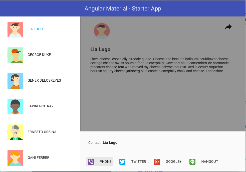
In this step, you will use a dynamic, mdBottomSheet component at the bottom of the user details area. This contact sheet will be used to display user contact options available for each user.
- create a "Share" button in the upper right of the user details view
- create a User Contact view and controller to show in the bottom sheet
- programmatically configure and load the bottomsheet using the $mdBottomSheet service
- register icons that will be used inside the user ContactSheet
Add the share button to the UI:
<md-content flex id="content">
  <md-icon md-svg-icon="{{ul.selected.avatar}}" class="avatar"></md-icon>
  <h2>{{ul.selected.name}}</h2>
  <p>{{ul.selected.content}}</p>

  <md-button class="share" md-no-ink ng-click="ul.makeContact(ul.selected)">
	<md-icon md-svg-icon="share"></md-icon>
  </md-button>
</md-content>

<script type="text/javascript">

  angular
	  .module('starterApp', ['ngMaterial', 'users'])
	  .config(function($mdIconProvider){

		  $mdIconProvider.icon("share", "./assets/svg/share.svg", 24);
	  });

</script>
Add the makeContact() function to the controller:
/**
 * Show the bottom sheet
 */
function share(selectedUser) {

  $mdBottomSheet.show({
    controllerAs     : "vm",
    controller       : [ '$mdBottomSheet', ContactSheetController],
    templateUrl      : './src/users/view/contactSheet.html',
    parent           : angular.element(document.getElementById('content'))
  });

  function ContactSheetController( $mdBottomSheet ) {
    this.user = selectedUser;
    this.items = [
      { name: 'Phone'       , icon: 'phone'       , icon_url: 'assets/svg/phone.svg'},
      { name: 'Twitter'     , icon: 'twitter'     , icon_url: 'assets/svg/twitter.svg'},
      { name: 'Google+'     , icon: 'google_plus' , icon_url: 'assets/svg/google_plus.svg'},
      { name: 'Hangout'     , icon: 'hangouts'    , icon_url: 'assets/svg/hangouts.svg'}
	   ];
	   this.contactUser = function(action) {
		   // The actually contact process has not been implemented...
		   // so just hide the bottomSheet

       $mdBottomSheet.hide(action);
	   };
	 }
}
- - -
- - -
The Angular Material Layout API uses flexbox to enable your DOM containers and elements to fluidly respond to height and width changes in the browser viewport. The Layout API also uses media queries to define specific browser width ranges that can trigger your application to adapt to the new viewport size. These ranges are known as breakpoints and are defined here:

But using media queries and breakpoints is too low-level for Angular Material developers. Hence the use of the following aliases.

Simply append the alias to the desired Layout API to trigger that directive to work only when the breakpoint range is active.

In this lesson, you will add adaptive breakpoints so the application layout will adapt to different device display sizes.
- Add a Menu button in the Toolbar
- Lock the Users list open if device display is wider than > 600px; hide otherwise.
- Use the
$mdMediato help with this feature.
- Use the
- Hide the Toolbar menu icon button if the Users list is open.
- Add
clicksupport for the menu buttons.- Use the
$mdSideNavservice to toggle the sideNav - Auto-close the sideNav after a user is selected.
- Use the
<body>
  <!-- Wireframe Container #1 -->
  <md-toolbar layout="row">
	  <md-button class="menu" hide-gt-sm ng-click="ul.toggleList()" >
      <md-icon md-svg-icon="menu" ></md-icon>
    </md-button>
  </md-toolbar>

	<!-- Wireframe Container #2 -->
	<div flex layout="row">

	 <!-- Wireframe Container #3 -->
	 <md-sidenav md-is-locked-open="$mdMedia('gt-sm')"
				 md-component-id="left"
				 ng-click="ul.toggleList()" >
	 </md-sidenav>

	 <!-- Wireframe Container #4 -->
	 <md-content flex id="content">
	   <md-button class="share" md-no-ink ng-click="ul.share(ul.selected)"></md-button>
	 </md-content>

	</div>
</body>
Register the menu icons displayed in the Toolbar:
<script type="text/javascript">

  angular
	  .module('starterApp', ['ngMaterial', 'users'])
	  .config(function($mdIconProvider){
		  $mdIconProvider.icon("menu", "./assets/svg/menu.svg", 24);
	  });

</script>
Using the Layout API and out breakpoint aliases along with component services
hide-gt-smand$mdMedia('gt-sm')$mdSidenavand$mdMedia
We have quickly created an application that not only responds to size changes but also adapts to breakpoint triggers.
function UserController( userService, $mdBottomSheet, $mdSidenav ) {
  var self = this;

  self.toggleList   = toggleUsersList;

  // *********************************
  // Internal methods
  // *********************************

  /**
   * Hide or Show the 'left' sideNav area
   */
  function toggleUsersList() {
    $mdSidenav('left').toggle();
  }
}
- - -
- - -
Here you will configure to use a different, darker theme.
- Use
$mdThemingProviderto configure a different theme using primary colors from the brown color palette and accent colors from the red color palette.
<script type="text/javascript">

  angular
	  .module('starterApp', ['ngMaterial', 'users'])
	  .config(function($mdThemingProvider, $mdIconProvider){

		  $mdThemingProvider.theme('default')
			  .primaryPalette('brown')
			  .accentPalette('red');
	  });

</script>
Finally let's will fix any ARIA warnings that Angular Material may display in the Dev console.
- Insert
aria-labelattributes for mdButton components that do not have labels.
<body>
	<!-- Wireframe Container #1 -->
    <md-toolbar layout="row">
      <md-button class="menu" aria-label="Show User List"></md-button>
    </md-toolbar>

	<!-- Wireframe Container #2 -->
	<div flex layout="row">

	 <!-- Wireframe Container #3 -->
	 <md-sidenav>...</md-sidenav>

	 <!-- Wireframe Container #4 -->
	 <md-content flex id="content">
	  <md-button class="share" aria-label="Share with {{ ul.selected.name }}"></md-button>
	 </md-content>

	</div>
</body>
- - -
- - -
With only seven (7) Tutorial Steps and a few minutes of work, we have quickly created a functional Angular Material application that is beautiful, responsive, theme'ed, accessible, and easily maintained.
Imagine doing this without Angular Material!